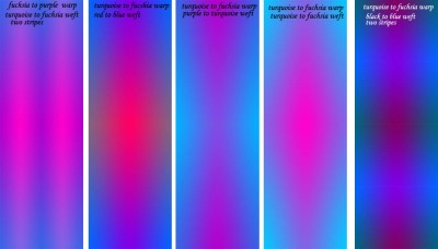
I have been simulating various warp and weft colors in Photoshop:

Based on my results (and these are just a small fraction of the things I’ve tested), I think I’m going to use the full fuchsia to turquoise color range, in just one reflected stripe (I found multiple stripes distracting). As for weft colors…no decisions yet. But that’s fine…all I really need to know right now is which pattern the warp colors will go in, so I can start winding the warp. And I know that now.
Later I will do more accurate simulations using Fiberworks PCW, but that’s a lot of labor so I am using Photoshop for the early work. Then, sampling of course!
Claudia asked whether I was planning to use the knitted blanks for weft. Yes, that’s what I’m going to use them for. I haven’t decided what colors to use yet, but they will most likely not be the same colors as the warp – I could use my pre-dyed warp colors for that!

Fascinating! I can get way too heavily involved in this kind of thing in Paint Shop Pro! What I am really eager to see is how the actual weaving will compare with the Photoshop design. I’m sure the piece will be outstanding, no matter what, but I really am curious about the comparison, and also how much, in the end, you believe working things out in Photoshop first helped you.