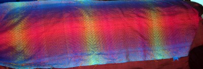
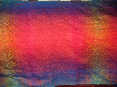
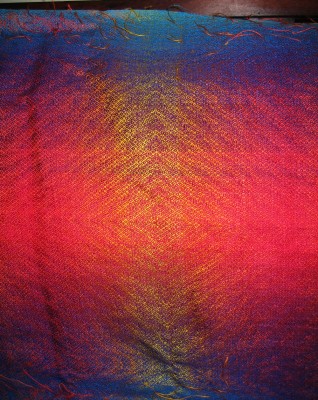
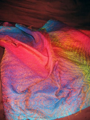
I got up this morning and took some photos of the shawl. I have mixed feelings about it.
Close up, the colors are gorgeous. But when you stand back five feet it looks like a series of stripes, and almost like a plaid in the places where I got the warp wrong and there are visible stripes in the warp. There is a strong value contrast between the yellow and the red, which makes the yellow stand out more, and there are uneven spots where you can see a clear distinction between two of the yellows. The pattern does not stand out in most of the areas. So there are definitely flaws in the piece, though the overall idea is sound.
I think I’m going to weave another piece with the same colors, only this time:
- Make each of the diamonds a single color, so the pattern shows up clearly. Or do a gradual fade across the diamond, keeping more or less the same value.
- Be more careful to get gradual color transitions.
- Tone down the yellow and only go to gold, instead of fading to the lemon yellow.
This piece is pretty, but I think it could be more! Advice on what might look nice would be welcome, I haven’t played with color theory much. I think perhaps some more Photoshop simulations are in order before I do the next round…
The pix:


Hi Tien,
Colours that are much lighter in value will stand out more distinctly against darker values, so yes, the lemon yellow will stand out. OTOH, while the shawl isn’t what you had envisioned, it looks pretty good to me! The irridescent area looks fabulous.
You are doing a great job of being analytical about your results and thinking through changes. Go Girl!
Cheers!
Laura
I agree with Laura and add one more thing that you really already know. Things look different closeup and far away. Weaving programs help to envision the differences a little by focusing in and out. Perhaps you can do this in PS as well to help you out? One more question: if your intention had been stripes, would you have liked the results?
I can see what you mean, and I know that I am always upset when the finished piece does not live up to my plans. But I do see the multiple layers of design that I like to have in my pieces. I want to have people from a distance see one design, but when they come close they are rewarded with an additional design.
Deanna