I’ve been fiddling with my sample all morning, trying to decide which spacing will look best on me and with the double-happiness ribbon. Curiously, the motifs with equal horizontal and vertical spacing are not my favorites…anyway, here are the samples, judge for yourself (and I’d love your opinion!):
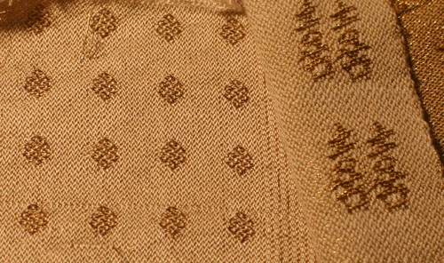
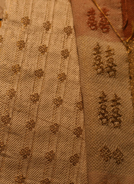
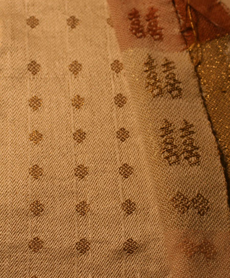

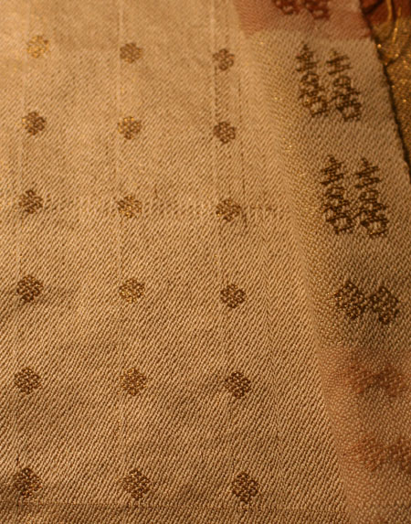
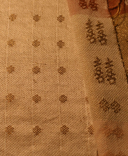
Which do you like best? For the moment, my favorites are the second one and the last one, but I’m not sure why, and I’d love to get more opinions. Please ignore the defects in the weaving – I made some mistakes in the threading! – it’s the spacing of the motifs that I’m trying to decide. The photos are pretty close to the real-life sizes.
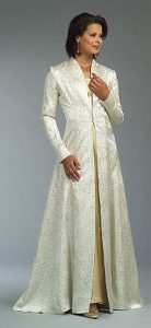
(As a reminder of what the coat looks like, here’s a photo from the front of the pattern. The ribbon of Chinese double-happiness characters will run down the front opening of the coat, on both sides.)

I agree with you. My favorites are close/med and med/wide. Between those two I think I like the close/med best, but it’s hard to tell with the photo shown. I find myself wanting to see it from a distance to see how it “reads”. 🙂
When I read this, I thought “I can’t possibly have a preference”.
But then I looked at them, and I do.
I like the third one best.
Of course, I’d like to see it from the distances that the coat will be seen from – so up close like some one is talking to you, and from several rows back in your wedding venue.
And, of course, everyone has different taste!
Sue
Your favourites both have narrower horizontal spacing than vertical, which I think echoes the double happiness symbol, which has a ‘tall’ feel to it. I think that makes the combination very attractive – particularly the last one, for me.
I also love the first one – but I liked that a lot in your previous post, too. In that case, I think it’s the background weave that I find so appealing; it’s very rhythmic and neat. Not that anyone will be able to see that when you’re wearing it, of course…
Last one, definitely!
Last one.
The 2nd one is my fav, but the last is good too and I don’t dislike the 3rd.
Tien, I think you need to think of your pattern and dress design when choosing what sample to use for your final product. Take your samples to your dress/coat consultant and let her give you her opinion as to which one would look best.
I like the medium vertical, wide horizontal. I think that gives the appearance of vertical stripes, which are generally more flattering.
I like number 2 and the last one so close your eyes turn yourself around and pick one
what a stunning coat you will be wearing
I like the 2nd and 4th, as I agree with Judy Nolan that they would read as vertical stripes. That would enhance the long sweeping lines of the coat. Good luck, and enjoy the process!
I was drawn immediately to the second one.
That’s my pick and I’m sticking to it !!
What a beautiful bride you will be.
Juli in MN
My preference is: 1 first, 6 second best. I doubt a little it about the vertical cramming – sleying error or on purpose? – in the 6th sample. Wouldn’t it give problems when sewing? The samples are in color. Will the dress be white or this yellowish color? Same color in warp and weft?
My compliments for your perseverance in the project!!!
Erica
I like the last one… you must post a wedding photo…. you do lovely work!
Tien, I definitely prefer the last pic, especially given the lines of the dress…
Tien,
They are all gorgeous! I like the first and second to the last best but these are close up views. Would it be possible for you to line up all the fabric samples and take a picture from a distance (were most folks will be seeing the fabric from)? I think seeing the fabric from further away will show more of how it will visually impact the viewer.
Hi Tien, Best wishes on you wedding! I am a friend of Alison’s, I am a pattenmaker in New York and a weaver. My advice is to think of your patterns as stripes or dots. You will observe that the samples with the motifs spaced equally vertically and horozontally will read as dots on a grid. ( like polka dots) The samples with motifs spaced close horozontally and far apart vertically will read as horozontal stripes (the enemy of wide or short people everywhere!) This is because the eye blends the closest spaced motifs to create a line. Conversely, the motifs spaced close vertically and far apart horozontally will read as vertical stripes (every woman’s best friend). To simulate what the “print” looks like from far away you can shrink your photos. XO Gail ( google me to see my credentials!) & Fog (I have credentials too!)
I love the samples–they’re great! My question is about the garment pattern–it looks as if the coat will have some front closures. I would suggest that you think about the size of buttons (or whatever) and spacing of the closures, and how the pattern will work with that. But no matter what, it will be beautiful, I’m sure!
Definitely the second appeals to me most, I like the more vertical emphasis in the pattern, I think it will be very flattering and elegant.
I think when there is more space between the motifs they look more like dots and less like intersting small patterns, somehow more space detracts from the detail.
The motifs are so beautiful!
I would vote for the wide/wide or med/wide spacing. When you actually make the garment….the designs will read as “dots” …which may distract from the clean lines of the coat. The further the spacing, the more elegant the fabric will look.
As weavers, we all need to “step back from the swatch”, and look at the big picture.
The double happiness band is also exquisite.
Do you know anyone who can simulate the garment with your fabric on it? That’s how a fashion design studio would make the decision.
Best wishes ..
Patrice
Came over from the Weaving list. Just as fabric, I like the second and fifth. But for your coat pattern, the last is my pick. I like the more open spacing of the motifs so the fabric doesn’t overwhelm the coat pattern, and agree with several pp to enhance the vertical lines of the coat. Also a great suggestion to run it by the consultant who probably sees a lot more combinations of patterns and fabrics on a regular basis, and can see the choices in person.
My vote if for #6
My preferences are no. 3 and no. 6. Going to be a beautiful fabric.