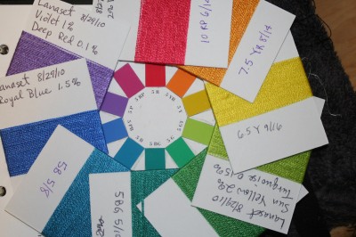
Peg asked whether it was difficult to determine the match when dealing with a glossy yarn “chip”. It is extremely difficult, because the hue and value change markedly depending on the angle of the yarn to the light and to the viewer. I finally settled on using diffuse daylight with the book flat in front of me; it was the only way to keep my sanity. According to Karren, industry uses light boxes for this purpose. I may try this; I have a makeshift “light box” for photography anyway, so could bring it out for use in color matching.
At any rate, here is my “color wheel”, minus the RP card, which I didn’t have time to wind. I am still tweaking the colors on most of these:

The red is a little too blue, the orange definitely too yellow. Yellow has too high chroma and needs to be toned down, probably by adding black. Yellow-green is problematic: it is ALMOST a match, the hue (color) and value (lightness/darkness) are correct but it has slightly too low chroma (saturation). This is difficult to fix, but I think I might be able to manage it.
Green is too yellow – more turquoise is needed. Blue-green and “blue” (what you are probably seeing as turquoise) are spot on. The royal blue chip is almost correct, but the chroma is too high (the color is too “bright”); next time I’ll add some black to tone it down. The violet is way off; it needs more red, but I don’t think I can get it correct with the dyes I used, so I’m going to try a different combination of dyes.
It is amazing how subtle the color differences can be, and how challenging they are to “fix”! I have been keeping notes on each batch, with comments about the direction in which I’m trying to nudge the colors. I think it will take me at least another 2-3 batches of skeins before I get things right.
After that, of course, it’s on to the Cibacron F color wheel…
Next (and final) exercise after that is picking a specific color to reproduce. I will probably pick a neutral color (beiges and browns), as Karren says they are the hardest to reproduce. I figure I might as well try the most challenging color possible during the study group – that way I can get help on it if I need it, which won’t be the case afterwards.
I am very pleased with what I am learning in this study group, it’s taught me huge amounts about dyes and dyeing. If Karren ever offers this class commercially, it will be well worth taking.

I have a white umbrella which is actually a tool for diffusing light. They clip over your light-source. Waiting for a nice, cloudy day is an option, as well. You can probably get the “brolly” at any good photo store.
Nancy C.