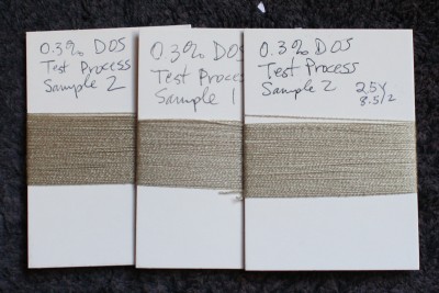
Dyeing has now begun in earnest for my dye study group. I’ve finished my process testing, dyeing three samples three times each to make sure that I can get reproducible color. Here are one set of sample skeins from the process tests. Each was dyed in a different dyebath at a different time, but using the same methods:

As you can see, the colors are identical (at least, I can’t tell the difference). The lighting in this photo is unfortunately from the side, so the rightmost skein looks paler than the leftmost one, but “in the flesh” they are identical.
So I have a dyeing method that gets me reproducible color. Yay!
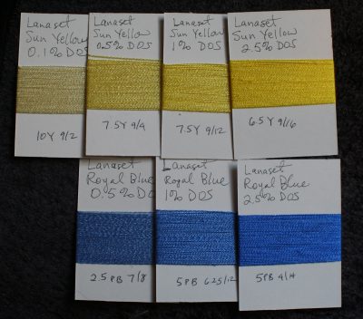
Next on the agenda is dyeing samples for each of the “pure” colors, i.e. dye colors that are not a mix of other colors. (Dye houses frequently mix together “pure” colors to produce a greater variety of shades to sell, but since those mixes are proprietary, they can (and sometimes do) change their formulas, making the mixed colors not as good for color mixing.) I did Sun Yellow, Royal Blue, and Deep Red yesterday morning, and wound the cards for Sun Yellow and most of Royal Blue last night:

The numbers on the bottom are the Munsell color codes for that particular card. The first indicates the hue – the “color”. The second indicates the value – roughly, how light or dark the color is. Higher values are lighter, lower values are darker. The third indicates the chroma – roughly, how bright/intense/saturated the color is (high chroma = more saturated color).
Karren Brito, who is teaching the study group, is having us determine the Munsell number for samples because that gives us a permanent record of the color of a freshly dyed sample. Dyed samples deteriorate over time, gradually fading away (faster if exposed to light). So old samples are not reliable determinations of color. But the Munsell number is absolute – it doesn’t change over time. So I can look at the Munsell number twenty years from now and still know what color the sample was originally.
One thing that is interesting to me is that, in addition to the expected changes in value and chroma (more dye = more intense, darker color), there is also a shift in hue. It’s hard to see, but the yellow, especially the far left sample, is a little greener as you decrease the amount of dye, and a little more orangey as you get to the 2.5% sample, which is the highest concentration of dye that I sampled. And the blue gets a trifle greener, though it’s so faint you can barely tell. I need to compare against the Munsell color notation of the substrate (yarn I’m dyeing) to see if that is the influence of the substrate or an actual difference, though Karren also says that a hue shift is more-or-less expected when doing different concentrations of dye.
I’m really enjoying this dye study group – it’s opening my eyes to a totally different world of color, and teaching me how to dye to get precise, repeatable results. Definitely different from a weekend workshop! I have been thinking more about colors, hue, chroma, and value, like never before.
I am still thinking about what to do with this warp on the loom. I have read up enough about overshot that I don’t think it is the most effective way to get pattern on a lots-of-shafts loom; it seems primarily to be a way to squeeze four blocks out of four shafts, and the requirement for blocks to be in twill order really restricts what can be done on a multi-multi-shaft loom. I would need to examine it more closely to understand the block structure, but that’s what I’ve been getting out of my reading so far.
So now I am examining other possibilities. Lampas and taquete both sound intriguing, and I have been reading up on them in The Woven Pixel and in my collection of Weaver’s and Prairie Wool Companion. I have a complete collection of Weaver’s and PWC, acquired by scouring the Internet for many months, and it is a treasure trove of information. The Woven Pixel, of course, has information on how to construct the presets and convert a drawing to a liftplan, in addition to some information on the structure. And I am intrigued by Lillian Whipple’s kimono draft in Complex Weavers’ Greatest Hits – I’ve seen the kimono pattern in person and it is exquisite. I think I could create some nice imagery that way.
But that, of course, requires a great deal more reading to understand the structure and be able to design/weave it off, so I am studying that as well. I’m pleased, though – I’m finding that I’m able to read and understand these articles (albeit with intense study) – a year ago, they would have been over my head!
Off to work!

Does this mean that the so called “pure” colors, despite not being manufactured by combining colors, are not really pure? Or is this simply a color phenomenon that would be true across the board? I’m wondering, for example, if the paler the yellow gets, the cooler it looks and cooler translates to the appearance of more blue. And the more intense the yellow, the warmer it appears, hence the suspicion of a bit of red (orange). So, is it perception only? Of course, in the end, it is how the color is perceived, no matter what its components, that is important!!