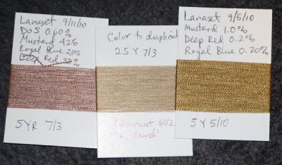
I only squeezed in one dyebath this weekend, but it was instructive. I managed to match one more color from the color wheel (only two left to go), and got one more near-match for the beige:

On the right is the first attempt; on the left is the second attempt, the color I’m trying to match is in the center.
Karren told us that value (lightness/darkness of the color) is the first thing we should try to match. So I tried a couple different DOS (depth of shade – the ratio of dye to fiber), and came up with one (the left-hand sample) that matched pretty well at 0.6% DOS.
The next thing to match is hue – the basic color. One of mine is too yellow, the other too red. Somewhere in the middle is the right hue. Since the too-yellow sample has a ratio of about 5:1 yellow: red and the closest too-red sample has a ratio of about 2.3:1, for my next batch of skeins I’m going to try a sampling of all the ratios in between.
Finally, once you have the hue down, you match the chroma (relative brightness or “pure-ness” of the color). Of the samples I’ve wound onto cards, 17-25% Royal Blue added to the yellow-red mix seems to produce the right chroma, about 3 on the Munsell scale. So I am using percentages of Royal Blue in that range.
Here are the next ten skeins I plan to dye:
| DOS | Mustard | Royal Blue | Deep Red | Ratio of Mustard
to Deep Red |
| Sample | ||||
| 0.6% | 62% | 25% | 13% | 4.7692 |
| 0.6% | 60% | 25% | 15% | 4 |
| 0.6% | 57% | 25% | 18% | 3.1667 |
| 0.6% | 55% | 25% | 20% | 2.75 |
| 0.7% | 60% | 25% | 15% | 4 |
| 0.7% | 57% | 25% | 18% | 3.17 |
| 0.7% | 55% | 25% | 20% | 2.75 |
| 0.6% | 65% | 20% | 15% | 4.3333 |
| 0.6% | 63% | 20% | 17% | 3.7059 |
| 0.6% | 60% | 20% | 20% | 3 |
| 0.7% | 65% | 20% | 15% | 4.3333 |
| 0.7% | 62% | 20% | 18% | 3.4444 |
| 0.7% | 60% | 20% | 20% | 3 |
The three variables I’m playing with are depth of shade, ratio of gold to red, and the percentage of blue. (The blue is in there to dull the color, being the complement of gold + red=orange.)
I’ve decided to switch over to percentage of total dye for my notation, as I’m finding it easier to think through when working with three colors.
It’s going to take me probably another 2-3 iterations to duplicate this color, but I can sense I’m getting closer!

With colour matching I think of a circle with the brightest colours on the outside, around the outside of the circle imagine the colours starting at 12 o clock=red, 3 yellow, 6 green, 9 blue.(Its best to draw this out)
Think of the centre of the circle as grey, the outside of the circle as the brightest colour possible.
Now imagine you have a very bright red and you want to “flatten” the colour, just add the colours from the opposite side of the circle, to pull the colour towards grey or make it duller, flatter. In this case add green (with a typical dye trichromat yellow and blue dye).
If you have a green and want to flatten it add red.
Browns and greys are the hardest colours to match usually when making changes I think of a 10% change as a noticeable movement and scale the required change according to how far the colour has to move. With browns and grey exact colour matching may require movements of as small as 5% change (which in normal colour matching would be considered barely noticeable).
By 5% change I mean say if you had 1% dye (on wt of substrate) a move to 1.05% or 0.95%.
Some times obviously you may need to add a new colour to achieve lifts in brightness where your std tric dyes are not bright enough eg bright turq to green mix that is too flat with a standard blue/yellow comb. Generally the turqs are’nt recommended in trichromats as they can lead to incompatibilty with unlevel skittery dye effects due to the high mol wt phthalocynine chemical base nec to manufacture these shades.