Our first assignment in design class was to take photos of contrasts: dark vs. light, circles vs. squares, near vs. far, and so on. This resulted in (among other things) these two photos:
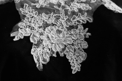
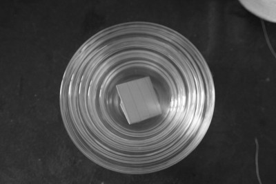
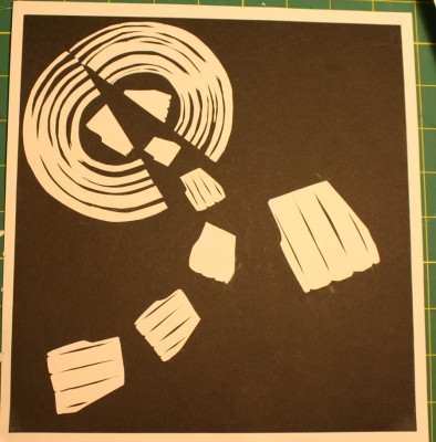
Next assignment was to take the photo and, using carbon paper, construction paper, Exacto knife and glue, create a second design (embodying the design principles we’ve been reading about in our text) based on components of the photo. The circles and squares was relatively simple, and produced this:
The design principles I’m using here are:
- unity (the vaguely trapezoidal shape is repeated multiple times, and the path of the trapezoidal shapes repeats the circular forms at top left),
- variety (some trapezoidal shapes are marked and some are not),
- asymmetric balance (the big shape at right “balances” the rest of the composition due to its increased interest and distance from the other shapes)
We had to come up with a title for this piece, so I titled it “Anxious Parent”. The circle can either be a womb (and the sliced trapezoidal shape in the circle giving birth), or just an interesting door, and of course the children are issuing forth as the trapezoidal shape outside watches.
The lace was a little more difficult. It’s entirely curvy lines and there isn’t that much variety in shape or line in the lace. I liked the lines of the lace, but was racking my brains over what to do that would be interesting, design-wise. I finally just “cut out” motifs from the lace in Photoshop, and started rearranging them to see what could be done. And here is what I came up with:
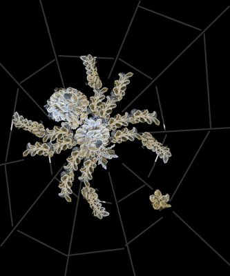
(You’ll notice that I cheated and put in the spiderweb. I felt that the spider and “fly” were too much unity of line, and I wanted to add some variety of style to add tension to the piece.)
I liked the “trompe d’oeuil” style – the creepy tarantula, on closer view, turns out to be made of this highly feminine bridal lace!
Unfortunately, when converted to construction paper outlines, the floral motif really isn’t as prominent:
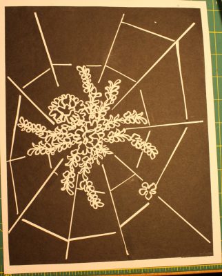
It’s still nice, but not nearly as visually amusing as the original.
Design principles here include variety of line, diagonal placement, focal point emphasis, and other stuff. Notice that the web spirals in on the main motif, the spider, but that the fly is also located at the crossing of two lines, adding visual emphasis. Also, the alignment of the spider and the fly is on the top left to bottom right diagonal, which is the natural motion of the eye in Western culture (because we read left to right and top to bottom), and which produces a more natural flow or “read”. They are also placed on the diagonal, which adds more energy to the movement – if you rotate the picture about 30 degrees (so the spider is horizontal) the “feel” is totally different!
Anyway, I’m not sure I would have composed this any differently before taking the design class – but now I am actively thinking about elements and how they go together, rather than having to rely on intuition and “this looks right”. Hopefully that should lead to a more powerful compositional style and a better ability to troubleshoot diagrams that “don’t feel right” in the future.
All this, of course, was extremely time-consuming (the lace spider took a loooong time to cut out of construction paper – it was delicate work!) so I have not been doing much drawing in the last few days. However, tomorrow I am leaving on a five-day business trip to Germany (visiting our EU office), and I am hoping to get some serious drawing in during my free time on the trip. (After all, if it’s 3am and jet lag is keeping you from sleeping, you might as well draw!)
