I spent some time this morning messing around in Photoshop, confirming a lot of things I’d read about color theory. I played with hue (colors), value (lightness/darkness), and chroma (saturation), and produced about twenty new samples. I won’t post them all, but here are some of the most instructive ones:
First, value matters a lot, probably more than hue, in where the eye goes. Here are three samples, all with lighter values and darker values, at top, middle, and bottom:
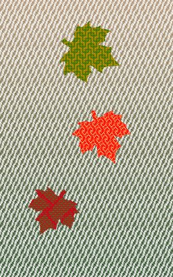
Notice how, despite the green being a higher chroma (“brighter”) color than brown, the eye is immediately attracted to the top section, which has a higher value (lighter).
Now, lighter value on bottom:
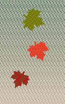
Here the eye is drawn immediately to the bottom. Not good, not bad – it depends entirely on what you’re after. This could work to draw the eye downward, if the effect is fairly subtle (more subtle than in this example) – in this example, the eye is drawn downwards and gets “stuck” there.
And, lighter value center:
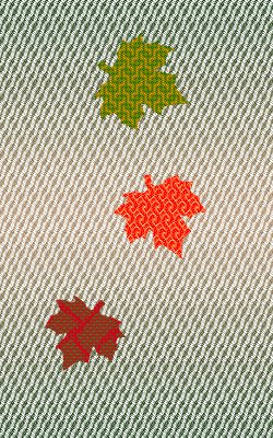
Here the eye is drawn to the center of the piece.
And, just for yuks, here is lighter value top and bottom:

Here the eye bounces between top and bottom. This one I don’t like at all; the eye doesn’t know where to go.
And, finally, equal values throughout:
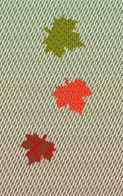
Here there is virtually no movement in the background, and the eye is drawn immediately to the leaves.
Lesson from all this: value matters a lot in establishing where the eye goes.
My conclusion from all this is that I want to keep the value fairly constant, to keep the eye on the leaves, and maybe make it a very small bit lighter at the bottom, to draw attention downward.
Now, let’s look at saturation:
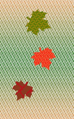
And here is the same simulation with the colors desaturated:
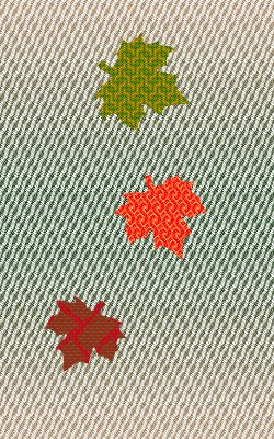
The “feel” of the first one is more exciting, but the leaves stand out better in the second one. This is because a bright color next to a dull color looks brighter, and a bright color draws the eye.
I think the right answer here is to pick a chroma somewhere between these two simulations – saturated enough to be interesting, but not enough to compete with the leaves. How saturated? Only experimentation will tell.
And, finally, color. Here is a version with red inserted, desaturated and lower-contrast so it doesn’t interfere with the leaves:
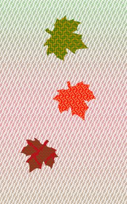
Here the eye is drawn to the red center, which is the warmest color, partly because of the background and partly because of the red leaf, which is both the warmest colors and the highest-chroma (most saturated) of the leaves.
I am still mulling over all this. The question is, where do I want the eye focused? In this particular piece, I think I want the eye to enter on the top leaf, and be drawn downwards via the implied line between the leaves. The eye naturally enters at the top left of a piece (for Western viewers), because we read starting from the top left, so the top leaf is one of the natural entry points (especially since it’s bigger, and thus has more “weight”). The red leaf draws the eye downwards, and because it’s pointing in a specific direction, the eye starts heading southeast, doesn’t find anything there, and then follows the implied curve of the leaf shapes down to the brown leaf, giving a curvy line to the direction of the eye, and a sense of motion. This is more or less what I want. Having more stuff going on in the background would be a distraction.
Conclusion: use similar value colors in the background, probably green and brown, possibly with a slightly lighter value at the bottom. Keep the leaves at a relatively similar level of visual interest, but with slightly higher interest towards the center and bottom, to keep the eye moving downwards.
This is all utterly fascinating to me, as it uses all the design principles I learned in class. The design class I took has made me much more aware of where the eye is going and why – many thanks to Sharon Alderman, who suggested I take it! It has been really helpful in refining my design.
Nancy asked what type of knitting machine I have. It’s called an ArtKnitter 510, and Googling says nothing about it. I’m guessing it was an unsuccessful knockoff of the Brother and Toyota knitting machines, which disappeared without a trace. Nonetheless, mine seems reasonably functional, and I’ve been enjoying playing with it over the last few days!

“Value is more important than hue” is one of the design mantras as given to me by a friend. 🙂
Thanks for sharing your experiments and your analysis of the results.
cheers,
Laura
Tien, is this to be a wall piece? My problem with the usual design books, is that designing a piece of fluid fabric that is to be worn has more complex design problems that, so far as I can see, the usual art design books do not address.
“Value does all the work and color gets all the glory.” I have no idea who said that but I think it’s dead bang right.