I finished weaving the first sample with a painted warp and knitted blank yesterday. I love it!
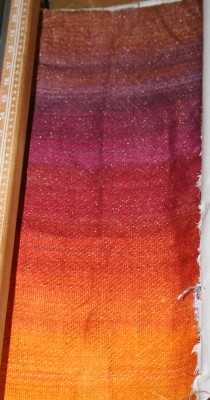
The striations in color don’t bother me at all – they add interest and, because most of it is burned away, the visual impact will be significantly less post-devore.
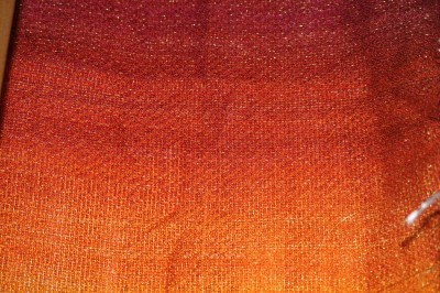
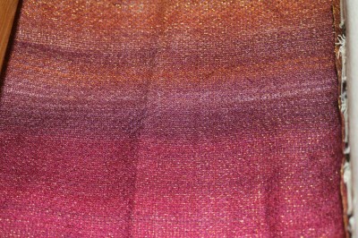
Here are two closeups – in the first the pattern (wavy diagonal stripes) is clearly visible, in the second it is subtle to invisible:
I then laid out a pattern of leaves on the fabric, using freezer paper as a stencil and ironing it to the fabric:
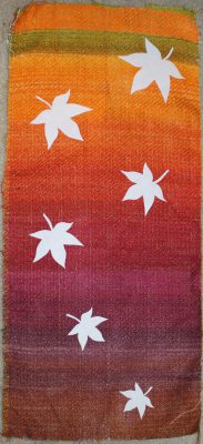
And I applied the devore solution and burned out the fabric:
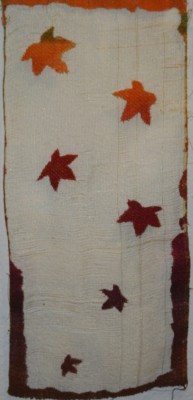
(The reason it looks ratty along the bottom left and bottom right edges is because I deliberately left some of the selvedges on in that section, to see if that produced a more stable fabric.)
Here is a closeup:
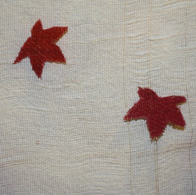
I like this! There are a number of obvious flaws that need correction – the stems disappeared, definition around the edges is poor, there are doubled threads in the gold warp, and so on – but leaves are floating on the gold “lace”, and the grid of gold thread is surprisingly stable. So stable that I’m wondering whether I partially melted the polyester – I used an press on damp fabric, which compressed the fabric and heated it at the same time, which may have set permanent pleats in the polyester thread, holding the grid in place.
Things I probably did wrong, which may have contributed to the flaws:
- Applied too much devore solution, with too much pressure with the brush, so it flowed under the edges of the stencil
- The freezer paper did not adhere well enough. May iron it longer next time, so it adheres better to the fabric.
- Pressed it while the burnout paste was still wet (okay, I was impatient, but we all know that 🙂 ), probably contributing to poor definition around the edges
- Devore solution may have been too runny – though I don’t know; if it had been thicker it probably would not have penetrated to the back of the fabric. Will have to experiment with this some.
- Floats in the draft may have been too long, contributing to poor edge definition. May have to experiment with this. More gold threads (1 out of every 3? 1 of every 2?) may help with this as well.
Things I’m thinking about now:
- Whether to replace the pattern with a pattern that has shorter floats. The current pattern has quite a few 5-thread floats in warp and weft; this produces poorer definition around the edges of the burnout sections. If I reduce the floats to 2 or 3 threads, I’ll get better definition (at least in theory). The downside is that I’ll get poorer contrast between sections. Only a test will show whether it’s worthwhile.
- What to use as background. I am thinking either a color gradation from green to brown (as originally planned) or shades of pale blue. The green/brown will harmonize with the colors, the blue will make the oranges, yellows, and reds really “pop” (because blue is the complement of orange), but will produce a cooler feeling in the piece overall. I want a warm “feel” to the piece – a cozy log fire rather than chilly gray days. I will dye pieces of commercial fabric to test out those color combinations.
- Whether to thicken the devore paste more. I am almost out of Fiber Etch (a premixed solution), so will have to start mixing my own. This is something of a pain, but also means I can make it thicker if I like.
All in all, this was a successful sample – I’m very pleased.
Next steps are to wind the second knitted blank onto bobbins, adjust the warp (some sections need to be re-aligned), and weave up the second warp sequence. This section of warp has gradual color changes, rather than the sharp contrasts in the first section, so will look somewhat different, even without the knitted-blank changes.
Onward and upward!
