In between winding bouts of the 37-yard warp (fifteen bouts down, nine to go), I’ve been frantically sketching out the framework for my article about color. I have a pretty decent understanding of basic color theory, but one could write entire books about color theory (and many people have!). How to distill the basics down into three magazine pages or less, including photos and project information?
But I think I’ve gotten most of my ideas out in about a thousand words, and with some serious editing I think it can be made to fit. I’ve also designed some samples that I hope will be illustrative. I really sweated over the sample design – each of my four samples will illustrate many points about color theory, and be pretty enough to weave as a project. Now I just have to make the samples!
Fortunately for me, a very generous friend (hi Ginny!) has agreed to let me borrow her loom, so I can weave up my samples while The Infinite Warp is on my loom. I’ve ordered the yarns that I’ll need, and sometime in late August or early September, I’ll run on up to her place to do the weaving.
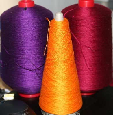
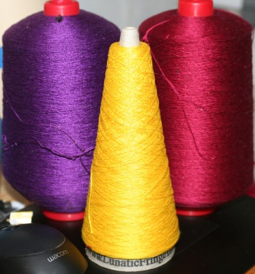
And, since 15 bouts of white warp on a half-wound warp beam isn’t very interesting, here’s a sneak peek at some of the yarns I’m planning to use in my samples:


There is a profound difference in the way the colors harmonize (or not!), even though the gold and yellow are relatively close in hue, and this is one of the things I think would be interesting to write about.

I vote for the gold. The yellow is kind of boring.
And about your hornworm – my poor tomatoes keep getting mowed down by a pack rat. First time he took the evidence. Last night he left the stems and leaves on my porch stairs! Time to get out the havaheart trap.
I like the gold. The richness of the other two colors makes the yellow look washed out.
Without doubt, the Gold. Hope you agree.