I’ve been thinking about collar colors – for symbolic reasons, I’d like green, but the purple collar looked better in the drawing. So, to simulate things, I stopped by the fabric store today and bought quarter-yard swatches of green and purple fabrics, and a quilting fabric patterned with autumn leaves.
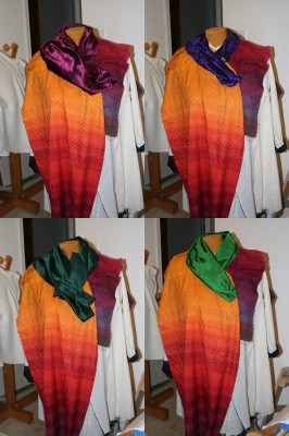
I then tossed the swatches up on the dress form:

The grass green at bottom right and wine at top left are my favorites. The other two are too dark, and have too much blue in them, to go well with the rest of the piece.
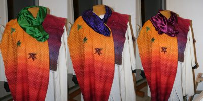
I concluded that the wine would probably produce the most harmonious piece – with the green, the collar and the rest of the coat would be fighting for attention – but wanted to see what would happen if I added some autumn leaves drifting down the front of the coat, as I’d envisioned. So I cut up the autumn-leaf quilting fabric and added a few smallish leaves to the mix (click for a larger view):

The green in the leaves helped fill some of the color gap between the green collar and the rest of the piece – enough so that I think I may knit/weave a sample in the same shade of green, to see what it would look like in the actual fabric. If I used either of the other two colors, I’d eliminate the green in the leaves, since they aren’t echoed anywhere else in the piece.
One other option, of course, would be to use a bright green but mix it with more autumn-y colors, by screen printing, appliqueing, or embroidering orange/red autumn leaves on the collar as well as on the coat front.
Lots of design options! I’m really enjoying this color play.

I like the grass green (wine red as a close second). I think putting the leaves on front is gilding the lily–I find it distracting. Fancy fabric or embellishments–but not both (and you don’t want it to look artsy-craftsy)
I like the green the best too. I think the wine blends in too much with the dark panel. And while I like the leaves, I agree that they are a bit distracting. Can’t wait to see the finished coat!