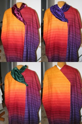
I dyed the bright panels and first dark panel yesterday, and rinsed them out at lunchtime today. Then, of course, I just had to throw them up on the dress form:

Sandra “called” it yesterday: the burgundy is the clear winner. The blue-purple and green don’t feel like they belong to the piece at all. The blue-purple actually is echoed in the dark panel about 2/3 of the way down, but is not present in the brighter panel. The burgundy relates to both panels, and looks elegant.
I didn’t do the bright green panel because (on seeing it) it was far too awful to contemplate. I think I will dye one of my two sample blanks burgundy and the other plum, and see what I think of the results.
I also did one drape with no collar, just to see how the colors interact. I’m not sure what to think of it; I think it’s beautiful, but probably a little austere for a fashion show.
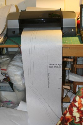
Meanwhile, I have just about finished drafting the pattern in Adobe Illustrator – I need to redraft the sleeve, but have finished the body of the garment pattern. This is trickier since it sounds since the four pieces in front are all different – right and left front are different because of the asymmetric collar, and the facings are different again because the upper collar is 1/8″ larger than the undercollar (so the collar lies correctly). I did, however, work out all the intricacies, and cranked it out on the printer, which did a maaaaahhhhhvelous job printing out all those 50″ panels, without a single complaint. Tomorrow morning I will redraft the sleeve, print it out, and start cutting out the muslin!
Here is the printer, chugging away:

Off to bed! Tomorrow is a whole ‘nother day. 🙂

I like that you posted one picture without the collar–because it’s clear that the collar is needed! The fabric is beautiful and I like the assymetrical design, but it really needs that “frame.”
I like the blue purple because it balances the purple on the dark side. Perhaps its just the photograph but I don’t like the the way the burgundy contrasts with the yellow. Since the collar will frame your face, which color goes best with your skin tone?
I’ve been following this project with a great deal of interest and admiration–I really love the fabric and the way the leaves work. But I find myself wondering whether the collar fabric strikes a false note by being too glossy? Have you considered a more matte fabric for the collar, so that its colors would be more in the same subtle universe as those of the jacket fabric? It may look different in real life, so this is just speculation. I can’t wait to see how the finished garment looks.