First, the house deal fell through: they already have multiple cash offers, so we’re out of the running. Oh well; on to the next one!
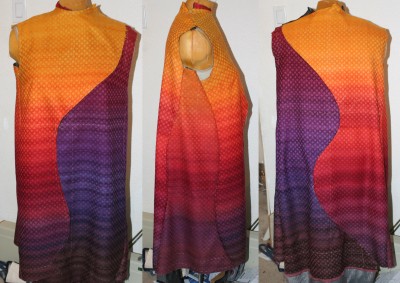
Anyway…I spent ten hours working on Autumn Splendor yesterday, thread-tracing each seam, then carefully basting the seams together, then machine-sewing along each seam. I gave the seams a light press and clipped them a little bit, but because I want the option of adjusting the fit after I see Sharon next weekend, I didn’t give them a hard press. So the seams are not flat, and still look a little wonky. I have not put on the sleeves or the facings yet.
But all that said, here it is! (Click for the full-size version.)

I’m more or less happy. The stripes match up beautifully in the front (the result of much fiddling), the color transitions match up all around, and the curves in front and and back are exactly as I had planned. The curved seams in the side panels are not obvious from the front or back, and look graceful when viewed from the side. (Also, you won’t see them much after the sleeves go on.)
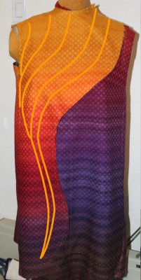
That said, I feel like the garment is a little plain as it stands; I think it could use a bit of bling, something to punch up the design. In particular, I think the front could use some work; the prominent stripes are fighting with the curve, and make the flow feel more static than I’d like. I want to emphasize the curve, so am considering adding a swirl of glittery seed (or bugle) beads down the yellow/orange section in front, to add some more motion.
Something like this:

Of course, I wouldn’t use orange throughout, but would make the bead colors match the garment. I don’t think I’d put beading on the back; there the stripes aren’t quite so obvious, and I don’t feel like the swoopy curve needs any help.
What think you, Gentle Reader?

I love your work. Such fine detail in the weaving. This garment is not plain, consider all the design elements you have going on already- stripes with checks and multi-colors in the fabric, colors overlaying each other, curves cutting across the colors and stripes. I think you need something solidifying like a scarf or other solid neck piece in one of the dark colors. It is a beautiful piece. One other thing I noticed, the curve in the front doesn’t seem to quite ‘flow’ like the one in the back. It feels like it starts right at the shoulder then drops too straight down below the bust.
I have enjoyed watching you design this dress and can’t wait to see if finished. Hope to hear from you.
Niki
I wouldn’t call the coat plain, but I think you are right that lines of beads add movement. Especially since small beads will be subtle. But perhaps they shouldn’t go so close to the arm and bring the first line a little closer to the edge. II’d pin something to mark the lines and try it on yourself.
Also, I think part of the problem is that you planned the color transitions when you still meant to use a collar, which leaves a rather large stretch of yellow at the neck. You still have a rather large seam allowance showing at the neck. Try pinning down the seam allowance and see if that helps.
I’d agree with Sharon: the large stretch of yellow at the top really jumps out at me. I wonder what breaking that cross-body yellow dominated section up with a not quite as deep as you have sketched out V shape in subtle beading would do. It’s hard to describe what I’m picturing in words, of course, but the beads would trail off as the color transitioned away from yellow.
Of course, then you would run the risk of making the top half too dominant, as the darker shades already visually recede. Maybe highlighting the bottom half instead would balance the garment more.