In between chores and shopping for hardwood flooring, I managed to snatch a little bit of time to try screen printing on warps.
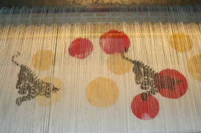
Here is what I screen printed on the warp, between the reed and the fell:

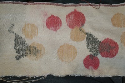
And here is what it looks like after weaving and wet-finishing:

I was surprised how little distortion there was overall; the circles are still recognizably circles and the outline of the tiger is definitely tiger-ish: you can even see the stripes in places!
On the whole, though, I think the potential of this technique lies primarily in solid chunks of color (blocks, silhouettes) or in “textural color” – for example, a spatter pattern which gives visual texture but isn’t imagery. The tiger has quite a bit of detail (and would have been more detailed yet had I used plain weave instead of a 2/2 twill) but needs to be bolder to really stand out.
Other thoughts:
- There are some clearly visible stripes where the warp threads clumped together and therefore didn’t get printed. (I used fabric paint.) Most obvious in the left hand tiger and the golden sun above it, much less of a problem in the red circles. I’m not sure how to get around this, since the fabric paint needs to be thick enough to screen print. I could mash the warp threads around a bit to get the color to transfer from one thread to another, but that would blur the image. This would probably be less of a problem with thickened dyes.
- It would be interesting to try this again with simpler imagery (maybe just circles, no tiger) but a more complex weave structure. The idea fascinates me; I must try it!
- There are some splotches of paint, probably because I got impatient and heat-set the paint before the recommended 24-hour period. I’m ignoring them; that’s an easily fixable problem.
- The fabric paint definitely stiffens the fabric; it’s not obnoxious, but definitely noticeable.
On the whole, I thought this was an interesting technique with a lot of potential; I plan to experiment with it more seriously after we move. (Currently the loom is over carpet, which means putting drop cloths everywhere if I want to screen print warps; after we move, the loom will be in the garage, and I can make messes with impunity.)
Also in surface design news, I bought two excellent books during a visit to Dharma Trading Company this weekend. The first is Screen Printing: Layering textiles with colour, texture, & imagery by Claire Benn and Leslie Morgan. The second is Finding Your Own Visual Language, by the same two authors plus Jane Dunnewold. Neither of these are dabblers’ books – they are meant for the serious textile artist. Screen Printing discusses the nearly-infinite number of ways you can use a screen to create complex cloth, including some I had never even thought of! – and also includes some notes on composition. Finding Your Own Visual Language looks like my personal Holy Grail – thoughts and exercises on design and composition, written by some very experienced textile artists and going far beyond introductory design principles.
I’ll write more about these books once I’ve had time to read and digest them. Which may not be immediately: we close on the house April 19, and will probably move in mid-May, meaning there is an awful lot of sorting, packing, moving, and supervising-of-contractors to be done over the next few weeks!
