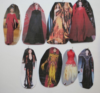
The 2012 fall couture collections are up on Style.com, so I spent some time perusing them and clipping all the interesting ones into Evernote. As usual, Jean Paul Gaultier was my favorite, mostly because he comes up with such outrageous ideas.
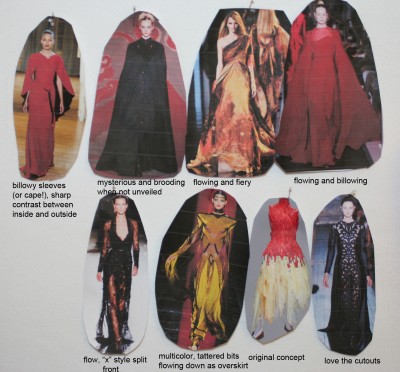
Anyway, I wound up clipping seven of them into a new mood board I’m starting, this one on construction rather than on overall look & feel. Here it is:

And here is the annotated version (click to view the larger version if you can’t read the text):

Not all these ideas are compatible, and so not all of them will get used.
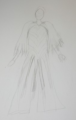
Here is a preliminary concept sketch, based heavily on the yellow outfit in the bottom row:

Here we have the flowing, raggedy bits from the yellow outfit, except that I have expanded the bottoms of the legs to make them more flowy (I think the correct name is “palazzo pants”). The cape (or are they sleeves?) at top left of the mood board has been imported into the sketch, and given the same raggedy fringe as the bottom. The idea here is to make it in some sort of doubleweave, gold and orange dominant on top with red on the bottom, so you get flashes of red underneath the gold and orange, plus streaks of red in the ragged/fringey bottom. Hopefully the feathery-bottomed cape would suggest wings.
I have no clue what to do with the bodice. The cutwork I liked at bottom right of the mood board feels very stiff and formal, and doesn’t really seem to fit with the rest. I really don’t like the downward-pointing chevrons – I just stuck them in there because I couldn’t figure out what else to do. Perhaps some katazome stencil patterns?
My feeling on this is that it may eventually be more successful than my original concept, because it meshes better with the nature of handwoven fabric. Handwoven fabric tends to fray, especially in fine threads – which would work nicely with a ragged bottom that degenerates into a fringe of warp threads. The larger expanses of fabric would show off handwoven patterns much better than the raggedy drapes in the skirt of the original version. It needs a lot of work and I would like to see a more thought out (and possibly draped) version before committing to anything, but I do think it has hope. My one worry is that it may come out looking too ’60s with all that fringe. But I think it won’t – my aim is for a very light and delicate fringe, not a heavier one.
For the fabrics, I’d sample 60/2 silk in doubleweave for the cape (which I want to have a little more body) – if that didn’t work I’d drop to 80/2 or 120/2 silk, still in doubleweave. I’d use 80/2 or 120/2 silk in some sort of fancy twill for the pants, and probably an 80/2 or 60/2 silk for the bodice, though it really depends on what I wind up doing with the bodice. If I do a dramatic, cross-dyed fabric using katazome stencils (which I am vaguely considering) I might go a little heavier.
Color-wise, I really have to do some color sketches to work things out.
This concept is much more complicated than the first one, though I also like it better. With all the sampling, draping of muslins, etc. it is probably a year and a half at least, and probably more like two years. But I like long, complicated projects, and this involves a lot of learning and study on quite a few fronts, so getting bored shouldn’t be a problem.
All that said, I am not committed to this version yet, and plan to do several more sketches over the next few days (while waiting for materials for the Celtic Braid Coat to arrive), to see if other interesting ideas arise.
