My quilting design class is moving along, and I find I’m getting a lot out of it. Interestingly, there is nothing in it that I didn’t already “know” from reading, but since I hadn’t practiced actual designs, the exercises are proving really useful.
Here is the result of some of the exercises, in color and value.
First is the image I started with (the result of several other design exercises – this started as phoenix tail feathers coming to life, flying out of a rigidly painted wall:
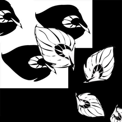
Next I played with some shading. The first value study I tried looked like this (below) – the idea was to show a progression in the feathers, starting dark and then “coming to life”, progressing to white at the end. Thematically, it works, but visually, it doesn’t – the big feather, which should be the focal point for the piece, doesn’t have enough contrast to stand out, so the eye enters at the white background, skips the big feather, and gets drawn to the smaller ones. It just looks weird.
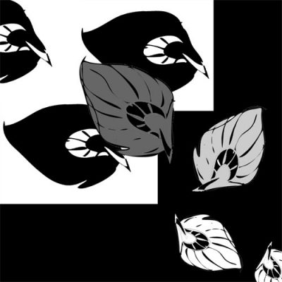
Here is value study two. In this one, I darkened the background (to make it compete less with the feathers for attention), lightened up the top feather considerably, and provided a gradual progression down to a black-and-white feather at the bottom. Visually, this works a bit better, but has two problems: first, the top feather is so much lighter than the other feathers that the eye kind of gets “stuck” there and doesn’t progress down the main diagonal. Second, the feathers increase in contrast as they get smaller, which provides a bit of a visual conundrum to the eye – as things move further away, they become both smaller and lower-contrast. Having high-contrast small feathers suggests to the eye that they are both closer and further away, which produces visual confusion.
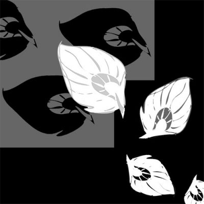
Armed with this realization, I moved on to value study three, which I think works pretty well, visually speaking. The big, white, relatively high-contrast feather is the obvious entry point, and the line of white moves the eye diagonally downwards through the piece to the exit point at the bottom. The weight of the black background in the right and bottom is offset by the white feathers, so while the weight is pretty clearly at the bottom (reinforced by the direction of the feathers), it doesn’t feel massively unbalanced either.

Next I moved on to color studies. I did quite a few of these.
First, I started with my original plan, using yellow and shades of orange and orange-red in the feathers, but leaving the background black:
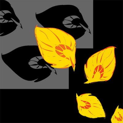
Interesting, and the feathers sure “pop”, but felt visually lacking and “dead” – too much neutral and not enough colorplay.
Next I tried a split complementary color scheme. Since I already had red-orange and yellow in the feathers, the color to fill out the split complementary scheme would be blue. So I added a blue and blue-purple background:
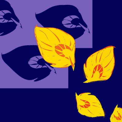
I liked this one a lot, but wanted to see what it looked like with a less-bright background, so I slapped a Photoshop hue/saturation filter on just the background, turned down the saturation, and got this:
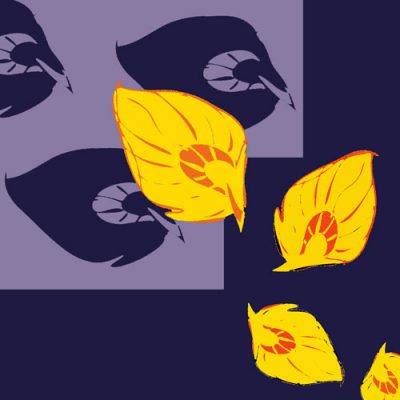
This was interesting: the dull colors really “popped” the brighter colors out, so the feathers appear to be floating luminously against the background (good!), but also toned down the energy level more than I would have liked. I’m still not sure which I prefer.
I decided to move on to some triad color combinations. I started with the primary colors:
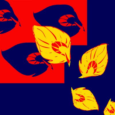
This is certainly very bold, perhaps a bit too much so. The red in the background competes with the yellow feathers for attention, and the overall effect is kind of cartoonish. It reminds me of those “We Can Do It!” posters from the war, or that popular red-white-and-blue Obama “Hope” campaign image that made the rounds last election cycle.
I then tried toning down the background with the desaturation filter:
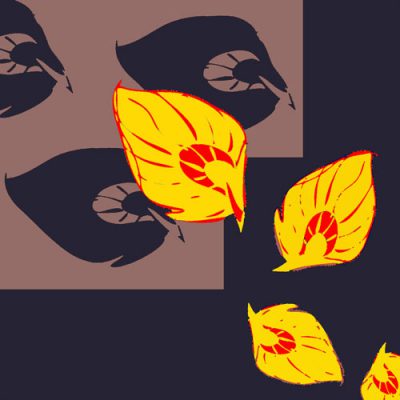
Better. The feathers now “pop” out (though they still look rather cartoony due to the lack of hue/value subtlety), but again, the overall energy of the piece goes down. Do I want a more lively piece? Don’t know. Will have to mull it over.
Next I tried a triadic color combination with the secondary colors – purple, orange, and green:
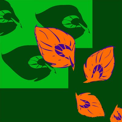
It surprised me how different it “felt” from the triadic color scheme in primary colors. I think it’s because orange and green both contain yellow, and orange and purple both contain red (etc.), so the colors “relate” more to each other? Dunno, but I liked it – more subtle (though still bright and cheery) and more harmonious.
I desaturated the background:
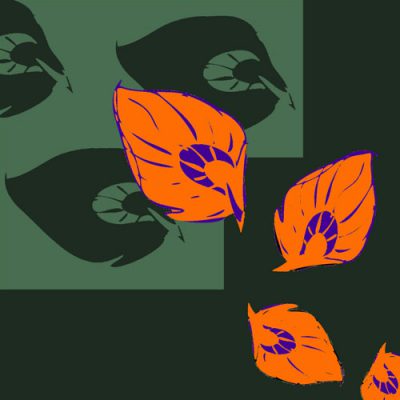
Again, the dull background makes the feathers look much brighter (bright colors against dull ones look brighter), more luminous – and since the cooler green background recedes, the feathers really “pop” out of the image. However, it doesn’t feel as bright and cheery as the first version.
Finally, I tried an analogous color scheme – using colors near each other on the color wheel:
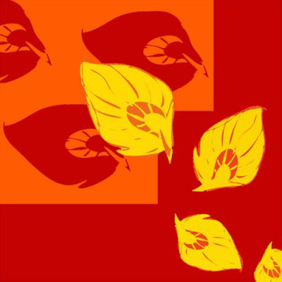
While it definitely “sets” a fiery mood, this is actually my least favorite of the images, because there really isn’t enough hue (or value!) contrast to make it interesting. It feels like too much of one thing.
I tried desaturating the background, but it just looked awful.
What have I learned from this? Well, lots of stuff, too much to elaborate on, but one thing is that you really do want just a bit of complementary color to bring life to an image. I had envisioned Phoenix Rising as purely red, orange, and yellow. Now I’m trying to figure out how to add a little blue or purple into it, to add visual interest. Thematically, I’m not quite sure how this happens, but it will work better, visually speaking, if I do.
Next steps: combine value studies with color studies – currently the feathers are all the same colors, which loses the value progression I put into the value studies. I may also experiment with shading, adding more dimensionality to the feathers. Finally, I would actually like to weave some of these images, which means coming up with some more simulations using different weave structures and choosing colors for warp and weft. Doing those simulations should keep me busy the rest of this week, so I’ll try katazome this weekend.
Meanwhile, in Celtic Braid Coat-land, I have finished the bound buttonholes. After struggling some more, I finally gave up in disgust and decided that the coat was just not going to have perfect bound buttonholes. And, of course, as soon as I concluded that, like magic the remaining buttonholes straightened themselves out. I won’t say they entirely match but they’re much, much better than what I had earlier. I am debating re-doing the one that really does look awful, but I may just leave it as is. Live and learn, I guess. I’d be more upset except that I consider the Celtic Braid Coat to be a minor piece, and as such am less prone to fuss over the details.
So now I need to finish assembling the coat, re-cut two pieces of lining and reassemble the altered lining, and attach the lining to the outer shell. I also need to understitch the cape, which will be enjoyable, but quite time-consuming. And then I need to put on the collar. I’m hoping to finish it this weekend, and move on to other things.

If you have too much fun with this sort of thing you might get the same ‘rep” I got at FIT….for ages afterwards, around the “rag district,” I’d run into people I’d gone to school with and they would inevitably introduce me with some variation of “This is Cassandra, she LOVED Colour Fundamentals!” LOL They used to list a course in “The Physics of Colour” that I was dying to take…but, being FIT, where academics aren’t terribly well-enrolled, they’d never get enough students to actually hold the class. bummer