My sprained ankle is much improved, but I’m still staying off it to avoid re-injury. So, no weaving, dyeing, or draping for me right now. I’m spending most of my time at the computer, watching fiber arts DVDs that I’ve been meaning to watch for awhile now.
I’ve also started playing with fabric design for the dress. (For those who need a reminder of what the current design looks like, here it is:)
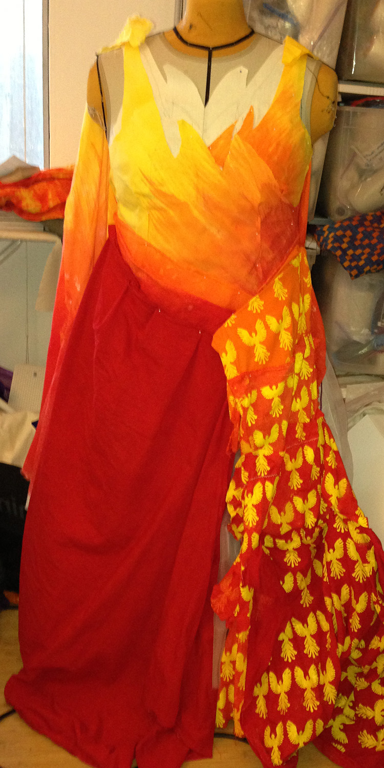
The bodice of the dress, being a painted warp, will be a plain, warp-dominant structure so I can show off the painted lines. I’m thinking 5-end satin. For the skirt, however, I have a bit of a conundrum: I think it should have subtle patterning to make it interesting up close, but strong patterning would distract from the phoenixes. The patterning should also relate back to the phoenix/fire theme. So what to do?
For subtle patterning, there are a few easy options. One is to create an iridescent fabric, probably plain weave with scarlet against black. If I design the skirt to have soft folds of fabric, the iridescence will add interest in the folds, and provide the illusion of additional motion as the wearer walks.
Another option is to create physical texture. Opposing a 1/3 with a 3/1 twill will naturally produce pleats in fabric – if I use a network drafted twill, like this one, I can get curvy lines, reminiscent of heat waves:
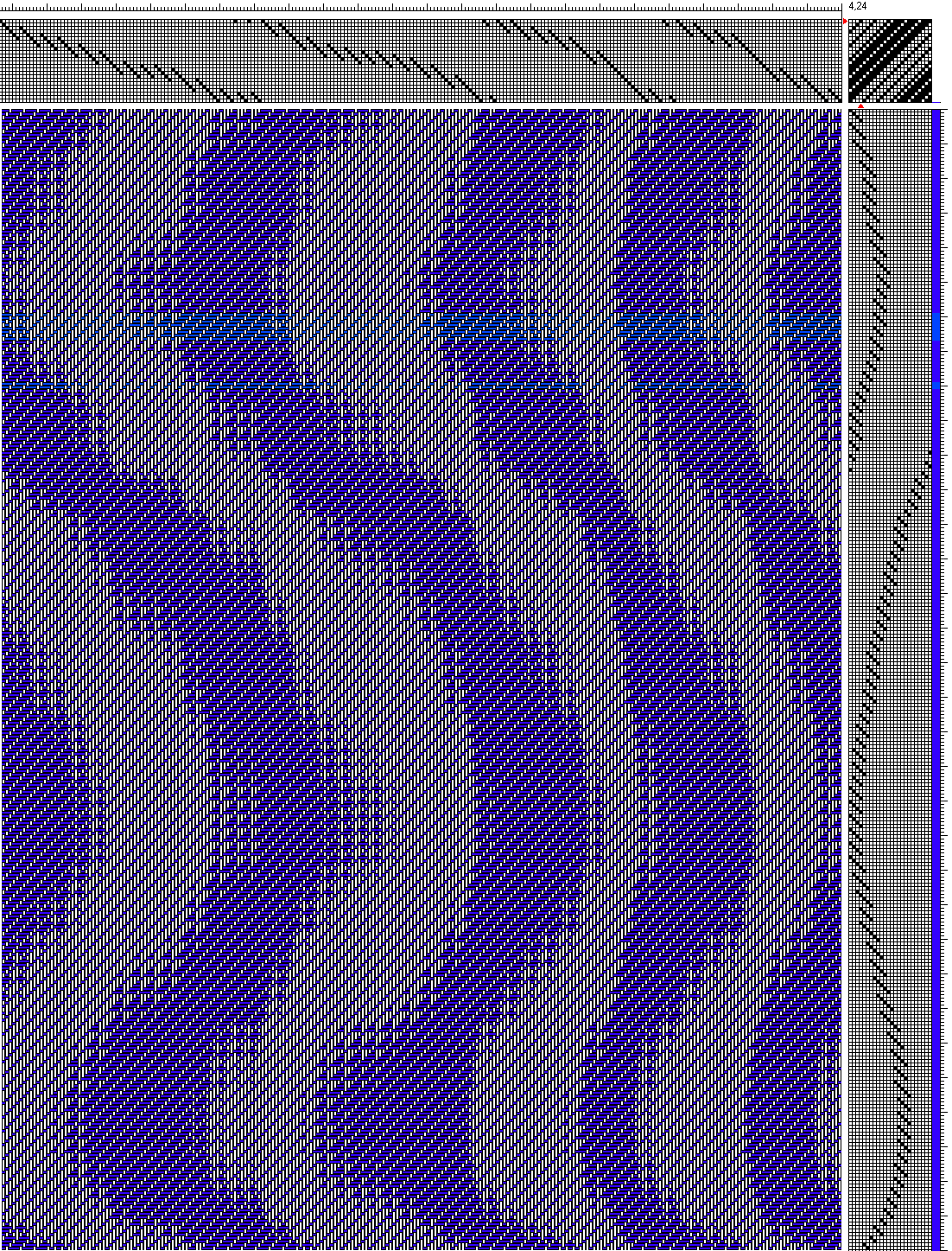
Of course, a 3-1 vs. 1-3 twill might give me more contrast than I want, since it will be solidly warp-dominant in one part of the twill and weft-dominant in the other part. So a 2-1 vs. 1-2 twill (which has less contrast between the two structures) might work better to soften the visual effect, though it would also reduce or eliminate the physical texture:

(Ignore the bands of lighter blue: I didn’t see that I had accidentally changed the color until after I’d saved the draft. Also, the “grid” in both of the small images is an artifact of the size reduction; click through to the large version if you want to see what it really looks like.)
A fourth possibility is to weave subtle imagery into the fabric, using a warp and weft that are very similar in shade (scarlet and dark red, for example) to reduce contrast. Something like this flame pattern, perhaps:
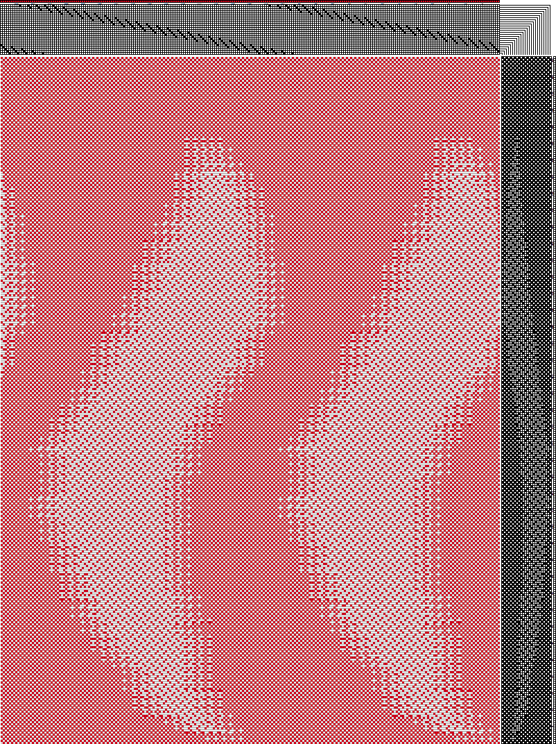
(The “grid” in the background is also an artifact of reducing the image size – click through for the larger version if you want to see what it looks like without distortion.)
So it basically comes down to visual and physical texture. There are tons of ways of adding either – the challenge is keeping the pattern subtle enough to be non-intrusive, and keeping the fabric from becoming heavy. I want it to float as the wearer moves – which means weaving with very fine silk and using weave structures that produce thin fabrics.
All this is purely theoretical, at least for now – until I really have the design nailed down, the skirt fabric could change at any time. Still, I think I’m close enough to finalizing the design that weaving samples could be productive. So, once I can stand comfortably again, I’m going to dye some 140/2 silk in bright scarlet, dye a couple of wefts in different colors, and start sampling!

For some reason, that picture of the draped fabric makes me think of a contemporary sari gown. Or something more ancient Roman?
Whatever.
It is always fun to watch your design and thinking process 🙂
And thank you, as watching your progress was a nice little break this last year of school.
I love the flames at the top. Wouldn’t they be fabulous if it were strapless and the shoulders and head just rose up from them? It’s fascinating and instructive to hear your reasoning for the design.
Hi Sarah, Pauline,
The drape does seem rather sari-like, doesn’t it? Or like a Roman toga. I think other people have commented on that as well. I think that’s fine for this piece.
Strapless is an interesting idea, and I may play with it some more. I like the idea of having the dress end in flame – visually and symbolically – but I also like the idea of having the phoenixes appear, disappear, and reappear on the other side of the flame – “reborn in fire”, as it were. So, choices, choices!