Over the weekend, having nothing better to do, I blitzed through a number of the design exercises in Joen Wolfrom’s Adventures in Design. The first one was to visit museums, etc. and see how line is used in your favorite pieces – whether the dominant lines are horizontal, vertical, or diagonal, and how that interacts with the format (aka aspect ratio: whether the piece is longer than it is wide, wider than it is long, or equally wide and long). Being lazy, instead of going to a bunch of museums, I went out and bought a couple of art catalogs at the local used bookstore for $3 apiece. This gave me a nice cross-section of artistic styles, and since they were cheap I didn’t have any compunctions about tearing out pages.
Anyway, I wrote down what I liked about each design’s use of line. A useful exercise! It taught me a lot about the internal logic of lines – how they interact with each other and with the piece as a whole.
The second exercise was to go out and shoot a lot of pictures of stuff with intriguing lines, then crop them to three formats: square, horizontal, and vertical. This exercise is partly learning about composition, but it’s mostly about learning how different formats interact with lines. The book mentions that a horizontal piece (wider than long) tends to emphasize horizontal lines, so it’s very difficult to make a successful horizontal piece with a dominant vertical line (and vice versa). Square formats are particularly difficult to manage as they don’t have dominant vertical or horizontal lines, providing no emphasis.
Here is one example of the exercise:
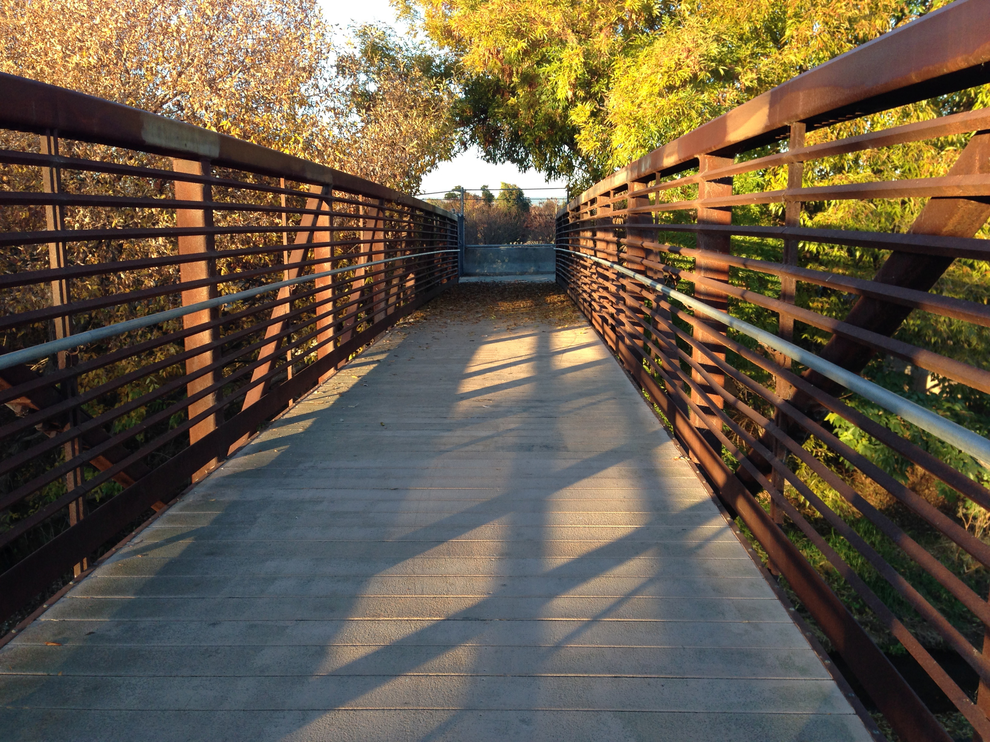


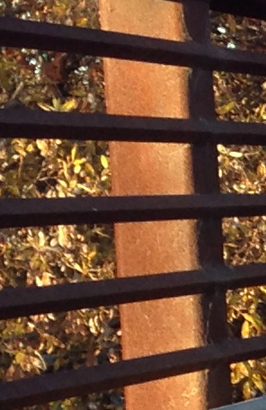
The horizontal format was pretty easy, and I managed the square format by emphasizing the diagonal. The vertical format was darned near impossible to get something decent, because of all the horizontal lines. In desperation, I finally cropped to the only vertical line in the photo – one of the columns of the bridge.
On the whole this was a really useful exercise, and I plan to repeat it often (as the book suggests). It’s really about training the eye to look at line in a composition. I’ve already done it with five or six photos and plan to do more.
A second exercise was to take a letter of the alphabet, in some interesting font, and base a design loosely off the letter. Three designs: vertical, square, and horizontal formats. I chose a script letter “z”, because I thought the lines are interesting. The vertical format design was quite crude and not very developed (I may go back and redo it later), but I thought I’d share the horizontal and square formats.
For the horizontal format, I took the lower loop of the “z” and used it as the basis for a line (the squiggly loop at bottom). Then I took the idea of a diagonal line (the top of the “z”)and made a twisty ribbon out of it. (I glued the letter itself to the back of the page, so you can see it faintly through the page as a ghostly shadow.)

Looking at it, though, I decided I didn’t like it. The lower loop was conflicting with the open loop up top, so my eye didn’t know where to go. I tried cropping out the bottom part of the loop, and liked the result considerably more:

Now it feels more unified; the jarring loop at bottom isn’t there, and the eye is drawn instead to the parallel and perpendicular lines. Interesting!
Now here is the square design, along with my notes on it:
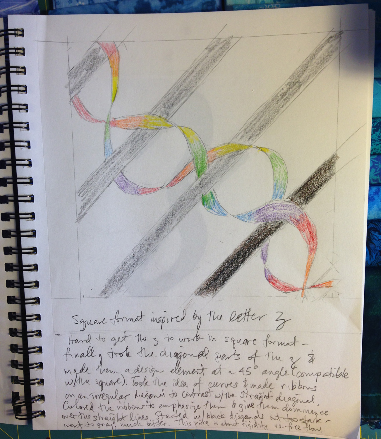
This piece started with the diagonals of the letter “z”, and evolved from there. I’m finding that diagonals work best with a square format (at least for me, at this stage of my development). I added a curvy line as that fit in with the theme of the “z”, and made it in rainbow color so it would dominate the composition, drawing the eye away from the rather stark diagonal lines. I tried a diagonal line in black, but felt the contrast between it and the white background was too stark – now it was competing with the curvy lines for attention. So I made the rest of the lines gray. In retrospect, I’d have made the black line a charcoal gray, not black, and made the diagonal line opposite it the same charcoal gray – darker than the other lines but not as stark as the black. This would have added some variety to the gray lines without overly drawing the eye. I think.
And, finally, for those patient enough to read through to the bitter end, a special treat: Fritz the Shadow Kitty! It’s really funny to see him moonwalking near the end.

I remember studying art prior to 1950’s We had to look at the horizon and squint our eyes and draw what we saw. Now when I look back, that was a good exercise in making horizontal lines. I remember studies in perspectives – those kind of exercises are not used today.
It is a delight to follow your blog. I will get Adventures in Design from the library. All I have to give is the name of the author and the name of the book and it will be ordered for me from the interlibrary loan. Thank you for sharing your experiences. Pirkko