The cold is finally tapering down and my energy and enthusiasm is increasing, at least to the point where I can do other things than blow my nose, have another cough drop, and drink tea. My IQ has also returned to a measurable level, enabling me to plan the color study in more detail.
I’ve concluded that, for this particular color study (and perhaps for color more generally), there are six knobs to fiddle with:
- Hue schemes. This basically amounts to “what color-wheel colors are in this piece?” There are a huge number of hue schemes, such as monochromatic (one color), analogous (colors from a 1/3 wedge of the color wheel), complementary (two colors from opposite sides of the color wheel), split complementary, triadic, tetradic, hexad, and probably a couple others that I’ve forgotten.
- Value schemes, i.e. how much light color vs. how much dark color and how wide a range of values is used. Deb Menz covers this in pretty good detail in her excellent book Color Works.
- Chroma schemes, i.e. how much saturation there is in each color, and how much contrast in saturation there is through the entire piece
- Proportion of color – how much of each color is used
- Placement of color – which colors are next to each other
- Color mixing – how the colors blend in the weave structure, since weaving rarely has patches of truly solid color
Towards this, I’ve wound a 13-yard warp which will be painted in a different set of three colors every 24 inches (for a total of 17-18 color combinations). I’ve selected the warp colors to cover as many hue, value, and chroma schemes as possible. Obviously it’s impossible to touch on more than a tiny number of the possibilities! so I’m trying to get a small sampler. If I find a color scheme that speaks to me, I’ll probably do a follow-up study to investigate it in more detail.
I’m not going to bore you with the entire matrix I’ve put together, but here are a few rows from the table:
| Overall color scheme | Dominant warp color | Secondary warp color | Accent warp color | Weft colors |
| Complementary, middle major value scheme, high saturation | red-orange | medium turquoise | light turquoise | light turquoise, medium turquoise, peachy orange |
| Complementary, medium minor value scheme, saturation mix | Dark navy | turquoise | Terra cotta | bright orange, turquoise, terra cotta |
| Split complementary, low minor value scheme, low saturation (blue-green, red, orange) | dull, dark blue-green | maroon | terra cotta | dull, dark blue green, terra cotta, maroon |
| Split complementary, high minor key (blue-green, red, orange) | peachy orange | pale red | pale blue-green | light blue-green, peachy orange, light red |
| Split complementary, middle minor key | medium spruce | medium orange | medium red | medium spruce, medium orange, light red |
| Split complementary, low major key | dull, dark blue-green | maroon | peach | dark maroon, pale blue-green, peach |
| Triad, medium major key (turquoise, yellow-orange, red-purple (fuchsia)) | dark dull turquoise | fuchsia | gold | Gold accent, red-purple, medium dull turquoise |
| Triad, low minor key, low saturation (red, yellow, blue) | Olive | navy | maroon | Navy, olive, maroon |
| Triad, medium major key, high saturation (red, yellow, blue) | Cerulean blue | Chinese red | lemon yellow | Cerulean blue, lemon yellow, Chinese red |
| Triad, medium major key, low saturation with high saturation contrast | Navy | Maroon | lemon yellow | Maroon, navy, golden yellow |
The weft colors are purely tentative, and I expect I’ll change them on the fly as I actually start weaving. However, I do intend to dye all those colors, so I can use them according to whim.
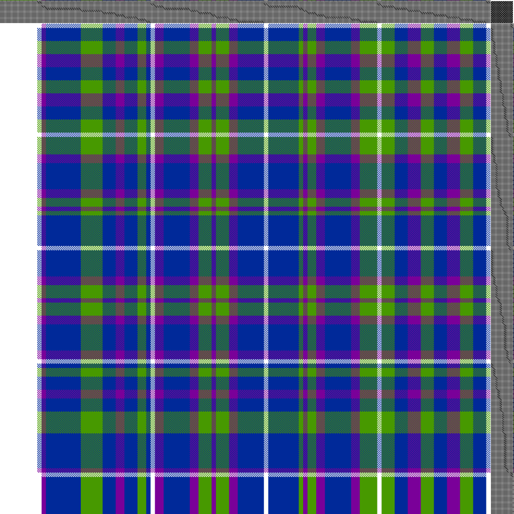
The warp will be threaded in four groups of warp stripes:
- Stripes of precisely equal width, in a 1-2-3 color sequence
- Stripes of irregular width, in a random color sequence
- Stripes with rhythmic width (like a regular plaid), in a symmetric color sequence
- Fibonacci stripes (stripes where the width is a Fibonacci number)
A quarter-inch section of white will separate the groups.
Weft-wise, the default plan is to weave the stripes “as drawn in”, to produce the proportion gamp I talked about in my previous post. However, I’m sure that plan will last about eighteen inches into the weaving, and that’s fine. I just need something to start with!
Here is the starting drawdown, showing what would happen if woven “as drawn in” with the same set of colors. The actual cloth will have very different colors, of course, but you can get some idea of the warp striping and its effects.

Structure? Good question. I have a LOT of options, because I’ve put each stripe within a group on an independent set of shafts. Stripe #1 is threaded on shafts 1-4, stripe #2 is on shafts 5-8, and so on. There are a total of 8 stripes (32 shafts) in each group. The white separator stripes and the selvages are each on their own set of shafts as well. (Ah, the luxury of 40 shafts!) So…I could weave every stripe in a different structure. Is your mind reeling yet? Mine is.
All that said, for simplicity’s sake, I plan to start with a 2/2 broken twill structure. There are a ton of things to explore without going down the rabbit hole of structure! But I’m keeping my structure options open in case I get the urge to fiddle.
There will be a total of 33 colors – not sure how many shades in the warp, but I counted 28 different weft colors. To avoid having to wind, tie, dye, and unwind 28 skeins of yarn, I’m going to make a whole bunch of knitted blanks using my knitting machine, then dye the blanks. (Less prone to tangling than dyed skeins, and easier to unravel later. The results may not be as level as dyeing in skeins, but for this purpose it really doesn’t matter.)
I do have a plan for getting the warp painted, but I’ll leave it for later as this blog post is already reaching heroic lengths. This week I’ll be working on tying off sections of the warp and prepping the warp for painting – the actual painting will likely take place next weekend, as it’s complicated, fussy, and time-consuming.
It is so nice to have energy again!
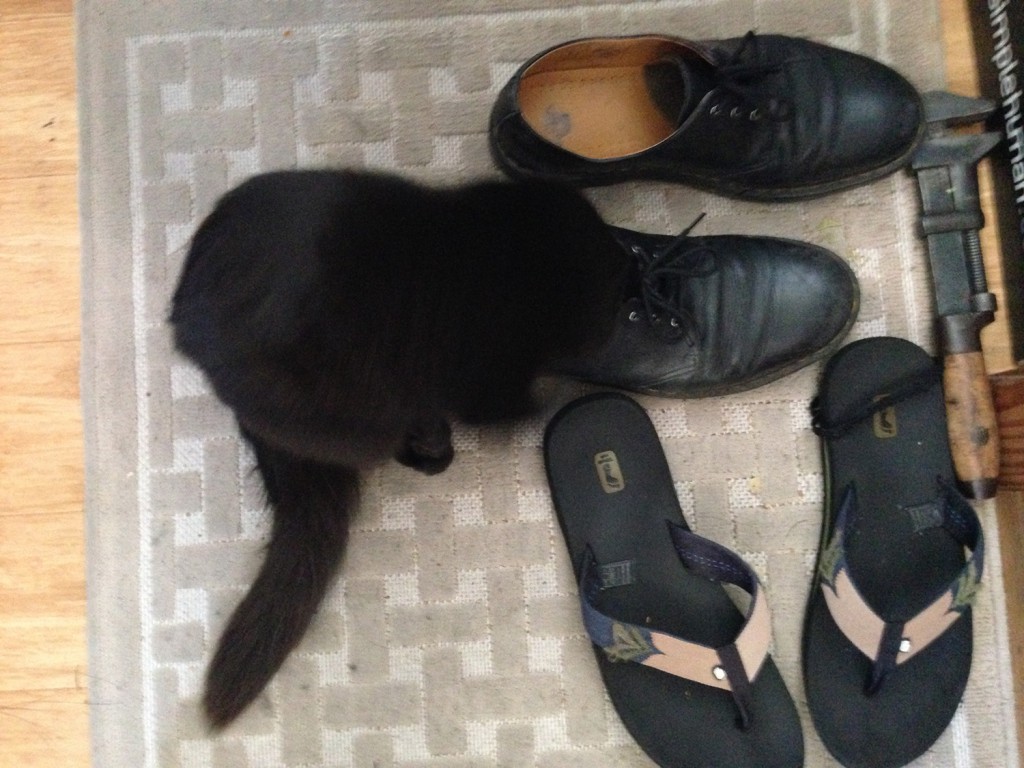
Finally, your kitten for the day! You may recall a previous photo of Fritz with his head stuffed completely into my shoe. Well, kittens grow, and his head is now too large to fit into my shoe. Which is why he was so ecstatic a week or two ago, when my friend Alfred (who has much bigger feet) came over. I don’t know where he got his shoe fetish, but it’s pretty funny.


Have you not discovered this site? http://colorschemedesigner.com/. Very helpful
Arleen
I had not seen it before! It looks really interesting; thanks for sharing it!
Fritz looks so much better in my shoe than I do…