I’ve now woven two and a half sections of the color study – all monochrome. The first featured black, white, and gray in the warp; the second was shades of purple; the third (still in progress) is shades of rusty orange.
The black/white/gray section of warp was all about playing with value (lightness/darkness). I did one section in (nearly) pure black and white, one section with a wide range of values (white/black/several shades in between), one in whites and pale grays, and one in black and dark grays. By mixing the white, medium gray, and black in the warp with white, pale gray, medium gray, and black in the weft, I managed to cover most of the value spectrum. Alas, no photos – I forgot! As soon as I take that section off the loom, I promise photos and commentary galore.
I similarly forgot to take photos of most of the purple portions, but I do have photos of this bit:

Here I was playing with shaded satins and a dark purple weft. I wanted to see if I could blend from 1-7 to 7-1 satin without a telltale line at the transitions. I spent some time messing with Photoshop to see if I could get it to do a semi-random gradation between, say, a 1-7 and 2-6 satin. Finally I just gave up and “feathered” the edges of the transitions by hand.
The result? I think it shaded very nicely and gradually, without obvious transitions – right up until it hit the 1/7 satin section (the dark purple line in the center). For some reason, this came out much darker than I expected. If I use this trick again, I’ll omit 1-7 satin. But shading by hand is quite laborious, so I may ask my Photoshop-savvy friends if they know a better way. Photoshop is so powerful that I’m sure there must be a way.
For most of the rest of the purple section, I experimented with stripe width and weaving the stripe patterns “as drawn in”. No pictures, alas, but I did enjoy playing with the gorgeous colors:
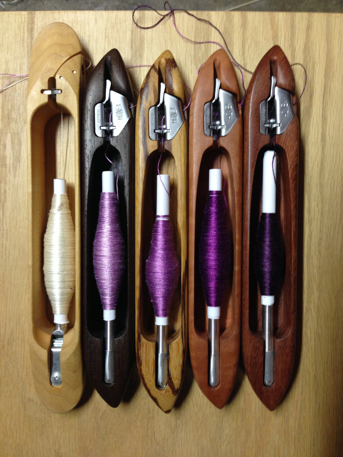
The leftmost color is actually white, so technically it was only four shades of purple, but they made a very nice value spectrum from light to dark. And apparently four Bluster Bay shuttles isn’t enough; I had to use one of my remaining Schacht end-feed shuttles to hold the fifth color. Fortunately, a remedy will soon be forthcoming: Terry at Bluster Bay Woodworks wrote me recently to tell me that he just got a stock of beautiful curly maple, which will make a nice fifth shuttle to add to the herd.
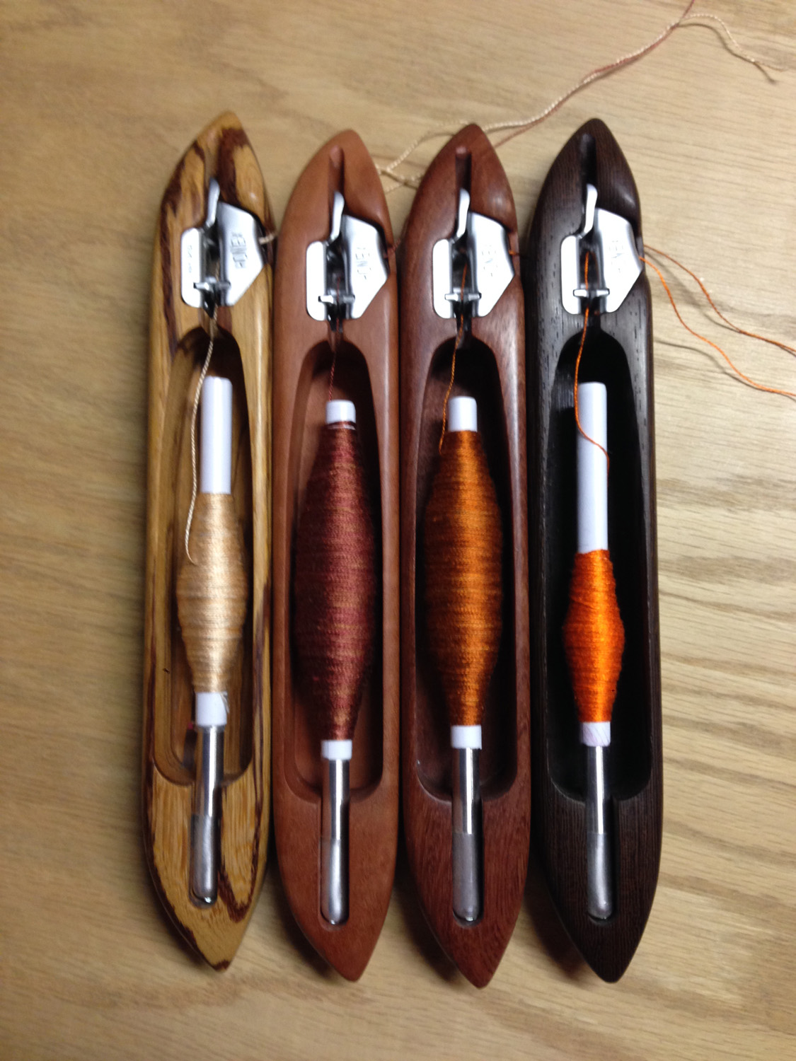
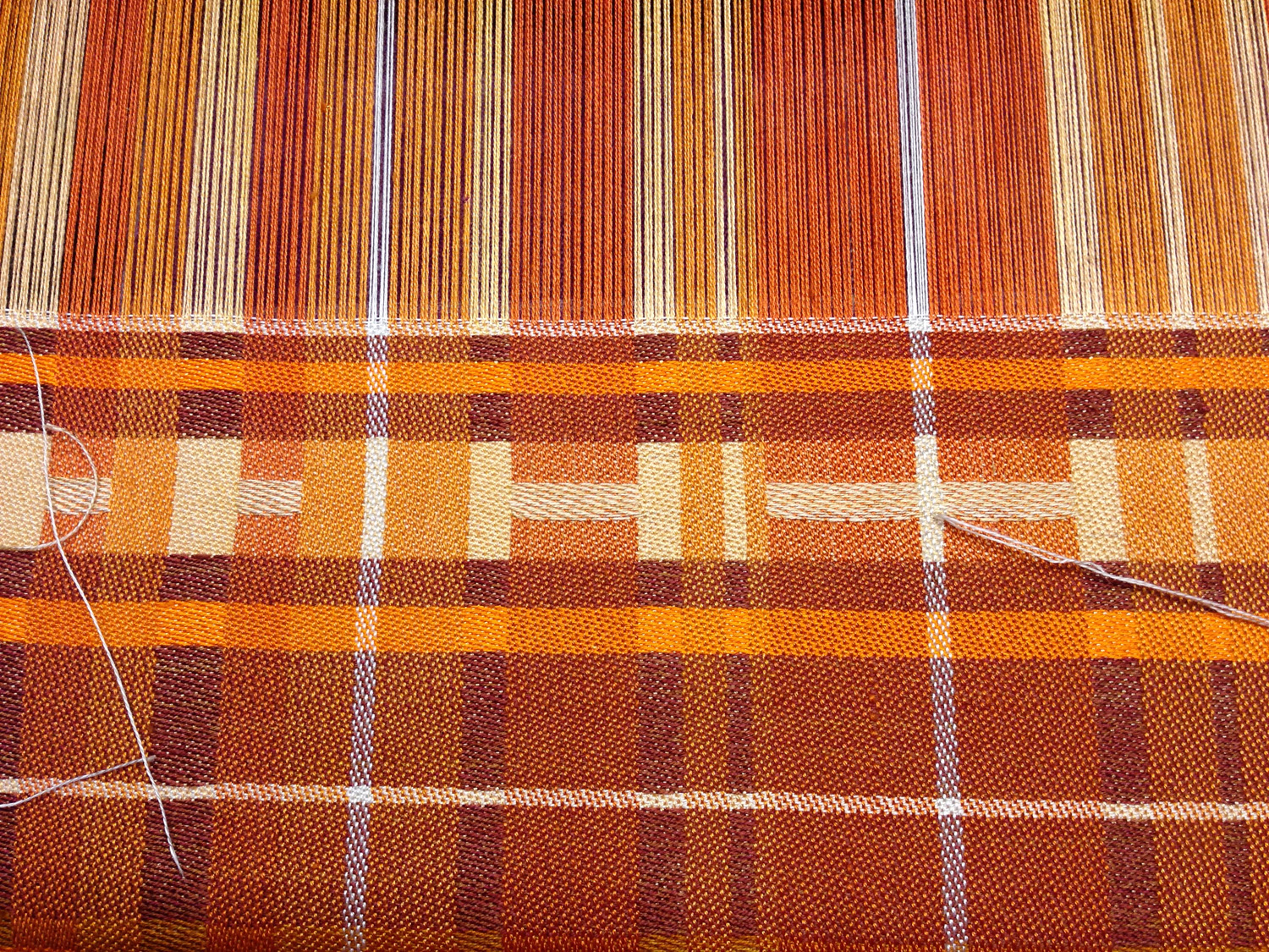
For the orange section, I decided to try “designing on the fly”. Here’s what I started with:
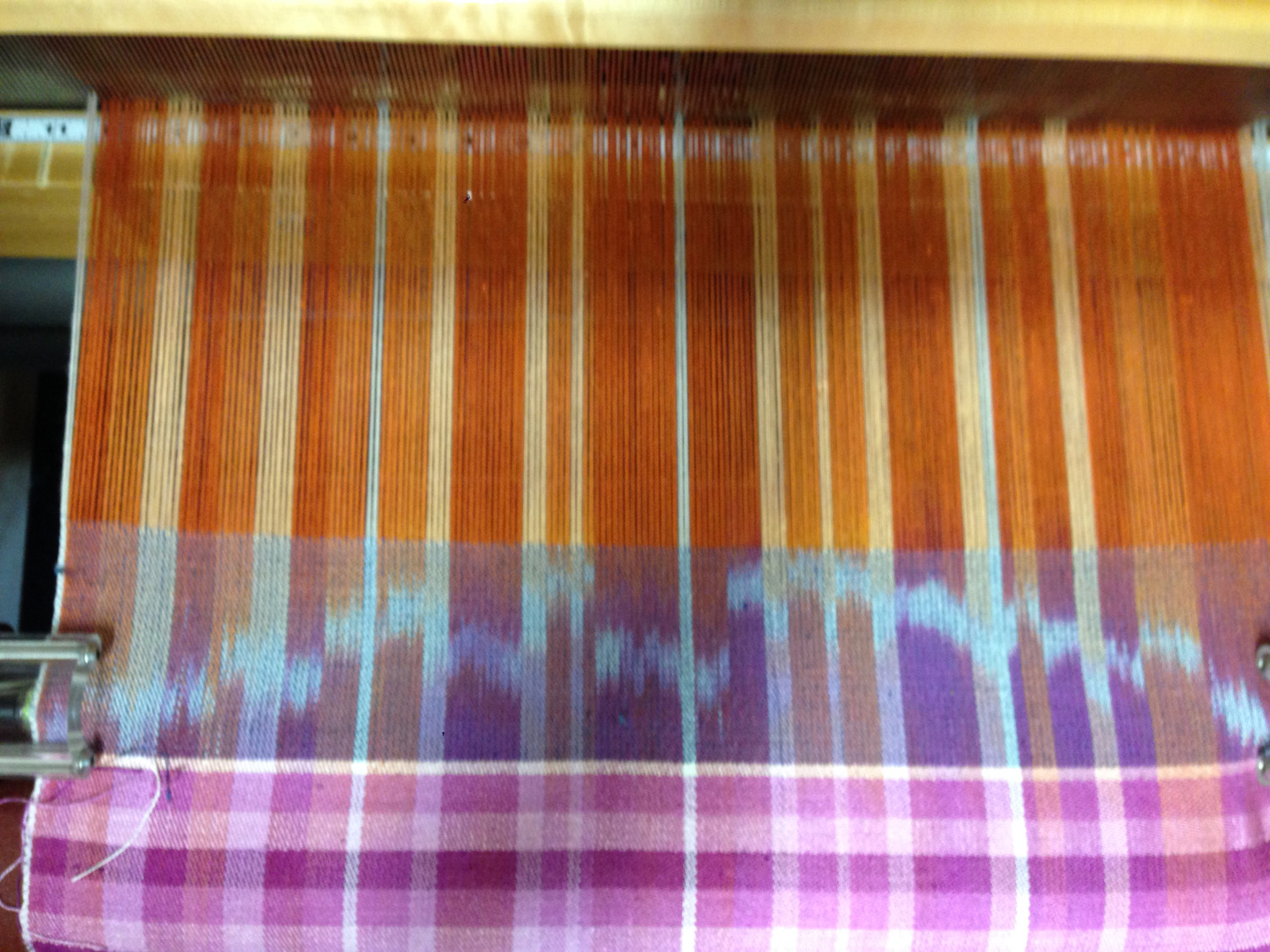
I decided to weave a design that would feature a motif in pale peach, against a darker background, using all four wefts. Here’s what I wove:
(I did not intentionally set out to say “Hi”, but thought it was a nice touch!)
This design isn’t particularly good, for a few reasons:
First, the medium peach sections near the bottom (below the “H”) distract from the main figure. Second, the golden brown just doesn’t fit with the rest of the colors – there’s too much yellow in it, so it sticks out like a sore thumb. And the main focus point (“HI”) is centered top to bottom, deadening the piece.
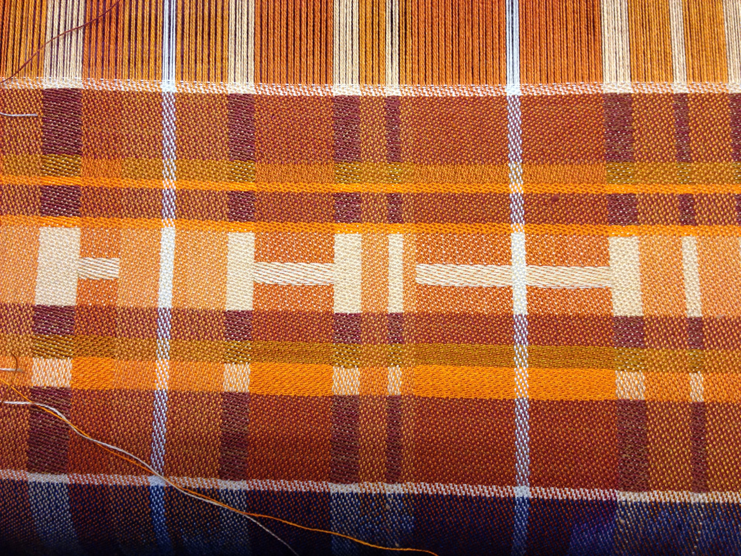
So I made some changes and wove a second version:
This still isn’t great art (though if you want to pay me a million dollars for it, I won’t object 🙂 ), but it’s a stronger design than the previous one. I eliminated the golden brown and changed the arrangement of the orange stripes to make it look a little less chaotic; I also put “HI” about 2/3 of the way to the top, making it more visually interesting. This results in a more focused piece.
So how am I designing all this? It’s pretty much all done on the fly. Here is the liftplan I’m using:
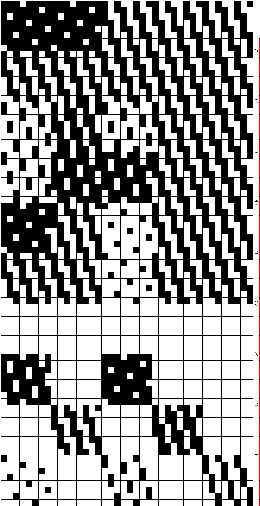
The bottom sections are for my convenience – all the shades of 8-end satin, from 1/7 to 7/1, ready to be cut and pasted. The sections at the top determine the interaction of warp and weft in each stripe of color. Shafts 1-8 represent one color, shafts 9-16 a second color, and 17-24 the third color. The remaining 16 shafts are devoted to the white dividers between sections and the selvages.
Each set of eight picks represents three blends of warp and weft (plus the selvages and white dividing lines, which are woven in 4/4 satin throughout). Looking at the liftplan shows the blending of each set of colors.
For example, in the eight rows at the top, shafts 1-8 and 9-16 are 7/1 satin, meaning the weft will heavily dominate those two colors. Shafts 17-24 are 4/4 satin, so the third warp color will weave up as a 50-50 mix of warp and weft. And so on.
So before starting each stripe of weft color, I consider how I want to blend the weft colors with the warp colors. I can make the warp essentially invisible by choosing a 1-7 satin, or I can make it dominate completely by using 7-1 satin. Or I can blend the two by choosing something in between.
Once I’ve decided what degree of blending I want, I go down to the bottom of the drawdown, and cut and paste the appropriate patterns into eight rows of the liftplan. I then repeat that set of eight picks for the length of the stripe. I’ve got six different blending patterns saved in the top part of the liftplan, so I don’t have to start from scratch every time. This gives me flexibility without compromising too much on speed.
Amidst all this busy-ness, I have a new concern. Fritz doesn’t seem to understand that sniffing shoes leads to harder drug use. Here he is with his head completely buried in one of Lieven’s shoes:
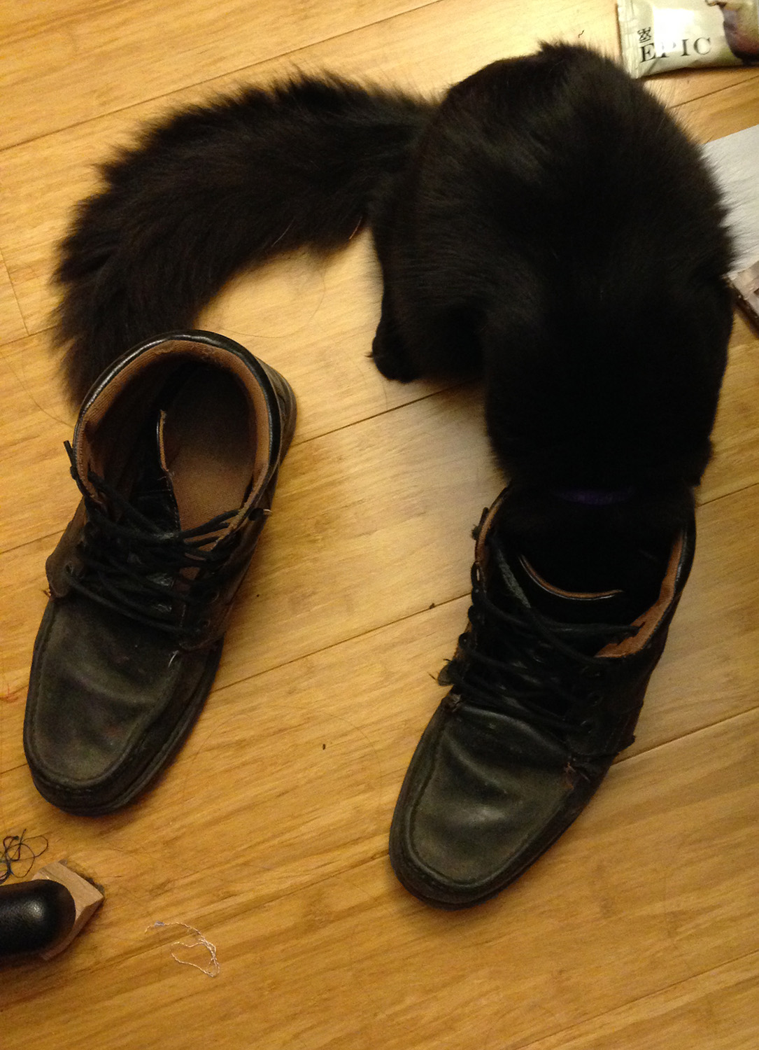
What’s next for this shoe-sniffing addict? Catnip?

Just a couple of observations as I have been doing some shading with 5 end satins. I too get an uneven transition. I get gradual transitions except for 1/4 to 2/3. With this transition there is very little discernible difference. I’ve tried different setts, colors–same results. Since the satin weaves are occurring in even steps, I don’t understand why this is occurring visually.
I’ve been using Photoshop Elements to make liftplans for the shading. My understanding of this software is limited but I have had interesting results using the gradient tool. Just dragging it top to bottom, side to side, or diagonally corner to corner. Then using either the shear or twirl filters to alter. And then indexing the file to the same number of colors as presets that will be used. Questions or like any more detail, just holler–Mary Miller, North Carolina