Tien Chiu

  • Home
  • About Tien
    • Honors, Awards, and Publications
  • Online Teaching
  • Gallery
  • Essays
  • Travels
  • Book
  • Blog
  • Dye samples
You are here: Home / All blog posts / The value of value
Previous post: Getting some rhythm going
Next post: Blissful idleness

March 30, 2014 by Tien Chiu Leave a Comment

The value of value

The first section of my color study warp was neutral monochromes – black, white, and gray. So I used it to study value.

The first sample I wove was (almost) pure black and white. I wanted to show a section with high value contrast:

woven sample, pure black and white

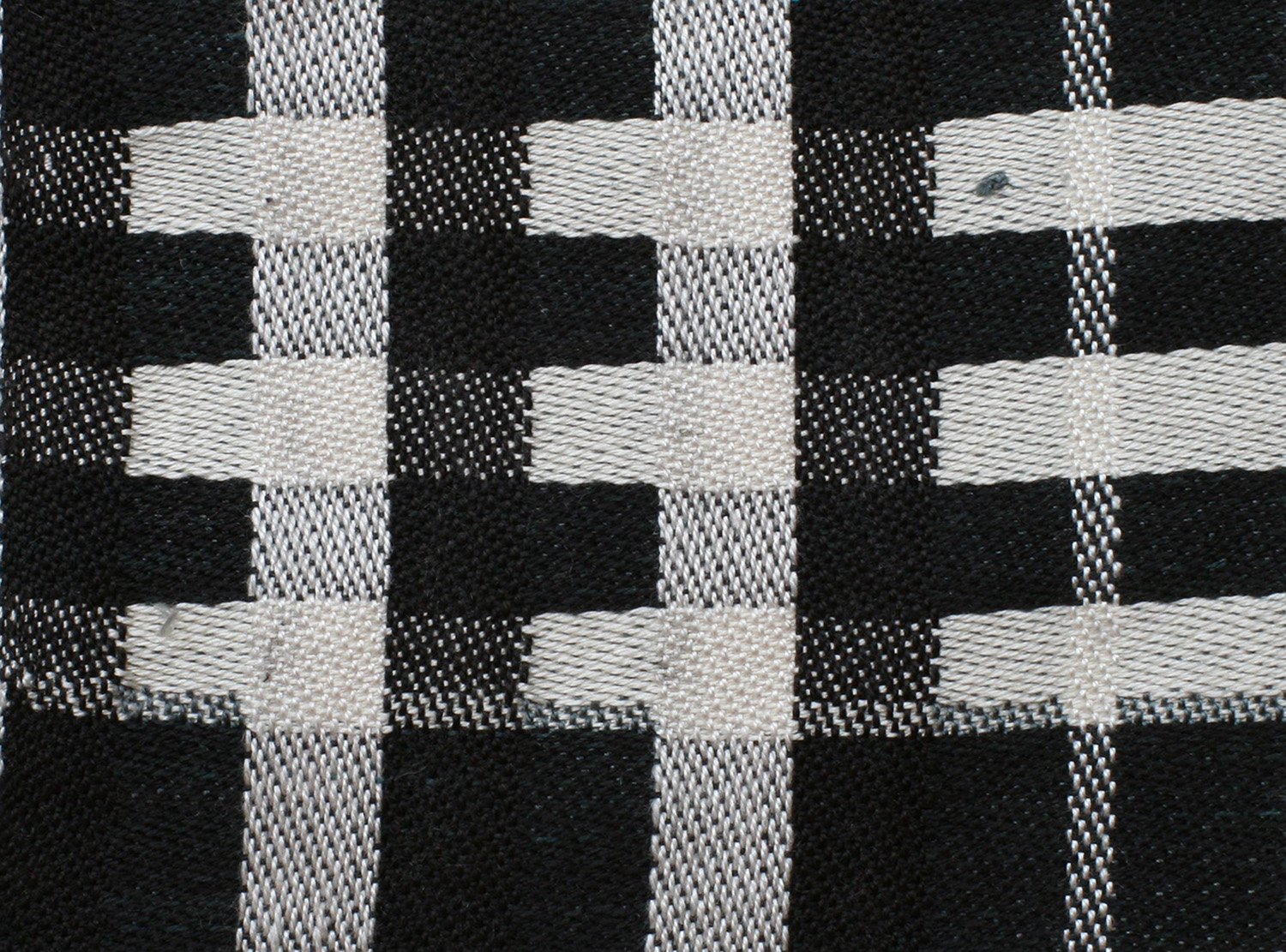
This is very high contrast, so energetic, but it also has a bit of a sterile feel.

For the second sample, I decided to introduce some grays. (Unfortunately, my grays when dyed came out distinctly blue-tinged, so not quite neutral, but try to ignore that.) Here we are with the second sample:

black, gray, and white, regular striping

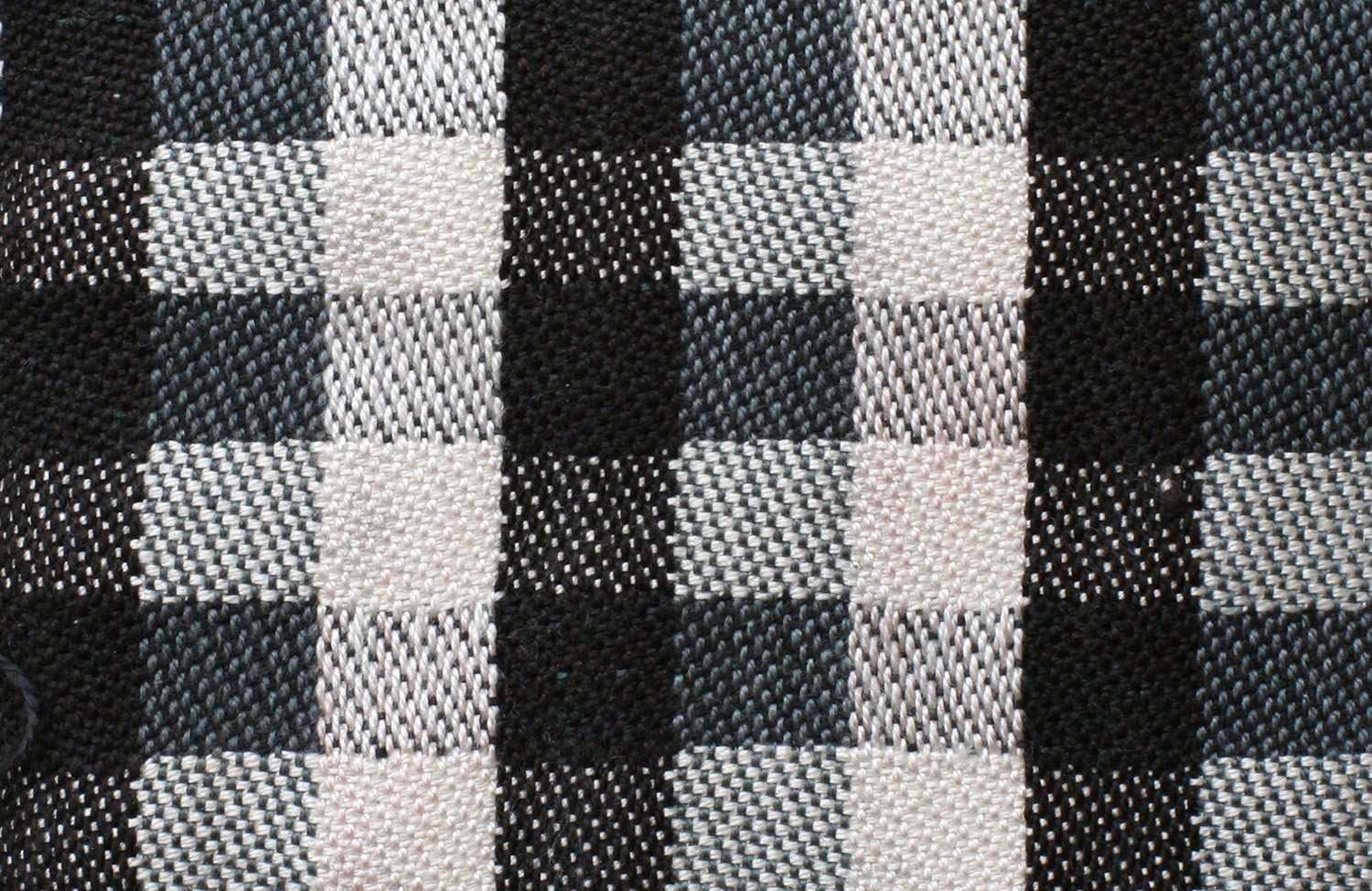
Another clean, classic look – but not as stark feeling as the black and white sample.

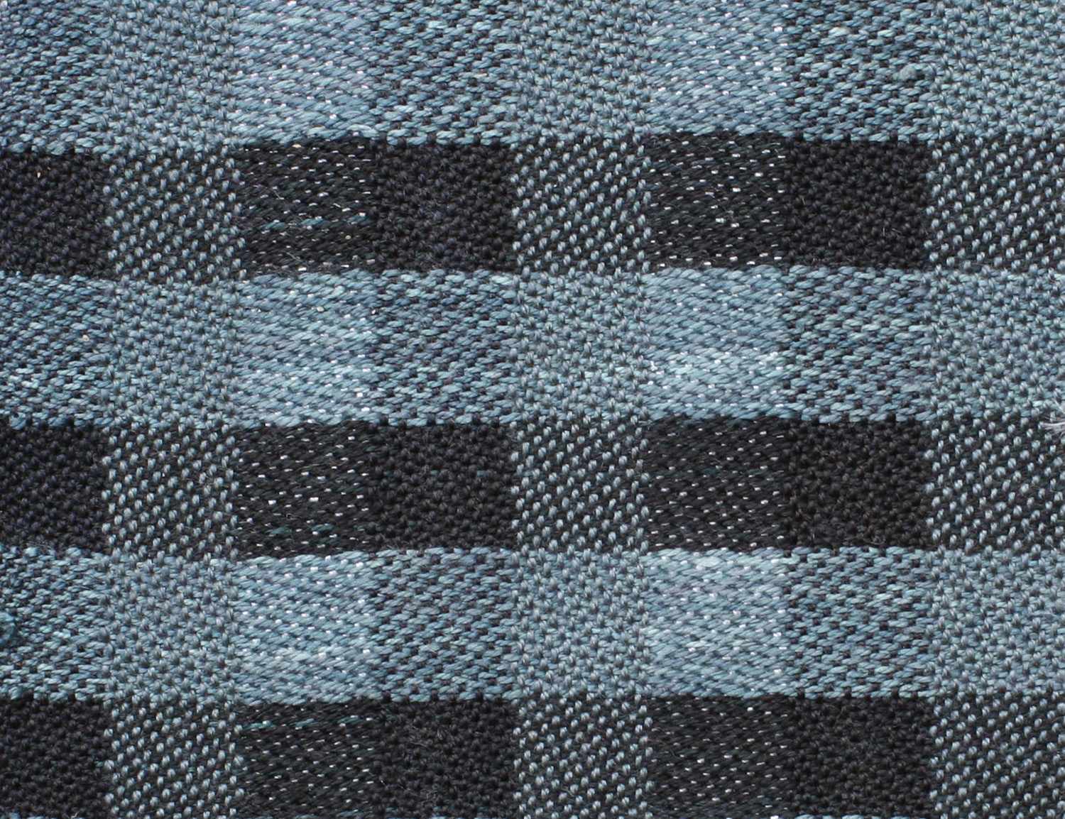
For the third sample, I introduced a wide range of values by blending white, light gray, medium gray, and black in varying quantities. Since they were randomly placed, the result was rather chaotic:

many shades of gray, producing a jumble of values

This, while chaotic, also has a much more nuanced (and lively) feel than the previous sample, with plenty of diversity in value.

Finally, I decided to do one sample with primarily lighter values and one sample with mainly darker values:

woven sample - white and medium to light gray
woven sample – white and medium to light gray
woven sample - black and dark gray
woven sample – black and dark gray

Here you can see how value affects mood – the first sample has a much “lighter” and more contemplative feel than the second sample, which feels rather dark and moody.

I’ve woven two other sets of samples, which I’ll use to illustrate my Designing Fabrics Study Group article (due tomorrow!). That article will be about the effect of value, particularly value contrast, on perception of color. The main problem I’m having with that article is photography! I have eleven samples to be photographed and converted to black and white, and it’s been remarkably difficult getting the photos to come out true to life. Fortunately my photographer friend Lieven has been helping out with advice, so as soon as the sun comes up, I’m going to reshoot my photos. I have a gray card which will help me keep the colors and values in sync across all eleven samples.

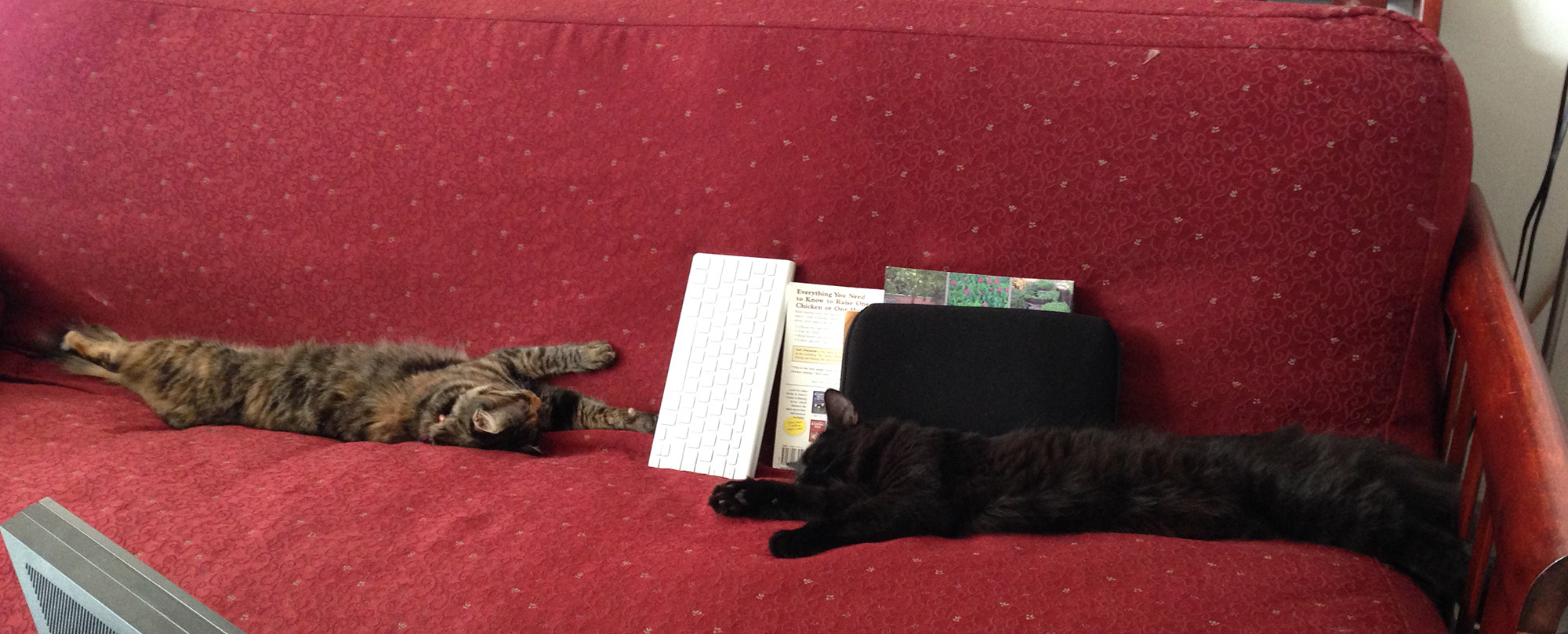
And, since I forgot to include a kitten in my last post (how could I have forgotten such wonderful and engaging creatures?!?), here is a photo with two kittens, practicing yoga on the couch. Stretch kittens! Is that like a stretch limo?

Fritz and Tigress, stretched out on the couch

Share this post!

  • Tweet
  • More
  • Click to share on Reddit (Opens in new window) Reddit
  • Click to email a link to a friend (Opens in new window) Email
  • Share on Tumblr
  • Click to print (Opens in new window) Print

Like this:

Like Loading...

Discover more from Tien Chiu

Subscribe to get the latest posts sent to your email.

Filed Under: All blog posts, textiles, weaving Tagged With: color study, color theory, design

Previous post: Getting some rhythm going
Next post: Blissful idleness

Leave a ReplyCancel reply

This site uses Akismet to reduce spam. Learn how your comment data is processed.

Archives

Tags

aids lifecycle outfits autumn splendor book cashmere coat cats celtic braid coat color study cross dyeing design devore doubleweave doubleweave shawls drawing dye samples dye study group gradient colors handwoven clothing house infinite warp jacquard loom katazome knitted blanks kodachrome jacket ma's memorial mohair coat network drafted jacket/shawl project network drafting painted warp phoenix rising phoenix rising dress phoenix rising kimono phoenix rising reloaded pre-weavolution project sea turtles taquete tie-dye tied weaves tomatoes velvet weaving drafts web design website redesign wedding wedding dress woven shibori

Categories

  • Africa
  • aids lifecycle
  • All blog posts
  • All travel posts
  • Asia
  • Bangkok
  • Belize
  • Cambodia
  • Central America
  • Chai Ya (Wat Suon Mok)
  • Chiang Mai
  • Chiang Rai (Akha)
  • China
  • chocolate
  • computer stuff
  • creating craft
  • Creative works
  • cycling
  • Delhi
  • Dharamsala
  • drawing
  • dyeing
  • Fiber Arts
  • finished
  • food
  • garden
  • Ghana
  • Guatemala
  • Hanoi
  • Ho Chi Minh City
  • Hoi An
  • India
  • Khao Lak
  • Knitting
  • knitting
  • Ko Chang
  • Laos
  • Luang Namtha
  • Luang Prabang
  • markleeville death ride
  • meditations on craft
  • mental illness
  • musings
  • Phnom Penh
  • powerlifting
  • Rewalsar (Tso Pema)
  • sewing
  • Siem Reap (Angkor Wat)
  • Southeast Asia
  • surface design
  • textiles
  • Thailand
  • travel
  • Vangvieng
  • Vientiane
  • Vietnam
  • Warp & Weave
  • weaving
  • Weaving
  • weavolution
  • writing

© Copyright 2025 Tien Chiu · All Rights Reserved ·


Loading Comments...
 

    %d