I finished weaving the sea-turtle scarf yesterday evening, and ran a few tests in the dyepots this morning. Here are the results:
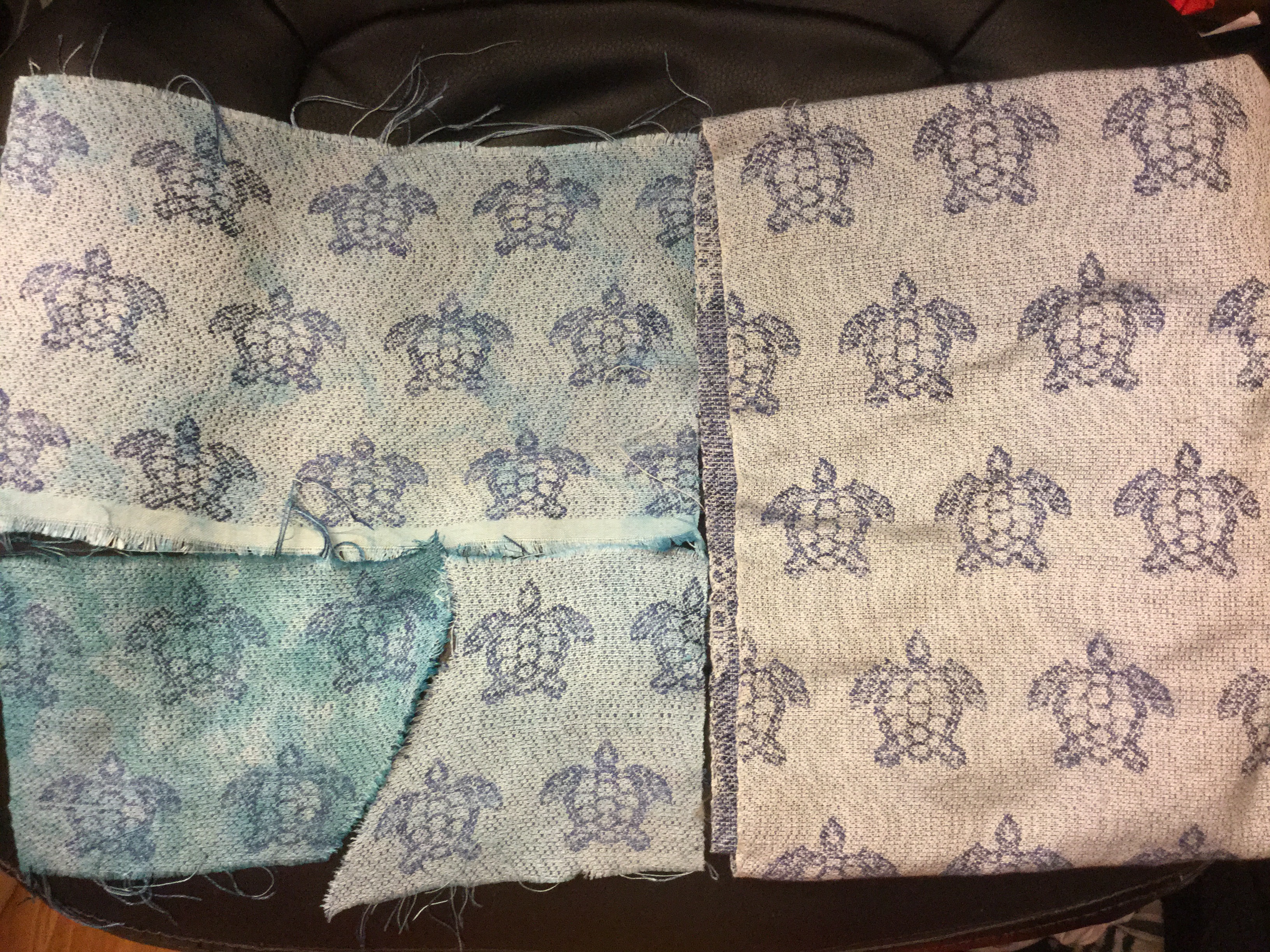
Clockwise from top left, they are:
- (top left) Dyed in a very weak turquoise immersion dye bath, then scrunched up and overdyed with a slightly stronger solution of turquoise to produce a mottled pattern
- (right) undyed – straight off the loom
- (bottom middle) dyed in a very weak turquoise immersion dye bath, with only very slight dye variations
- (bottom left) scrunched up and dyed with relatively strong solutions of green and turquoise
Of the four, I think I like the undyed version the best, but the colors don’t look good on me, so I am thinking of using the dye processes in either sample 1 or 3. (Sample 4 doesn’t work, in my opinion; the colors are too strong and the sea turtles are hard to see.) But I can’t decide between 1 and 3.
Conceptually, I like the idea of the mottled dye job in sample 1: it gives the impression of looking down through water at the sea turtles, which is (thematically) what I was after. But the irregular dye job also draws the eye away from the sea turtles towards the variation in color, and I’m not sure I like that. Sample 3 is simpler, and keeps the focus on the sea turtles, but isn’t quite as visually interesting. Across the length of a 72″ scarf, the mottled dye job might hold up better.The good news is that I have to do sample 3’s dye technique (weak immersion dyebath) before I can get to sample 1, so I can always do the dyebath and then decide whether to stop there. But I wish I could decide whether sample 1 or 3 looks better.
What do you think? Please let me know in the comments, below.
And thanks to everyone for the surgical well-wishes!

Like #1, definitely.
I agree with you, out of these I like the clean version best. How about instead of mottled a little striped with some arashi shibori.
I like method 1 the best. I feel like it has great movement through the turtles and I just want to keep looking and seeing more.
I like sample one. I don’t think the dye variation takes away from the turtles, which I love by the way.
Straight off the loom no dye is my preference. You can see the water ripples and the turtles stand out. Love your design, the turtles are charming.
Hope your surgery goes well.
Hi Tien,
My preference is for the undyed #2 or the darker dye #4. To my eye – and it may be due to seeing a photo not the real thing – #1 and #3 look like mistakes. #4 looks intentional but does take away from the turtles. Maybe you’d prefer to dye the ‘white’ yarn a pale turquoise before weaving?
They are all beautiful!
Stephanie S
What about a variation on #1? Would it be possible to overdye it a second time, perhaps with a color midway between the background and the original overdye? (Or another watery color?) Perhaps then the variations in the dye won’t draw the eye so much. I do like the concept of looking down at turtles–and in real life, while you do have to concentrate a bit to see them, it’s worth it. 🙂
I like the less-mottled #3. Otherwise, the mottling runs the risk of looking like a dyeing error.
I like the undyed best. I think both #1 and #3 look (at least in the picture) like dye jobs that went wrong. I know you say the undyed colors don’t look good on you, but are you really sure? Maybe you could take a picture of yourself wearing the scarf and then decide. I always enjoy seeing what you are weaving.
I like the theory behind #1, but to me it comes across as looking like a dyeing mistake. I like the suggestion someone further up had of trying it with a few colours overdyed, I think the unevenness may look more obviously deliberate then. I can’t quite picture how it extends to a large piece though.
I love sample 1. I like the irregularly. It is not too dark and I don’t feel it distacts from the turtles. Beautiful work and good luck with your surgery.
I like the sample dyed with darker blue green color the best and would look good long term. The other samples seem a bit pale.So for me the far left sample No. 4.