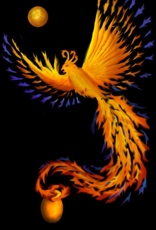
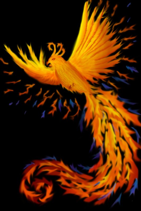
Here is the second draft of the digital painting for my mom’s memorial piece:

I think it’s much better than the first draft I posted a few days ago:

I thought you might be interested in what I changed and why, so here is a summary of the changes.
First, I added the red-orange moon to fill in the “dead space” at top left. I put it roughly in line with the diagonal of the bird’s body and the first part of the tail, to emphasize the diagonal flow of the piece. (Had I put the moon dead center between the wings – the natural temptation – it would have disrupted the flow of the piece, as well as looking overly rigid.)
I chose to make the moon red-orange rather than white for two reasons. First, a white moon would have stuck out like a sore thumb because white appears nowhere else in the piece. It would have been visually jarring and would have drawn attention to the moon (rather than the phoenix) because of the high color contrast. Second, a white moon would either have required that I use five wefts rather than four when weaving, or else do some fancy-dancing to bring the white warp up from the bottom in just that one area. So for visual and technical design reasons, red-orange made more sense than white.
I added a tiny bit more yellow to the bottom of the bird, and (on my friend Carolyn’s suggestion) added a bit more yellow in the feathers, especially toward the end of the tail. The focal point for this piece is the bird’s head – all the elements, especially the high-contrast wings, point at the head. From the head, the line of yellow along the body draws the eye down to the tail, and the yellow and bright orange draws the eye through the tail to the cremation urn. I had originally made the urn dark brown, but Carolyn also suggested that I brighten it up and add some yellow to make it more visible. I also altered the last few feathers of the tail to make the bird appear to be rising out of the urn.
The most obvious changes are in the feathers/flames radiating out from the wing. I wasn’t satisfied with the “feel” of the original, rather jerky flames. They looked almost electric, like lightning, rather than like fire. They also clashed with the style of the rest of the piece. So I replaced them with “flames” that are stylistically very similar to the tail feathers. I had initially felt that the spacing of the feathers was too rigid, but (after playing with different spacing) decided that the very regular, formal spacing worked the best. It does two things: First, it has a peaceful, calming feel, which I thought was better suited for the piece than the more jazzy lightning effect. I wanted the idea of a spirit at peace, not an angry or overly energetic one. Second, it radiates outward, so the phoenix feels like it’s expanding. I wanted to convey the idea of a phoenix bursting forth from its physical body (the ashes) – I think these wing feathers do that very nicely.
I chose blue for the outer edges of the wing and the tail to add some color contrast. The dominant color of the piece is orange, with some yellows and reds. Blue is the complement of orange, and complementary colors tend to intensify each other. So outlining the orange in blue intensifies the orange. And because blue tends to recede while orange comes forward, the blue doesn’t distract from the orange phoenix.
Using a complementary color also adds to the energy of the piece by amping up the color contrast. Without the blue, the color scheme would be an analogous one, composed of colors adjacent on the color wheel (yellow, orange, red). Analogous color combinations are harmonious, but don’t have much visual tension. I wanted more energy in this piece. By adding a strongly contrasting hue, I increased the energy of the piece. (Try visualizing the piece without the blue – it’s much less emphatic.)
This painting is not the end of the story, of course – I will have to translate it to woven cloth and then add embellishments. An important part of the theme of this piece is the use of beads, embroidery floss, and ribbons from my mother’s stash. So I am thinking about where and how to add some of the things she left me.
I will probably continue to noodle on the image until early next week. Before I can translate the image to weave structures, I need to finish dyeing the weft yarns. Then, to get my color palette, I’ll need to create a weave blanket, photograph it, and translate it into a set of colors. That will take me a couple more days. So I don’t expect to be weaving until Monday at earliest.

Tien, alternatively you could use ArahWeave’s color shading and translate the JPEG directly into weaving, check page 106.
http://www.arahne.eu/pdf/aweave-EN.pdf
The second one is much nicer.
Cant wait to see how it translates in fabric.
I love it! Will it glow like this when woven? 🙂
Love the newest iteration!
I definitely see the improvements as you pointed them out. I wonder, though, how would it look with a blue moon? Or a blood moon (i.e. red)? Have you considered those? (I definitely agree that white would be the wrong color for the moon in this picture.)