Tien Chiu

  • Home
  • About Tien
    • Honors, Awards, and Publications
  • Online Teaching
  • Gallery
  • Essays
  • Travels
  • Book
  • Blog
  • Dye samples
You are here: Home / All blog posts / Logos again
Previous post: Labyrinth
Next post: Estes Park

June 10, 2016 by Tien Chiu 22 Comments

Logos again

I’ve developed the product and launch plans for my new business, and am getting ready to put the website together. Which means I need to finalize my logo! I’ve been playing with colors, and settled on blue/orange as the most visually powerful combination. However, I’m worried that these colors no longer communicate “craft”.

So here are a few combinations of colors and background. What do you think? Feel free to comment, reply to my email, or send me email through the sidebar. I’d love to hear your opinion!

original brown Creating Craft logo with beige textured background
blue/orange Creating Craft logo, white background
blue-orange Creating Craft logo with black and white textured background
blue-orange Creating Craft logo with cream-colored textured background
color play - blue and maroon
color play – blue and maroon

Share this post!

  • Tweet
  • More
  • Click to share on Reddit (Opens in new window) Reddit
  • Click to email a link to a friend (Opens in new window) Email
  • Share on Tumblr
  • Click to print (Opens in new window) Print

Like this:

Like Loading...

Discover more from Tien Chiu

Subscribe to get the latest posts sent to your email.

Filed Under: All blog posts, creating craft

Previous post: Labyrinth
Next post: Estes Park

Comments

  1. Eileen J. Crawford says

    June 10, 2016 at 5:36 am

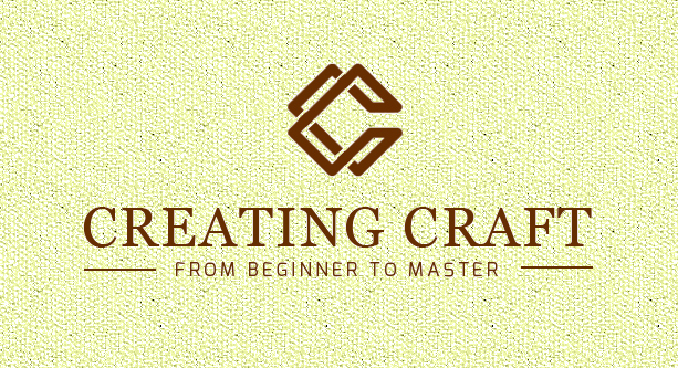
    Fourth option, orange, blue logo on cream colored textured background has visual appeal, communicating warmth and offering color, texture and volume that subtly engages the senses. Good luck!

    Loading...
    Reply
  2. Nancy Warren says

    June 10, 2016 at 6:18 am

    I like #4 the Blue/orange text and the cream background. This looks very professional.

    Loading...
    Reply
  3. Cynthia Hull says

    June 10, 2016 at 6:28 am

    I prefer the blue/maroon option. In my opinion, it reads more clearly and looks stronger.

    Loading...
    Reply
  4. Ian Bowers says

    June 10, 2016 at 6:33 am

    again, the fourth option, it is warm and friendly (to me!)

    Loading...
    Reply
  5. Rebecca says

    June 10, 2016 at 6:37 am

    Love where you are going with the logo. I like options 2 with white background and 5 with maroon. The beginner to master line stands out better, to me, in those logos.

    Loading...
    Reply
  6. Angie says

    June 10, 2016 at 7:31 am

    I find the blue and maroon combination the most appealing. I think it seems “warmer” to me.

    Loading...
    Reply
  7. Susan Targove says

    June 10, 2016 at 7:50 am

    I agree with Eileen (a fellow guild member), the blue and orange on cream seems more appealing, both professional and modern.

    Loading...
    Reply
  8. Laurie Schellinger says

    June 10, 2016 at 8:27 am

    I like the one with no background.

    Loading...
    Reply
  9. Mary Coburn says

    June 10, 2016 at 8:37 am

    I like #5 the best. I don’t know why, though.

    Loading...
    Reply
  10. Laurie Carlson Steger says

    June 10, 2016 at 8:44 am

    Tien, I would try making the brown a deep marroonish brown. The red aspect will attract the eye, the brown is earthy, and the textured background is natural, too.

    Loading...
    Reply
  11. Michelle Rudy says

    June 10, 2016 at 9:27 am

    The blue and maroon is great. Second is #4. Like the cream colored background. How does the blue and maroon look on the cream?

    Loading...
    Reply
  12. Alison says

    June 10, 2016 at 10:00 am

    I prefer the blue and maroon option, stands out o well.

    Loading...
    Reply
  13. Janet Colville says

    June 10, 2016 at 10:03 am

    The blue/orange on white stands out the best. Nest for me would be the last one…color play.

    Loading...
    Reply
  14. maggie says

    June 10, 2016 at 10:04 am

    Hi Tien
    seems i’m of a different mind. i go for classic and elegant. the first one has my vote but my weaving tends to be very traditional. it depends on the message you want to send. second choice is the blue and maroon.

    Loading...
    Reply
  15. Marya says

    June 10, 2016 at 11:37 am

    color play- blue and maroon

    Loading...
    Reply
  16. Eliz Tritthart says

    June 10, 2016 at 5:08 pm

    I suggest a white damask background, with the logo in gold leaf. You practice ancient craft of luxury, your cards should represent that image. The lettering could be either a rich mahogany or the deep blue it is now. You would like others to believe they can achieve the same success that you have.

    Loading...
    Reply
  17. Mary Knox says

    June 11, 2016 at 12:51 am

    The blue and maroon stands out for me. Not only do the colours draw the eye, they seem most harmonious together, including the background.

    Loading...
    Reply
  18. Linda Lacasse says

    June 11, 2016 at 8:58 am

    I like #5. Visually the Title reads first, then you see the logo then you see the subtitle as it is smalled and tinted. In the other options you see the logo first then the title. Nice logo by the way.

    Loading...
    Reply
  19. Ruth says

    June 12, 2016 at 4:53 am

    Everyone in Colorado (and perhaps US football fans around the country) will think “Denver Broncos” when they see blue & orange. The maroon/blue combo comes too close to the cliche’d red-white-blue combo for me. What about purple and that wonderful bronze color that you get when you mix purple and gold when you’re dyeing? Or some other combo with some kind of purple. You’re talking about being creative. I think you need to get more creative with the logo. You don’t want to look like some corporate conglomerate.

    Loading...
    Reply
  20. Diane says

    June 12, 2016 at 3:48 pm

    I’d use the same colors as the text on your book cover. This consistent look would link to the book, and really develop your brand.

    Loading...
    Reply
  21. bibliotecaria says

    June 13, 2016 at 10:23 am

    Tien, I was thinking, as I looked at the double C of your logo, that a way to convey craftsman might be to have a variation of the logo that turns those two “C”s into hands. It is hands that do the work of a craftsman. Do you think that might convey the idea more clearly

    Loading...
    Reply
    • Tien Chiu says

      June 15, 2016 at 4:50 am

      I think that might work! I may give it a try post-launch; for now, I’m so far behind in all I need to get done that I think I’m going to stick with this one. If I have time post-launch I’ll try again.

      Loading...
      Reply

Leave a ReplyCancel reply

This site uses Akismet to reduce spam. Learn how your comment data is processed.

Archives

Tags

aids lifecycle outfits autumn splendor book cashmere coat cats celtic braid coat color study cross dyeing design design class devore doubleweave doubleweave shawls drawing dye samples dye study group gradient colors house infinite warp jacquard loom katazome knitted blanks kodachrome jacket ma's memorial mohair coat network drafted jacket/shawl project network drafting painted warp phoenix rising phoenix rising dress phoenix rising kimono phoenix rising reloaded pre-weavolution project sea turtles taquete tie-dye tied weaves tomatoes velvet weaving drafts web design website redesign wedding wedding dress woven shibori

Categories

  • Africa
  • aids lifecycle
  • All blog posts
  • All travel posts
  • Asia
  • Bangkok
  • Belize
  • Cambodia
  • Central America
  • Chai Ya (Wat Suon Mok)
  • Chiang Mai
  • Chiang Rai (Akha)
  • China
  • chocolate
  • computer stuff
  • creating craft
  • Creative works
  • cycling
  • Delhi
  • Dharamsala
  • drawing
  • dyeing
  • Fiber Arts
  • finished
  • food
  • garden
  • Ghana
  • Guatemala
  • Hanoi
  • Ho Chi Minh City
  • Hoi An
  • India
  • Khao Lak
  • Knitting
  • knitting
  • Ko Chang
  • Laos
  • Luang Namtha
  • Luang Prabang
  • markleeville death ride
  • meditations on craft
  • mental illness
  • musings
  • Phnom Penh
  • powerlifting
  • Rewalsar (Tso Pema)
  • sewing
  • Siem Reap (Angkor Wat)
  • Southeast Asia
  • surface design
  • textiles
  • Thailand
  • travel
  • Vangvieng
  • Vientiane
  • Vietnam
  • Warp & Weave
  • Weaving
  • weaving
  • weavolution
  • writing

© Copyright 2025 Tien Chiu · All Rights Reserved ·


Loading Comments...
 

    %d