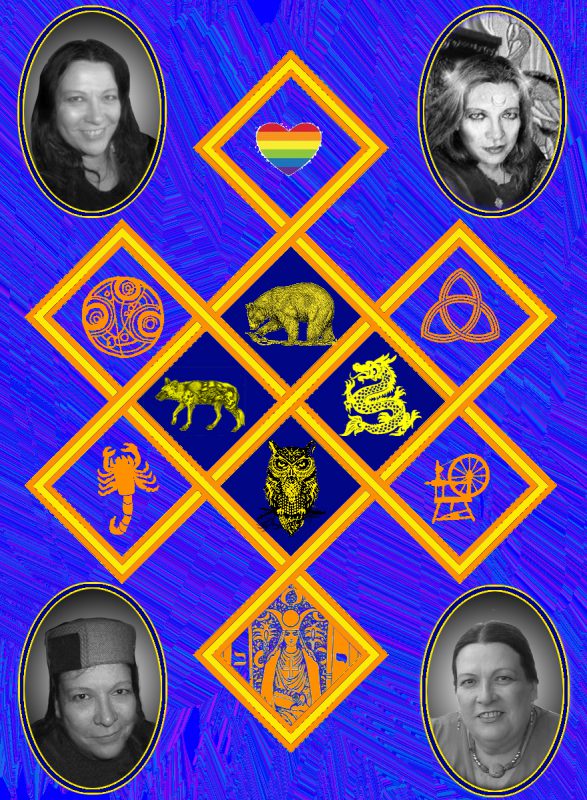
I’ve spent the last few days getting everything set up to weave Joy’s memorial piece. It’s a complicated process. I started with this mockup:

But a mockup is not a file that can be read by a jacquard loom. There are (broadly speaking) three steps to creating an image the loom can use.
First, you create a mockup that contains what you would like to see in the finished piece. The image above is the mockup for Joy’s memorial piece.
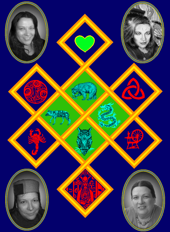
Next, you create a cartoonish version of that mockup, using only a small set of colors. Each color will represent a single weave structure -a repeatable interlacement of threads. The colors may or may not have anything to do with the original mockup colors. In fact, I like to use radically different colors, because it makes the shades easy for me to distinguish. Here’s the 23-color cartoonish version of the mockup:

You’ll notice that there appear to be lots of shades of gray in the photos. There are actually only seven shades of gray, but they’re scattered to give the impression of more subtle shading. Similarly, there are only seven shades of aqua/black in the central animals.
Creating the “cartoon” file looks like it should be a straight-up conversion in Photoshop, but it often isn’t. For example, the orange and yellow lines of the eternity knot took a huge amount of tedious cleanup, because the original mockup had some shaded pixels at the boundaries that came out ragged in the cartoonish version. So I had to go in with a few more Photoshop tools and smooth out all the boundaries between the lines. That plus other cleanup took me four or five hours – definitely not as simple as it looks!
Once you have a suitable file, you need to load it into your weaving software and convert each colored pixel into the appropriate weave structure. Some people use Photoshop for this, but I use Arahweave, which is much more powerful. In Arahweave, you just load your cartoonish image, fire up the jacquard conversion window, and map each color to a weave structure. Simple, fast, and fun!
…once you’ve built the weave structures you plan to plug in, that is.
The weave structures for this particular piece were actually pretty complicated. While it’s not obvious on the surface, the piece is actually three layers of cloth, all woven at the same time. And the layers interchange. So designing a weave structure for this piece means designing all three layers of cloth, then combining the designs for each layer to produce a design representing how to weave all three layers at once. Figuring out all this in your head is the sort of thing that drives people out into the streets at midnight screaming uncontrollably about Cthulhu’s Second Coming.
Fortunately, I don’t have to! Arahweave does the heavy lifting for me. But it’s still complicated. I’m weaving with three warps (lengthwise colors): white, orange-red, and blue. I’m weaving with three wefts (crosswise colors): gold, red, and black. Any of those wefts can weave with any of those warps, so for any particular structure, I have to decide what warp/weft pair is on top, what warp/weft pair is in the middle, and which one is on the bottom. And how each of those pairs is interlacing. The possibilities are maddeningly complex.
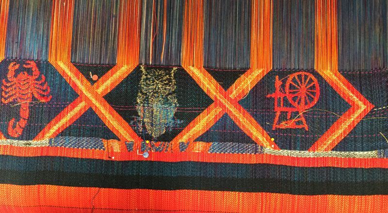
Anyway, I spent most of the day yesterday cleaning up the “cartoon” image and designing weave structures. Last night, after much hard work, I finally got to the point of weaving samples. Here is the first sample, one of the middle sections:

The contrasting threads are to help me figure out proportions. Usually a design comes out a little denser or looser than you expected when designing in the software. Then you need to stretch or squoosh your cartoon image to compensate, so it looks right when woven. The top and bottom threads are 350 picks (crosswise threads) apart, and should (in theory) measure just shy of 4 inches for this particular combination of interlacing threads. In this case, I got lucky: the actual density was exactly the same as the expected density, so no adjustment was needed.
The contrasting threads also mark boundaries between versions of the weave files. For example, I didn’t like the bottom half of the owl, which was woven with the blue warp and the gold weft interlacing. I didn’t feel there was enough contrast, so I wove the top half using the blue warp interlacing with both the gold and the black weft simultaneously. This added more contrast to the owl. So the process of sampling is really a cycle: design, create the sample, evaluate the sample, identify changes that need to be made, and start designing your changes. (By the way, this process is covered in far more detail in my book Master Your Craft.)
Because I needed to get feedback from Joy’s wives, Lena and Nyondo, I drove up to their place this morning to show it to them. They liked it! but wanted to know if it was possible to get more white into the owl. I initially didn’t think there was, but I got an idea on the way home. So tomorrow I will try swapping the blue warp for the white warp, and weaving the owl in white, gold, and black. It’s a good thing I have Arahweave to simplify the construction of each structure, or I’d probably have lost my mind by now.
I’m deeply enjoying this process, as complicated as it is. With the TC-2 jacquard loom and Arahweave, I feel I finally have the tools I need to express myself in handwoven cloth. I can come up with a meaningful design, solve the technical puzzles, and weave the samples and cloth for a major project – in just ten days! Now that I’m armed with the right tools, I feel like a total creative powerhouse. It’s like my early cycling days, when I switched from riding a clunky, heavy hybrid bike to a much lighter road bike, and went zipping around the first day shouting “I am a GOD!!!!” It felt SO good to be on something so fast and responsive – and that’s exactly how I feel with my jacquard loom and weaving software.
