I’ve now completed my second set of Procion MX dye samples on cotton yarn – the Gold, Mixing Red, and Intense Blue samples.
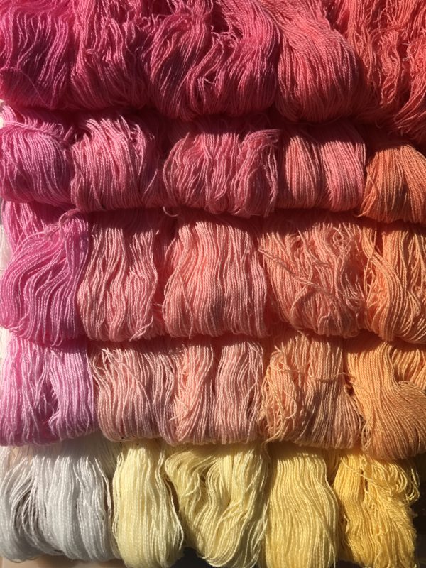
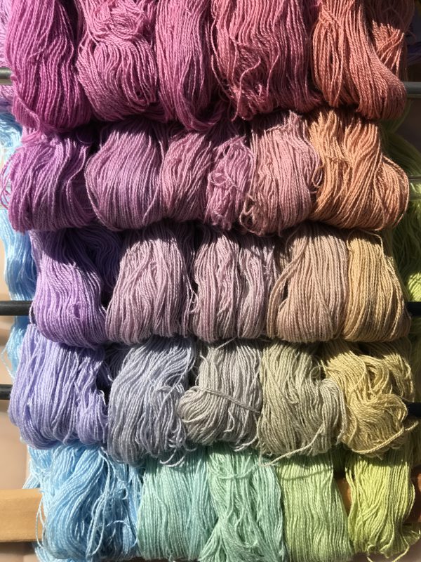
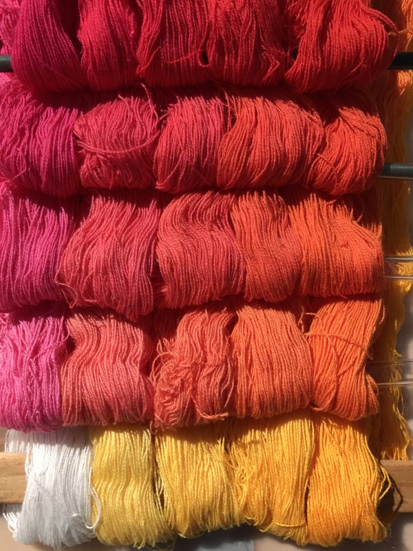
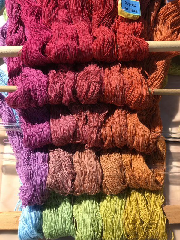
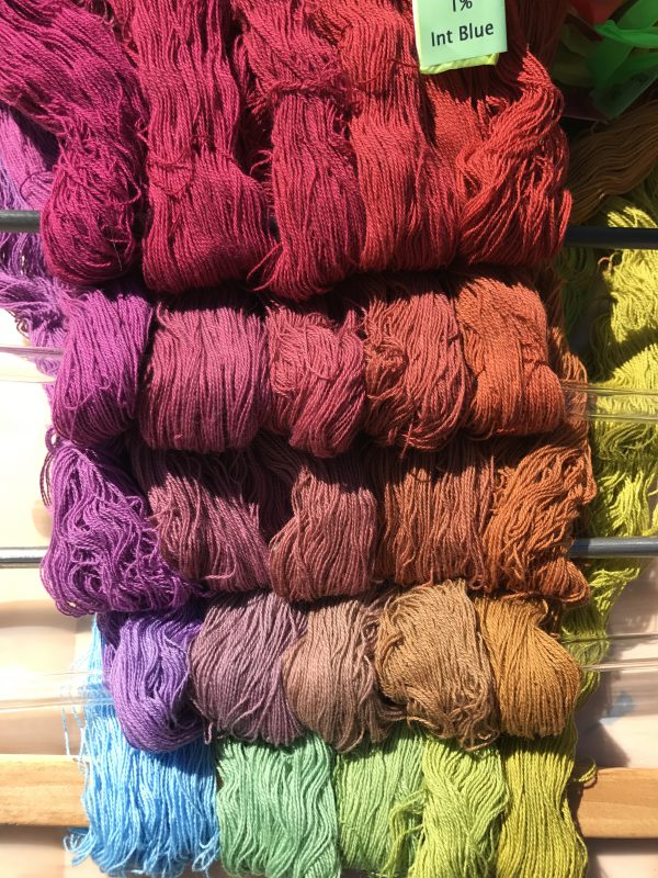
Here are photos of all 250 skeins. Each photo shows all the skeins dyed in one concentration of Intense Blue, which is listed in the caption. The concentration of Gold increases as you travel left to right along the rows; the concentration of Mixing Red increases as you travel up along the columns.
Here’s an annotated photo that shows how it works. This “level” of the cube has 0% Intense Blue, so it’s solely Gold and Mixing Red.
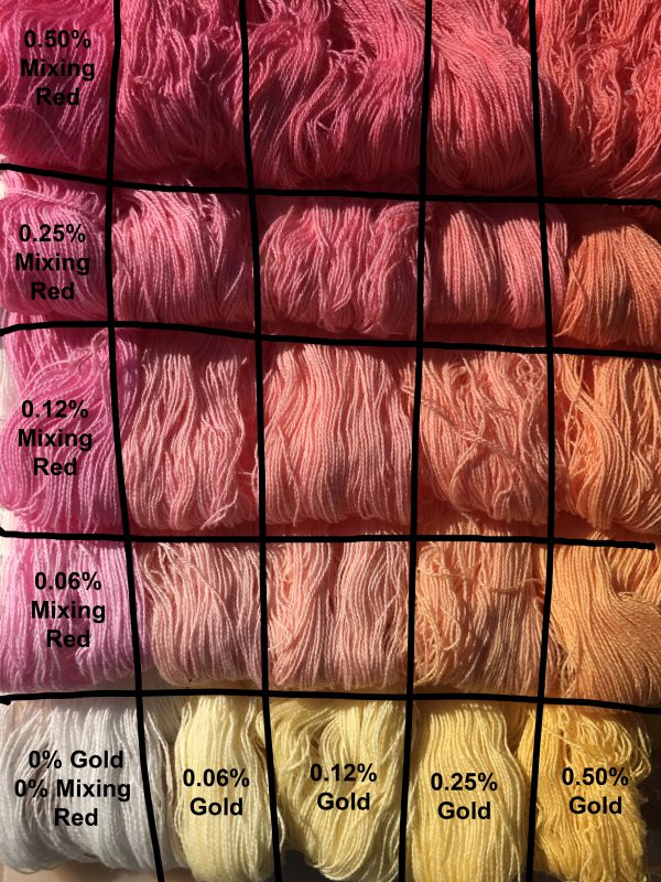
Each column has one concentration of Gold, each row has one concentration of Mixing Red.
Here are the photos of the “light” cube (lower concentrations of dye). The concentrations are 0, 0.06, 0.12, 0.25, and 0.50% in both Mixing Red and Gold. The concentration of Intense Blue is the same for each photo, and is listed in the caption.
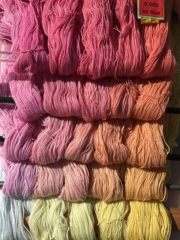
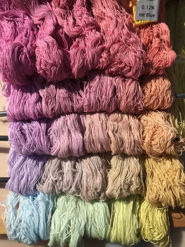

And here are the darker concentrations. The concentrations that were used are: 0. 0.50%, 1%, 2%, 4%.
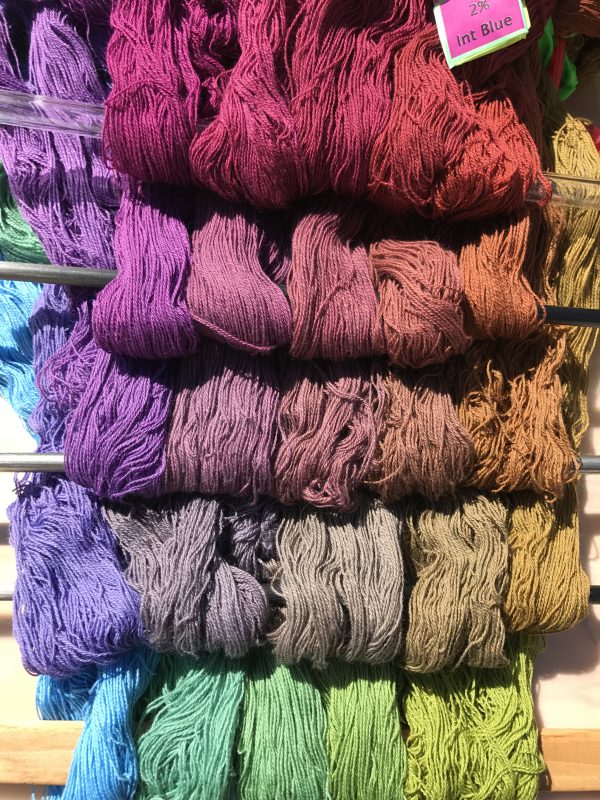
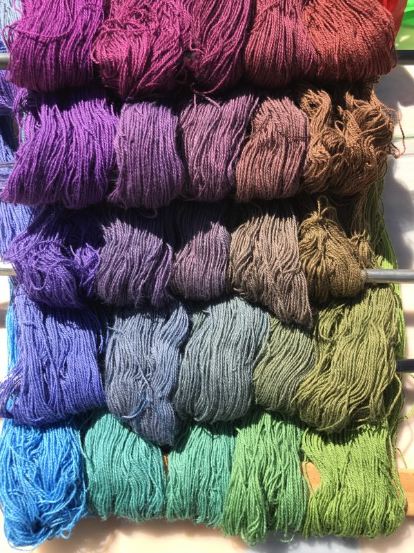
Some thoughts I had while looking at these photos:
First, true neutral grays are very rare. So far I’ve found maybe two neutral grays in about 500 sample skeins. Everything else leans noticeably one way or another. I had read this, but hadn’t really understood how true it is before.
Second, undertones matter. Here is a photo (unfortunately uncalibrated, so the colors may not be 100% true to life) of the Sun Yellow/Fuchsia/Turquoise skeins. Sun Yellow, Fuchsia, and Turquoise are all cool tones, so you’d expect cool shades to result. But look at the dramatic difference between these cooler primaries and the warmer ones:
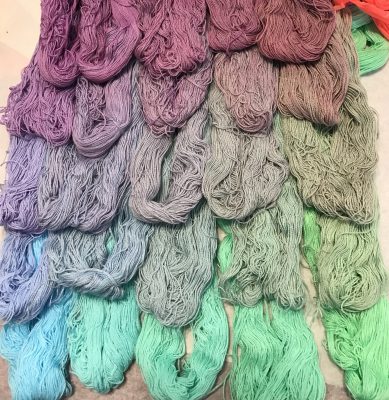
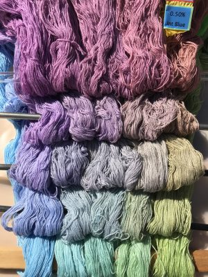
At first glance, the color ranges are similar. But there is a big difference in “feel” – the warm primaries on the bottom produce a much warmer “feel” than the cool ones on top. I hadn’t fully appreciated how big a difference primary undertones can make!
My third realization was about color mixing. Here’s one of my two neutral grays (it may not appear neutral gray on your monitor, but it is in real life). The columns show gradually increasing concentrations of yellow, the rows the concentration of red.
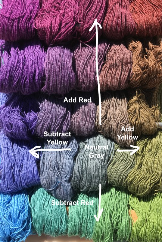
Of course, any class on color theory will tell you that if you mix yellow and purple you get gray in between, since they are complementary colors. And the same for red and green, moving up and down the columns. But seeing this illustrated in real life is pretty darn cool. It also gives me an appreciation for all the shades of color and how one gets to them by mixing colors. I had never thought of “mauve” as “gray with a little extra red/blue” before, or “olive” as “yellow with a tiny bit of purple”. I could, of course, have thought each of those out based on what I know of color theory, but that’s very different from an intuitive understanding of color. All sorts of happy little connections are being made internally, and I feel I have a much better grasp of color now.
My final realization has to do with complementary colors. Here’s the same photo as above, but annotated differently:
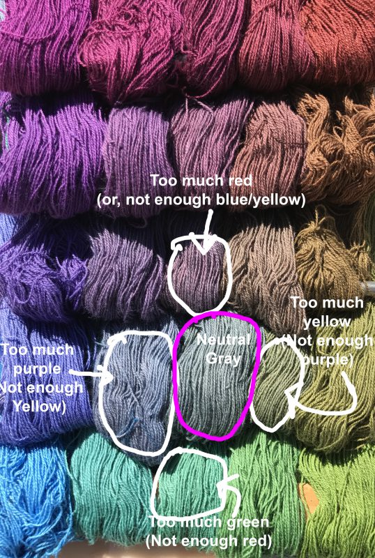
The interesting thing is that I would normally think of the color right above gray as “gray plus a little red”. But it could be seen equally correctly as “gray subtracting a little green”. Similarly, the color to the left of neutral gray might be considered “gray + purple”, but it could equally be seen as “gray – yellow”. And so on.
I’m not sure exactly why this strikes me as profound. If you think about complementary colors, it’s intellectually obvious. But I had never thought of it this way before. Perhaps it’s because it’s difficult to subtract color in fine art media: If you have some gray paint on your palette and you want to make it redder, you don’t try to subtract green paint, because that’s impossible. You add red. So I had always thought in terms of adding one color or another.
But with dyes, sometimes you don’t want to add more of a particular dye color, because you don’t want to change the concentration of dye. So realizing that you can take out a little blue/yellow dye rather than adding more red is a useful realization, I think. It’s certainly a new way of looking at color, and I’m grateful to have it.
I’m now 2/3 of the way through another dye “cube” – this one is Sun Yellow/Mixing Red/Navy Blue. Hoping to post that in another week or two, along with my observations.

Looking great! Getting some good arm muscles?
Hoo yeah. Hauling lots of five gallon buckets around…repeatedly!
What is interesting to me in your last photo is the rust reds and brown colors on the right. Those colors and redder coral – ish colors are harder to mix for me at least.