I’ve been having a lot of fun the last few weeks doing scientific experiments about art. (Hey, you can take the girl out of science, but you can’t take the science out of the girl! Even as an artist, I still work using the scientific method, because I find it so effective.) These science-of-art experiments have mostly been made for my latest Warp & Weave blog post. The post is about how to work with clashing colors. The secret is pretty simple. Clashing colors jar the eye because they contrast strongly, generally in both hue (color family) and value (lightness/darkness). So the solution is simply to reduce the contrast between them, either by adding a transitional color in between (if you are doing warp or weft stripes), or by using a weft that blends them into more compatible colors. (More details in the blog post.)
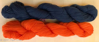
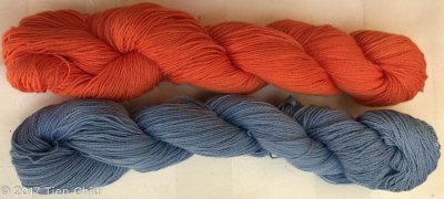
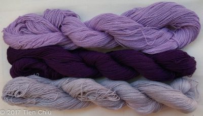
This all makes sense, but to come up with the blog post I had to do quite a few scientific experiments. (Which is what made it fun!). I don’t think I had ever thought deeply about what makes two colors clash before, for example, or to define what it means to clash – up until then, I’d relied on an intuitive definition. Like the Supreme Court justice said, “I know it when I see it.” So I pulled out my collection of 500+ skein leftovers from my dyeing project, and started shuffling colors around, looking at which ones clashed (to my eye) and which didn’t. Then I tried to figure out exactly which characteristics/differences between the colors caused them to clash. I finally concluded that clashing colors resulted from a high difference in value (lightness/darkness) plus a difference in hue (color family), and that while saturation (brightness/dullness) could contribute to clashing, the effect wasn’t as profound as the first two. You can see this in these three photos:
Most people would say the first two yarns clash. This is because these two yarns contrast across all three color characteristics – orange and blue are opposites on the color wheel, the navy blue is much darker than the orange, and the orange is much more saturated (brighter) than the blue.
Many people might still say that the next two colors clash, but to a much lesser degree than the first pair. That’s because the blue, while the exact same hue as the navy blue, has been lightened up to be the same value (light/dark) as the orange.
Most people would say that the purples in the last photo, while high-contrast, do not clash. That’s because they have big value and saturation differences, but no difference in hue.
By coming up with various theories, then comparing and contrasting lots of different pairs of colors to test this theory, I eventually arrived at a set of characteristics that defined the color combinations that appear to clash.
After that, of course, I had to formulate some hypotheses about how to create harmonious cloth with clashing colors, and test those hypotheses. So I pulled out three yarns from my stash that appeared to clash, and did some yarn wraps to test my hypotheses:
And then I wove samples with many different wefts to test my theories on what would resolve the clashing and produce a harmonious fabric:
Most of my theories stood the test, but some didn’t. So then I had to discard the old ideas and formulate new theories, then test the new ones. And then weave more samples to illustrate my points. This research, while fun, also ate a couple days. But lots of people have been saying they find it useful, and that’s a good thing. (If this has piqued your interest, check out the full blog post!)
I’m really enjoying my scientific analysis of color – it’s satisfying a deep-rooted need to explore and explain the world. I was raised by two brilliant scientists, so even though my focus is art, I still have a passion for identifying, analyzing, and then explaining the solution to whatever puzzles I encounter. It’s not as obviously science as technical experiments in neurobiology, but the concept and process are the same. It’s the science of art, and it’s endlessly fascinating.
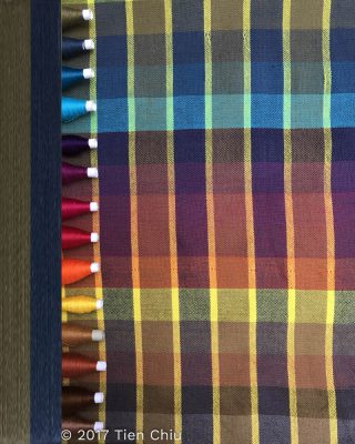
I’ve also been working on an article for an upcoming issue of Handwoven, which will be the “Inspiration” issue. I can’t say much about the article, of course, but here’s a teaser:
I’m currently creating/weaving everything else I need for the article, and it’s coming out beautifully.
Finally, I have one more EXCELLENT piece of news: my wedding dress is going to the Henry Ford Museum in Dearborn, Michigan! This is a huge relief – the dress has been in limbo ever since the American Textile History Museum closed, and I was really worried about its fate. But it looks like it is safe now. I can’t tell you how happy that makes me!


Thank you for your hard work in putting the Warp & Weave blog together. You are making me think more on how I pull my colors together even in Saori style weaving. Be sure to let us know when your dress is in it’s home. I’d love to make that trek to visit the museum. It has a lot more that I would have expected.
Wonderful news about your gorgeous wedding dress! I went to see it in Lowell and thought it was just fabulous and was grateful that you chose to share it with others. A safe new home is just what it needed and even though it’s far from me, I’ll never forget seeing it in person and getting to touch the fabric samples you thoughtfully included in the display.
Tien, you are stepping into a minefield, where others before have struggled. I will try to outline some of the issues.
Dyes are not a pure colour. That a chemical absorbs much of the magenta and cerise in white light to appear yellow, does not mean you have a pure yellow, likewise with the other ‘primary’ dyes you use.
There is a good description in this book related to pigments, where the same issues apply, and also on the author’s web site:
http://www.michaelwilcoxschoolofcolor.com/product/blue-and-yellow/
As a result most of your blended dyed colours are secondary and probably tertiary colour mixes. This makes the opportunity for clashes much reduced. Classic clashes are a primary against the opposite secondary of the same tone, eg yellow and purple, magenta and green, cerise and orange.
The second point is that the eye is not equally sensitive to the three primaries, but most to yellowish green, which makes it easier to spot clashes with this colour. Also the sensitivities change with light intensities. So some colours clash more in some lights. As a result what you see in your light may not be what others see.
https://www.nde-ed.org/EducationResources/CommunityCollege/PenetrantTest/Introduction/lightresponse.htm
Colour and its effects have been widely studied for many years, and in my opinion one of the best summaries is Gerritsen, Theory and Practice of Colour (there is a better one by a French author published by Archetype (web site not working), but I can’t remember the details as the book is at home, and I am not!)
However when it comes to weaving to manage the clashes; fantastic.
It’s wonderful news about your wedding dress. So happy for you that it will be in a permanent collection.
I love the fact that you are a scientist doing all these experiments and sharing them. I have found that many weavers are either scientists or mathematicians. They see things in a different light than many of us wouldn’t see them from structure to color. And even the way they wind a warp and put it on the loom! It opens a whole new world. Thanks so much for doing this blog. Looking forward to your article in Handwoven.
I found your blog by searching for schact factory tour. Very nice. Apparently I need to name my Mighty Wolf loom LOL. I have spun some fiber I want to weave to make a jacket. I’ve seen some pretty cool things made out of rectangles. I don’t more of a jacket look vs a shawl look so I thought I would check out your blog.
Hi Patty! Consider the cocoon jacket – it’s made from a rectangle and can be quite attractive.