I’m teaching two classes in June, at ANWG – a workshop on color mixing and a seminar on how to choose colors and weave structures for painted warps. (You can register for either of them here. Friday’s morning’s talk on painted warps is already full, but last I heard there were still spaces in the workshop and in the afternoon seminar.)
Since I’ve been too foggy-headed to do much work on Color Study #5 for the workshop, and I need to create some more examples for the painted warp seminar, I’ve been brainstorming painted warp samples instead.
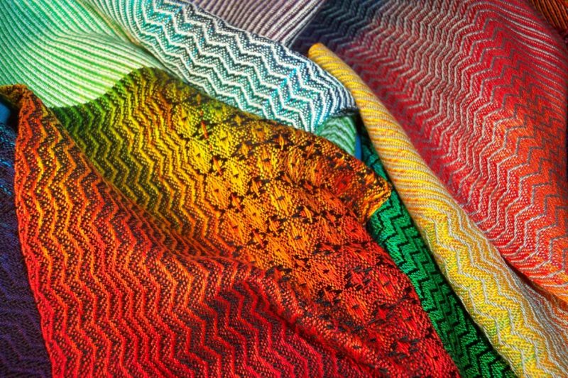
I already have one set of samples, which Laura Fry wove for me, and which are winging their way to me as I write. They are woven on a warp that I had previously dyed in rainbow colors, in a variety of structures and with carefully chosen weft colors, and are lovely:

However, since I didn’t plan out the warp colors in advance, they don’t fully demonstrate the principles that I want to illustrate. So a second set of samples will be needed.
There are two approaches to sampling. The first is the exhaustive, information-gathering approach. This is where you have no hypothesis and are trying to develop one by gathering data, so you try every possible combination and then develop a theory to fit the data. (Cue 1,500 dye samples.) This is incredibly labor-intensive, but sometimes it’s got to be done.
I had originally planned to take this approach to painted warp sampling, because I didn’t have a solid theoretical basis for color. I thought up all the color and weave structure combinations that I thought would be useful to try, and came up with about 1,500 of them. Clearly this was not going to fly.
Fortunately, after another year and a half of study, plus teaching the first half of the Color Courage for Weavers Workshop course (it’s amazing how much more you learn through teaching), I now have a solid understanding of how color works in weaving. Very solid. I won’t claim to understand everything about color (nobody ever understands everything about anything), but at this point I think I understand enough about color in weaving to solve almost all the common color problems in weaving, or explain why the problem isn’t resolvable. (As in physics, no matter how much you know, you still can’t do the impossible.)
Since I now know more, I can take the other approach to sampling, which is testing a hypothesis. This is where you say “I think X will happen if I do Y, and will do a sample to see if this is true.”
So now I’m formulating samples to demonstrate known principles, rather than doing samples in order to figure out the principles.
Suddenly, I’ve gone from 1,500 samples to 44. Whew!!
Here are some of the principles I’m planning to demonstrate:
- Warps with a wide range of values (i.e., that contain light, medium, and dark values) will make pattern appear/disappear in areas, no matter what weft is chosen.
- Warps with a narrower range of values (i.e. all light, all medium, all dark, or combinations of any two) can be made to have bold or subtle pattern depending on choice of weft colors and weave structure.
- Warps made with colors that fall between two primaries (primaries here are cyan (turquoise), magenta, and yellow) will allow you to choose a weft that preserves the bright colors while blending with everything else – warps that don’t, will blend into duller colors if woven in a structure that blends colors.
- If your colors blend into dull colors, choosing a weave structure that separates warp and weft colors as much as possible (by creating warp dominant and weft dominant areas but not 50-50 mixes) will allow you to preserve the bright colors in your painted warp.
- To show off painted warps, use a weft that is the same darkness or darker – a lighter weft will tend to draw attention to itself, pushing the painted warp into the background.
The ANWG seminar will likely form the nucleus for an online course about weaving with painted warps. It probably won’t be released for awhile yet, though – I’m planning to revamp my Color Courage for Weavers online course offerings and the painted warp course will definitely have to wait until after that work is done.
I’ve chosen the colors for the samples and am currently debating drafts. The simplest choice would be a plain twill plus twill blocks, which would probably resonate with students who prefer simpler structures. The twill would demonstrate what happens when you pick a structure that blends colors, and the twill blocks would demonstrate what happens when you mix colors. Simple and neat.
However, I’ve woven miles of twill and twill blocks for my other samples, and I’m desperately bored of both structures. I also want to demonstrate that you can weave sexier structures than those. So I’m thinking of using these two drafts, which I was using to demonstrate optical mixing and simultaneous contrast in my Color Courage for Weavers Workshop course a few weeks ago.
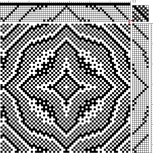
Here’s the first draft, from Handweaving.net (contributed by an anonymous visitor). It demonstrates what happens when you blend colors:

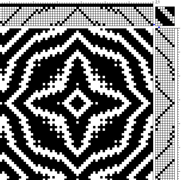
And here is the same draft with a different tie-up, demonstrating keeping colors separate:

Kathy Fennell (one of the course participants) wove up both drafts, and they look quite nice in real life. They need very different setts, of course, but they look good enough that I think they would work to demonstrate the principles. And it’s a nice touch that they are the same design, except that one is subtle and the other bold.
The only thing I worry about is that they will look too complex and will intimidate some students. And 44 samples in that one weave structure is a LOT! Perhaps I will rethread to something different, halfway through.
Meanwhile, the cold is starting to improve, so I’ll be back at work on Color Study 5 for Color Courage for Weavers – Workshop later today.
Color Study 5 is about visual complexity/busy-ness, which is basically how much effort it takes for the brain to take in/process a piece. It’s a juicy topic, and I’m starting with an explanation of how the brain processes an image – any image. Which, in turn, starts with some observations about what our visual system evolved to do. It’s really cool stuff.
For example, our eyes are irresistibly attracted to areas of high contrast, particularly light/dark contrast. Our eyes go to areas of high contrast first, and as designers we need to be aware of that/take advantage of that in when designing, to focus the eye where we want it. But why is that? It’s because the eye is physically built for edge detection, finding and signaling edges before data even goes to the brain. The stronger the contrast, the louder the signal. That’s because early detection of edges helps the brain distinguish pattern from ground (objects from background) faster. And that, in turn, enables us to detect food and predators faster and more efficiently.
There are other factors related to our evolution that affect how we view an object, and how the brain processes what we see. That, in turn, influences how we need to design.
Do my students need to know all that information about human evolution before they can design effectively? Technically, no. I could just list off the important factors and tell them to design using those factors. But I believe that giving them the why is important, because it enables them to do more than memorize – it enables them to think for themselves, to reason about other factors that I may not be giving them. For example, if they encounter a diagonal line, they might say, “Aha! And how would the primitive brain react to diagonal lines in nature? What diagonal lines might it encounter?” and get insight from that.
When I was sixteen, I went to a summer program that taught the process of mathematics – not just facts, but the intellectual explorations involved in doing mathematical research. The motto of the program was “Think deeply of simple things.”
And that’s how I approach teaching – not just what, but also why.

OMG!! Impressive