I’ve spent the last few days painting my warps. Five warps, actually, though only two warps after they go onto the loom. Four of them are going onto Grace as a single sample warp. It will be double weave, three warps going as bouts in a single layer side by side, and the other in the bottom layer. The other is going onto Maryam, as one layer in double weave, with the other layer in black, as the “art warp”.
Today I’m going to talk about the process for Maryam’s warp, the “art warp,” as Grace’s warp is way more complicated to explain and I think it will be easier to explain once the warp is actually on the loom. So here it is.
The conventional way to paint a warp is to stretch it out on a table and paint it crosswise in stripes of solid color. This produces horizontal banding of solid color, kinda like this:
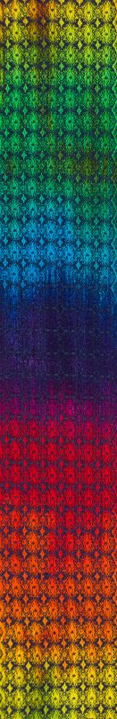
This is pretty, but not at all what I wanted. I wanted a warp with random variations in color, in all the colors of fire, like the orange splotches in this swatch:
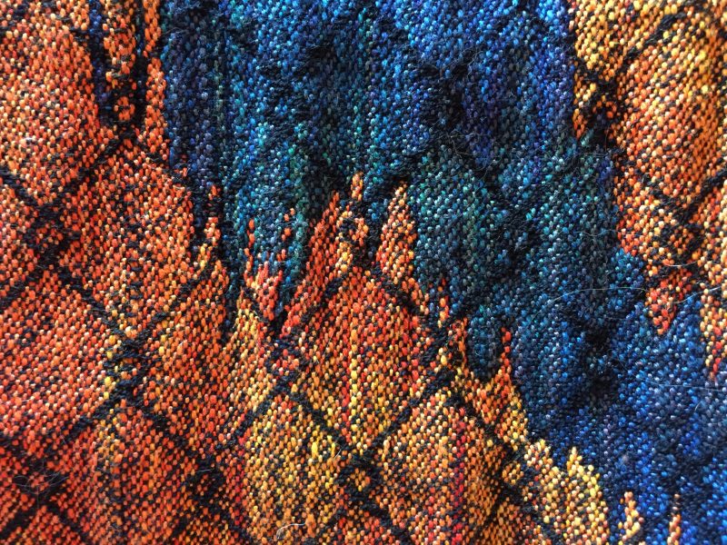
To achieve this effect, I used threads of different size and different fiber types, so they’d absorb the dyes differently and also have physical texture due to the different thread type. So I set out to do the same with this warp.
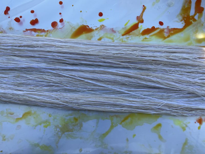
I wound the warp with one strand of natural (unbleached) 10/2 cotton, which is about 4200 yards per pound, one strand of bleached 20/2 cotton (8400 yards per pound), one strand of 4-ply silk cord (8500 yards per pound), and one strand of natural 60/2 silk (15,000 yards per pound). Scoured, soaked, and stretched for dyeing, it wound up looking like this (luscious!):
To get the variegated effect I was after, with patches of subtle shading, I painted it with four colors: lemon yellow, gold, orange, and diluted scarlet. I wanted the overall color to be yellow-orange, and I wanted a lot of color blending. I diluted the scarlet because I know from experience that scarlet is a strong color, and also that orange is a mix of 80-90% yellow/gold and about 10-20% scarlet, so if I wanted orange-red I needed very little scarlet indeed!
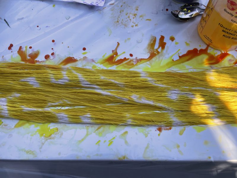
I started by applying splotches of lemon yellow. You start by applying the weakest color, mixing-wise, because as you apply more color, the brushes will pick up previous colors and contaminate the colors in the bucket. If I’d started with scarlet, the brush in subsequent colors would have picked up bits of scarlet from the warp and dumped it into the lemon yellow, turning it into orange in no time flat. I didn’t want that, so I started with lemon yellow to keep it pure. Scarlet will barely notice if you add lemon yellow or orange to it, so I put it last in the queue.
Here’s the warp after applying the lemon yellow:
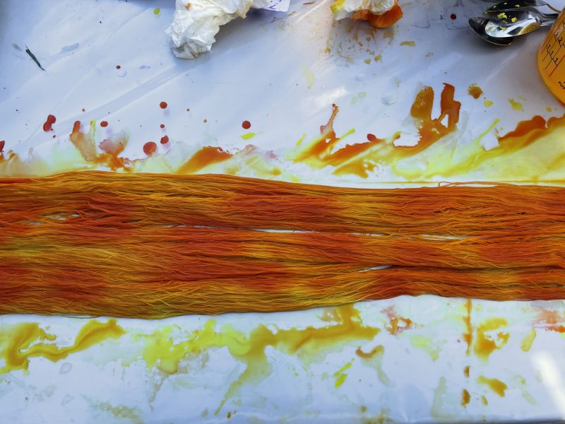
Next I added splotches of gold dye. I applied these two colors very heavily because I wanted to make sure there was no white left in the warp, and both these colors are relatively weak relative to orange and scarlet. If I soaked the warp in gold and yellow and then added a bit of orange and scarlet, the warp would wind up yellow, orange, and scarlet; if I tried using orange, gold, and yellow in equal proportions, the orange would overwhelm the gold and yellow, producing a warp that looked almost entirely orange. If I added scarlet in equal proportions, it would overwhelm everything else. So: mostly gold and yellow, first.
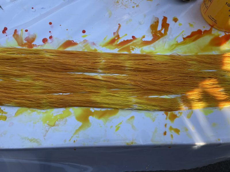
Now it was time to apply the orange. Because orange is so much stronger than yellow, and because the warp was already quite soaked with dye at this point (encouraging the dye to “run” along the length of the warp), I dabbed on only bits of orange here and there:
If I had stopped here, the orange would have run slightly but there would have been distinct patches of pure orange dye. This is not what I wanted. I wanted a blended look. So I quickly squooshed (that’s a technical term 😉 ) the warp with my fingers to distribute the dye before it had a chance to bond much.
Here it is after squooshing:
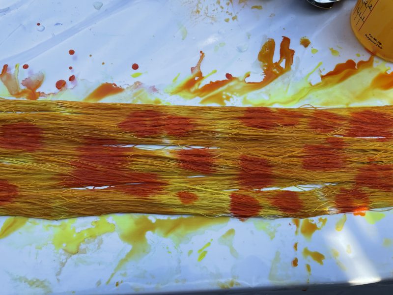
This warp is fine so far as it goes, but it lacks a feeling of emotional tension. It could use a trace of something a little darker to add a bit of value (light/dark) contrast. Enter the scarlet:
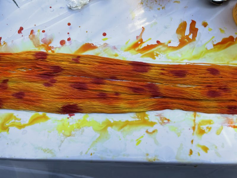
You’ll notice I kept the dots of scarlet quite small. That’s because they are supposed to be dots of shadow, sort of like highlights but in reverse. I didn’t want them to be a big part of the design.
Of course, now the warp looks like it has measles. Worse if you look at the whole thing:
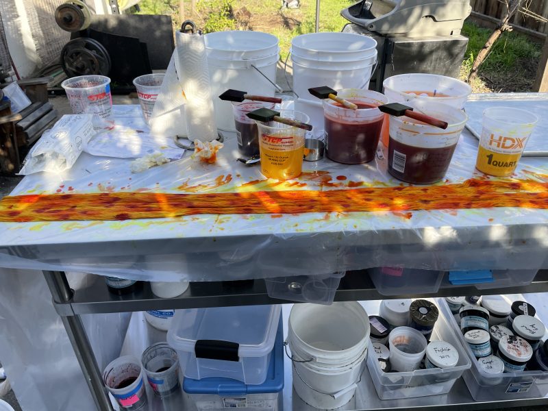
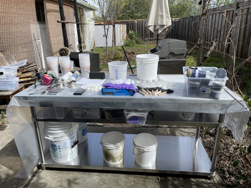
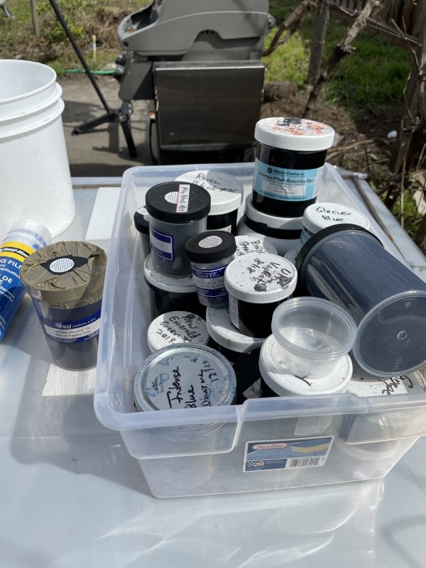
(You’ll notice that the dye “studio” now looks like a total mess. I told you that neat look would last about ten seconds!)
The cure for warp-measles, of course, is more squooshing. The sooner, the better.
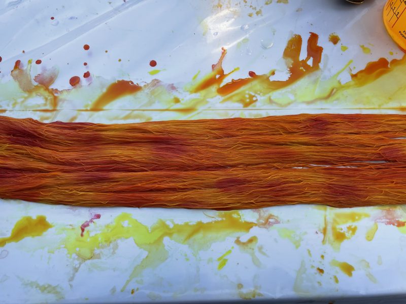
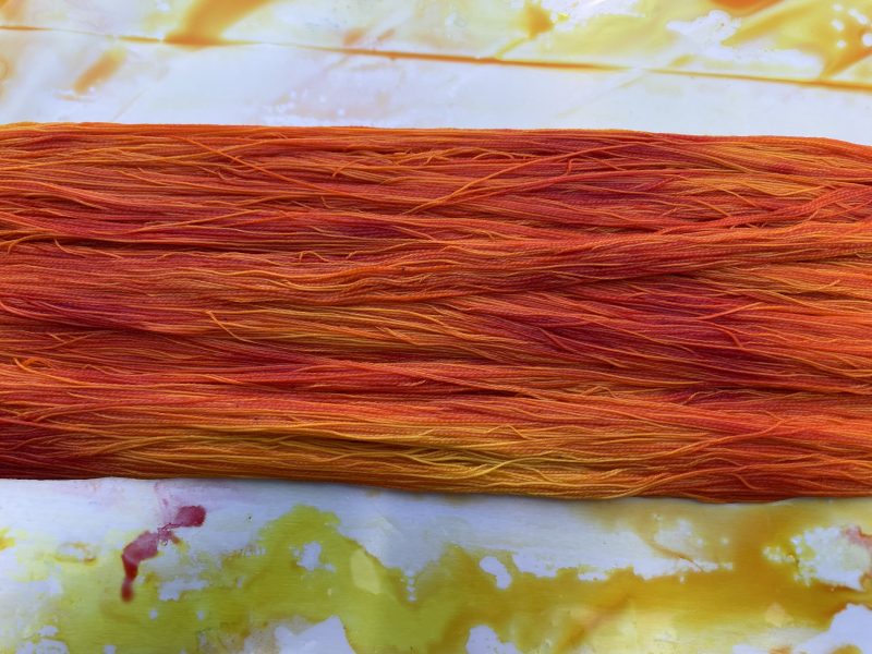
When you paint a warp, you always want to flip it over to check for white spots. I flipped it, touched up the back with more dots of yellow, orange, and scarlet (mostly orange and scarlet – there was plenty of yellow), and squooshed again. Then I flipped the warp back to the front. By this time, the scarlet was becoming very nicely distributed:
Now I was done painting that section of warp, and ready to pull the next section up for painting. To keep it under control, I chained it – essentially, crocheting it – like this:
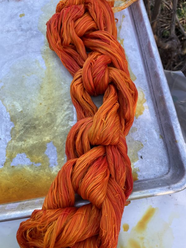
You would NEVER EVER EVER want to do this with a conventional painted warp because the colors would bleed all over and contaminate each other, but with this particular warp, I wanted color blending, and the colors all blend gracefully, so it made sense to chain the warp. Chaining it helps keep the warp threads aligned and prevent tangling later.
Here’s the finished warp:
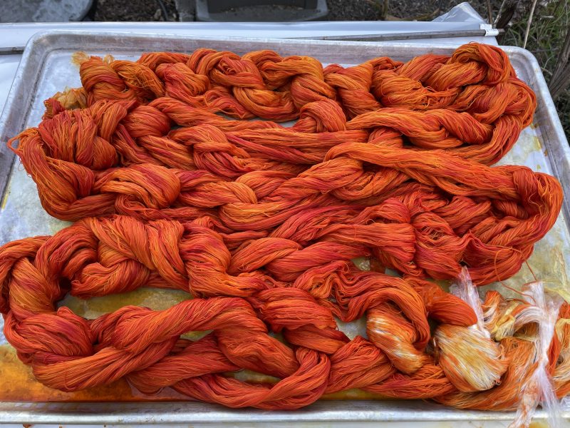
You may be wondering about the white part. That’s the back end of the warp, which won’t be woven because it’s loom waste – the part that is stuck in the heddles at the end and can’t be woven. Dyeing it would be a waste of time and dye, and leaving it undyed makes it easy to identify which end of the warp is which.
I finished yesterday afternoon, which means I can start rinsing the warp later this morning. Because fiber-reactive dyes are so tenacious, rinsing is a 1-2 day process. Looking forward to seeing what it’s like once it’s fully rinsed-out and dried!