Tien Chiu

  • Home
  • About
    • Honors, Awards, and Publications
  • Online Teaching
  • Gallery
  • Essays
  • Book
  • Blog
  • Dye samples
You are here: Home / Archives for autumn splendor

March 14, 2011 by Tien Chiu

Beginning the design process

With Kodachrome nearly done (just the sleeve and hat linings remaining), I’m starting to think about the next project, which will be an outrageous couture costume of some sort, designed to show off some of the unique things handweaving can do.  I have spent several days poring over the couture collections from the last few years, plus some fashion books that Sharon loaned me.  So many design options!  Elegant, or convoluted?  Colorful or understated?  Floofy or straight?  Suitable for everyday wear, or outrageous?

Well, ok, you know me.  While I might change my mind, this outfit will be a tribute to my AIDS Lifecycle costumes.  Which is to say, totally outrageous.  Brilliant colors.  Probably floofy, though I may not go tutu-short.  Definitely not something to wear on the street!

So now comes the design process.  I’m struggling a bit with the wide variety of designs – there are so many I like! – so I’m thinking I may come at it another way, by thinking about the weaving and sewing techniques I might want to use, and how they might roll up into a finished piece.

Here is one example that I think looks promising:
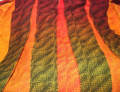
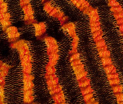
pleated stripes
pleated stripes

This is left over from an unsuccessful project (on the same warp that gave birth to the Liquid Fire and Black Fire shawls).  I like the “moth” effect – the dark colors that, when the wings are spread, show a startlingly bright color underneath.  My one concern is that the pleating will tend to be bulky at the top.

Other possibilities include:
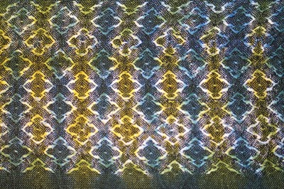
woven shibori
woven shibori
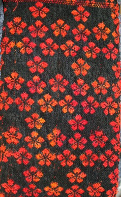
woven imagery - diversified plain weave (but could be taquete or other tied weaves)
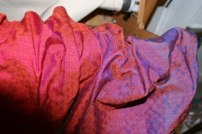
woven iridescence
woven iridescence
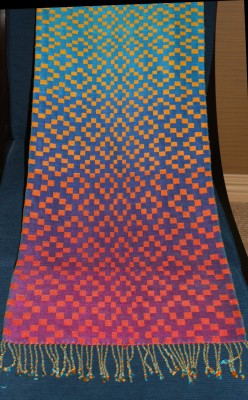
gradient colors
gradient colors
collapse weave
collapse weave
painted warp
painted warp

There are, of course, infinitely more possibilities, and I will probably use some techniques that aren’t on the list, but I am looking specifically for techniques that are specific to handweaving, that can’t be gotten in other ways.  (This is, of course, an arbitrary decision, but I like the idea of showing off the things handweaving is uniquely capable of.)

That narrows the field down a bit.  I am going to let things percolate a bit.  It is still overwhelming, but perhaps a bit less completely so.

Sharon asked about the cashmere coat.  It is still “on hold”.  I had planned to work on it after Kodachrome, but I’m feeling a bit burned-out on sewing right now.  I want a break to design and weave.  So it will probably be next year before I come back to it again.

The other projects – the tencel warp that is currently on the loom, and the tiger eye yardage that I’ve started winding – will get done as well.  I figure I can weave those up while sewing the muslins and designing the fabrics for the handwoven couture project.
Filed Under: All blog posts, textiles, weaving Tagged With: autumn splendor

March 15, 2011 by Tien Chiu

Space aliens?

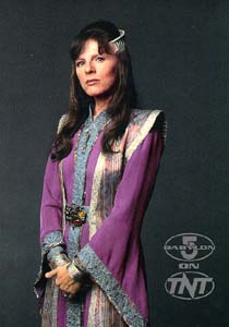
I was flipping through fashion plate after fashion plate and feeling rather despondent about my design process, when I suddenly remembered a design that I’d absolutely loved!  It’s from the science fiction TV series Babylon 5, and it’s the ambassadorial robes worn by Delenn, the Minbari ambassador to Babylon 5:

Delenn, the Minbari ambassador to Babylon 5

Let me start by saying that I adore Delenn.  She’s smart (both in IQ and street-smarts), she’s empathetic, she’s got the courage of her convictions, and she totally kicks ass when she feels like it.  And she’s the best-dressed person in the entire show.  What’s not to like?

I’d describe her outfit as a split tabard integrated into a fitted, flowing robe.  This design has some major advantages for what I’m doing:

  • It’s mostly flat fabric, which shows off handwoven patterns very well
  • It’s a layered garment, so I can weave/show off several different fabrics in the same garment
  • It’s simple, which means the focus will be on the fabric and the wearer, not the construction
  • It’s also probably not that hard to draft the pattern for ““ important since I don’t have much experience in pattern drafting
  • And, of course, it’s beautiful!

(I will also admit, cheerfully, that I’ve fantasized about wearing something like Delenn’s outfit for ages.  As good a reason to do it as any, I suppose!)

I do want to make some alterations to the design ““ mostly so nobody says, “Didn’t I see that outfit at the Minbari embassy’s tea party last week?” –  but haven’t figured out what yet.  I seem to have a severe lack of imagination when it comes to fashion design ““ I know what I like and don’t like, but don’t seem to be able to visualize changes in a design.  I’m going to correct that by studying the basics of fashion illustration ““ if I can draw it, I can visualize it!

Filed Under: All blog posts, textiles, sewing Tagged With: autumn splendor

March 21, 2011 by Tien Chiu

Patience, and some answers

With Kodachrome winding down, it’s time to move on to the next project.  I am trying to be patient with the creative process, and not start working on a design too soon – I don’t feel fully comfortable with my current options, so it needs to percolate some more.  But it is difficult, because I don’t tolerate open-endedness very well; I want decisions made so I can move on.

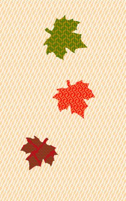
Right now I am developing two ideas: the Delenn costume I posted about two days ago, and a vision of falling autumn leaves.  I think it would be fun – and technically quite interesting – to use the cellulose/animal fiber yarn trick to make patterned maple leaves against a background of a different color.  I’m envisioning using metallic fibers and maybe some metallic gold paint to outline the veins of the leaves as they drift towards the ground.  This would be a neat combination of weaving and surface design that exploits the better parts of both.  This assumes the technique works at all, of course – I need to experiment to find out!

How this fits into the Delenn costume I’m not sure.  I am tentatively thinking that the leaves could fall down the front of the long vest and also down the back of the outfit, but as the vest is fairly narrow I don’t know if it would allow enough space to give the leaves some “motion”.  I might have to widen it, or abandon it entirely. The other problem is that the motion and line of the leaves carries the eye down to the bottom, and I want to focus attention at the top, nearer the wearer’s face.  (Because shoes are just not that interesting!)  I think I can do it by adding something interesting at the top – perhaps a branch full of leaves, perhaps not.  More design concepts to work out!

I am trying hard to give these ideas (and the experimentation needed to implement them) time to mature.  Somewhere in the back of my head, however, is a voice shouting that the project needs to get started now or else it won’t be done in time for Convergence or CNCH, next year’s two most likely show venues.  I am doing my best to ignore it – I don’t think rushing things will improve the work, and that is more important- but have to admit that yes, it may not complete in time for either show.  There are too many new techniques I need to explore to pull off what I’m currently envisioning! and couture takes time, so this may be a year-and-a-half project.  Oh well.  There’s always next time.

Meanwhile, I have discovered a wonderful book, Artwear, by Melissa Leventon, former textiles curatrix for the Fine Arts Museums, and (curiously) the woman who appraised my wedding-dress.  The book is basically an art history of art-to-wear! which is exactly what I have been wanting/needing.  I bought it expecting only  pretty pictures but am thrilled to find a book jam-packed with useful information.  I am starting to understand art vs. fashion a lot better now.  Leventon mentions in passing that fashion is more about the interaction of the clothing with the body and personality of the wearer.  That suggests to me the division line between wearable art and fashion is that wearable art is more about the artistic statement and fashion is more about, as she says, the interaction of clothing with the wearer.  Obviously it is not a strict dividing line, more like two poles on a continuum, but it’s a  good place to start.

Meanwhile, answers to some questions:

Mary asked how I had changed my rhythms to suit the CompuDobby IV.  I have essentially decoupled the treadling from the movement of the beater.  Previously, I had changed sheds exactly as the beater hit the fell: down-up in the flash of an eye.  Now I change sheds as the beater is headed towards the reed: down, start-beater-moving, up.  The shed is still fully open by the time the beater reaches the reed and I throw the shuttle, so it doesn’t slow me down, but it does slow the changing of the sheds just enough to suit the CompuDobby.

Michelle asked if I ever sleep!  Yes, I do, but because I’m a morning person (and wake up if exposed to light), I usually get up between 5 and 5:30am.  This lets me do my morning blog post before everyone else gets up.  (You’ll notice that you don’t typically hear from me late at night!)  I like working this way both because I’m at my best in the morning and because, since I get up before any sane human does, it gives me several hours of peace and quiet before I have to be anywhere or do anything.  This lets me get a lot more done than if I got up later.

Filed Under: All blog posts, textiles, weaving Tagged With: autumn splendor

March 25, 2011 by Tien Chiu

Devoré

The tencel warp is drawing to a close – I’m guessing there’s only another yard or two that can be woven – and I am starting to think about what comes next.  I want to do more work with the “Autumn Splendor” theme – developing the concept into something more concrete, something I can actually embody.  Right now I have a vision of falling maple leaves, glimpses of gold glitter, and brocade over flowing silk.  I have to figure out how to transform that into something I can actually make.

One of the ideas I have been playing with is the transient nature of autumn.  As a child, I was fascinated by the leaf bookmarks that my parents would bring home from Taiwan – leaves treated with acid to burn away the soft parts, leaving only the spidery, skeletal veins.  It reminded me a little of the decorations people put up around Halloween – except this was a skeleton leaf, not a skeleton person.  Same thing: beauty in transience, delicacy in death’s remnants.

So I really liked the idea of “ghost leaves”, skeletal remnants of a woven design suggesting a leaf.

Skeletal remnants of a woven design, of course, leads directly to devoré, a technique in which the cellulose components of a fabric are “burned out”, usually with sodium bisulfate, leaving only the protein/synthetic components.  It’s frequently used with silk/rayon velvet, burning out the rayon pile in patterns while leaving the silk “backing” intact.  Anne Field has written a book on devoré for weavers and knitters, which was really helpful, and Holly Brackmann has done considerable work with devoré in handweaving, plus written a book on surface design techniques.  She was gracious enough to give me some advice.

Based on that I’ve decided to try using cotton-wrapped polyester thread to make my “skeletal leaves”.  It’s apt to be stronger and finer once burned out than a blended yarn, and because the yarn stays intact, it won’t produce a ragged edge in the burnout areas.

The ideas that I am gradually developing, if I had to put them in words, would be:

  • beauty in death/transformation
  • the ghostly “veil” between worlds
  • secrets revealed when covering is burned away

And here, plucked from my Evernote notebook, is what I am envisioning:

Something fancy using devore and double weave – for example, a rusty orange-and-metallic gold backing layer (in silk or another protein fiber), with a black layer on top of that.  Weave the top layer (black) in a cotton-covered polyester yarn.  Burn out the cellulose content to reveal the double weave layer underneath.  Could get some interesting leaves that way!

I’ve spent some time the last few days contemplating how exactly I would achieve that, and came up with some more scribbled plans in Evernote:


Description for sample:
  • Basic cloth is stitched doubleweave:
    • top layer:
      • warp: deep brown cotton-wrapped polyester, dyed before weaving.
      • weft: medium (warm) brown cotton-wrapped polyester, dyed before weaving.  Possibly space-dyed for very minor color variegation, possibly not.
      • Structure: network drafted with long curvy lines, reminiscent of a leaf’s path as it falls.
    • bottom layer:
      • warp: white 60/2 silk.
      • weft: pre-dyed rusty brown 2/60 nm wool, stranded with metallic gold weft.  Or maybe just a metallic gold weft, need to experiment.
      • Structure: unknown.  Something that would go well with maple leaf design.
  • Treatment post-weaving:
    • Simultaneously devoré and dye remaining polyester on top layer:
      • Mix disperse dyes with burnout compound, two or more colors
      • Paint or stencil onto top layer (doesn’t matter if it gets on bottom layer) in maple-leaf shape
      • Iron to burn out cotton and dye polyester.  This reveals the bottom fabric.
    • Dye bottom layer:
      • Use fiber-reactive dyes to dye the silk in colors that will contrast with the solid rust brown weft: brilliant red, golden yellow, etc.  This will also dye the top layer but, because the top layer is dark already, it shouldn’t result in much more than a little bit of visual texture.
      • It may make sense to predye the warp a base color (golden yellow?) and then do a scrunch-dye (or stitched shibori) with tightly bound fabric, to produce sharp lines – reminiscent of veins in maple leaves.

I’ve since sketched out the ingredients needed for this witches’ brew in my notebook, and drawn up a list of the steps required.  It will take considerable time to create and experiment with the samples, but I think the end results will be pleasing.

I won’t be able to get started on this, of course, until I actually get some polyester/cotton thread to work with.  So this weekend will be a relatively quiet one – finish weaving off the tencel warp, sew the label into Kodachrome, write a promised article for Complex Weavers Journal, and review some DVDs from Interweave Press.  And start designing the draft for the devoré doubleweave, of course!

Description for sample:
  • Basic cloth is stitched doubleweave:
    • top layer:
      • warp: deep brown cotton-wrapped polyester, dyed before weaving.
      • weft: medium (warm) brown cotton-wrapped polyester, dyed before weaving.  Possibly space-dyed for very minor color variegation, possibly not.
      • Structure: network drafted with long curvy lines, reminiscent of a leaf’s path as it falls.
    • bottom layer:
      • warp: white 60/2 silk.
      • weft: pre-dyed rusty brown 2/60 nm wool, stranded with metallic gold weft.  Or maybe just a metallic gold weft, need to experiment.
      • Structure: unknown.  Something that would go well with maple leaf design.
  • Treatment post-weaving:
    • Simultaneously devore and dye remaining polyester on top layer:
      • Mix disperse dyes with burnout compound, two or more colors
      • Paint or stencil onto top layer (doesn’t matter if it gets on bottom layer) in maple-leaf shape
      • Iron to burn out cotton and dye polyester.  This reveals the bottom fabric.
    • Dye bottom layer:
      • Use fiber-reactive dyes to dye the silk in colors that will contrast with the solid rust brown weft: brilliant red, golden yellow, etc.  This will also dye the top layer but, because the top layer is dark already, it shouldn’t result in much more than a little bit of visual texture.
      • It may make sense to predye the warp a base color (golden yellow?) and then do a scrunch-dye (or stitched shibori) with tightly bound fabric, to produce sharp lines – reminiscent of veins in maple leaves.

Filed Under: All blog posts, textiles, dyeing, weaving Tagged With: autumn splendor

March 27, 2011 by Tien Chiu

Simulation, and sample prep

It has occurred to me that perhaps I don’t have to do double weave for my devore.  In fact, I’ll get a more interesting effect if I weave a separate fabric to hang behind the devore, and just tack them loosely together in spots so the two layers can shift slightly as the wearer moves.  This will give additional “motion” and variation to the leaf motifs, and will free me from some of the constraints imposed by using double weave.  Currently I am visualizing something like this:

simulation of handwoven and cross-dyed devore leaves, two layers

(You’ll have to imagine the layers shifting as the wearer moves.)

The top layer is the white and beige wavy pattern, burned out in areas to reveal the brightly colored bottom layer.  Cross-dyeing will allow me to have the different leaf colors, and of course it is easy to change structures in sections of the fabric as long as the threading remains the same – so I can have wholly different patterns in each of the leaves.  I’ll almost certainly use different weave structures, but you get the idea.

(I posted to a couple of mailing lists, by the way, and found out the correct name for the technique I’ve been calling “differential dyeing” is actually “cross-dyeing”.   So that’s what I’ll use from now on.)

Actual weaving of samples is on hold, alas, until I get some cotton-wrapped polyester thread in.  As the cheapest source I’ve found is in Georgia, it may take some time for it to arrive.

Meanwhile…

I have finished weaving off the 13-yard tencel warp, mostly in alpaca weft, in eight or nine patterns.  I have decided to cut up my samples, which are mostly 12×18″ after wet-finishing, into eight swatches approximately 6×4.5″, and do eight test-dyes on each sample.

Here are the eight things I want to try:

  1. Low contrast fiber-reactive and low-contrast acid dye
    1. Scrunch-dye in turquoise and blue fiber-reactive dye
    2. Scrunch-dye in fuchsia and fuchsia-violet acid dye
  2. High contrast fiber-reactive, low-contrast acid dye
    1. Arashi shibori in fiber-reactive dye, blue
    2. Scrunch-dye in fuchsia and fuchsia-violet acid dye
  3. High-contrast fiber reactive, high contrast acid
    1. Arashi shibori in fiber-reactive dye, blue
    2. Solid color acid turquoise dyebath
    3. Arashi shibori in fuchsia dye
  4. Imagery: low contrast fiber-reactive background, simple figure on low-contrast background in acid dyes
    1. Scrunch-dye in brown and black fiber-reactive dye
    2. Scrunch dye yellow and red acid dyes
    3. Stencil brown maple leaf (inverse or regular) with acid dyes
  5. Imagery: low-contrast fiber-reactive background, complex figure in acid dyes
    1. Scrunch-dye in turquoise and blue fiber-reactive dye
    2. Stencil horse or silkscreen running tiger in acid dyes
  6. Imagery: simple figure in fiber-reactive dyes overlapping simple figure in acid dyes
    1. Stencil inverse maple leaf in color turquoise, fiber-reactive
    2. Stencil maple leaf in color fuchsia, fiber-reactive
    3. Stencil inverse maple leaf, overlapping, in color purple, acid
    4. stencil maple leaf in color yellow, overlapping, acid
  7. Imagery: simple figure in discharge paste on a complex background
    1. Scrunch-dye in turquoise and blue fiber-reactive dye
    2. Scrunch-dye in fuchsia and purple acid dye
    3. Apply discharge paste using DIFFERENT maple leaf stencil, discharge color
    4. Using dye stencil, stencil in yellow/red in fiber-reactive and acid dye
  8. Imagery: complex figure in discharge paste on simple background
    1. Scrunch-dye in turquoise and blue fiber-reactive dye
    2. Scrunch-dye in fuchsia and purple acid dye
    3. Apply discharge paste using DIFFERENT complex stencil (a second running tiger?), discharge
    4. Dye (or not) using contrasting colors, as appropriate.

I spent this afternoon writing up detailed instructions for myself, so I’ll be able to work efficiently once I get started.  I also cut most of the samples up into squares – eight fairly complex patterns plus a 3/1 twill and a 2/2 twill will give me eight dye patterns on ten weave structures, for a total of 80 samples from this batch.  (The mind reels!)

Anyway, tomorrow’s primary focus will be finishing the first dye run, which will be fiber-reactive dyes.  There will be a total of five dye/discharge processes in this set of samples – fiber reactive, followed by acid, followed by discharge, followed by redyeing one set of samples with both acid and fiber-reactive dyes.  So I expect this to take me all week.  Complicated, but fun.

Filed Under: All blog posts, textiles, dyeing, weaving Tagged With: autumn splendor, cross dyeing

Next Page »

Subscribe to Blog via Email

Information resources

  • Dye samples
    • Procion MX fiber-reactive dye samples on cotton
    • How to "read" the dye sample sets
    • Dye sample strategy - the "Cube" method
  • How-Tos
    • Dyeing and surface design
    • Weaving
    • Designing handwoven cloth
    • Sewing

Blog posts

  • All blog posts
    • food
      • chocolate
    • musings
    • textiles
      • dyeing
      • knitting
      • sewing
      • surface design
      • weaving
    • writing

Archives

Photos from my travels

  • Dye samples
    • Procion MX fiber-reactive dye samples on cotton
    • How to "read" the dye sample sets
    • Dye sample strategy - the "Cube" method
  • Travels
    • Thailand
    • Cambodia
    • Vietnam
    • Laos
    • India
    • Ghana
    • China

Travel Blog

Entertaining miscellanies

© Copyright 2016 Tien Chiu · All Rights Reserved ·


Loading Comments...