Tien Chiu

  • Home
  • About
    • Honors, Awards, and Publications
  • Online Teaching
  • Gallery
  • Essays
  • Book
  • Blog
  • Dye samples
You are here: Home / Archives for color study

October 6, 2018 by Tien Chiu

More than my weight in weasels

101 days ago, I was a couch potato. Today?

Tien squatting 195 pounds

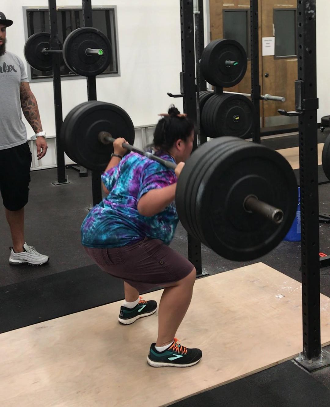
That’s me squatting 780 weasels (195 pounds) – more than my body weight!

And here’s me at 99 days, deadlifting 700 weasels (175 pounds):

That kind of improvement exceeds my wildest expectations – in fact, it sounds like something you hear about in an ad on late-night TV. You know, “I was a 48-year old couch potato…but after 101 days of Weasel-Power! Boot Camp, I was squatting over 780 weasels!” That would totally have me going out and buying their Weasel-Power video series and their “Weasel-Flex” exercise widget! (For the more gently minded, of course, there would also be “Weasel Yoga – Make yourself supple as a weasel!”. Or – for you digital folks – the electronic game with social media leaderboards, “Wea-Fit”.)

But the amazing part (to me) is that I’ve made this massive improvement without a single injury. I’ve had plenty of muscle soreness, and I’ve tweaked my wrist, shoulder, etc. a few times, but no major injuries and no soreness lasting more than a few days. This kind of improvement isn’t my expertise and certainly isn’t luck: it’s having an excellent trainer. Touissant has done a fantastic job of encouraging me to push as hard as I can without going beyond my physical limits (general or from minor injuries), and helping me improve my form so I can lift more efficiently while staying safer.

Just as importantly, working with Touissant has gradually enabled me to trust that I’m not going to hurt myself lifting, which has enabled me to put everything I’ve got into the workout, rather than worrying about whether I’m going to hurt myself this time. I have a long history of overdoing it exercising and then losing months to injuries – now that I can trust him to watch out for me, I don’t have to unconsciously limit myself and can put everything I’ve got into the task at hand.

Another thing that’s made rapid progress possible is that Mike and I are working out together. We get fewer exercises done total, but it’s more fun to be able to work out with a friend and partner, so I’m more comfortable working out and more motivated to show up.

All of which has made me realize how important having a mentor and a peer group is to learning/doing anything new. People have asked me how I learn each new medium with lightning speed. I’ve always said, “Because I focus obsessively on things and I read a lot,” but I’ve also realized it’s because I reflexively seek out mentors and social groups that can answer my questions, encourage me, and keep me from getting frustrated when I tackle my super-over-ambitious projects.

I think this is true for others as well. So the online course I’m developing will offer both direct mentoring (from me, of course) plus a forum where students can interact, encourage each other, discuss the exercises and their current work, etc. Because, especially for people who are nervous about a new topic, having someone to guide, encourage, and support you makes learning much easier (sometimes it’s what makes learning possible at all!), and having a peer group to work with helps you put that learning into practice once class is over.

Speaking of the class…I’ve been pretty quiet about my teaching business for the last few months, mostly because I’ve been hard at work on it! But I’m getting closer to releasing my class. Close enough that I’m comfortable divulging a few details.

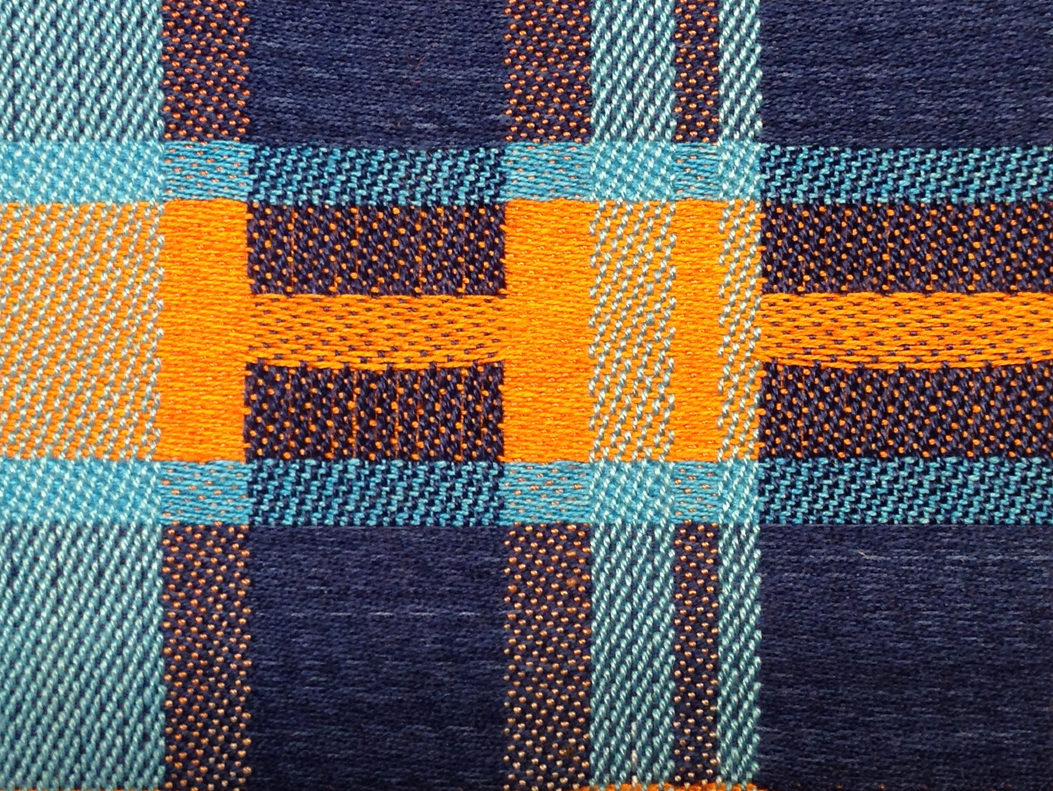
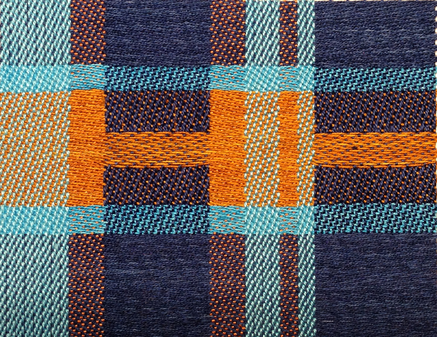
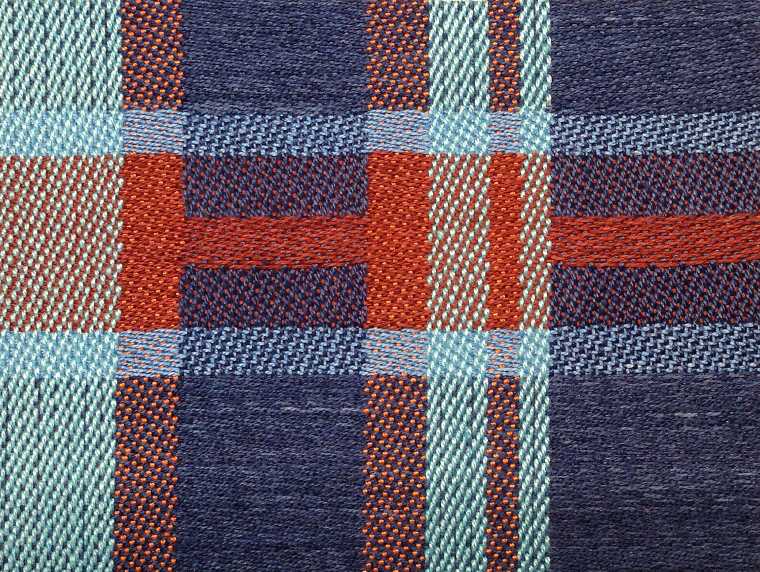
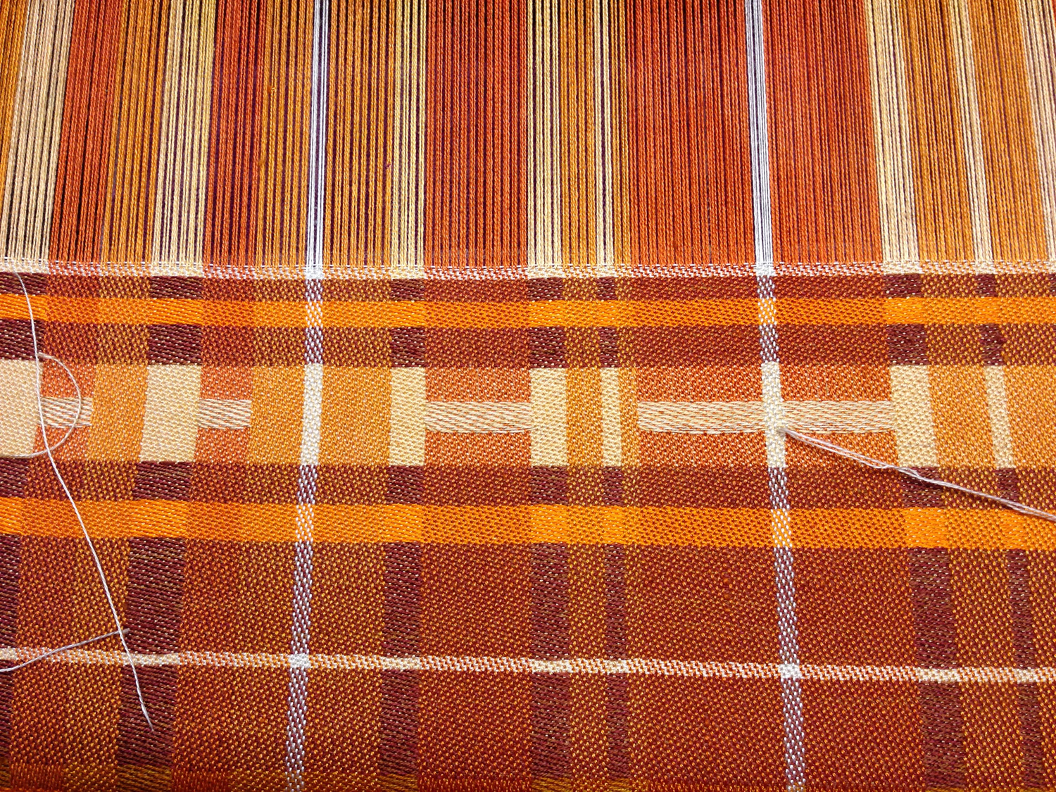
The class is going to cover the essentials of color in handweaving. The first part will cover basic color theory: the fundamental properties of color (hue, value, and saturation), how colors interact when interlaced in cloth, and a brief discussion of color mixing.

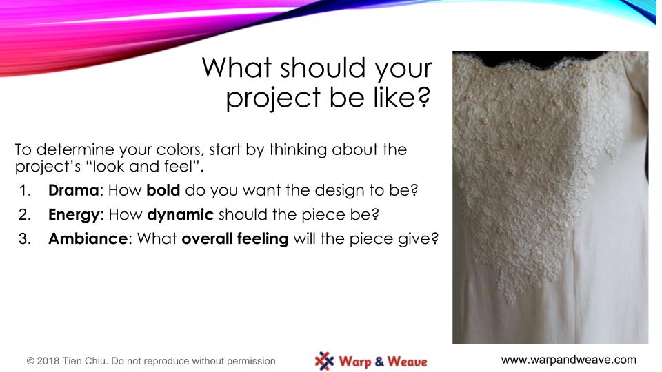
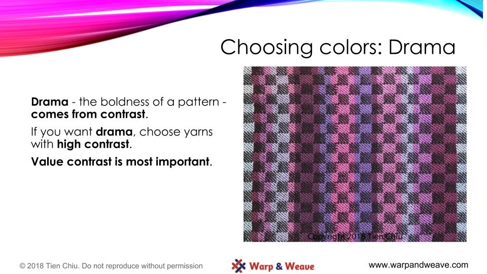
The second part talks about design: How to set the mood of a handwoven project by controlling drama, energy, and ambiance with color.

And the third part walks you through the design process: Choosing and using a warp color, weft color, and draft to achieve the mood you want.

The class will be offered in two formats. One will be a 1-2 hour streaming video plus handouts. That will (cross fingers) be released in November.

The other class option will be a full online course, with a discussion forum, exercises, feedback from the instructor (me!), etc. I’m planning to open registration in mid to late November, with the first session starting in January.

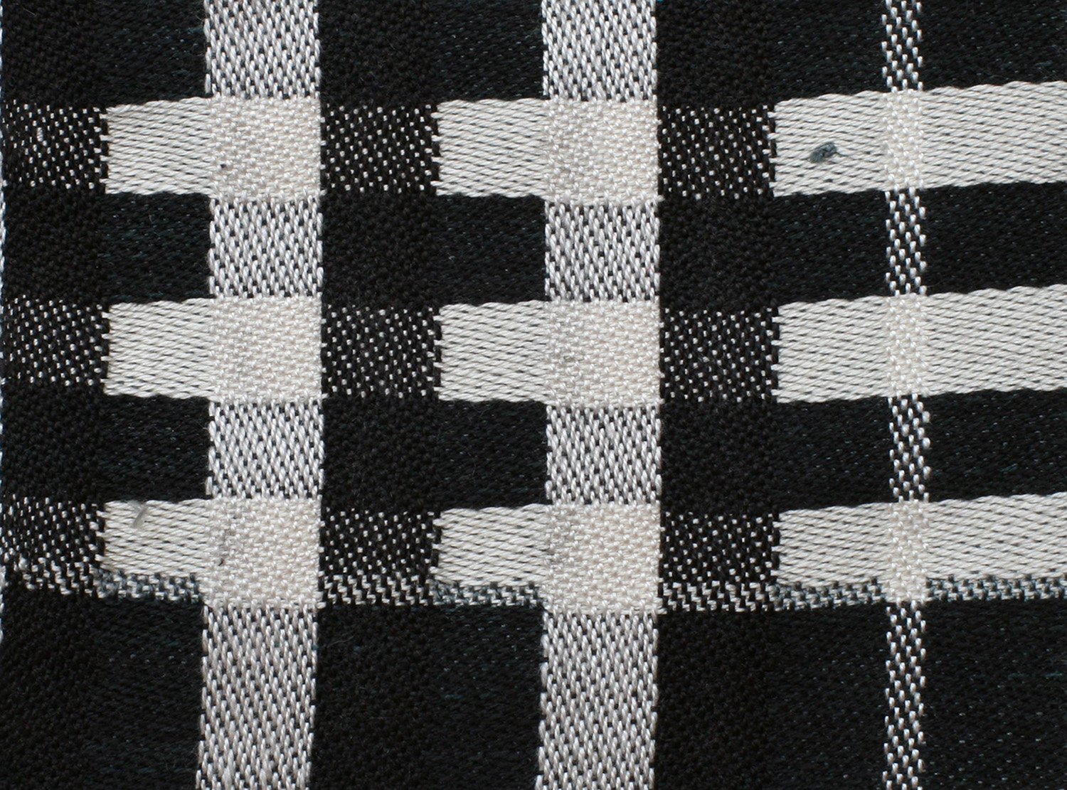
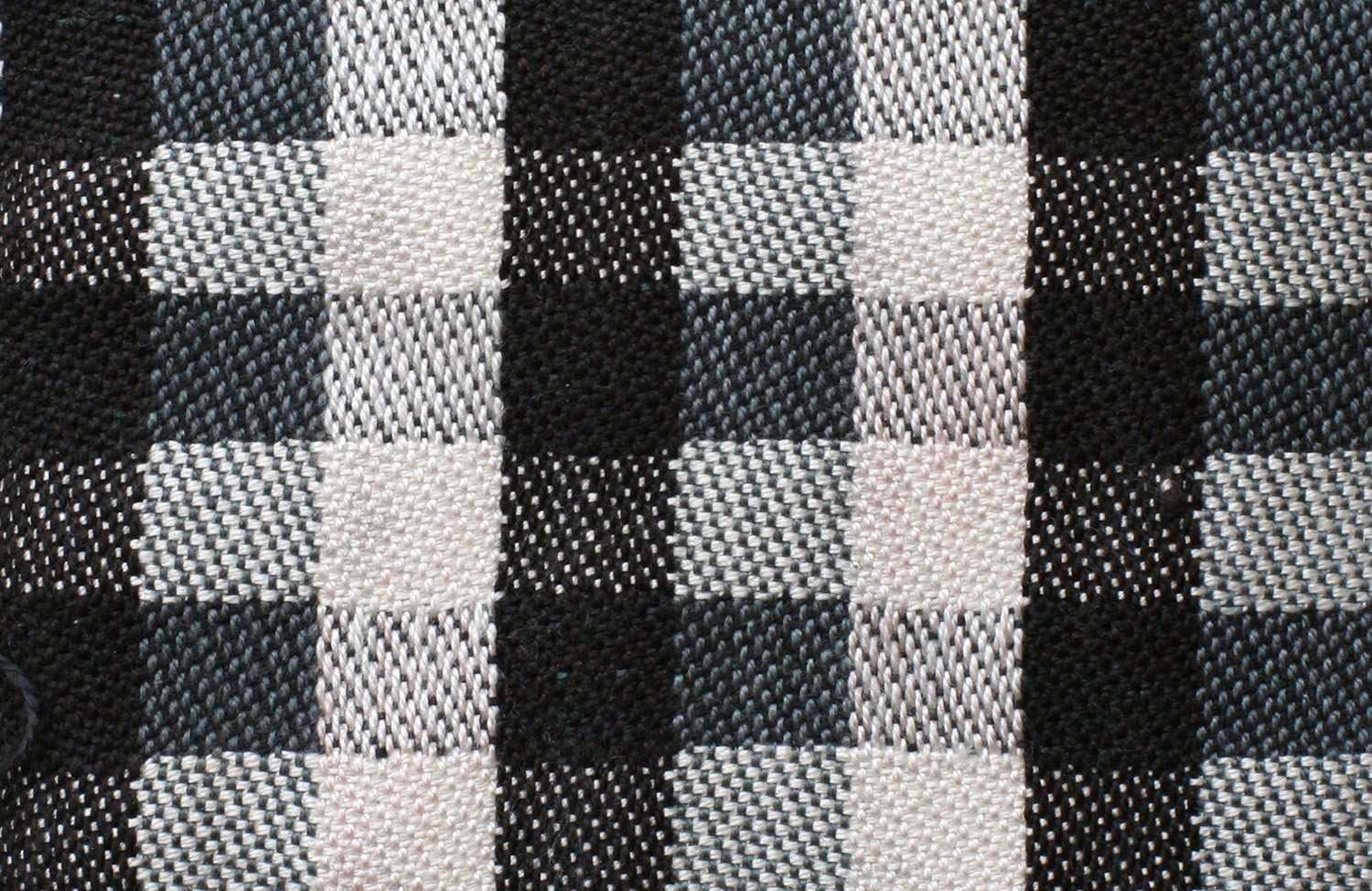
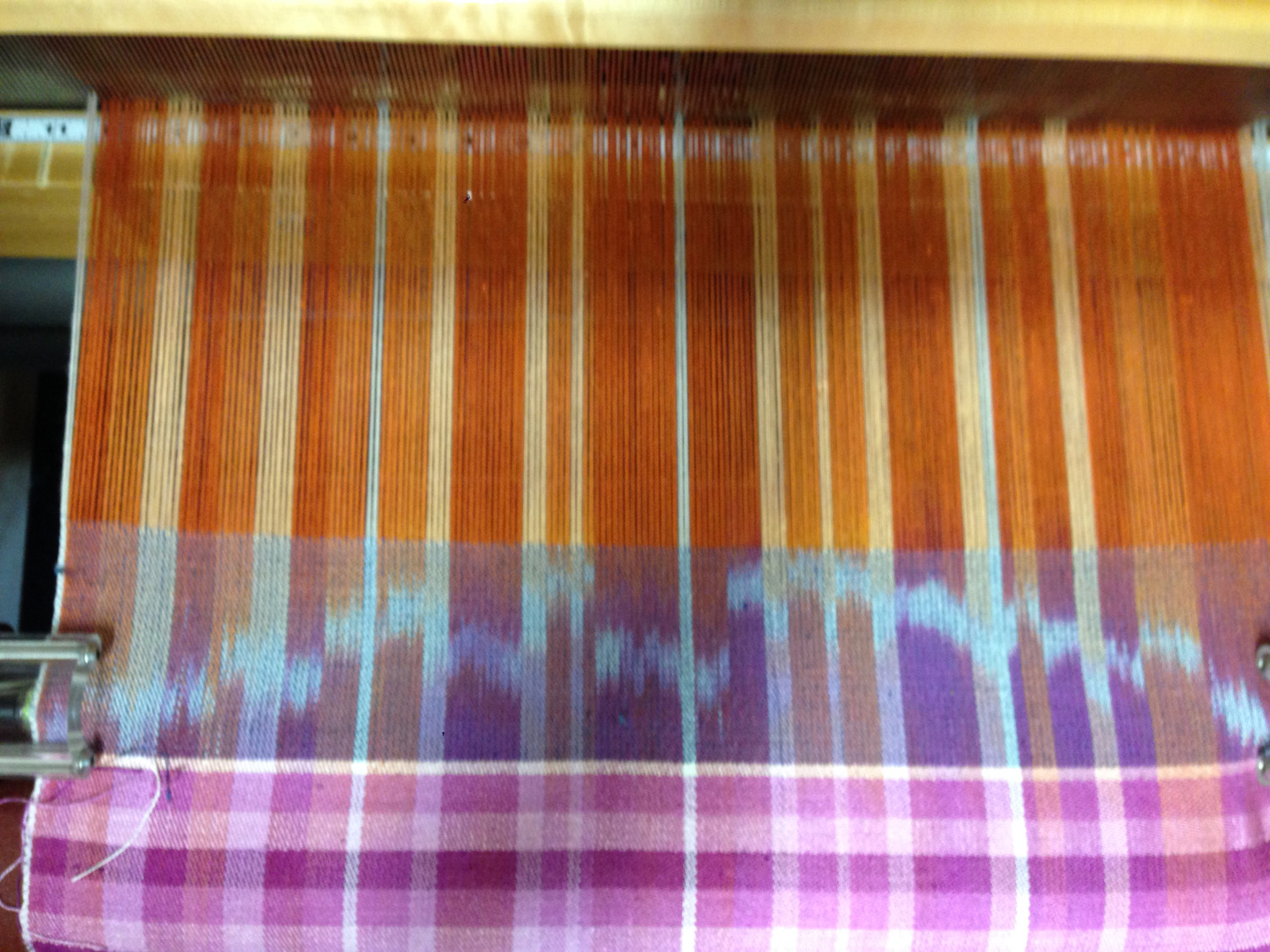
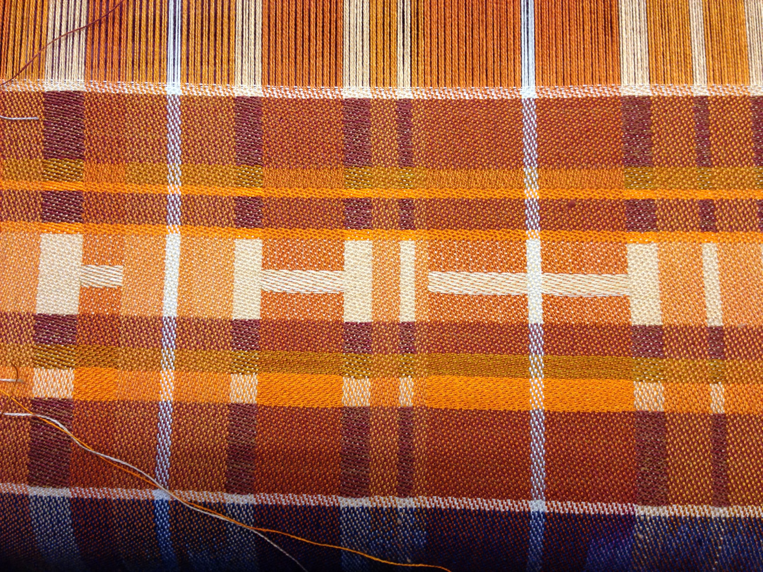
Here are two slides from the section on the design process:

Designing with Color - design process slide #2
Designing with Color – design process slide #2
Designing with Color - design process slide #3
Designing with Color – design process slide #3


I hope that, once my course is released, my students will be making weaselly fast progress with color!

By Keven Law (originally posted to Flickr as On the lookout...) [CC BY-SA 2.0 (https://creativecommons.org/licenses/by-sa/2.0)], via Wikimedia Commons
By Keven Law, via Wikimedia Commons

Filed Under: All blog posts, Warp & Weave, weaving Tagged With: color study, powerlifting, Warp & Weave, weightlifting

April 13, 2014 by Tien Chiu

Color study: saturation and value

I’ve been getting progressively grumpier over the last several days, as commitment after commitment kept me from doing anything creative. So when I woke up this morning with nothing on the slate, I rushed out to the loom and started weaving on the color study again. This time I was experimenting with saturation and value. (Value = lightness/darkness; high value = light color, low value = dark.)

Here are today’s samples:

high saturation, medium value
Sample 1: high saturation, medium value
sample 2: low saturation, medium value
sample 3: low saturation, low value


sample 4: medium saturation, high value

My iPhone unfortunately did not do the best job with colors, but you can see (more or less) that in the first sample, the motif “HI -” jumps out at you. That’s because orange is an advancing color and thus grabs attention, and also because it is highly saturated against a duller background, which also makes it stand out more.

As the color gets less saturated in sample 2, the motif is less obvious. And in sample 3, the color is quite desaturated (the real thing is less red and more brown) and also quite close to the background in value, so it doesn’t stand out nearly as strongly.

In sample #4, saturation isn’t particularly high, but the motif is a very light color, producing high value contrast with the dark background. As a result, the motif stands out clearly.

I still have 11 sections remaining on the color study. My plan is to continue weaving the same motif, varying the color combinations. I can get 3-4 versions of the motif out of each section, so I have (in theory at least) another 44 possible combinations. I considered changing the design as well as the color combinations, but decided there was plenty to explore just in color variations. Also, it will be much quicker to weave if I don’t have to design everything from scratch every time. I’m eager to get the sea turtle warp onto the loom, and experiment with weaving fine threads on Emmy.

And here is our shoe-sniffing Fritz, demonstrating one of his other vices! He is thoroughly addicted to belly rubs, and has been known to pass out from pure pleasure during a belly-rub session. Here Mike is catering to his addiction:

Fritz getting a belly rub
Fritz in the throes of a belly rub

It’s hard to resist a cat that’s begging for belly rubs!

Filed Under: All blog posts, textiles, weaving Tagged With: color study, design

March 30, 2014 by Tien Chiu

The value of value

The first section of my color study warp was neutral monochromes – black, white, and gray. So I used it to study value.

The first sample I wove was (almost) pure black and white. I wanted to show a section with high value contrast:

woven sample, pure black and white

This is very high contrast, so energetic, but it also has a bit of a sterile feel.

For the second sample, I decided to introduce some grays. (Unfortunately, my grays when dyed came out distinctly blue-tinged, so not quite neutral, but try to ignore that.) Here we are with the second sample:

black, gray, and white, regular striping

Another clean, classic look – but not as stark feeling as the black and white sample.

For the third sample, I introduced a wide range of values by blending white, light gray, medium gray, and black in varying quantities. Since they were randomly placed, the result was rather chaotic:

many shades of gray, producing a jumble of values

This, while chaotic, also has a much more nuanced (and lively) feel than the previous sample, with plenty of diversity in value.

Finally, I decided to do one sample with primarily lighter values and one sample with mainly darker values:

woven sample - white and medium to light gray
woven sample – white and medium to light gray
woven sample - black and dark gray
woven sample – black and dark gray

Here you can see how value affects mood – the first sample has a much “lighter” and more contemplative feel than the second sample, which feels rather dark and moody.

I’ve woven two other sets of samples, which I’ll use to illustrate my Designing Fabrics Study Group article (due tomorrow!). That article will be about the effect of value, particularly value contrast, on perception of color. The main problem I’m having with that article is photography! I have eleven samples to be photographed and converted to black and white, and it’s been remarkably difficult getting the photos to come out true to life. Fortunately my photographer friend Lieven has been helping out with advice, so as soon as the sun comes up, I’m going to reshoot my photos. I have a gray card which will help me keep the colors and values in sync across all eleven samples.

And, since I forgot to include a kitten in my last post (how could I have forgotten such wonderful and engaging creatures?!?), here is a photo with two kittens, practicing yoga on the couch. Stretch kittens! Is that like a stretch limo?

Fritz and Tigress, stretched out on the couch

Filed Under: All blog posts, textiles, weaving Tagged With: color study, color theory, design

March 28, 2014 by Tien Chiu

Getting some rhythm going

Sorry for the radio silence – I’ve been busy weaving!

I have now completed five of the 16 sections – black and white, purple monochrome, orange monochrome, red/orange yellow at low saturation, red/orange/yellow at high saturation.

In the purple monochrome section, I decided to play with stripes. I set the weave structure to be 4/4 satin to even out the color blending, and then wove three sections – each with a different stripe pattern. Here is a subset of the results:

stripe effects in handwoven cloth

Sample #1 has all stripes equal width, with a regularly repeating color pattern, in both warp and weft. The result is a very rhythmic, even pattern – one that would go well where you don’t want any particular part to catch the eye. Napkins, for example.

Sample #2 has rhythmic stripes in both warp and weft – the color patterns and stripe widths are arranged symmetrically, resulting in a regular plaid. This has more irregularity than the equal-width pattern, adding more visual interest and energy. (Which could also be interpreted as “more busy”, depending on whether you liked the change or not.) This might make an interesting pattern for a jacket, as it adds visual interest without demanding 100% of the eye’s attention.

Sample #3 has stripes in a Fibonacci ratio – each stripe is a Fibonacci ratio to its neighbor – and woven “as drawn in”, i.e. with the same color and stripe-width sequence in warp and weft. Because there’s no symmetry and no repetition, it feels more chaotic to the eye, and because the lighter colors are in the top left, the eye is drawn to the top left, leaving the composition somewhat unbalanced. This might be useful as part of an art piece – or as more visually interesting napkins, depending on how you feel about napkins!

Sample #4 is irregular both in warp and weft, pattern and color. It has no rhythm at all, so it feels the most chaotic of the four samples, and I’d be least inclined to use it. It feels more like a jumble of color than something intentional.

Remarkable how rhythm and repetition affect the feel of a piece, no?

Filed Under: All blog posts, textiles, weaving Tagged With: color study, design

March 23, 2014 by Tien Chiu

Designing on the fly

I’ve now woven two and a half sections of the color study – all monochrome. The first featured black, white, and gray in the warp; the second was shades of purple; the third (still in progress) is shades of rusty orange.

The black/white/gray section of warp was all about playing with value (lightness/darkness). I did one section in (nearly) pure black and white, one section with a wide range of values (white/black/several shades in between), one in whites and pale grays, and one in black and dark grays. By mixing the white, medium gray, and black in the warp with white, pale gray, medium gray, and black in the weft, I managed to cover most of the value spectrum. Alas, no photos – I forgot! As soon as I take that section off the loom, I promise photos and commentary galore.

I similarly forgot to take photos of most of the purple portions, but I do have photos of this bit:

shaded satin in purple

Here I was playing with shaded satins and a dark purple weft. I wanted to see if I could blend from 1-7 to 7-1 satin without a telltale line at the transitions. I spent some time messing with Photoshop to see if I could get it to do a semi-random gradation between, say, a 1-7 and 2-6 satin. Finally I just gave up and “feathered” the edges of the transitions by hand.

The result? I think it shaded very nicely and gradually, without obvious transitions – right up until it hit the 1/7 satin section (the dark purple line in the center). For some reason, this came out much darker than I expected. If I use this trick again, I’ll omit 1-7 satin. But shading by hand is quite laborious, so I may ask my Photoshop-savvy friends if they know a better way. Photoshop is so powerful that I’m sure there must be a way.

For most of the rest of the purple section, I experimented with stripe width and weaving the stripe patterns “as drawn in”. No pictures, alas, but I did enjoy playing with the gorgeous colors:

five shades of purple weft

The leftmost color is actually white, so technically it was only four shades of purple, but they made a very nice value spectrum from light to dark. And apparently four Bluster Bay shuttles isn’t enough; I had to use one of my remaining Schacht end-feed shuttles to hold the fifth color. Fortunately, a remedy will soon be forthcoming: Terry at Bluster Bay Woodworks wrote me recently to tell me that he just got a stock of beautiful curly maple, which will make a nice fifth shuttle to add to the herd.

For the orange section, I decided to try “designing on the fly”. Here’s what I started with:

four shades of orange weft
monochrome orange warp

I decided to weave a design that would feature a motif in pale peach, against a darker background, using all four wefts. Here’s what I wove:

monochrome design, version one

(I did not intentionally set out to say “Hi”, but thought it was a nice touch!)

This design isn’t particularly good, for a few reasons:

First, the medium peach sections near the bottom (below the “H”) distract from the main figure. Second, the golden brown just doesn’t fit with the rest of the colors – there’s too much yellow in it, so it sticks out like a sore thumb. And the main focus point (“HI”) is centered top to bottom, deadening the piece.

So I made some changes and wove a second version:

monochrome design, version two

This still isn’t great art (though if you want to pay me a million dollars for it, I won’t object 🙂 ), but it’s a stronger design than the previous one. I eliminated the golden brown and changed the arrangement of the orange stripes to make it look a little less chaotic; I also put “HI” about 2/3 of the way to the top, making it more visually interesting. This results in a more focused piece.

So how am I designing all this? It’s pretty much all done on the fly. Here is the liftplan I’m using:

liftplan for color study

The bottom sections are for my convenience – all the shades of 8-end satin, from 1/7 to 7/1, ready to be cut and pasted. The sections at the top determine the interaction of warp and weft in each stripe of color. Shafts 1-8 represent one color, shafts 9-16 a second color, and 17-24 the third color. The remaining 16 shafts are devoted to the white dividers between sections and the selvages.

Each set of eight picks represents three blends of warp and weft (plus the selvages and white dividing lines, which are woven in 4/4 satin throughout). Looking at the liftplan shows the blending of each set of colors.

For example, in the eight rows at the top, shafts 1-8 and 9-16 are 7/1 satin, meaning the weft will heavily dominate those two colors. Shafts 17-24 are 4/4 satin, so the third warp color will weave up as a 50-50 mix of warp and weft. And so on.

So before starting each stripe of weft color, I consider how I want to blend the weft colors with the warp colors. I can make the warp essentially invisible by choosing a 1-7 satin, or I can make it dominate completely by using 7-1 satin. Or I can blend the two by choosing something in between.

Once I’ve decided what degree of blending I want, I go down to the bottom of the drawdown, and cut and paste the appropriate patterns into eight rows of the liftplan. I then repeat that set of eight picks for the length of the stripe. I’ve got six different blending patterns saved in the top part of the liftplan, so I don’t have to start from scratch every time. This gives me flexibility without compromising too much on speed.

Amidst all this busy-ness, I have a new concern. Fritz doesn’t seem to understand that sniffing shoes leads to harder drug use. Here he is with his head completely buried in one of Lieven’s shoes:

Fritz indulging his foot fetish

What’s next for this shoe-sniffing addict? Catnip?

Filed Under: All blog posts, textiles, weaving Tagged With: color study, design

Next Page »

Subscribe to Blog via Email

Information resources

  • Dye samples
    • Procion MX fiber-reactive dye samples on cotton
    • How to "read" the dye sample sets
    • Dye sample strategy - the "Cube" method
  • How-Tos
    • Dyeing and surface design
    • Weaving
    • Designing handwoven cloth
    • Sewing

Blog posts

  • All blog posts
    • food
      • chocolate
    • musings
    • textiles
      • dyeing
      • knitting
      • sewing
      • surface design
      • weaving
    • writing

Archives

Photos from my travels

  • Dye samples
    • Procion MX fiber-reactive dye samples on cotton
    • How to "read" the dye sample sets
    • Dye sample strategy - the "Cube" method
  • Travels
    • Thailand
    • Cambodia
    • Vietnam
    • Laos
    • India
    • Ghana
    • China

Travel Blog

Entertaining miscellanies

© Copyright 2016 Tien Chiu · All Rights Reserved ·


Loading Comments...