Tien Chiu

  • Home
  • About
    • Honors, Awards, and Publications
  • Online Teaching
  • Gallery
  • Essays
  • Book
  • Blog
  • Dye samples
You are here: Home / Archives for color theory

August 18, 2017 by Tien Chiu

The science of art

I’ve been having a lot of fun the last few weeks doing scientific experiments about art. (Hey, you can take the girl out of science, but you can’t take the science out of the girl! Even as an artist, I still work using the scientific method, because I find it so effective.) These science-of-art experiments have mostly been made for my latest Warp & Weave blog post. The post is about how to work with clashing colors. The secret is pretty simple. Clashing colors jar the eye because they contrast strongly, generally in both hue (color family) and value (lightness/darkness). So the solution is simply to reduce the contrast between them, either by adding a transitional color in between (if you are doing warp or weft stripes), or by using a weft that blends them into more compatible colors. (More details in the blog post.)

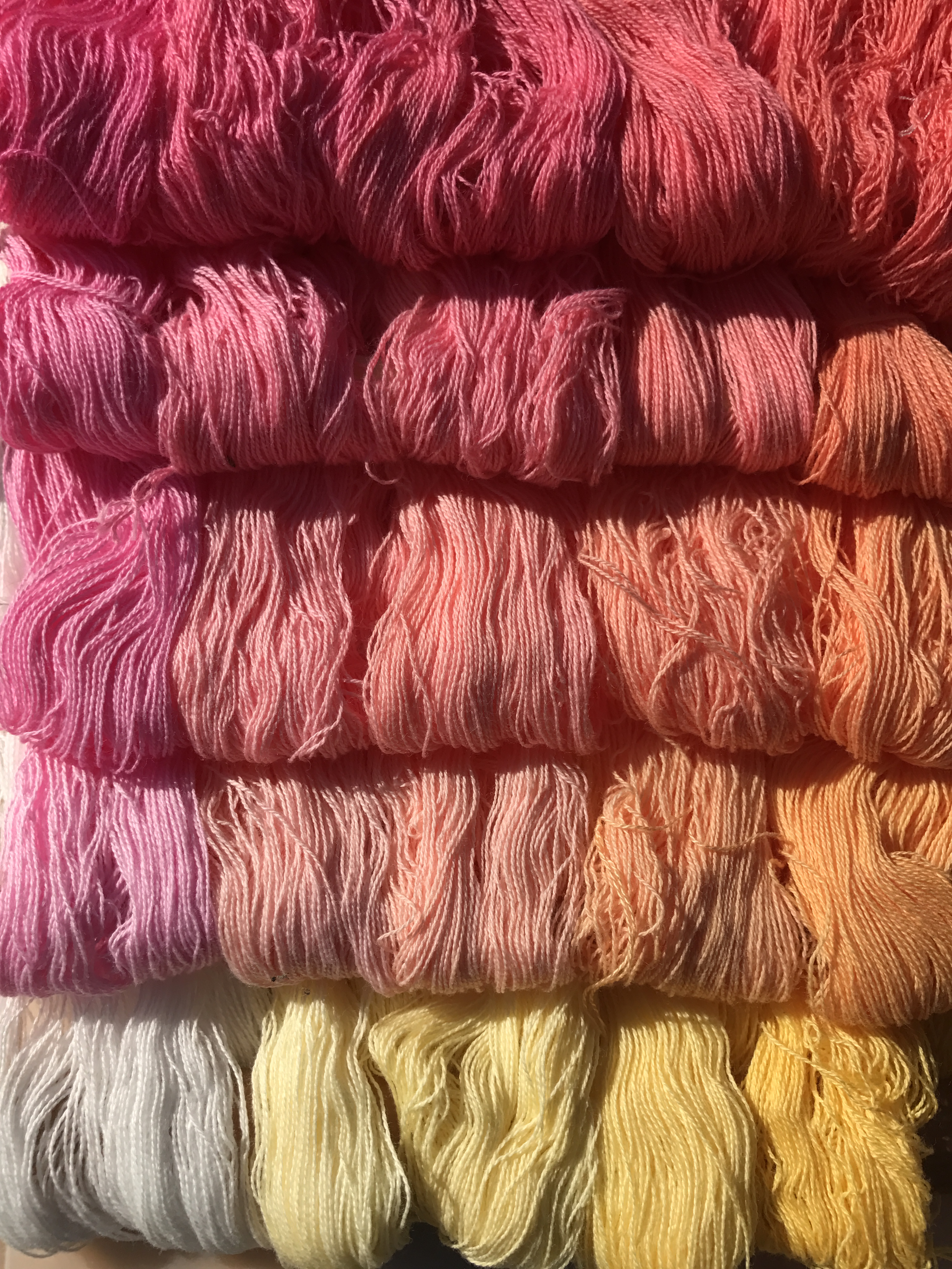
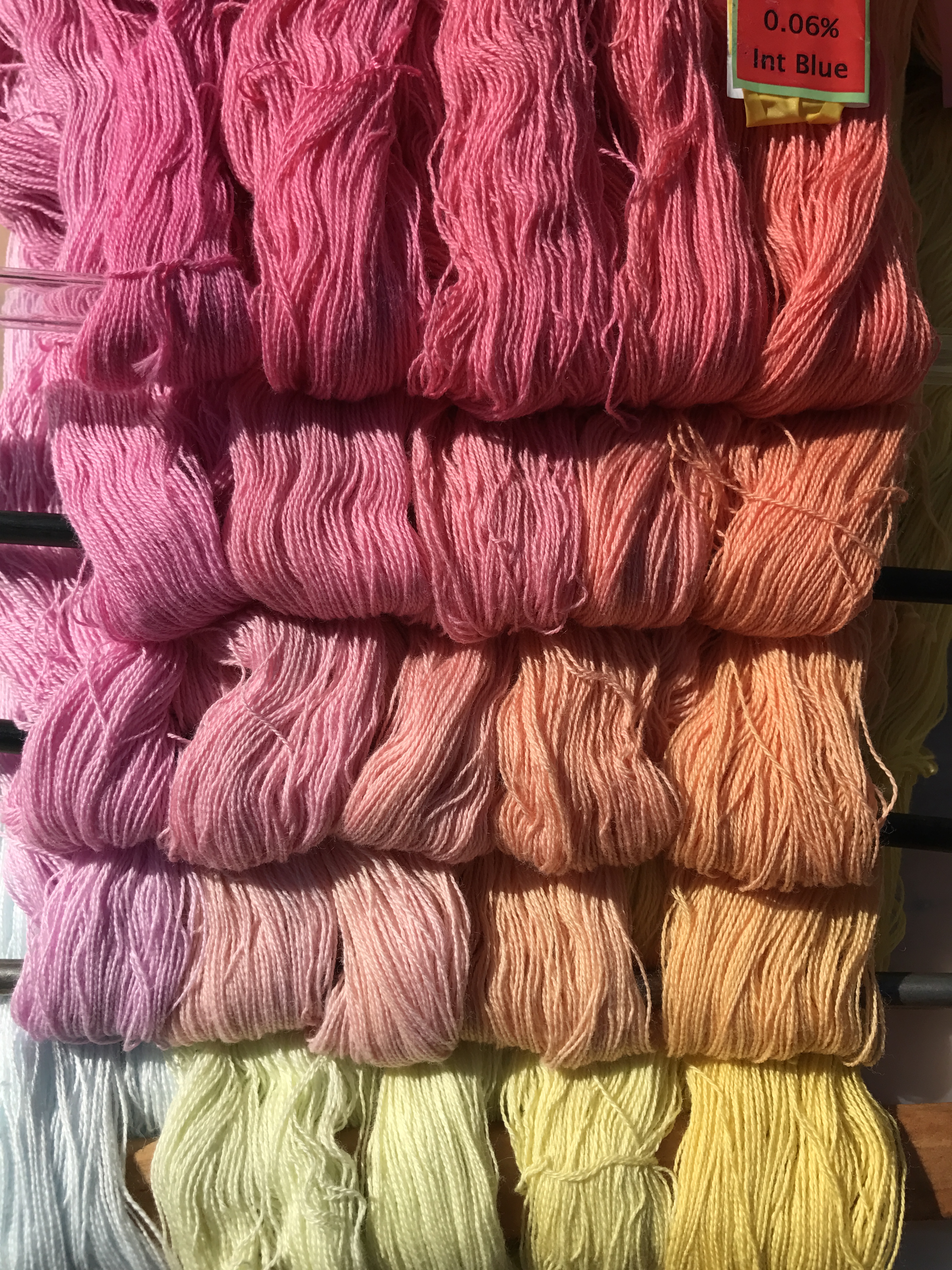
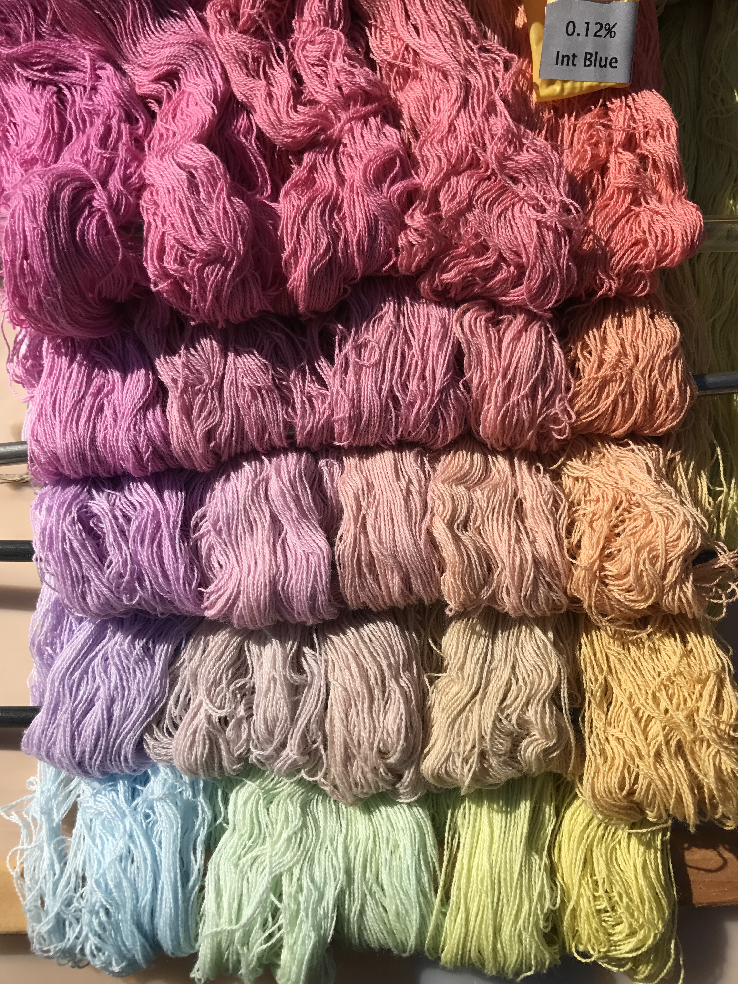
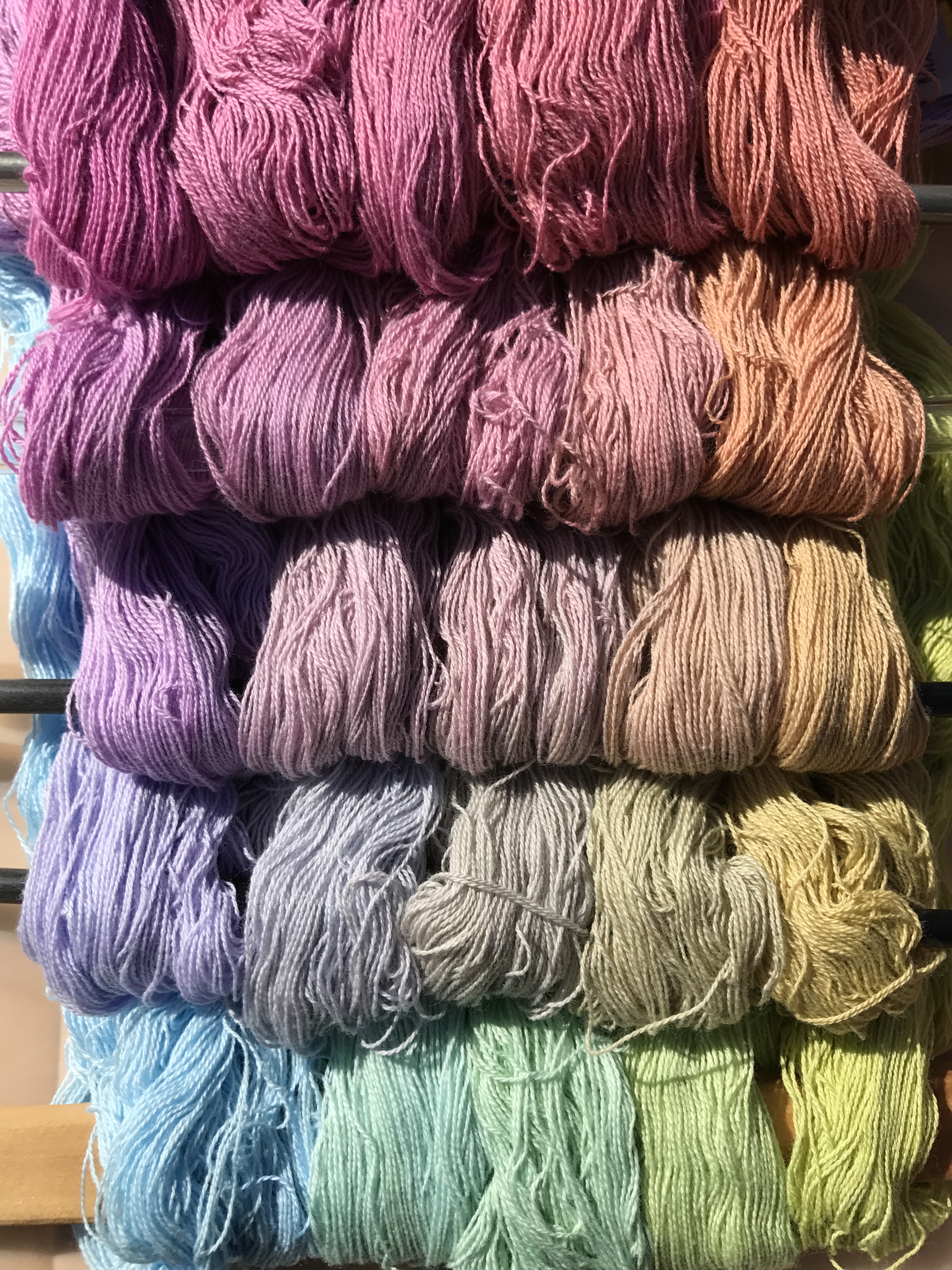
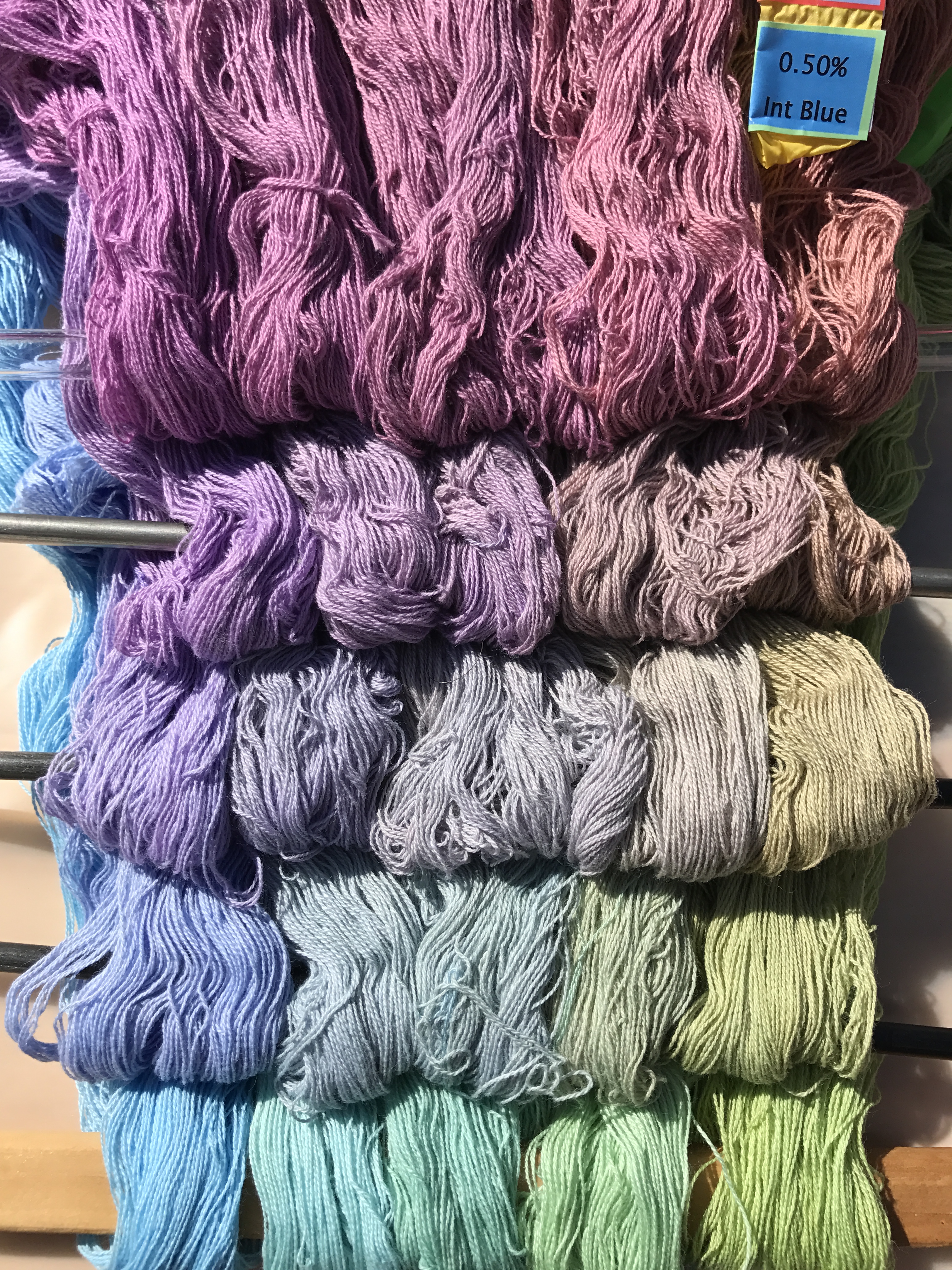
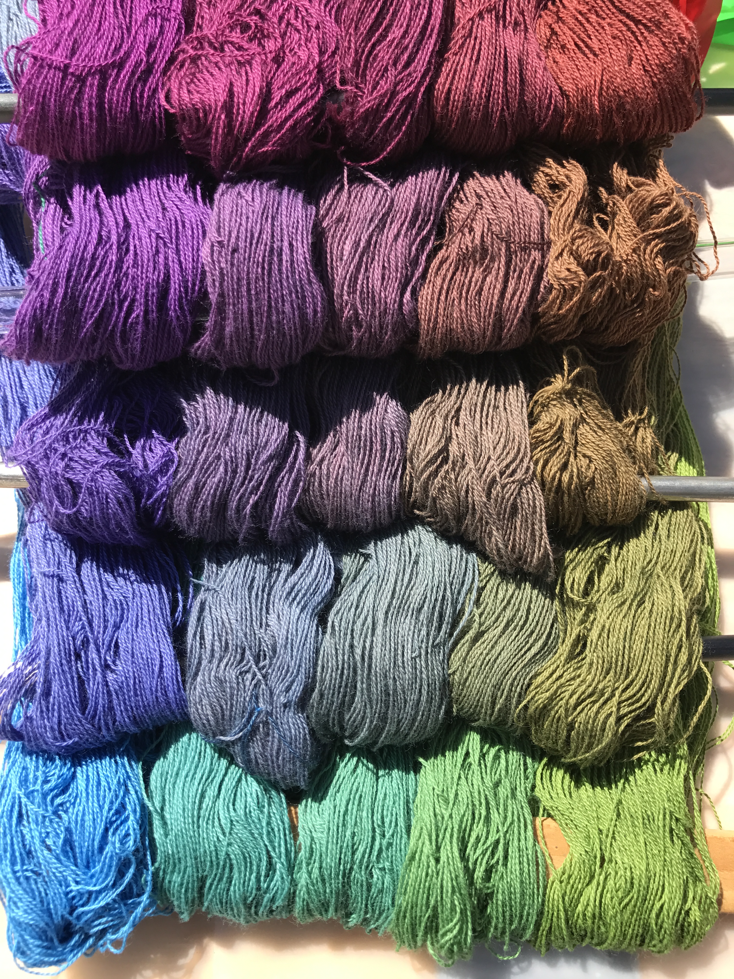
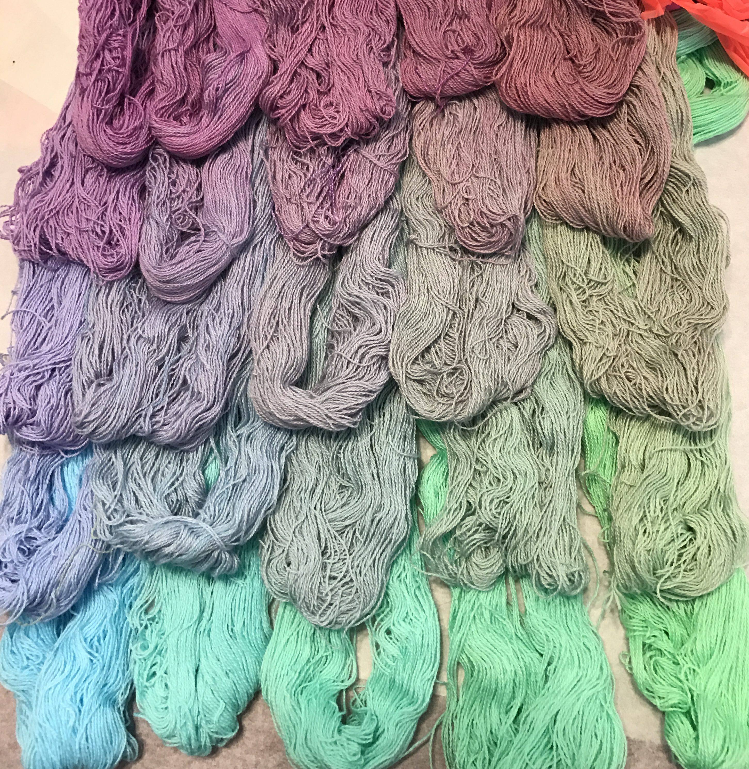
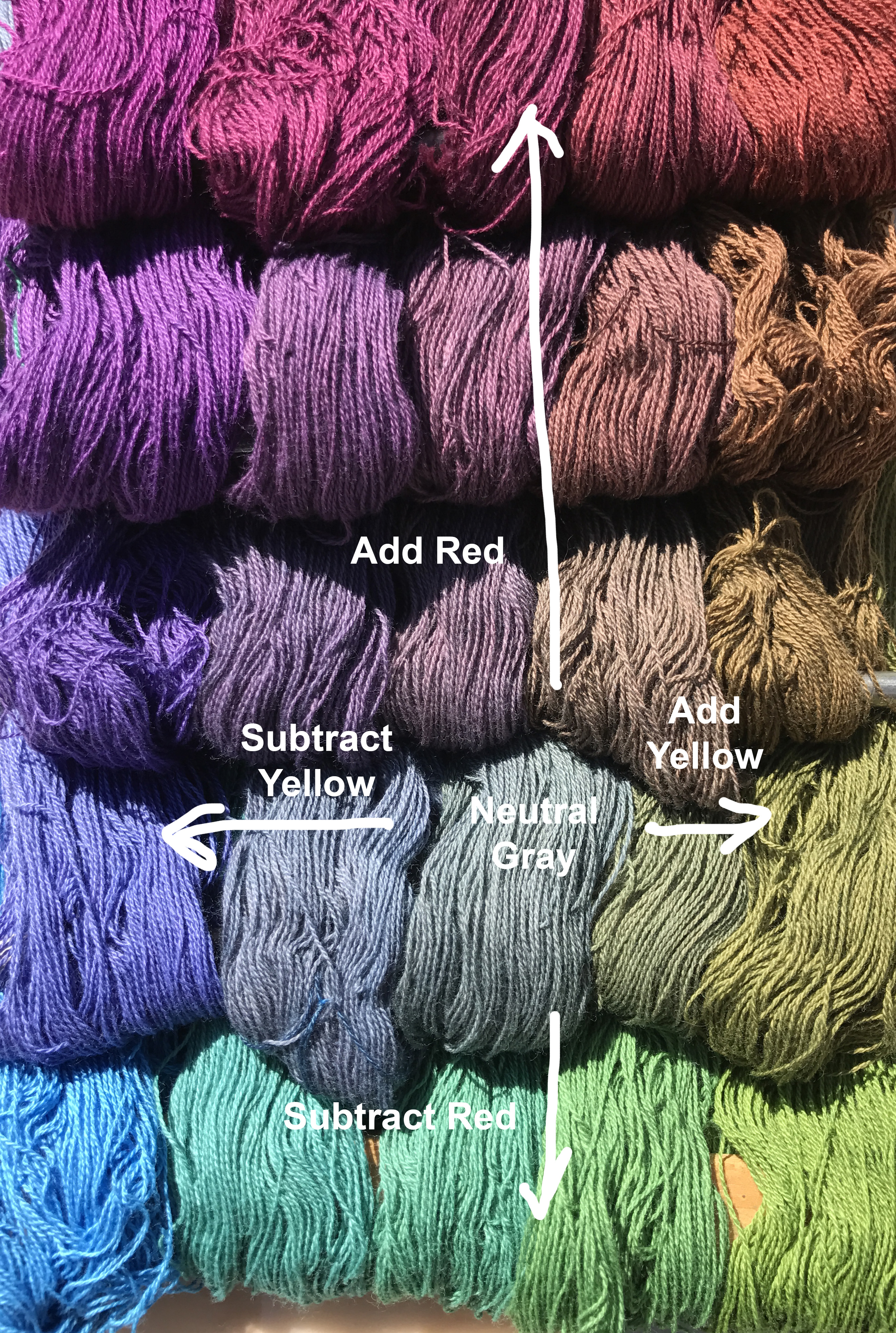
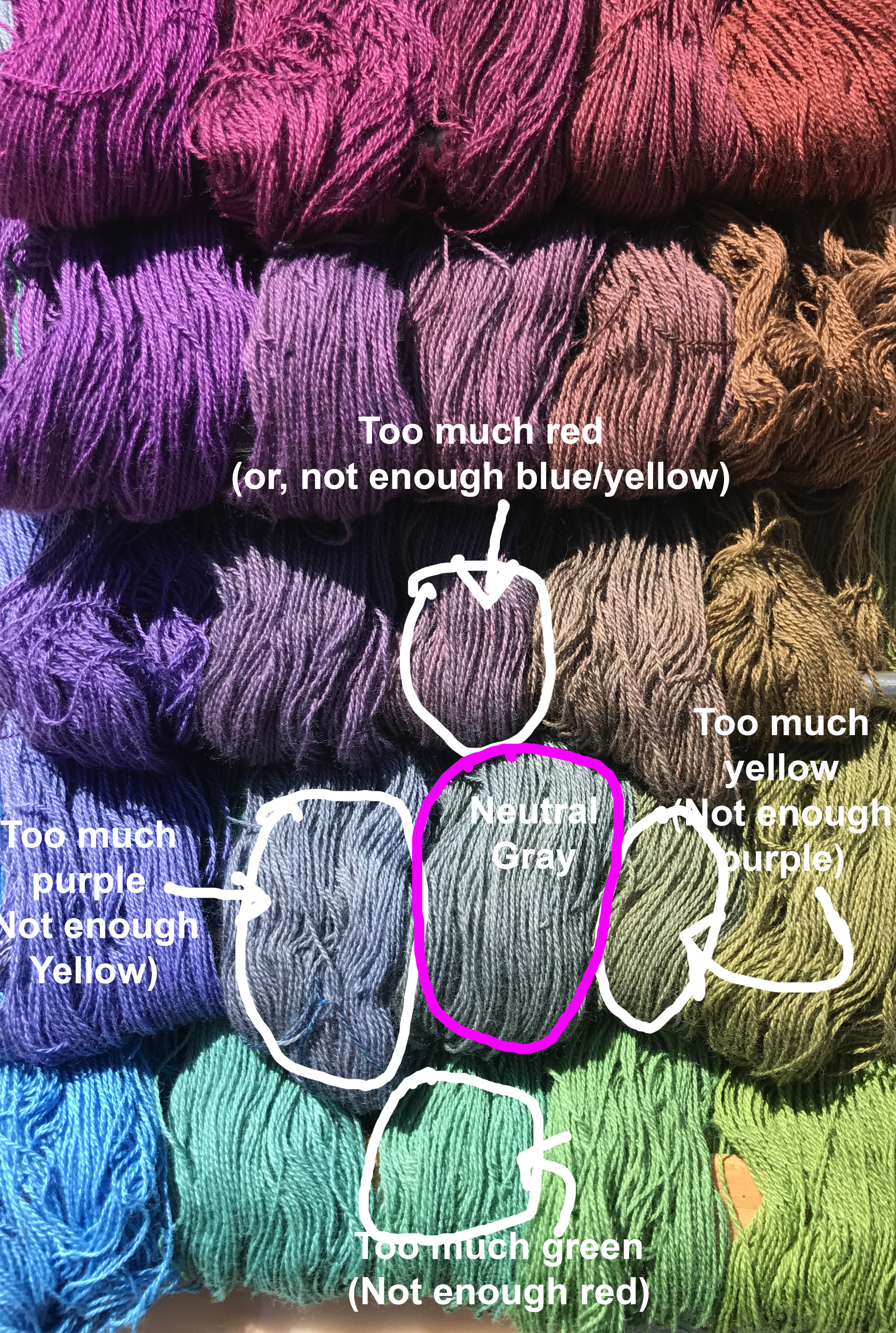
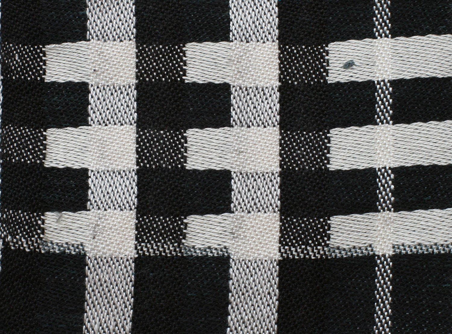
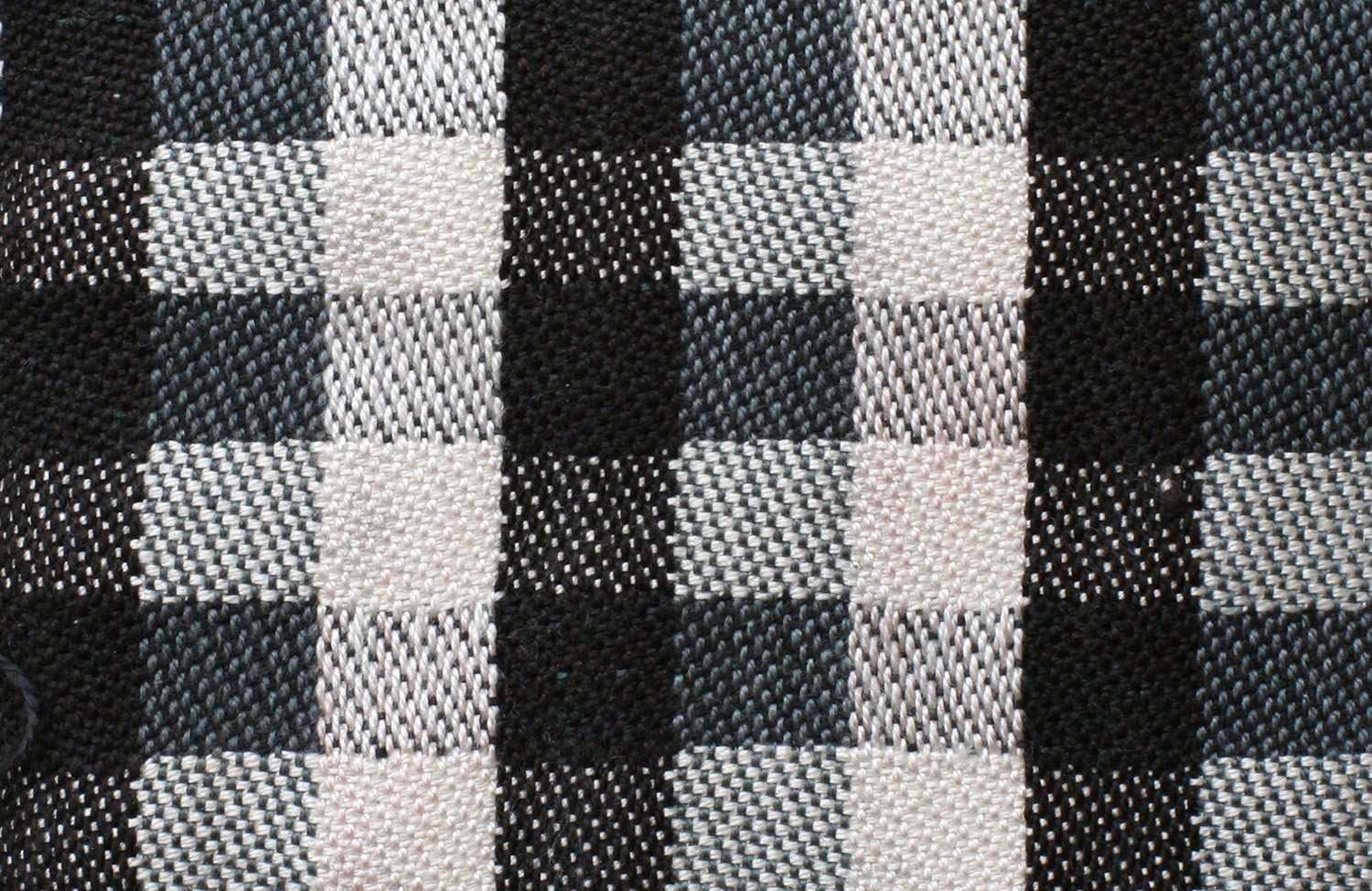
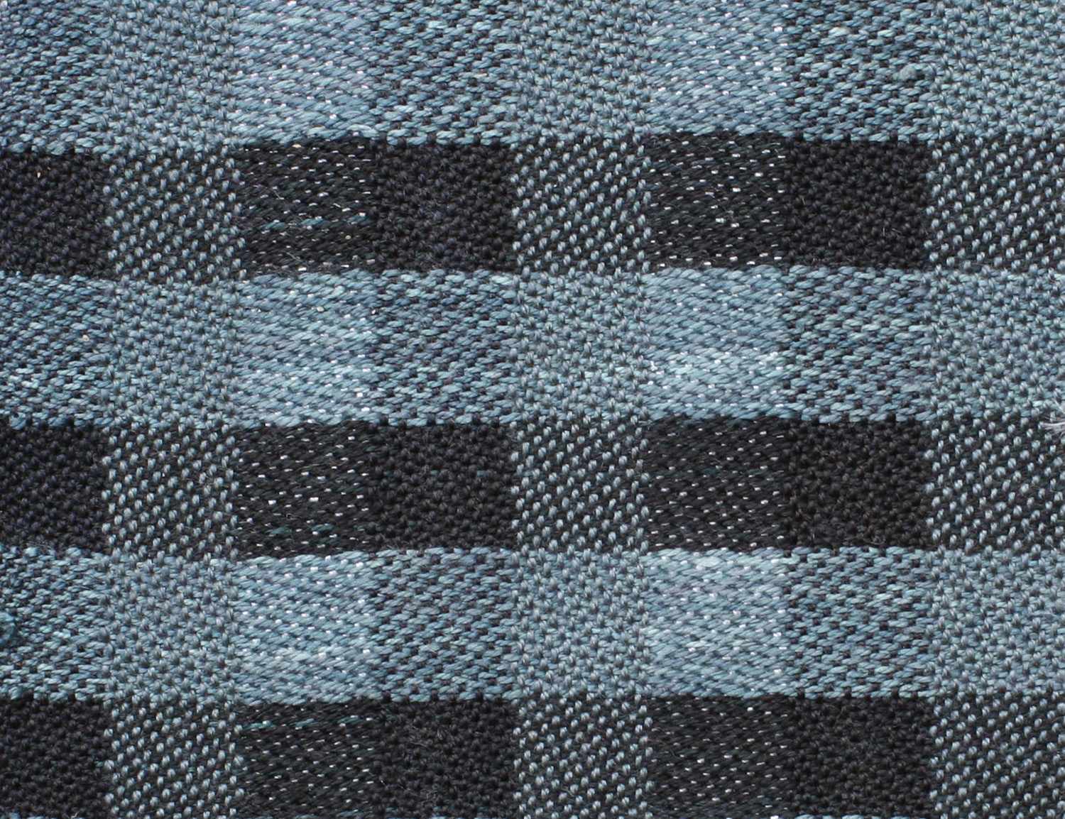
This all makes sense, but to come up with the blog post I had to do quite a few scientific experiments. (Which is what made it fun!). I don’t think I had ever thought deeply about what makes two colors clash before, for example, or to define what it means to clash – up until then, I’d relied on an intuitive definition. Like the Supreme Court justice said, “I know it when I see it.” So I pulled out my collection of 500+ skein leftovers from my dyeing project, and started shuffling colors around, looking at which ones clashed (to my eye) and which didn’t. Then I tried to figure out exactly which characteristics/differences between the colors caused them to clash. I finally concluded that clashing colors resulted from a high difference in value (lightness/darkness) plus a difference in hue (color family), and that while saturation (brightness/dullness) could contribute to clashing, the effect wasn’t as profound as the first two. You can see this in these three photos:

orange and dark blue yarns together

orange and light blue yarns

yarns of different values but similar hues

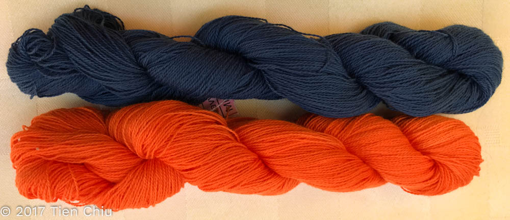
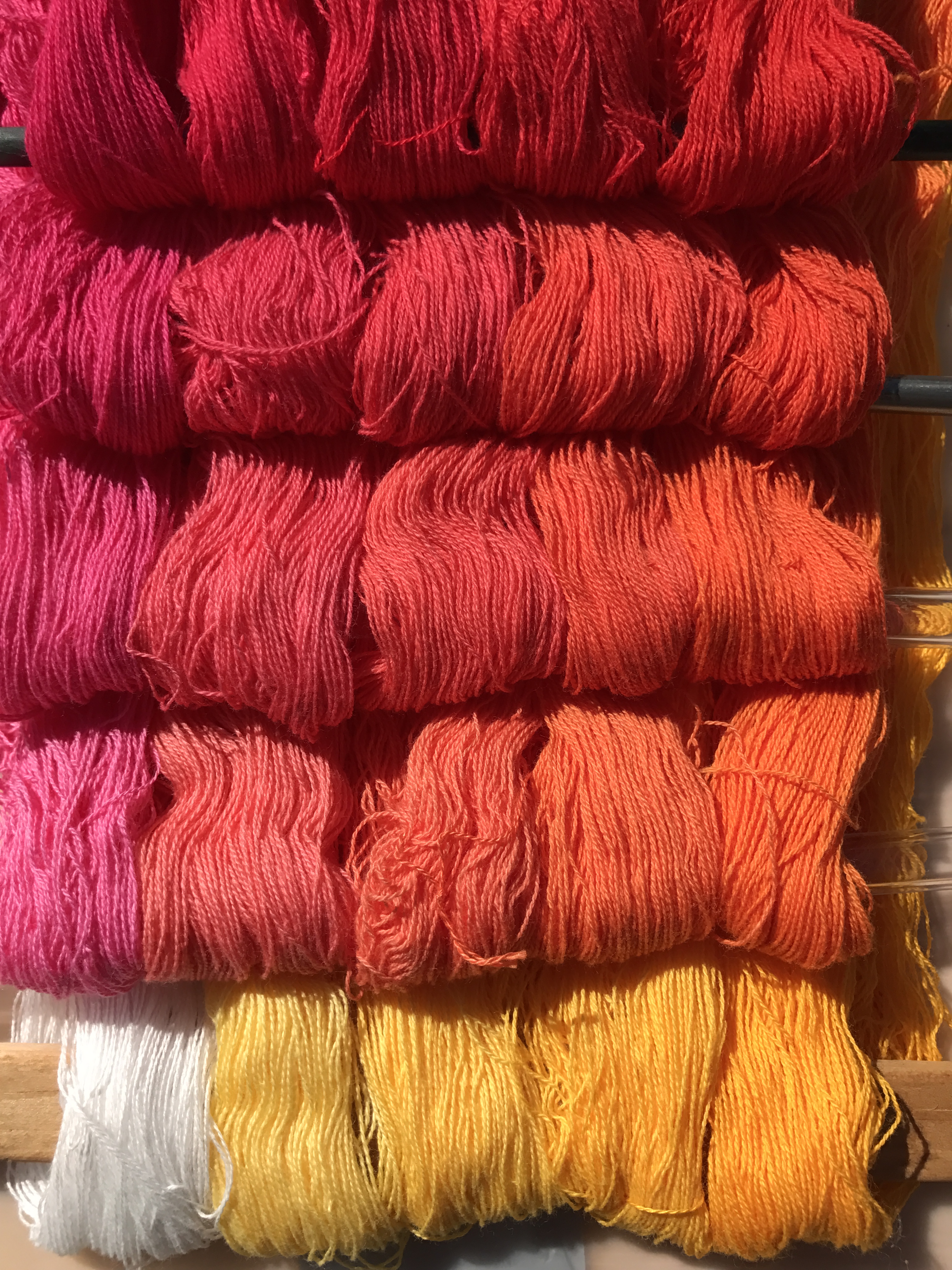
Most people would say the first two yarns clash. This is because these two yarns contrast across all three color characteristics – orange and blue are opposites on the color wheel, the navy blue is much darker than the orange, and the orange is much more saturated (brighter) than the blue. 

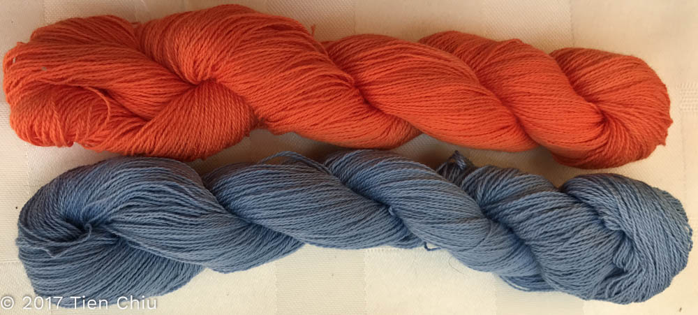
Many people might still say that the next two colors clash, but to a much lesser degree than the first pair. That’s because the blue, while the exact same hue as the navy blue, has been lightened up to be the same value (light/dark) as the orange.

Most people would say that the purples in the last photo, while high-contrast, do not clash. That’s because they have big value and saturation differences, but no difference in hue.

By coming up with various theories, then comparing and contrasting lots of different pairs of colors to test this theory, I eventually arrived at a set of characteristics that defined the color combinations that appear to clash.

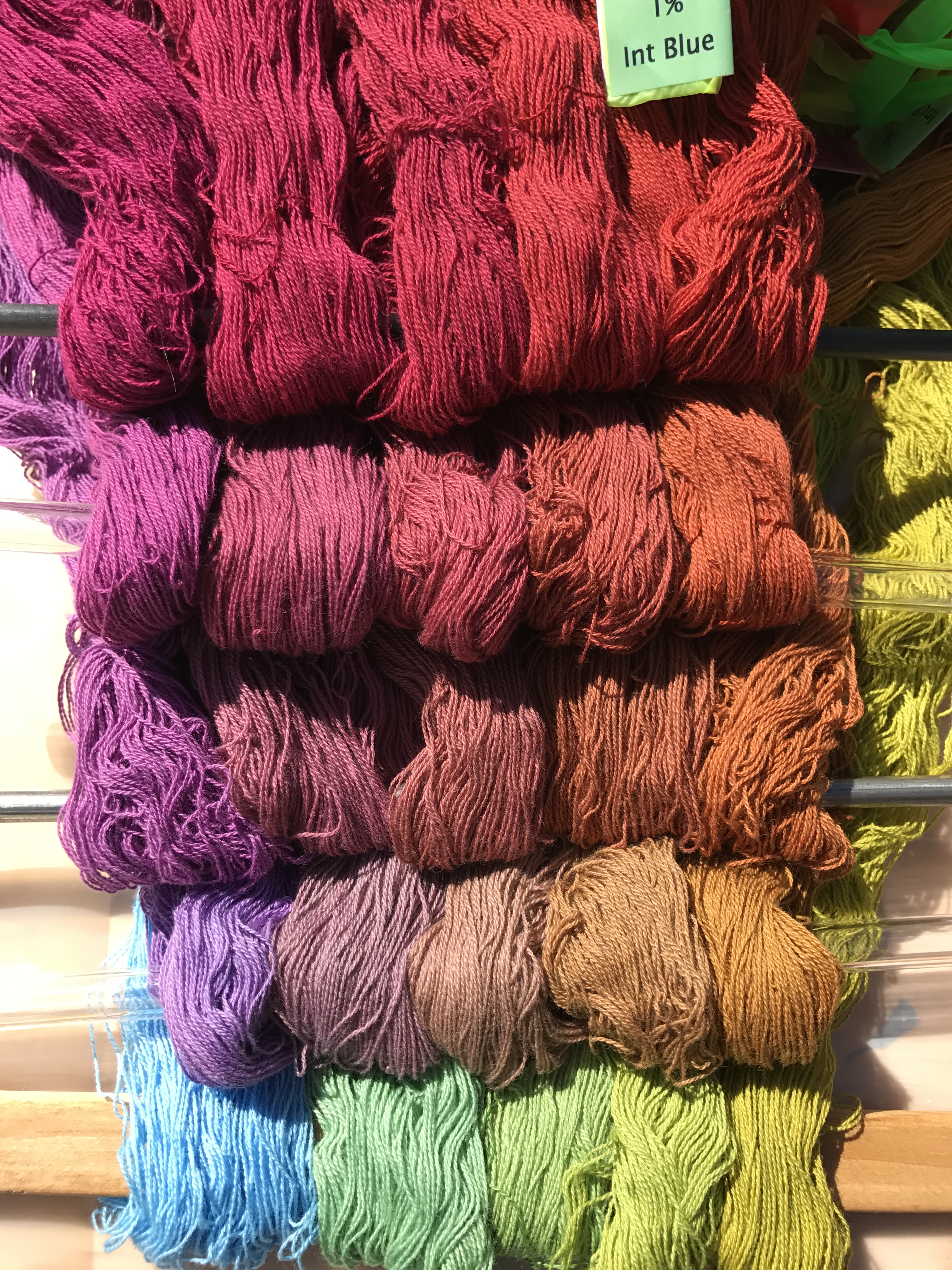
After that, of course, I had to formulate some hypotheses about how to create harmonious cloth with clashing colors, and test those hypotheses. So I pulled out three yarns from my stash that appeared to clash, and did some yarn wraps to test my hypotheses:

blue yellow olive yarn wraps

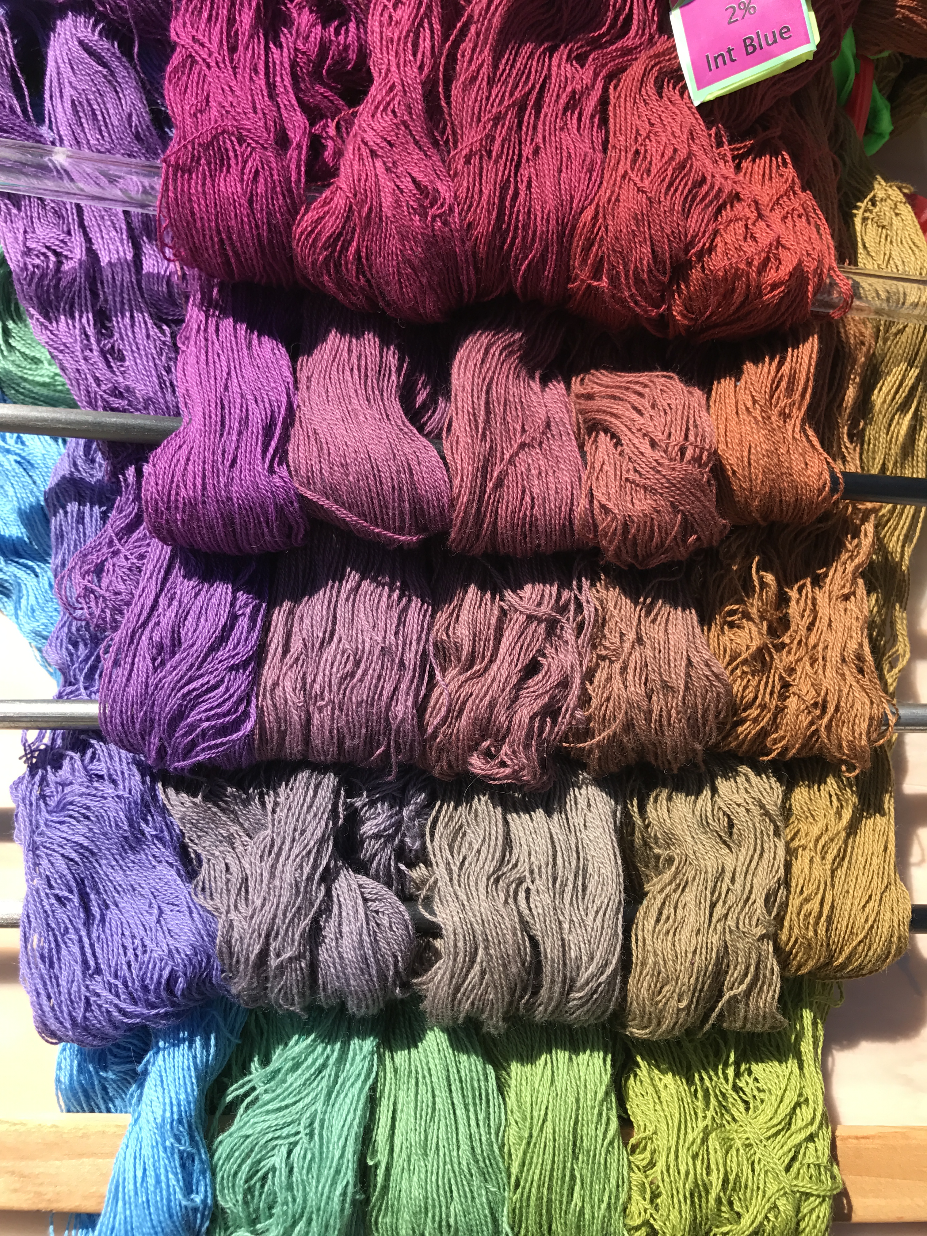
And then I wove samples with many different wefts to test my theories on what would resolve the clashing and produce a harmonious fabric:

color gamp with blue, olive, and yellow warps

Most of my theories stood the test, but some didn’t. So then I had to discard the old ideas and formulate new theories, then test the new ones. And then weave more samples to illustrate my points. This research, while fun, also ate a couple days. But lots of people have been saying they find it useful, and that’s a good thing. (If this has piqued your interest, check out the full blog post!)

I’m really enjoying my scientific analysis of color – it’s satisfying a deep-rooted need to explore and explain the world. I was raised by two brilliant scientists, so even though my focus is art, I still have a passion for identifying, analyzing, and then explaining the solution to whatever puzzles I encounter. It’s not as obviously science as technical experiments in neurobiology, but the concept and process are the same. It’s the science of art, and it’s endlessly fascinating.

I’ve also been working on an article for an upcoming issue of Handwoven, which will be the “Inspiration” issue. I can’t say much about the article, of course, but here’s a teaser:yarn wrap for Handwoven article

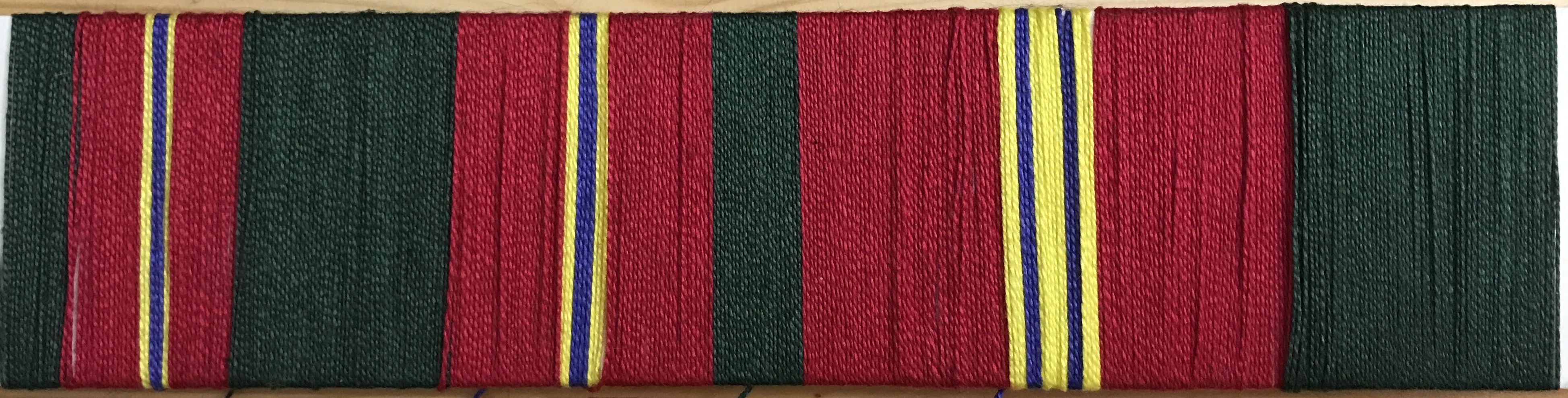
I’m currently creating/weaving everything else I need for the article, and it’s coming out beautifully.

Finally, I have one more EXCELLENT piece of news: my wedding dress is going to the Henry Ford Museum in Dearborn, Michigan! This is a huge relief – the dress has been in limbo ever since the American Textile History Museum closed, and I was really worried about its fate. But it looks like it is safe now. I can’t tell you how happy that makes me!


Filed Under: All blog posts, musings, textiles, weaving Tagged With: color theory

July 19, 2017 by Tien Chiu

Announcing Warp & Weave!


I’m thrilled to announce the launch of my new teaching website, Warp & Weave!

Warp & Weave logo


Warp & Weave will teach you how to design superb handwoven cloth. Since that’s a pretty broad topic, I’m starting by writing about color, since it’s a huge challenge for many weavers. I expect to spend the next year focused on helping people choose and use color fearlessly in creating handwoven beauty. I’ve already written three blog posts on the topic, and will be publishing more color articles weekly.

To give you an idea of what I’ll be publishing there, here are my three most recent Warp & Weave posts:

Why Bright Colors Weave into Dull Projects – and What to Do About It

How to Tame Troublesome Hues When Creating Handwoven Fabric

How to Use Black to Give Your Handwoven Fabric Pizzazz

In addition to the blog posts, I have a free e-book on my site:

It will help you choose colors and drafts that create bold or subtle patterns in your woven projects, as you prefer. Get the e-book here.

Finally, I’m developing an online class, Fearless Color, which will teach you how to use color confidently in creating beautiful cloth.

(If you want to be notified when the class is ready, sign up here.)

Please check out Warp & Weave! (And if you like what you see, please share it with your friends, guilds, and online groups!)

Warp & Weave logo

Filed Under: All blog posts, textiles, Warp & Weave, weaving Tagged With: color theory

March 10, 2017 by Tien Chiu

Procion MX dye samples on cotton: Gold – Mixing Red – Intense Blue

I’ve now completed my second set of Procion MX dye samples on cotton yarn – the Gold, Mixing Red, and Intense Blue samples.

Here are photos of all 250 skeins. Each photo shows all the skeins dyed in one concentration of Intense Blue, which is listed in the caption. The concentration of Gold increases as you travel left to right along the rows; the concentration of Mixing Red increases as you travel up along the columns.

Here’s an annotated photo that shows how it works. This “level” of the cube has 0% Intense Blue, so it’s solely Gold and Mixing Red.

annotated photo of Procion MX dye samples on cotton
annotated photo of Gold, Mixing Red, and Intense Blue Procion MX dye samples on cotton

Each column has one concentration of Gold, each row has one concentration of Mixing Red.

Here are the photos of the “light” cube (lower concentrations of dye). The concentrations are 0, 0.06, 0.12, 0.25, and 0.50% in both Mixing Red and Gold. The concentration of Intense Blue is the same for each photo, and is listed in the caption.

Procion MX dye samples on cotton - Gold-Mixing Red-Intense Blue- 0% intense blue
Procion MX dye samples on cotton – Gold-Mixing Red-Intense Blue- 0% intense blue
Procion MX dye samples on cotton - Gold-Mixing Red-Intense Blue- 0.06% intense blue
Procion MX dye samples on cotton – Gold-Mixing Red-Intense Blue- 0.06% intense blue
Procion MX dye samples on cotton - Gold-Mixing Red-Intense Blue- 0.12% intense blue
Procion MX dye samples on cotton – Gold-Mixing Red-Intense Blue- 0.12% intense blue
Procion MX dye samples on cotton - Gold-Mixing Red-Intense Blue- 0.25% intense blue
Procion MX dye samples on cotton – Gold-Mixing Red-Intense Blue- 0.25% intense blue
Procion MX dye samples on cotton - Gold-Mixing Red-Intense Blue- 0.50% intense blue
Procion MX dye samples on cotton – Gold-Mixing Red-Intense Blue- 0.50% intense blue

And here are the darker concentrations. The concentrations that were used are: 0. 0.50%, 1%, 2%, 4%.

Procion MX dye samples on cotton - Gold-Mixing Red-Intense Blue- 0% intense blue (darker concentrations)
Procion MX dye samples on cotton – Gold-Mixing Red-Intense Blue- 0% intense blue (darker concentrations)
Procion MX dye samples on cotton - Gold-Mixing Red-Intense Blue- 0.50% intense blue (darker colors)
Procion MX dye samples on cotton – Gold-Mixing Red-Intense Blue- 0.50% intense blue (darker colors)
Procion MX dye samples on cotton - Gold-Mixing Red-Intense Blue- 1% intense blue
Procion MX dye samples on cotton – Gold-Mixing Red-Intense Blue- 1% intense blue
Procion MX dye samples on cotton - Gold-Mixing Red-Intense Blue- 2% intense blue
Procion MX dye samples on cotton – Gold-Mixing Red-Intense Blue- 2% intense blue
Procion MX dye samples on cotton - Gold-Mixing Red-Intense Blue- 4% intense blue
Procion MX dye samples on cotton – Gold-Mixing Red-Intense Blue- 4% intense blue

Some thoughts I had while looking at these photos:

First, true neutral grays are very rare. So far I’ve found maybe two neutral grays in about 500 sample skeins. Everything else leans noticeably one way or another. I had read this, but hadn’t really understood how true it is before.

Second, undertones matter. Here is a photo (unfortunately uncalibrated, so the colors may not be 100% true to life) of the Sun Yellow/Fuchsia/Turquoise skeins. Sun Yellow, Fuchsia, and Turquoise are all cool tones, so you’d expect cool shades to result. But look at the dramatic difference between these cooler primaries and the warmer ones:

yellow/fuchsia/turquoise dye "cube" in Procion MX fiber-reactive dyes, 0.5% turquoise
yellow/fuchsia/turquoise dye “cube” in Procion MX fiber-reactive dyes, 0.5% turquoise
Procion MX dye samples on cotton - Gold-Mixing Red-Intense Blue- 0.50% intense blue
Procion MX dye samples on cotton – Gold-Mixing Red-Intense Blue- 0.50% intense blue

At first glance, the color ranges are similar. But there is a big difference in “feel” – the warm primaries on the bottom produce a much warmer “feel” than the cool ones on top. I hadn’t fully appreciated how big a difference primary undertones can make!

My third realization was about color mixing. Here’s one of my two neutral grays (it may not appear neutral gray on your monitor, but it is in real life). The columns show gradually increasing concentrations of yellow, the rows the concentration of red.

color mixing
color mixing

Of course, any class on color theory will tell you that if you mix yellow and purple you get gray in between, since they are complementary colors. And the same for red and green, moving up and down the columns. But seeing this illustrated in real life is pretty darn cool. It also gives me an appreciation for all the shades of color and how one gets to them by mixing colors. I had never thought of “mauve” as “gray with a little extra red/blue” before, or “olive” as “yellow with a tiny bit of purple”. I could, of course, have thought each of those out based on what I know of color theory, but that’s very different from an intuitive understanding of color. All sorts of happy little connections are being made internally, and I feel I have a much better grasp of color now.

My final realization has to do with complementary colors. Here’s the same photo as above, but annotated differently:

complementary colors

The interesting thing is that I would normally think of the color right above gray as “gray plus a little red”. But it could be seen equally correctly as “gray subtracting a little green”.  Similarly, the color to the left of neutral gray might be considered “gray + purple”, but it could equally be seen as “gray – yellow”. And so on.

I’m not sure exactly why this strikes me as profound. If you think about complementary colors, it’s intellectually obvious. But I had never thought of it this way before. Perhaps it’s because it’s difficult to subtract color in fine art media: If you have some gray paint on your palette and you want to make it redder, you don’t try to subtract green paint, because that’s impossible. You add red. So I had always thought in terms of adding one color or another.

But with dyes, sometimes you don’t want to add more of a particular dye color, because you don’t want to change the concentration of dye. So realizing that you can take out a little blue/yellow dye rather than adding more red is a useful realization, I think. It’s certainly a new way of looking at color, and I’m grateful to have it.

I’m now 2/3 of the way through another dye “cube” – this one is Sun Yellow/Mixing Red/Navy Blue. Hoping to post that in another week or two, along with my observations.

Filed Under: All blog posts, dyeing, textiles Tagged With: color theory, procion mx dye samples

March 30, 2014 by Tien Chiu

The value of value

The first section of my color study warp was neutral monochromes – black, white, and gray. So I used it to study value.

The first sample I wove was (almost) pure black and white. I wanted to show a section with high value contrast:

woven sample, pure black and white

This is very high contrast, so energetic, but it also has a bit of a sterile feel.

For the second sample, I decided to introduce some grays. (Unfortunately, my grays when dyed came out distinctly blue-tinged, so not quite neutral, but try to ignore that.) Here we are with the second sample:

black, gray, and white, regular striping

Another clean, classic look – but not as stark feeling as the black and white sample.

For the third sample, I introduced a wide range of values by blending white, light gray, medium gray, and black in varying quantities. Since they were randomly placed, the result was rather chaotic:

many shades of gray, producing a jumble of values

This, while chaotic, also has a much more nuanced (and lively) feel than the previous sample, with plenty of diversity in value.

Finally, I decided to do one sample with primarily lighter values and one sample with mainly darker values:

woven sample - white and medium to light gray
woven sample – white and medium to light gray
woven sample - black and dark gray
woven sample – black and dark gray

Here you can see how value affects mood – the first sample has a much “lighter” and more contemplative feel than the second sample, which feels rather dark and moody.

I’ve woven two other sets of samples, which I’ll use to illustrate my Designing Fabrics Study Group article (due tomorrow!). That article will be about the effect of value, particularly value contrast, on perception of color. The main problem I’m having with that article is photography! I have eleven samples to be photographed and converted to black and white, and it’s been remarkably difficult getting the photos to come out true to life. Fortunately my photographer friend Lieven has been helping out with advice, so as soon as the sun comes up, I’m going to reshoot my photos. I have a gray card which will help me keep the colors and values in sync across all eleven samples.

And, since I forgot to include a kitten in my last post (how could I have forgotten such wonderful and engaging creatures?!?), here is a photo with two kittens, practicing yoga on the couch. Stretch kittens! Is that like a stretch limo?

Fritz and Tigress, stretched out on the couch

Filed Under: All blog posts, textiles, weaving Tagged With: color study, color theory, design

May 5, 2011 by Tien Chiu

Color and value in design

I spent some time this morning messing around in Photoshop, confirming a lot of things I’d read about color theory.  I played with hue (colors), value (lightness/darkness), and chroma (saturation), and produced about twenty new samples.  I won’t post them all, but here are some of the most instructive ones:

First, value matters a lot, probably more than hue, in where the eye goes.  Here are three samples, all with lighter values and darker values, at top, middle, and bottom:

autumn leaf simulation, light value on top

Notice how, despite the green being a higher chroma (“brighter”) color than brown, the eye is immediately attracted to the top section, which has a higher value (lighter).

Now, lighter value on bottom:

leaf simulation, light value on bottom

Here the eye is drawn immediately to the bottom.  Not good, not bad – it depends entirely on what you’re after.  This could work to draw the eye downward, if the effect is fairly subtle (more subtle than in this example) – in this example, the eye is drawn downwards and gets “stuck” there.

And, lighter value center:

leaf simulation, light value in center

Here the eye is drawn to the center of the piece.

And, just for yuks, here is lighter value top and bottom:

leaf simulation, lighter values on top and bottom

Here the eye bounces between top and bottom.  This one I don’t like at all; the eye doesn’t know where to go.

And, finally, equal values throughout:

leaf simulation, more or less equal value throughout

Here there is virtually no movement in the background, and the eye is drawn immediately to the leaves.

Lesson from all this: value matters a lot in establishing where the eye goes.

My conclusion from all this is that I want to keep the value fairly constant, to keep the eye on the leaves, and maybe make it a very small bit lighter at the bottom, to draw attention downward.

Now, let’s look at saturation:

leaf simulation, saturated colors

And here is the same simulation with the colors desaturated:

leaf simulation, desaturated

The “feel” of the first one is more exciting, but the leaves stand out better in the second one.  This is because a bright color next to a dull color looks brighter, and a bright color draws the eye.

I think the right answer here is to pick a chroma somewhere between these two simulations – saturated enough to be interesting, but not enough to compete with the leaves.  How saturated?  Only experimentation will tell.

And, finally, color.  Here is a version with red inserted, desaturated and lower-contrast so it doesn’t interfere with the leaves:

leaf simulation, all identical values, adding red to the background

Here the eye is drawn to the red center, which is the warmest color, partly because of the background and partly because of the red leaf, which is both the warmest colors and the highest-chroma (most saturated) of the leaves.

I am still mulling over all this.  The question is, where do I want the eye focused?  In this particular piece, I think I want the eye to enter on the top leaf, and be drawn downwards via the implied line between the leaves.  The eye naturally enters at the top left of a piece (for Western viewers), because we read starting from the top left, so the top leaf is one of the natural entry points (especially since it’s bigger, and thus has more “weight”).  The red leaf draws the eye downwards, and because it’s pointing in a specific direction, the eye starts heading southeast, doesn’t find anything there, and then follows the implied curve of the leaf shapes down to the brown leaf, giving a curvy line to the direction of the eye, and a sense of motion.  This is more or less what I want.  Having more stuff going on in the background would be a distraction.

Conclusion: use similar value colors in the background, probably green and brown, possibly with a slightly lighter value at the bottom.  Keep the leaves at a relatively similar level of visual interest, but with slightly higher interest towards the center and bottom, to keep the eye moving downwards.

This is all utterly fascinating to me, as it uses all the design principles I learned in class.  The design class I took has made me much more aware of where the eye is going and why – many thanks to Sharon Alderman, who suggested I take it!  It has been really helpful in refining my design.

Nancy asked what type of knitting machine I have.  It’s called an ArtKnitter 510, and Googling says nothing about it.  I’m guessing it was an unsuccessful knockoff of the Brother and Toyota knitting machines, which disappeared without a trace.  Nonetheless, mine seems reasonably functional, and I’ve been enjoying playing with it over the last few days!

Filed Under: All blog posts, textiles, weaving Tagged With: autumn splendor, color theory, design class

Subscribe to Blog via Email

Information resources

  • Dye samples
    • Procion MX fiber-reactive dye samples on cotton
    • How to "read" the dye sample sets
    • Dye sample strategy - the "Cube" method
  • How-Tos
    • Dyeing and surface design
    • Weaving
    • Designing handwoven cloth
    • Sewing

Blog posts

  • All blog posts
    • food
      • chocolate
    • musings
    • textiles
      • dyeing
      • knitting
      • sewing
      • surface design
      • weaving
    • writing

Archives

Photos from my travels

  • Dye samples
    • Procion MX fiber-reactive dye samples on cotton
    • How to "read" the dye sample sets
    • Dye sample strategy - the "Cube" method
  • Travels
    • Thailand
    • Cambodia
    • Vietnam
    • Laos
    • India
    • Ghana
    • China

Travel Blog

Entertaining miscellanies

© Copyright 2016 Tien Chiu · All Rights Reserved ·


Loading Comments...