Sorry for the radio silence – I’ve been busy weaving!
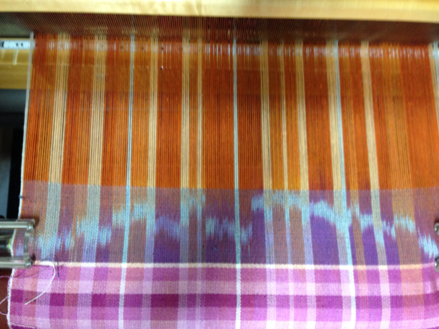
I have now completed five of the 16 sections – black and white, purple monochrome, orange monochrome, red/orange yellow at low saturation, red/orange/yellow at high saturation.
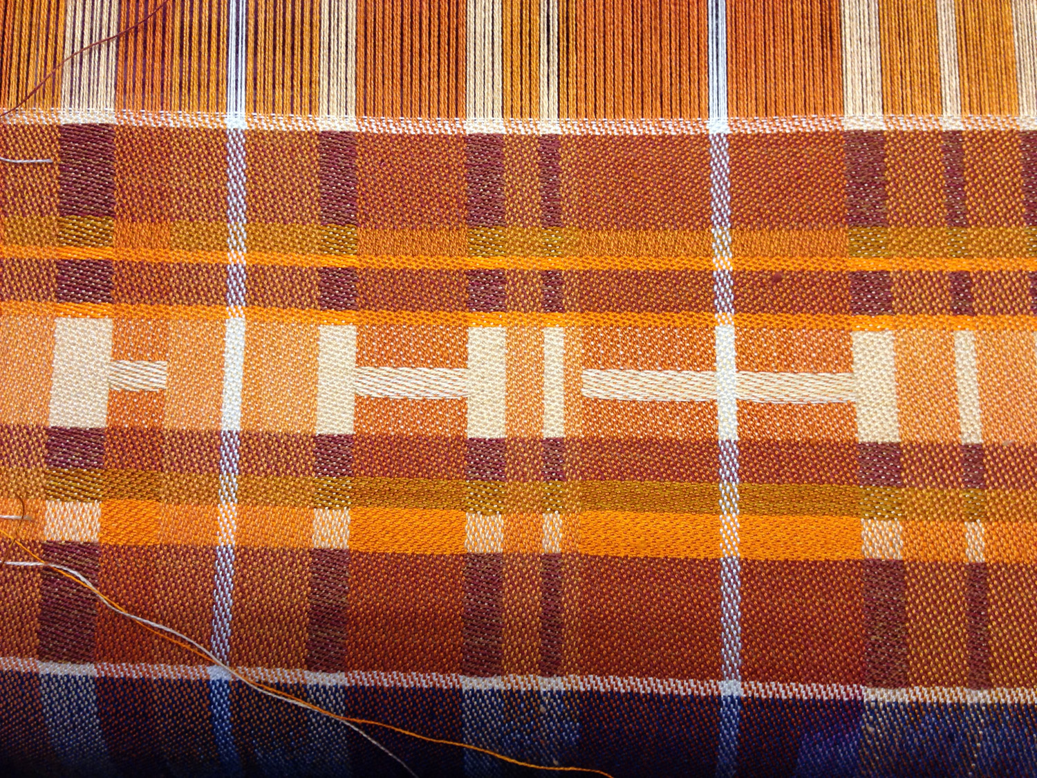
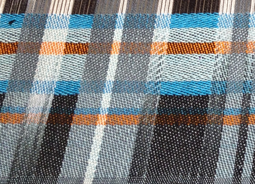
In the purple monochrome section, I decided to play with stripes. I set the weave structure to be 4/4 satin to even out the color blending, and then wove three sections – each with a different stripe pattern. Here is a subset of the results:

Sample #1 has all stripes equal width, with a regularly repeating color pattern, in both warp and weft. The result is a very rhythmic, even pattern – one that would go well where you don’t want any particular part to catch the eye. Napkins, for example.
Sample #2 has rhythmic stripes in both warp and weft – the color patterns and stripe widths are arranged symmetrically, resulting in a regular plaid. This has more irregularity than the equal-width pattern, adding more visual interest and energy. (Which could also be interpreted as “more busy”, depending on whether you liked the change or not.) This might make an interesting pattern for a jacket, as it adds visual interest without demanding 100% of the eye’s attention.
Sample #3 has stripes in a Fibonacci ratio – each stripe is a Fibonacci ratio to its neighbor – and woven “as drawn in”, i.e. with the same color and stripe-width sequence in warp and weft. Because there’s no symmetry and no repetition, it feels more chaotic to the eye, and because the lighter colors are in the top left, the eye is drawn to the top left, leaving the composition somewhat unbalanced. This might be useful as part of an art piece – or as more visually interesting napkins, depending on how you feel about napkins!
Sample #4 is irregular both in warp and weft, pattern and color. It has no rhythm at all, so it feels the most chaotic of the four samples, and I’d be least inclined to use it. It feels more like a jumble of color than something intentional.
Remarkable how rhythm and repetition affect the feel of a piece, no?