Tien Chiu

  • Home
  • About
    • Honors, Awards, and Publications
  • Online Teaching
  • Gallery
  • Essays
  • Book
  • Blog
  • Dye samples
You are here: Home / Archives for double weave cape

June 20, 2020 by Tien Chiu

Whew! What a month!!

I know I’ve been delinquent with the blog updates. I’ll plead that it’s been quite the month! Fortunately, in a very good way.

Janet Dawson and I decided to team up and teach a weave-along about weaving from your stash. We thought we’d get five hundred, maybe a thousand students, tops. Instead, we had over THREE THOUSAND WEAVERS sign up!! We were delighted, but also a wee bit overwhelmed. As a result, we both more or less dropped off the map for about a month.

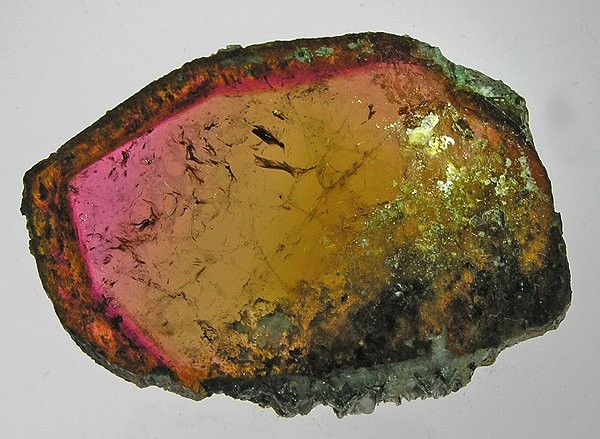
I did get the sample warp onto the loom and weave the first set of samples for Tourmaline Butterfly. I was doing a rendition of this image:

image of butterfly wing
butterfly wing

The concept is that the cape, when the arms are spread, looks like butterfly wings, with dark green veins coming out from the body of the wearer and ending in the border of dots. The interior of the “wings” portion is intensely colored and shaded out towards the veins to give a dimensional effect.

For the folks who like technical details (if you don’t, just skip to the next paragraph): in all the samples, I used a point threading and a networked rosepath treadling in the pink areas (the tie-up is twill), and a brick-like fancy twill pattern in the green areas. It’s double weave, so the pink is one layer and the green is another layer, stitched together periodically so the fabric comes out as a single layer.

Tourmaline Butterfly sample set #1

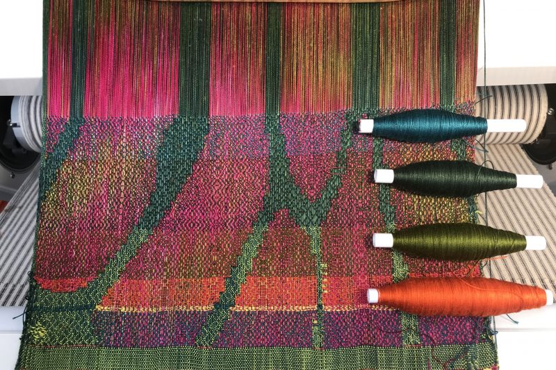
As you can see, the colors are pretty disappointing. I was hoping for some nice hue contrast and a clear, distinct pattern, but there simply wasn’t enough value (light/dark) contrast, and the chunks of color blended into each other even from a relatively short distance, muddying the bright pink into a dull brown.

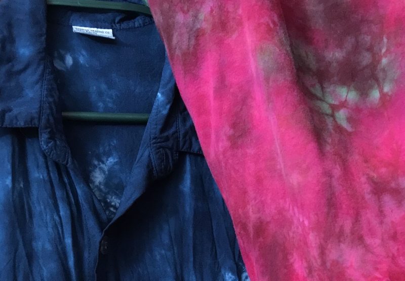
I sat down and thought about it. I was facing a difficult color dilemma. Green and magenta, the two colors in the bright part of my painted warp, sit opposite each other on the color wheel. That meant that practically any color I chose as weft would blend into a dull color with one or the other of them. The only two exceptions were yellow and turquoise, both of which were strong-minded colors that would shift the colors away from the magenta and green I wanted. And yellow in particular is a super-assertive color that would probably drag attention from the painted warp (yellow is such a diva!).

Nonetheless, I thought I’d give them a shot.

Sample #2 for Tourmaline Butterfly, with yellow, turquoise/blue, and olive green wefts.

None of these were what I wanted – the blue was about the same darkness as the magenta, producing a nearly invisible pattern. The yellow produced a bright result and a clear pattern, but HOO BOY!! took over the entire piece – entirely predictably, and not at all what I wanted.

I thought about it some more and eventually decided that this section was all about magenta, and it would be okay to lose some of the oomph of the green. So I decided to try a dark, dull magenta weft. Using a darker, duller weft is a great way to bring forward the colors in a painted warp (because the eye is more attracted to light, saturated colors), and using a similar color would reinforce the magenta.

This led me to Sample #3:

In the previous samples, I had felt that there wasn’t enough of the painted warp showing due to the shading from the center to the outside of each section (it goes from showing more weft near the outside of each pink section to showing more warp on the inside). So I switched it to showing mostly warp throughout the entire section.

But on seeing it, I decided the sample looked too “flat”. So I wove sample #4, which was Just Right:

Sample #4 for Tourmaline Butterfly, with dark magenta weft and shading towards the edges of each pink section

I like this sample a lot. The darker magenta weft gives it subtle motion without significantly diluting the intensity of the pink areas, and the very subtle shading from dark outside towards lighter inside of each pink area gives it a subtle sense of three-dimensionality. I think for the final piece I will want to make the weft a bit darker, but I will have to weave more samples to be sure.

At the top of the fourth sample is another experiment with a slightly more saturated pink weft. I don’t like that one as much; it looks brighter but not as rich as the one below it. That’s interesting, considering that normally I am a bright-color magpie!

So that’s the Tourmaline Butterfly update.

Meanwhile, other things have been happening!

Jamie and I celebrated our 10th wedding anniversary! Here we are together, after a wonderful take-out meal from Manresa (three-star Michelin take-out – only in the Bay Area!). Hard to believe we’ve been married for an entire decade, but it’s true.

And yes, 10 years since my handwoven wedding dress really kicked off my weaving career. Hard to believe I had only been weaving 2.5 years when I started it!

handwoven wedding dress
handwoven wedding coat
closeup of wedding coat

And here it is in its home at The Henry Ford museum, being shown to some visitors.

A volunteer there told me that most garments are stored hung for space reasons, but my dress is stored flat in a special, custom-built archival box. I’m glad to hear that they are treating it as precious; I’d like to think it will be preserved for many generations to come.

Finally, the fruit trees Jamie planted seven years ago when we moved in are starting to bear fruit. Lots and lots of fruit. I have been making pie:

Mulberry pie
Mulberry pie
Aprium (apricot-plum cross) pie with chocolate ice cream

And, of course, the first tomatoes are ripening. An eager-beaver Sungold.

Sungold tomato - first of the season!
First tomato of the season!

Finally, since no blog post would be complete without a cat, here is Tigress, Queen of the Laundry Pile. Because laundry is not truly clean until it has been liberally bestowed with cat hair.

Whew! What a post. But there was SO much to catch you up on!

Filed Under: garden, All blog posts, food, textiles, weaving Tagged With: double weave cape

May 10, 2020 by Tien Chiu

Tourmaline Butterfly (?)

After taking in quite a few suggestions, both here and in the Color in Weaving Facebook group, I’ve settled on a possible working title: Tourmaline Butterfly. The colors in the warp remind me of one of my favorite stones, watermelon tourmaline:

watermelon tourmaline crystal
Watermelon tourmaline. Photo by Rob Lavinsky.

I was thinking about how best to use the colors. Depictions of flowers seemed too literal and too specific for the way the colors flowed. I thought about doing a waterfall theme, but wasn’t happy with the feel, especially after looking at waterfalls.

Then I was looking at drafts on Handweaving.net, and stumbled on this gorgeous draft by Bonnie Inouye:

draft by Bonnie Inouye, looks like a stained glass window
Draft from Bonnie Inouye, Handweaving.net draft #60970

I love this draft. In particular, I love the blurry lines from the advancing twill design, which suggest a design in the distance, set against the sharp bars in the center. It looks like a stained-glass window. Or like a butterfly’s wings, with the soft colors against the sharp veining that holds the wings together:

monarch butterfly
Monarch butterfly. Photo by Erin Wilson.
blue morpho butterfly
Morpho butterfly (I think). Photo by Anne Lambeck.

I’m envisioning a three-quarter or full circle cape with the body of the garment in those lovely pink-and-green tourmaline jewel colors, and with dark green “veins” branching through the garment like the veins on butterfly wings.

As the wearer opened her arms, the “wings” of the butterfly would open, revealing the pink and green.

I’m also considering making the cape so that, when the cape is draped normally, most of what you see is dark green, and you only see the pink and green portions when the arms are spread. In that case I’d be tempted to name the piece Coronavirus Chrysalis. Or maybe just the far more timeless Chrysalis.

The downside to designing the cape like that, of course, is that nobody would see the beautiful pink and green most of the time. It would make a dramatic fashion show garment, but not a very interesting one otherwise….unless, of course, I put a design on the back, where the cape would lie flat, and put the dark green covering the “wings” of the cape.

So many possibilities!

I’m now about 2/3 of the way through tying on the sample warp. The pink and green areas are tied on, now I’m working on the green warp:

sample warp, partly tied on

This warp is going onto Maryam, and is designed to test whether the pink and green painted warp areas will stay cohesive enough to look good when woven. Also to test the concept for the overall patterning. The warp is 3.5 yards long, and 14.5 inches wide.

Because Maryam is threaded up at 60 ends per inch rather than Grace’s 90 ends per inch, I’ve doubled up the threads to get a good solid cloth. So the resulting sample will be heavier and coarser than the final cloth, but it should still tell me everything I need to know.

Next step is designing the first sample. Bonnie’s draft won’t work for my purposes, so I’ll have to create my own.

Finally, outside, things are happening.

The tomatoes are shooting upwards. I’ll have to hang the trellises this weekend:

tomato plants in my garden

The mulberries are ripening. I shook the tree this morning, with very tasty results:

box of mulberries

My ginger is sending up shoots. (This is culinary ginger – the stuff you eat. I mostly grow it because the leaves smell so wonderful when you brush against them. But it’s nice having ginger on the back stoop, too! At least I’ll never absentmindedly run out. I love Chinese cooking, so that would be utter disaster.)

shoots of ginger root

And, finally, the yellow irises are flowering. I wasn’t expecting them to bloom this year – I only planted them last year, and the purple irises are already done – but they appear to be, ahem, late bloomers.

yellow irises

(And yes, orange California poppies and roses in the background. The roses actually bloom all year round, even in December. There’s just no stopping them!)

That’s it for now!

Filed Under: garden, All blog posts, textiles, weaving Tagged With: double weave cape

May 2, 2020 by Tien Chiu

Searching for a theme

Time passes, and I’ve now dyed the sample warp. Here’s a not-great photo of it in the raddle, getting ready to be beamed onto the loom:

Sample warp being prepared for beaming onto the loom
New warp preparing to be beamed on

The warp is actually brighter-colored in real life, particularly the fuchsia-and-green one; it’s closer to orchid purple and moss green, very beautiful.

The warp is going onto Maryam, not onto a table loom. I had been debating this for most of a week. It really makes more sense to sample on Maryam, who has the same patterning capabilities as Grace, only with a lot less effort in putting on a warp (880 threads instead of 2,640). I was just feeling guilty about cutting off the 10 yards of warp still on Maryam, and feeling guilty about using Maryam for samples for an art piece when I had originally purchased her with the intent of using her for color samples.

Then some friends (thanks, Kaye and Sand!) pointed out that the 10 yard warp had been sitting there for months because I wasn’t enthused about weaving it, and that it made more sense to put on a warp that I would actually weave than one that would just sit there for another couple months. Also that I had no particular use for those color samples, and if I wasn’t enthused about them and had no particular use for them, why were they tying up my loom?

Point made. Off comes that warp. I got a nice pair of Kai scissors (best I’ve ever used!) recently, and they come out today.

That, of course, means that I have to figure out what to weave on that warp. I confess that I have no idea what I’m going to do with it yet, I just like the colors. But I need to choose some patterning (and some weft colors!) soon. Abstract swirls? Feather patterns? A traditional weaving draft but in nontraditional curlicues between pink/green and dark green? The possibilities are so endless that I’m feeling baffled. Suggestions welcome!

Since I’m at a total loss right now, I’m thinking it would be good to start with a theme, or maybe a title for the piece.

“Orchids and Moss”? “Bougainvillea Boogie”? ” “Jungle Birds”?

Or maybe I need to start with interesting patterning ideas and develop a title from there.

Your thoughts?

Filed Under: All blog posts, textiles, dyeing, weaving Tagged With: double weave cape

April 19, 2020 by Tien Chiu

More painted-warp cape dye samples

I’ve now done a few more sets of yarn samples for the painted-warp cape, testing out a few more dye approaches for the double weave warps. I started by trying the fuchsia/orange/yellow and deep indigo blue idea, dyeing these three skeins:

Three skeins of yarn, dyed in fuchsia/gold, fuchsia/orange/gold, and navy or indigo blue.
Fuchsia and Gold, Fuchsia/Orange/Gold, and Deep Navy skeins

The top skein is dyed using Fuchsia and Golden Yellow MX fiber-reactive dyes; the middle skein is dyed using Fuchsia, Soft Orange, and Golden Yellow. The bottom skein is dyed using Strong Navy. (All names are Dharma Trading Company (Procion) MX fiber-reactive dye names.)

What’s interesting about the top two skeins, if you look closely, is that Fuchsia and Golden Yellow strike about equally well on cotton and silk – there’s no difference in darkness in the threads in the top skein, which is only Fuchsia and Golden Yellow. But in the middle skein, which contains Orange as well, there is a noticeable difference in the areas that are orange – the strands of silk yarn (the shinier strands) are lighter, suggesting that the orange dye either absorbs or binds preferentially to the cotton yarn.

You can view this differential dyeing as either a fault or a positive trait. Or both. I happen to like it in the fuchsia/golden yellow/orange skein, and in the dark blue skein below it (where the silk strands are noticeably lighter than the cotton strands). However, it’s dreadfully inconvenient in this green sample, where I wanted different intensities of a single shade of forest green:

Green skein showing differential dyeing - some yellow and some blue-green areas

As you can see, I wound up with strands of pale yellow-green and bluish moss green instead, because the yellow and blue component dyes struck differently on the silk and cotton. (There’s no such thing as a “pure” green dye, alas.) The result is a gorgeous skein of yarn – that is not at all what I wanted.

I solved the green dye problem by doing what Ian and Teresa (and perhaps a few other people) recommended a few blog posts ago, and overdyeing. I dyed the top skein in the photo below variegated dark blue two blog posts ago; now I’ve overdyed it with gold. Now it’s a lovely dark forest green, with some subtle variation in color – but not nearly as much as the skein below, which was simply painted with green (blue + yellow) dyes in a single pass.

dark green skein on top, variegated yellow and medium green skein on bottom

Of course, neither skein is “right” or “wrong”; they’re both attractive color combinations, and both could create beautiful projects. However, the top skein is much closer to the effect I’m looking for, so I will paint one warp blue and then overdye it to get mottled forest green.

And the second warp?

I was not really happy with the combination of fuchsia/orange/yellow and dark blue. I’ve been working with that color combination for quite some time, and this time it didn’t “sing” to me.

Fortunately, I had decided to try another skein of fuchsia and green, this time using Golden Yellow instead of Sun Yellow. This was for technical reasons. Sun Yellow is a weak mixing color, meaning that it takes a LOT of Sun Yellow to shift either red or blue noticeably from its original color. So here’s the first skein, where green + fuchsia produced purple:

One of the things that happened (I think) was that the Sun Yellow simply got overpowered by the blue and the fuchsia dyes, resulting in purple and fuchsia. Golden Yellow is a MUCH stronger mixing color, and better able to hold its own against other colors.

Anyway, the next skein came out beautifully. Here it is, with the first skein (the one that produced fuchsia + purple) below it, for reference:

two fuchsia-and-green skeins, dyed differently

The first skein has much more subtle color variation, and much less dramatic differences between the threads. It looks much more unified than the other skein.

I think that’s because I applied just enough blue dye that – in the darker threads – the blue dye is the same darkness as the pink threads. I’m not going to go into all the color theory, but keeping the colors similar in darkness means they will blend together visually.

At any rate – I had eyeballed the dye mix for that particular sample, so the next step was to mix up dyes for another set of skeins using much more rigorous (aka, reproducible) measurements. Out came the digital scale and the measuring syringes. And here are the two final samples:

third set of fuchsia and green sample skeins

The top sample uses about 1/3 more blue than the bottom sample, so produces a cooler green. (The bottom skein looks more yellow on my screen than it does in real life; the top skein looks bluer than it ought. I could write reams about color inaccuracy in digital photos, but perhaps another time….)

I like the bottom sample better, so will be using that ratio of dyes.

The next step will be to test what my dye application method does on an actual warp. To dye the skein, I simply spread the skein out, dabbed bits of green dye on it, filled in the undyed areas with pink dye, flipped it over, and did the same on the other side. This produced what appeared to be unified areas of color. BUT – I don’t know whether those areas would continue to look unified if the dots and dabs were put into a warp. How would the threads rearrange themselves? How big would the areas of color be? What would it look like once woven?

Interesting questions. I don’t know, and I would like to know before dyeing, beaming, and tying on a monster 2,640-thread warp (20 yards long!).

Since Maryam is tied up with a different project, I’m arranging to borrow my friend Alfred’s Louet Jane table loom, so I can wind, dye, and put on a short warp, weave a little bit, and see what happens.

Stay tuned….

Filed Under: All blog posts, textiles, dyeing, weaving Tagged With: double weave cape

April 12, 2020 by Tien Chiu

Unexpected results

Today I’m giving thanks for my methodical, always-sample-first approach!

I was considering the “Just Do It” approach and just diving into dyeing my warp. But a little voice said, “Mixed fibers – you don’t know what will happen!” So I wound and dyed a small test swatch first. And boy howdy, am I glad I did!

Here’s the effect I was after – the fuchsia and green swatch on the right:

navy blue and fuchsia/green tie-dyed swatches

Here are the colors I used:

four dye swatches - fuchsia and green on top

And here is what I wound up with, after dyeing:

Yarn sample in fuchsia, salmon, and purple, with just a little bit of green

I’ve got lovely shades of fuchsia, purple, and pinky-orange, but where did the green go??

Here’s what I’m pretty sure happened.

The fuchsia struck equally well on both cotton and silk. No problem there.

The yellow struck preferentially on one fiber (I suspect the silk). It got zooped up immediately, leaving none for the other fiber.

The blue either attached preferentially to the other fiber (I think the cotton), OR the fuchsia and yellow hit first, and saturated out the dye sites on the silk (silk has fewer bonding sites than cotton), leaving nowhere for the blue to attach. So only one fiber got the blue dye.

The end result: the blue only dyed one fiber and the yellow only dyed one fiber. The fuchsia dyed both fibers. So I wound up with fuchsia in the areas I dabbed with fuchsia, a mix of salmon (fuchsia+yellow) and purple (fuchsia+blue) in the areas where fuchsia mixed with green, and blue and yellow and a teeny-tiny bit of green in the areas that were pure green.

Since I deliberately made most of the areas a mix of fuchsia and green (I didn’t want a whole lot of green), that meant that I wound up with a LOT of fuchsia-and-purple and almost no green.

So that idea is DOA. Good thing I sampled first!

At this point I have a few options:

I can try to get green from a different mix of dyes. There are four “pure” blues in the MX dyes and two yellows. A different combo may produce a green less inclined to “break” into component dyes. I’m a bit skeptical of this since I’ve heard all the blues are slower-striking than all the yellows, but it might be worth a try.

I can change the colors I’m trying to achieve. This seems like a sounder approach. If I use a single “pure” dye, or two more closely related colors than magenta and green (which are color-wheel opposites), I’ll probably get less chaos. If I want to see my pattern clearly, it would be good to use two colors of similar values (darkness). I’ll have to think about what colors, though, and of course do considerable sampling. I may be back to my favorite color combination, blue and orange-red, again. Not the worst of color combinations (I mean, it’s my favorite for a reason), but I’d kind of like to experiment with something different, too.

Whatever I do, though, I’ll definitely have to sample. Doing a mixed fiber warp is complicating things more than I’d expected. But that just makes it more fun!

Filed Under: All blog posts, textiles, weaving Tagged With: double weave cape

Next Page »

Subscribe to Blog via Email

Information resources

  • Dye samples
    • Procion MX fiber-reactive dye samples on cotton
    • How to "read" the dye sample sets
    • Dye sample strategy - the "Cube" method
  • How-Tos
    • Dyeing and surface design
    • Weaving
    • Designing handwoven cloth
    • Sewing

Blog posts

  • All blog posts
    • food
      • chocolate
    • musings
    • textiles
      • dyeing
      • knitting
      • sewing
      • surface design
      • weaving
    • writing

Archives

Photos from my travels

  • Dye samples
    • Procion MX fiber-reactive dye samples on cotton
    • How to "read" the dye sample sets
    • Dye sample strategy - the "Cube" method
  • Travels
    • Thailand
    • Cambodia
    • Vietnam
    • Laos
    • India
    • Ghana
    • China

Travel Blog

Entertaining miscellanies

© Copyright 2016 Tien Chiu · All Rights Reserved ·


Loading Comments...