Tien Chiu

  • Home
  • About
    • Honors, Awards, and Publications
  • Online Teaching
  • Gallery
  • Essays
  • Book
  • Blog
  • Dye samples
You are here: Home / Archives for fashion design

May 17, 2013 by Tien Chiu

Design studies

Yesterday I decided to try something different: instead of designing around my phoenix fabric, I wanted to see what would happen if I just let my design ideas roam freely. I sketched out several designs, then photocopied the most interesting one several times and colored in the photocopies:

multiple designs for Phoenix Rising

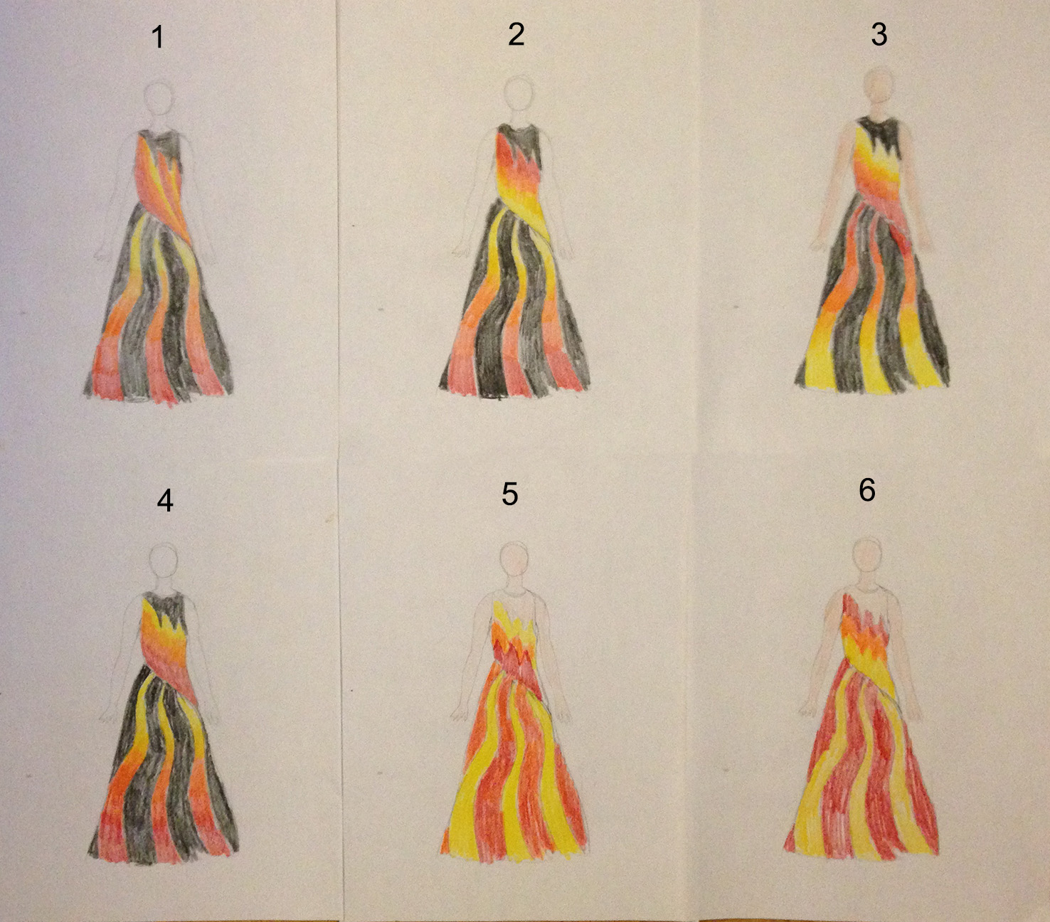
In #1, I was playing with diagonal lines across the bodice, but it didn’t work, mostly because it created visual confusion at the waist, where the converging diagonal lines on top met the radially symmetric lines on bottom. My eye doesn’t know where to go at the waist, which is bad.

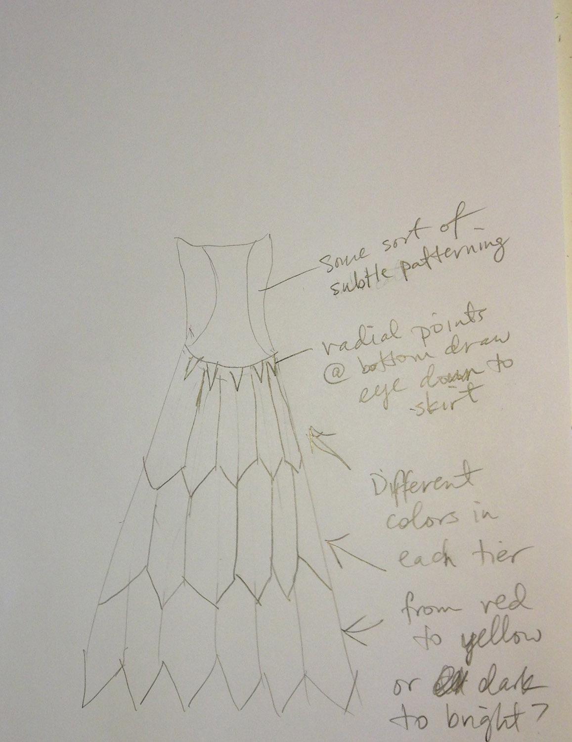
Enter #2. Here I shaded the bottom but made the waist a solid color, shading back to red at the top. This is a really strong design, in my opinion; the yellow connects and unifies top and bottom, and the reflected color gradations make for nice rhythm. The one problem? The brightest color (yellow) and the highest contrast portion sits at the waist, emphasizing the waist and hips. That’s not where I want attention, at least on my figure.

#3 was an attempt to keep the unity at top and bottom without focusing attention in the center. It’s not as strong a design, however,  because the two focal points (high contrast/brightest color) are now at top and bottom, leaving the eye feeling a little abandoned as it flips between the two. Also, I don’t want people focusing on my feet!

In #4, I wanted to see what happened if I kept the color gradation going in a single direction rather than flipping it. Unfortunately, it doesn’t work as well as #2; there’s still that jarring transition at the waist.

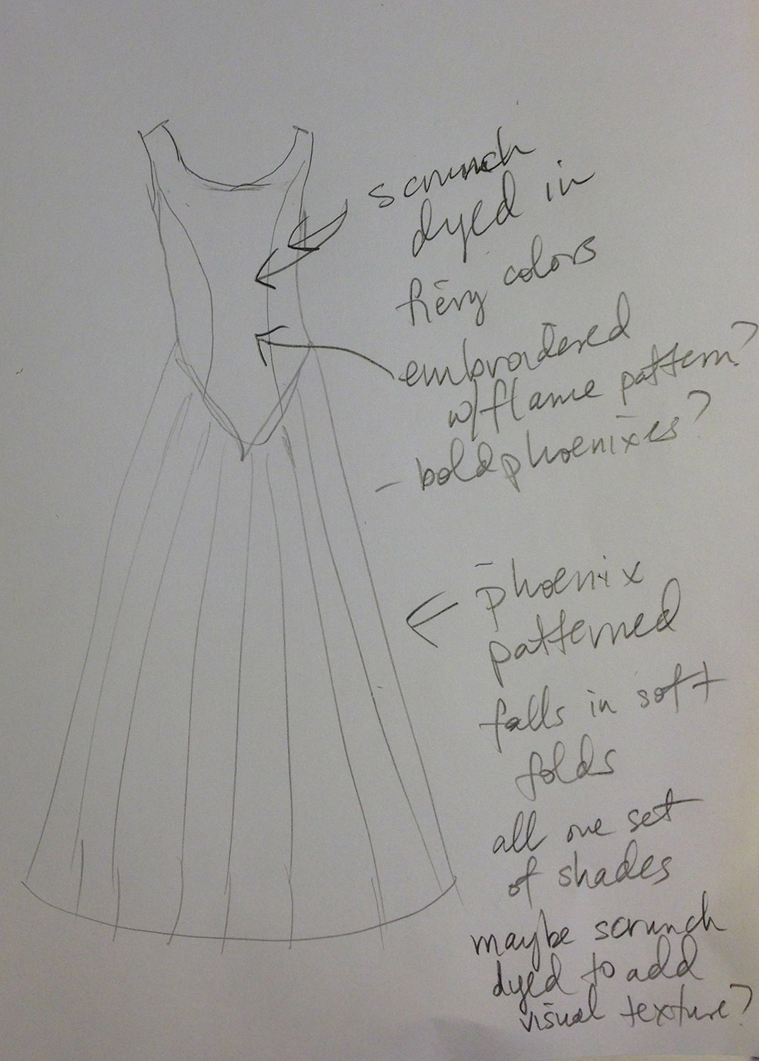
I wanted to see what happened if I eliminated the black, so I tried #5. It was ok – the flames at the top had potential – but I didn’t feel the red adequately unified the top and bottom – odd, since the red stripes meet the red torso bottom in the same proportion (theoretically, anyway) as the yellow stripes meeting the yellow torso bottom in #6. However, yellow is a more visually dominant color than red, so I think what’s happening is that the eye is traversing the yellow stripes in #5 and then crashing into the red of the torso. In #6, the eye travels up the yellow stripes, encounters the yellow bottom, and moves smoothly into the rest of the piece.

Verdict? #2 is definitely the strongest design of the set, at least in my opinion. If I were using it, though, I’d add some crystals or some lace at the top of the red flames on the bodice, to draw the eye up from the waist and give a focal point that isn’t the waist/hips. (Also, because the line of the dress flares at the hip, the waist looks thinner than it is, so it might work anyway.)

I don’t know that I’ll use this design – I really want to use the phoenix fabric and am not sure the curvy stripes would work well with the phoenix pattern – but working my way through multiple variations has really helped me understand what works and what doesn’t, especially with color gradations.

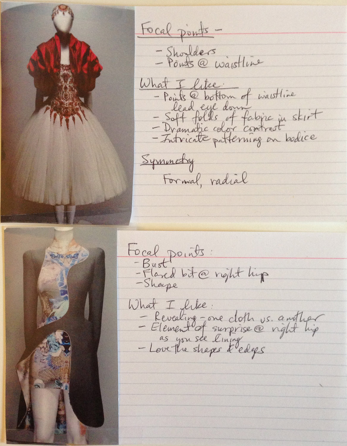
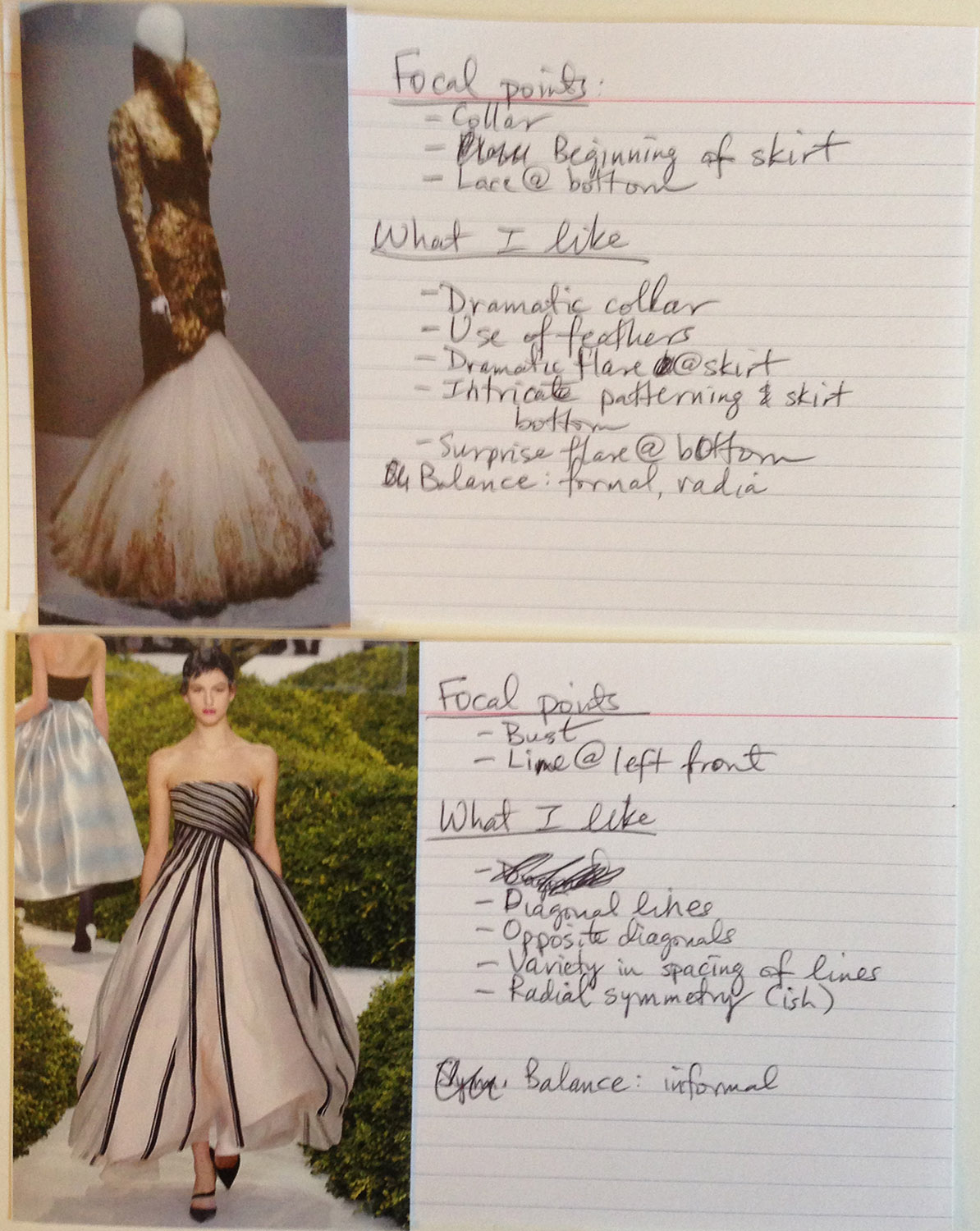
I’m also in the process of helping a friend critique a set of photos from a really interesting costume shoot, which is helping me develop my design analysis skills. There is really nothing like looking at a set of designs (some good and some not) and evaluating each one to see how it works. It’s easier (for me) with a variety of quality levels than it is in looking at perfect work – looking only at super strong designs, it’s hard to see what doesn’t work, which is just as important as seeing what does work.

So anyway, yesterday was enlightening, and hopefully today will be equally so!

Filed Under: All blog posts, sewing, textiles Tagged With: fashion design, phoenix rising, phoenix rising dress

May 10, 2013 by Tien Chiu

Design analysis, Design Poker

Yesterday, after flipping through several hundred photos of couture dresses, I selected fourteen that struck my eye. They weren’t designs I would want to use, necessarily, but each of them had one or more features that drew my attention.

So this morning I went through them and did a bit of design analysis. I had two aims. The first was educate my eye about design by doing an informal analysis: where are the focal points? Where is the eye drawn, what is the balance of the piece? How does the eye move through the piece? What is the overall mood and why?

The second aim was to figure out what had caught my eye in each piece, and capture those ideas on index cards so I could play Design Poker with them.

To give you an idea of what this was like, here are four of the design analysis index cards (click for a bigger version)

design analysis 2 design analysis 1

As I made each card, I captured the ideas I liked on index cards, scribbling a few words for each concept. When I was done, I had a set of sixteen cards, and was ready to play Design Poker. I “dealt” a hand of five cards, set a timer for fifteen minutes, and sketched five designs inspired by those five ideas before the timer went off.

They weren’t great designs, of course – the purpose of Design Poker is to brainstorm ideas. The timer is what keeps you moving – with an average of three minutes per design, the most you can do is scribble down ideas. This is intentional; otherwise it’s too easy to spend hours on a single design concept. In the early stages, I want lots of design ideas; later, I’ll condense and improve the best of the ideas into two or three working designs.

Here are some of the five designs I made:

design 1 design 2 design 3

As you can see, the designs are fairly crude and the ideas are not developed. That’s the idea for this round!

My next step is two more rounds of Design Poker with the remaining cards. After that, I’ll look at the designs, extract the better ideas from the more successful ones, and start consolidating things down to three or four working designs. I’ll develop those designs a little more fully, and then start draping and experimenting to “vet” those designs before settling on one to work with.

But first, I need to do some prep work. Some friends are coming over for a tie-dye party on Sunday, and I need to prepare! (As in, clean the work area, make sure I have all the requisite equipment, etc.) I also want to pre-tie some shirts, as some of my designs are fairly complex.

Filed Under: All blog posts, sewing, textiles, weaving Tagged With: design, design poker, fashion design, phoenix rising, phoenix rising dress

July 22, 2012 by Tien Chiu

Fun with Illustrator

The Jean Paul Gaultier exhibit at the De Young Museum was fantastic – and photos are allowed, as long as you don’t use flash!  I hadn’t realized that, or I would have brought my camera.  I did manage to snap 40-odd photos with my cell phone, but I’m planning to go back to the exhibit next weekend, better camera in hand.  There are a lot of construction details that aren’t visible in the printed photos, and what a stellar collection of ideas!

I’m not even going to begin trying to describe the exhibit until I have better photos – but if you haven’t seen the exhibit yet, and you’re in the Bay Area, RUN to the De Young Museum and see it!  Pure amazement.  (And don’t miss the film at the end!)

Anyway, Sharon and I sorted out the details of the Celtic Braid Coat’s construction over lunch, and also went through my collection of design sketches.  We agreed that the one with the strong diagonal lines interested us the most, and that I should proceed with sketching (and possibly even draping!) some of it.

When I got home, it was still way too hot indoors to even think about working with the Celtic Braid fabric, which is thick, warm, and positively stifling in this weather.  (We do have an air conditioner, but it doesn’t cool the entire house and we haven’t installed the whole house fan yet.)  So I fired up Adobe Illustrator and started working through a few tutorials on how to use it with a Wacom tablet/pen (which Mike gave to me for Christmas a year or two ago).

And (after some fiddling), it worked!  I’m totally jazzed about this.  I feel like a whole new world has opened up…I can draw! and if I don’t like it, I can undo and redo it!  And I can color and recolor it, add repeating patterns, and…stuff!  Lots of stuff!  I’m super excited about the power of Illustrator and Photoshop, and plan to keep working through tutorials.  I’ve barely scratched the surface, I know.

Here is the revised sketch of the “wing” design:

Phoenix Rising, design sketch

I got rid of the curlicues around the shoulder and one of the bell sleeves, balancing the design instead with a single shoulder strap that descends into a drape.  I’m using matching gold-to-red gradient colors in the sleeve and the bodice, and a red-to-gold gradient in the drape.  This puts the most assertive color (golden yellow) at the top of the shoulder and at the mid-thigh – the eye will naturally enter at the yellow on the shoulder, be drawn diagonally down by the “feathers”, and end in the yellow of the drape.

The pants are also a color gradient, from bright orange-red at the waist to a darkish red at the bottom.  Sharon suggested narrowing the top of the legs slightly to make my legs look longer – though not too much, to avoid looking like a ’60s refugee.

I’m really excited about this conception, and can’t wait to try draping the bodice.  I’ll need some horsehair braid to give the feathers body, though, so I’ll have to order some.

And there is the Celtic Braid Coat, of course, which has a deadline.  I’ll probably focus mostly on the Celtic Braid Coat for the next few weeks, then (once it’s done) go back to Phoenix Rising.

But I can draw in Illustrator!  How exciting is that?!?

Filed Under: All blog posts, sewing, textiles Tagged With: design, fashion design, phoenix rising

July 19, 2012 by Tien Chiu

Design Poker, Round Two

I got up and played six more games of Design Poker this morning.  It’s addictive!  It’s like free-writing – there is no right and no wrong, it’s OK to make mistakes, it’s OK if it doesn’t work – it’s a five-minute sketch and you can throw away the results if you want.  No investment, but lots of good ideas!  I think I’m going to incorporate this game into my Creative Design Process workshop – it’s a great way to get past designer’s block.

Here are the six results:

2nd round of design poker

Some themes are emerging.  I like cutwork, as evidenced in three of the four left-side garments.  I am envisioning them as yellow/gold/orange fabric cut away to reveal a bright red design, usually flames.  I think it would be neat to do these in stitched doubleweave, then cut away just enough of the stitching (if possible) to allow parts of the yellow to be cut away and hemmed, leaving the red fabric beneath.

I also like bell sleeves, particularly the dramatic one (which also involves cutwork!) in bottom center.

I’m not so enthused about the straight-cut designs, as in top right.  It feels too severe and constrained, unlike phoenixes and fire.

On the whole my favorite is bottom center, with the bottom left coming in second.  But I plan to play a few more rounds of Design Poker, to see what I can see.  Then I’ll take the more successful designs and play a “winner’s round” of Design Poker, using my favorite designs as inspiration for yet another round of Design Poker.  I’m hoping this will eventually refine into my final idea.

But whether it does or not, I’m having great fun, and coming up with lots of new ideas!

Filed Under: All blog posts, sewing, textiles Tagged With: design, fashion design

Subscribe to Blog via Email

Information resources

  • Dye samples
    • Procion MX fiber-reactive dye samples on cotton
    • How to "read" the dye sample sets
    • Dye sample strategy - the "Cube" method
  • How-Tos
    • Dyeing and surface design
    • Weaving
    • Designing handwoven cloth
    • Sewing

Blog posts

  • All blog posts
    • food
      • chocolate
    • musings
    • textiles
      • dyeing
      • knitting
      • sewing
      • surface design
      • weaving
    • writing

Archives

Photos from my travels

  • Dye samples
    • Procion MX fiber-reactive dye samples on cotton
    • How to "read" the dye sample sets
    • Dye sample strategy - the "Cube" method
  • Travels
    • Thailand
    • Cambodia
    • Vietnam
    • Laos
    • India
    • Ghana
    • China

Travel Blog

Entertaining miscellanies

© Copyright 2016 Tien Chiu · All Rights Reserved ·


Loading Comments...