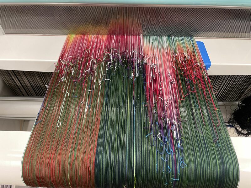
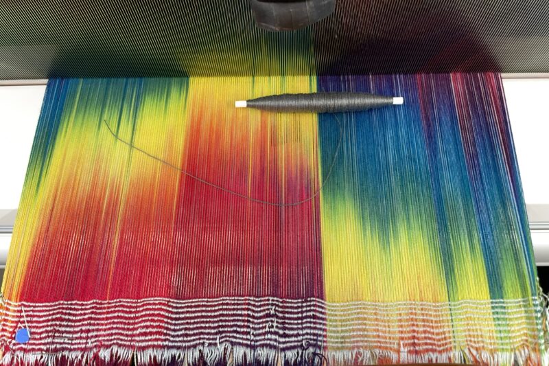
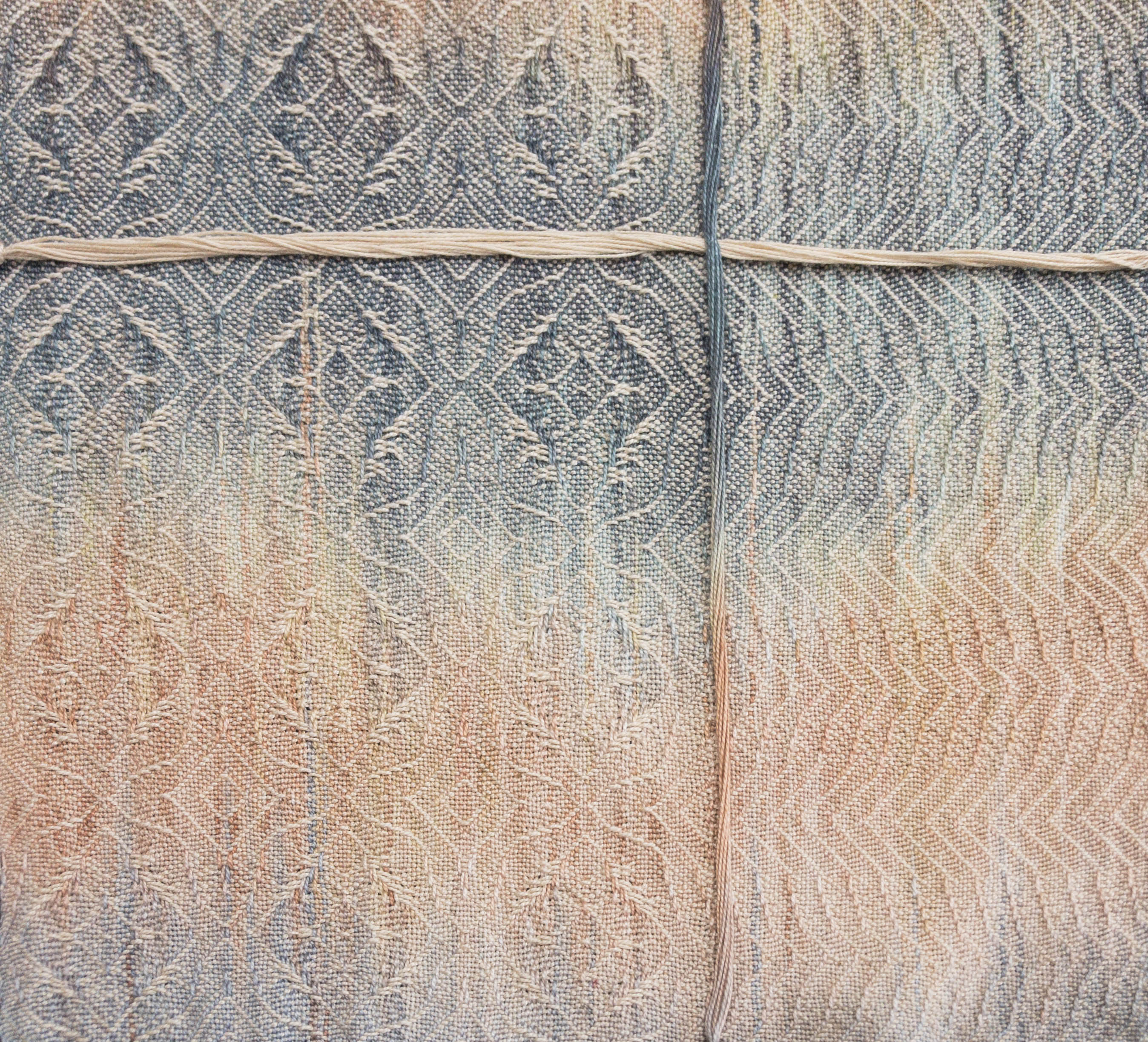
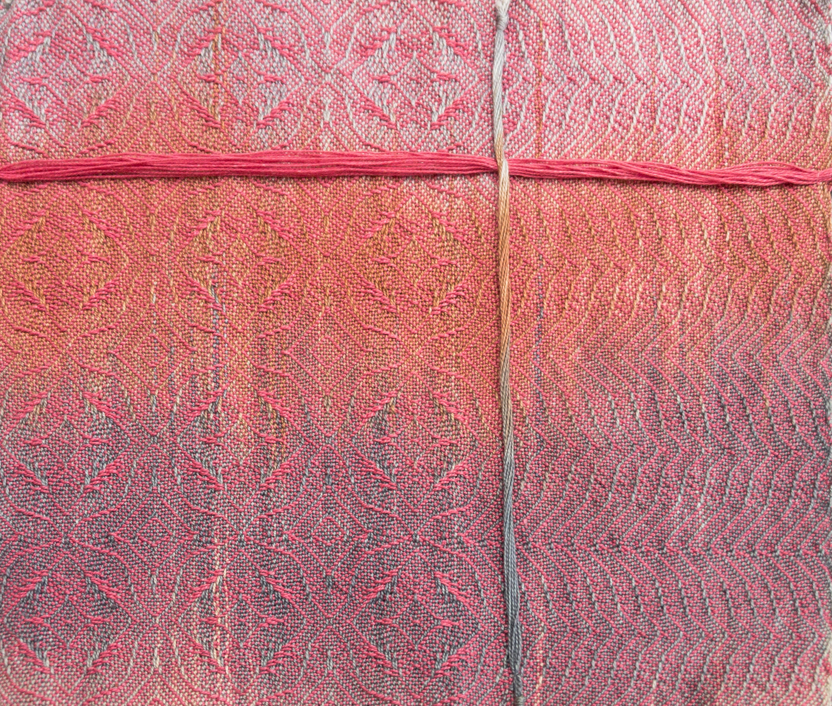
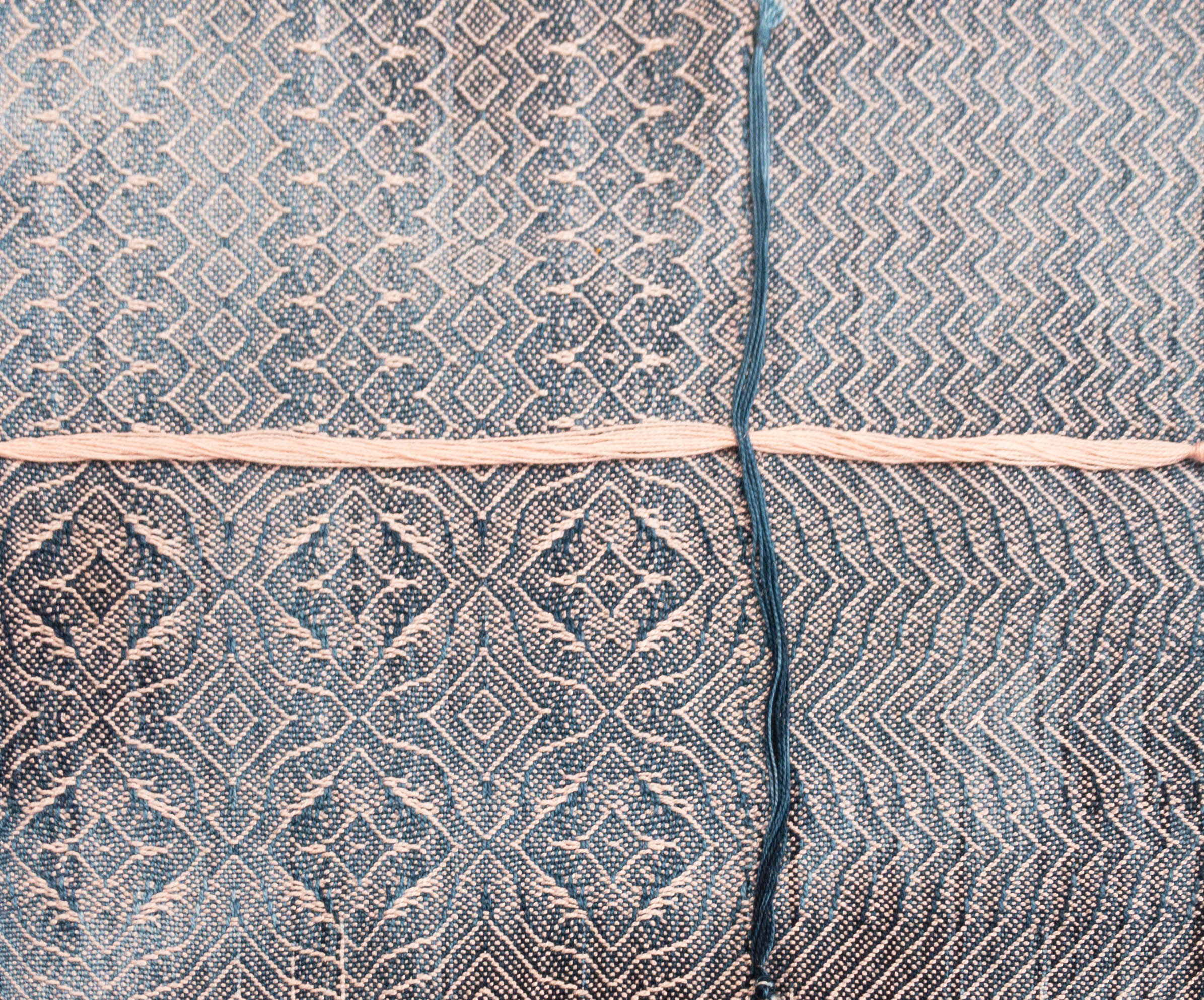
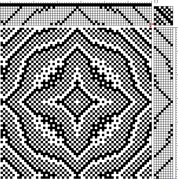
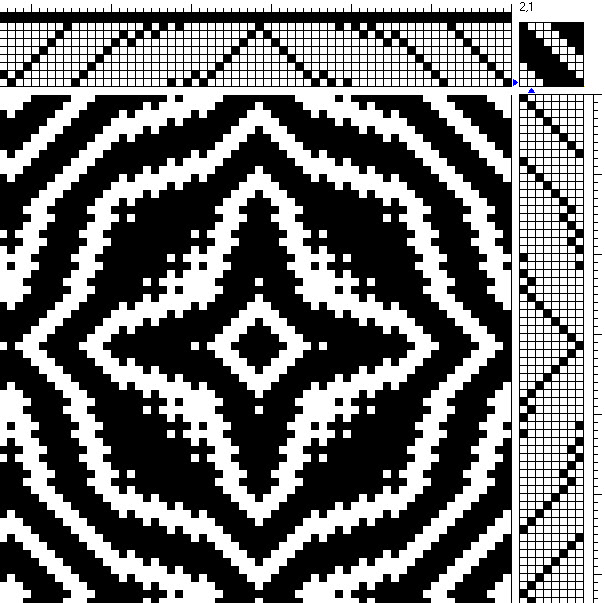
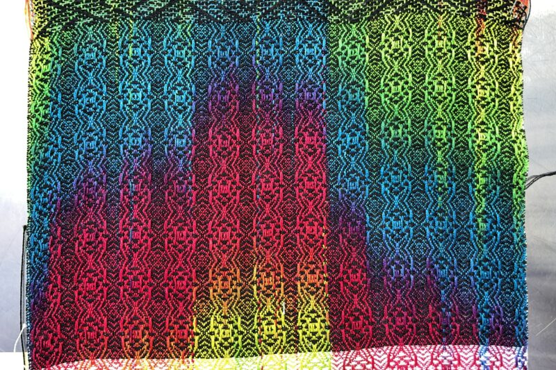
My next class at the Handweaving Academy is going to be Designing Painted Warps. So of course I have a painted warp on Grace, and have been weaving samples in lots of structures, stripe patterns, and so forth. The nice thing about a jacquard loom is that you can weave any structure you like in any sett you like (up to the maximum sett for your configuration), without having to rethread or resley.
This vastly speeds up sampling. So far I’ve woven something like 25 samples, all in different structures and/or at different setts. On a shaft loom, that would probably have taken me 1-2 weeks at least. I did it in two days. Go Grace!!
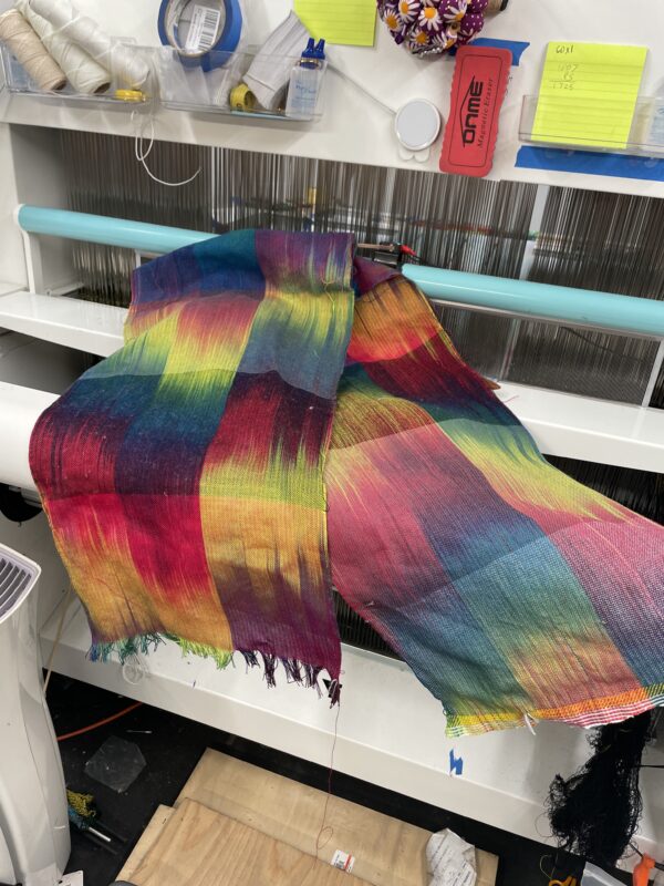
Most of the samples are intended to be instructional rather than pretty, but here’s a quick snapshot of my favorite:
I’ve still got another 7-8 yards of warp left – I may not weave the rest, though, as I may have enough to demonstrate my points already.
I am still replacing pistons on Grace, and have arrived at a dreadful conclusion. I have (surprisingly – what’s this common sense thing??) realized that perching on a stepladder, leaning way over into the loom, and doing fiddly stuff with both hands while trying to stay stable on the stepladder might not be the wisest thing to do. It’s certainly difficult and uncomfortable.
The more ergonomic and safer thing to do would be to remove the heddle kits from the loom, put the heddles on a table, and do all the fiddly piston-replacing stuff at my leisure, while seated in a nice, comfy position.
The only catch is: removing the heddle kits means rethreading. And I loathe rethreading. With the blazing fury of a thousand exploding suns. (Ask me how I really feel….)
On the other hand, not falling off a stepladder, contorting my body into cramped positions, or ruining my wrists does have a certain attractiveness.
So I’ve decided to remove the heddle kits from the loom, change out the pistons, and rethread. It will take time but it will also be (literally!) less painful than trying to change the pistons with everything in place.
For reasons too tedious to mention, that also means redoing the velvet warp from start to finish. I’m not wildly enthused about that but it does give me the opportunity to get the colors right, and maybe change some details of the configuration. C’est la vie.
Sometimes it feels like I’m taking two steps forward and eighteen steps back. But, as I keep telling myself, if you’re on an epic journey into uncharted territory, you have to expect to get lost in a swamp, fight off orcs and goblins, and eat frogs and lizards to survive the rougher bits. So cheer up! At least there are no orcs (yet!), and the food’s good, too. Onward ho!
Powerlifting-wise, I’m in the final stages of prep for my second-ever meet, which is this coming Saturday (January 27th). Last week was my last heavy-lifting week, lifting 290 pounds in squat, 145 in bench press, and 295 pounds in deadlift. Today and tomorrow are some super light weights, just to keep my muscles moving – 185 pounds for squats and 90 pounds for bench press (no deadlift). And then I do absolutely NO lifting for three days. That way I’ll be fully recovered, rested, and at full power going into the meet.
Interestingly, the California state record for women in my age/weight class (50-54, 181-198 pounds) is only 292 pounds for the squat. My personal record is 310 pounds, so breaking that record should be quite feasible as long as I don’t screw up. Fingers crossed!
I am still debating between two T-shirts to wear when not lifting:
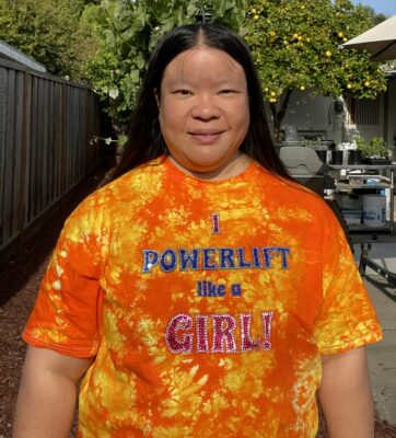
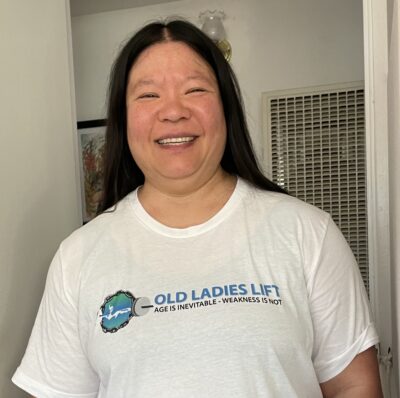
You gotta admit, it’s a tough choice. Which do you like best?