Tien Chiu

  • Home
  • About Tien
    • Honors, Awards, and Publications
  • Online Teaching
  • Gallery
  • Essays
  • Travels
  • Book
  • Blog
  • Dye samples
You are here: Home / Archives for procion mx dye samples

April 2, 2017 by Tien Chiu 6 Comments

Ready to go with the new dye setup!

After ruining four batches of skeins, I have managed to create a dyeing setup that works. It’s a complex procedure, because each jar has to start out with a different amount of water, salt solution, and dye. And then the correctly labeled skein needs to be added to the jar. During the dyeing, each skein must be lifted out of the jar multiple times, which can result in cross-contamination between jars. The water bath level needs to remain stable and the temperature correct throughout dyeing. So I had a lot of failures before working out my method. But I did. For the curious, I wrote up my procedure in this Google Doc, which also links to the calculator spreadsheet that works out how much water, salt, etc. is needed for each jar.

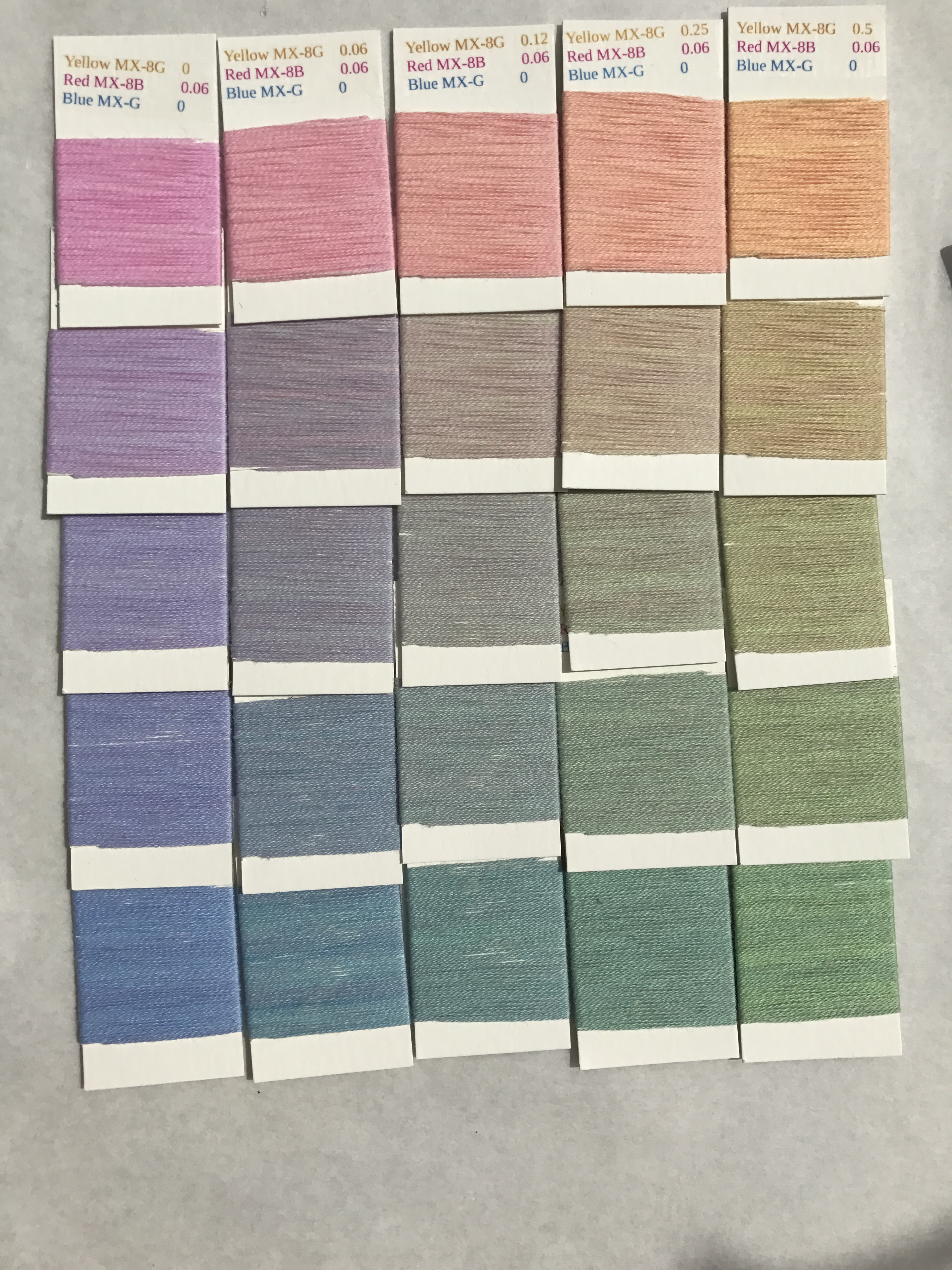
Here is the first completed layer of the light-colored “cube” for Gold/Mixing Red/Navy:
Gold-Mixing Red-Navy, 0.12% Mixing Red

I love this group of colors – they have a soft, subtle glow, as opposed to the brighter/more garish Gold/Mixing Red/Intense Blue skeins that I put up a blog post or two ago. 

The funny thing is that I would never have imagined using these colors before I started dyeing my samples. My taste runs towards very bright, contrasting colors. Partly, though, that was because bright colors are more popular, so more readily available. Before starting my dye experiments, I didn’t have samples in paler shades and less saturated ones – so this project is really broadening my view of color. I’m looking forward to working with a wider palette!

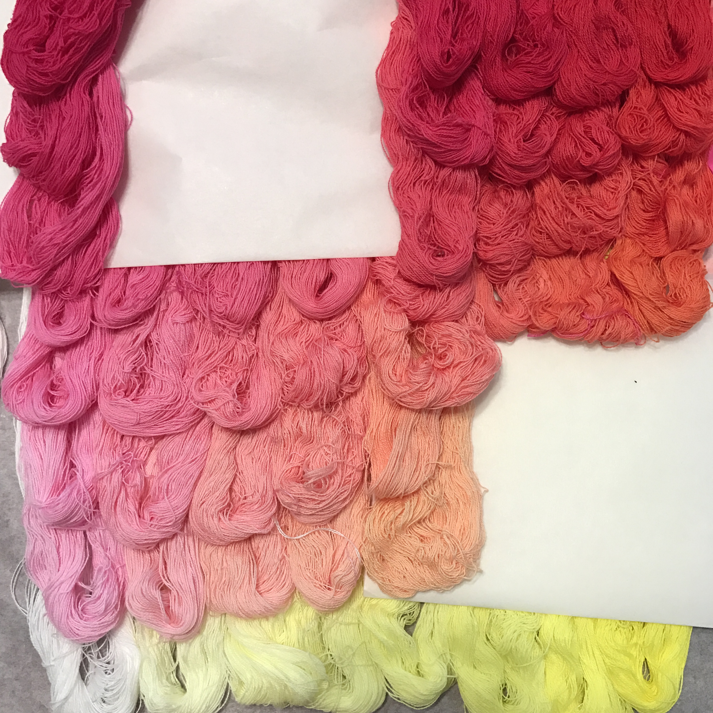
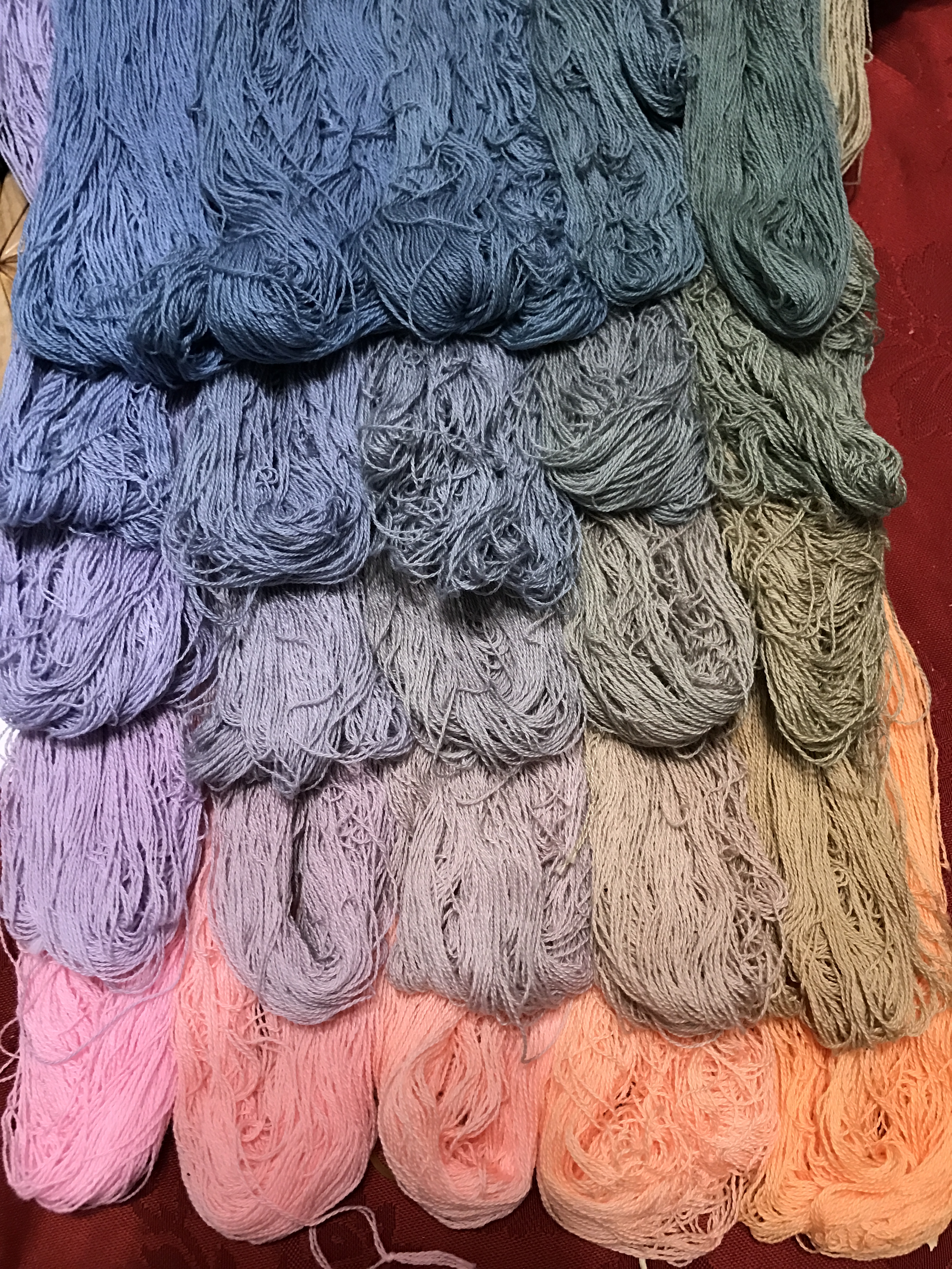
Meanwhile, my friend Carla has finished winding the first layer of the Sun Yellow/Fuchsia/Turquoise skeins that I dyed a month or two ago. Here are two of the layers:
Sun Yellow - Fuchsia - Turquoise - 0% Fuchsia
Sun Yellow – Fuchsia – Turquoise – 0% Fuchsia
Sun Yellow - Fuchsia - Turquoise - 0.06% Fuchsia
Sun Yellow – Fuchsia – Turquoise – 0.06% Fuchsia

As you see, there is a lot of color variation within the samples. This is because I hadn’t yet worked out my method for the sequential-dyebath cubes and thus didn’t rotate the location of the skein ties as often as I should have. I’m hoping later samples are much more level.

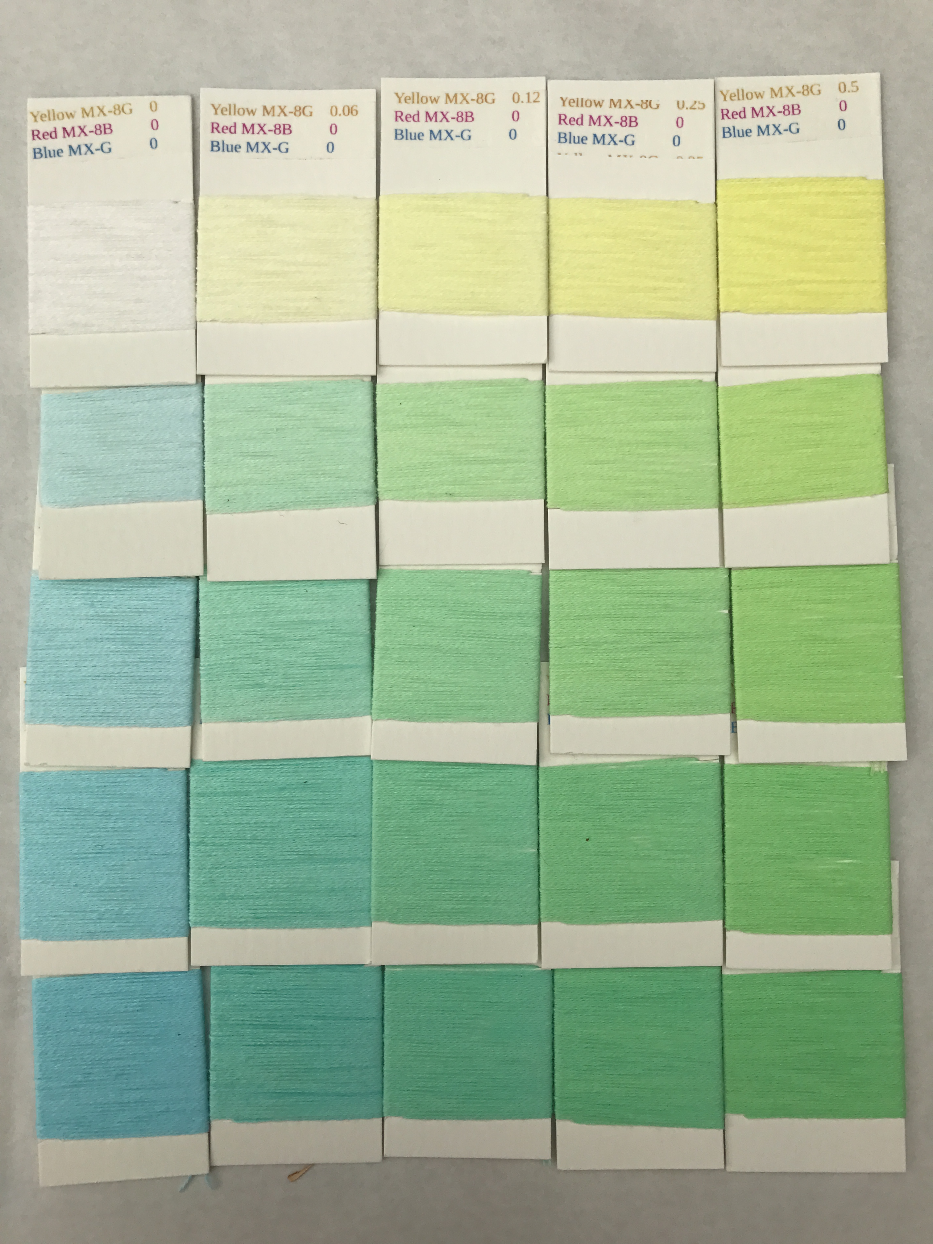
I personally enjoy the photos of skeins more than the photos of the cards, because there is more richness and complexity in the photos of the skeins. However, the cards will provide a much more accurate measure of the colors, and are much more compact. So each has its place.

Yesterday I dyed two batches of skeins (52 skeins total) in a single session. I won’t do that again – while I did manage to get the procedure more or less correct, I didn’t get to circulate the skeins through the dye baths as much I would have liked, so I’m worried that the results might not be evenly dyed. I was also running around like crazy wishing I were an eight-armed octopus for the first hour or so. I may try doing two batches of skeins again, but it will be in overlapping dye sessions, not both at once. Oh well – it had to be tried!

I’ll leave you with this fabulous photo of a jellyfish swimming through a sea of plankton. I took this photo at the Monterey Bay Aquarium, which has fantastic exhibits of sea life. Doesn’t it look like a Space Invaders alien come to conquer Earth?
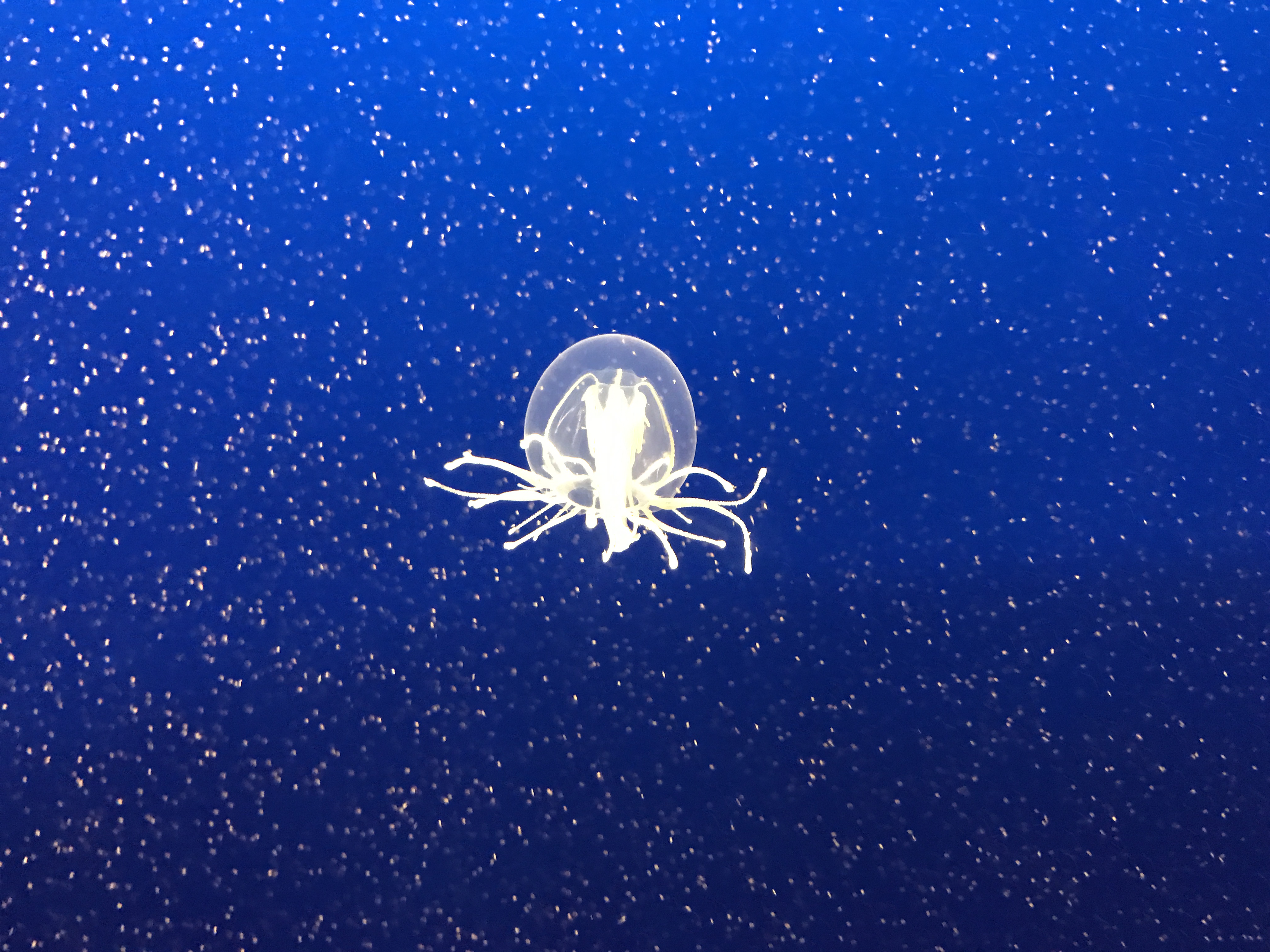
Jellyfish at the Monterey Bay Aquarium


Filed Under: All blog posts, dyeing, textiles Tagged With: procion mx dye samples

March 19, 2017 by Tien Chiu 14 Comments

New dyeing setup

I’m considering changing my dye methodology for my 1500+ samples. I timed some steps, did some calculations, and discovered that the rearranging and relabeling of skeins between dyebaths takes a lot more time than expected. The total amount of time required for each skein comes out to almost 10 minutes a skein! That is, at least in theory, pretty close to the amount of time required for individual dyebaths. And individual dyebaths would be of more practical use since I wouldn’t have to do three dyebaths to replicate the color in the sample.

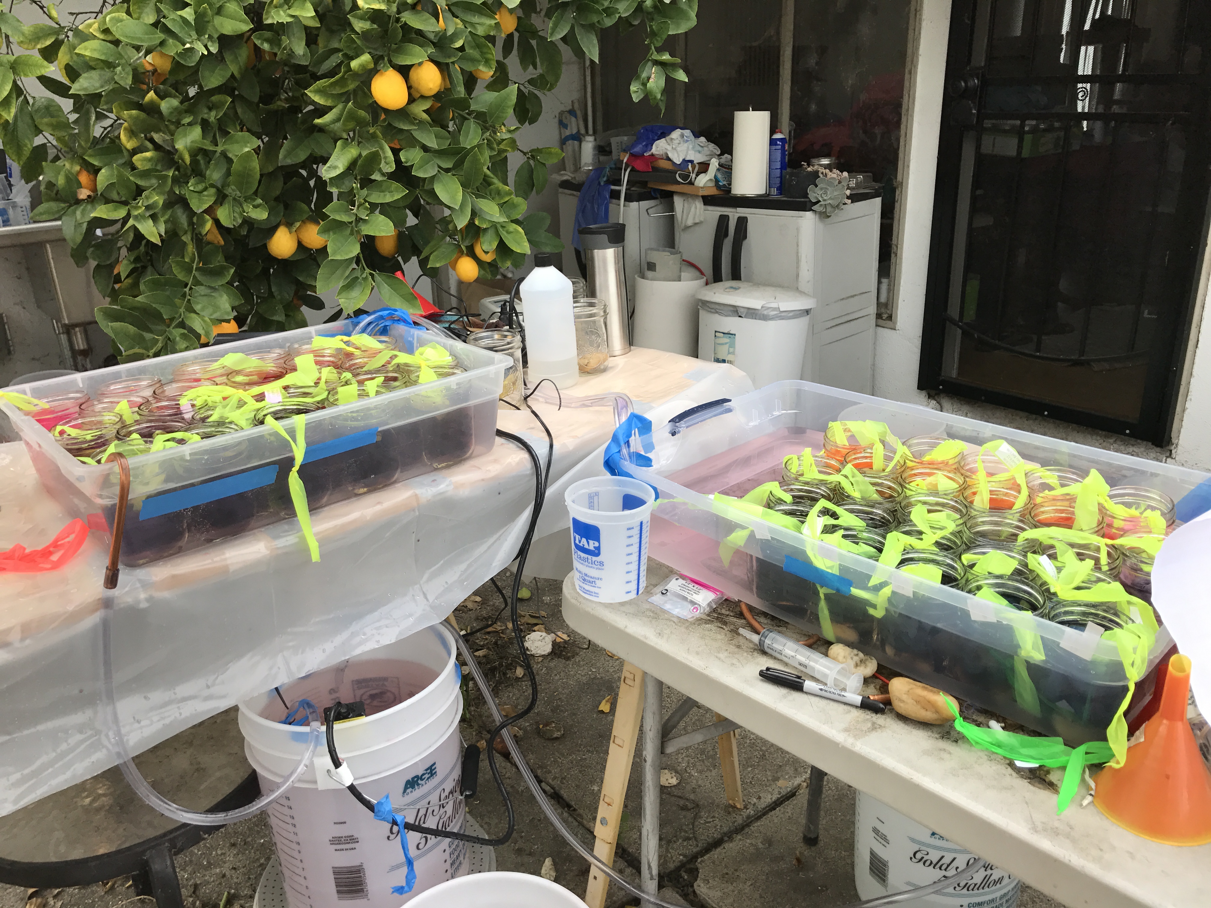
So I have been working on developing and refining my methodology for individual samples. It’s been…complicated. Here’s my basic setup:

basic setup for individual dyebaths

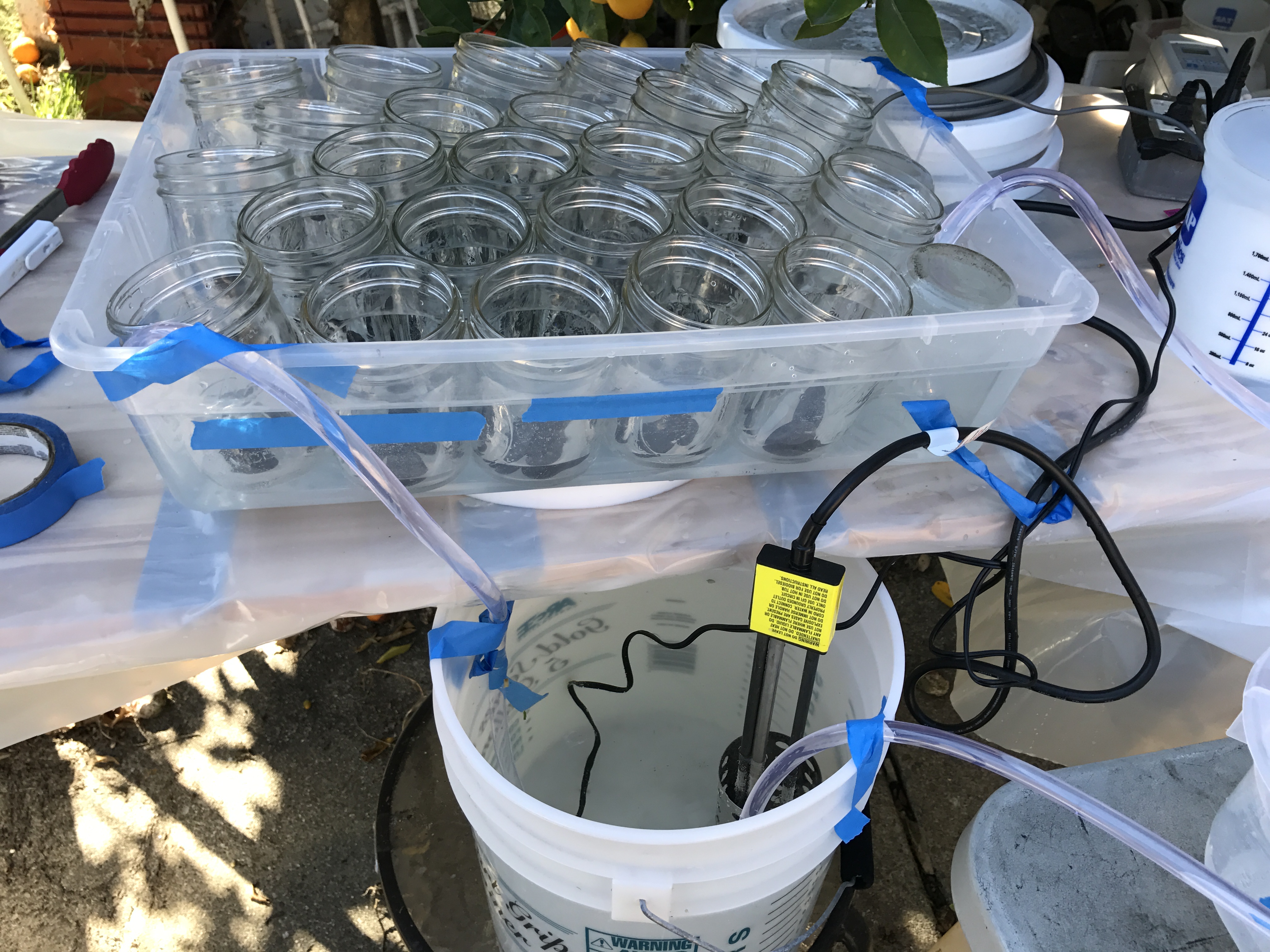
The dyebath needs to be kept at about 90F, which is difficult to do when working with small jars for individual dyebaths. So I am putting glass pint canning jars into a pair of circulating water baths. (The right-hand water bath has no jars in this photo – I was still setting up.)

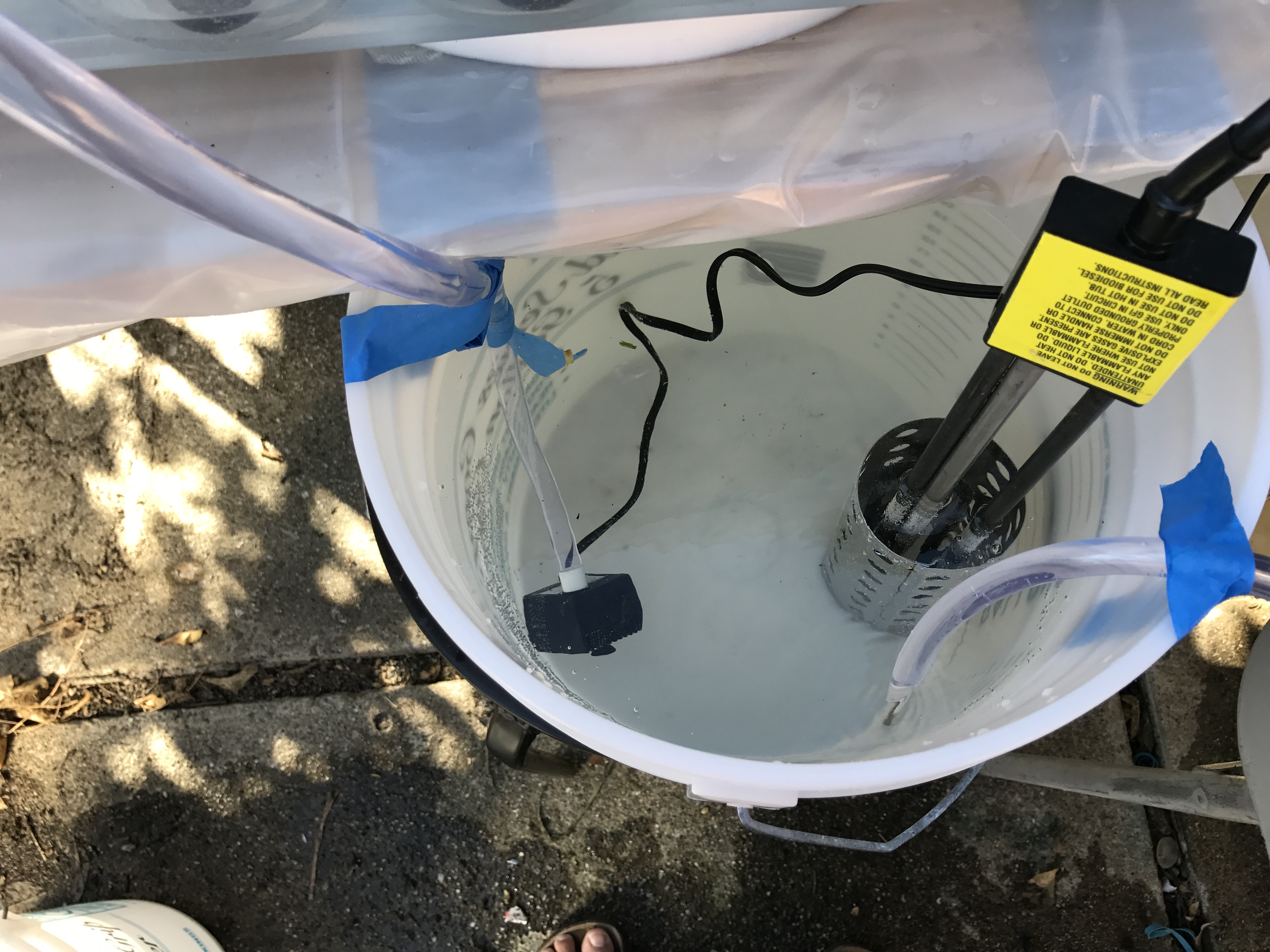
A bucket below the jars contains a pump and a bucket heater (to maintain the temperature).

pump and heater for circulating dyebaths

The pump (meant for a small fountain) pushes the water up the tube on the left, into the first water bath:

first circulating water bath

Water is coming up from the bucket through the left-hand tube. A clear tube on the right side siphons water out of the bath and into the next circulating water bath. Because the pump and siphon are on opposite sides of the container, water moves through the entire container, keeping the temperature even. A temperature probe (the cord taped to the back right corner of the water bath) controls the heater in the bucket and keeps the temperature of the bath at 90F.

The second circulating water bath is a bit simpler. It’s located a few inches below the first water bath, so gravity pulls water through the siphon in the first water bath down into the second bath. A second siphon at the opposite end of the container pulls the water down and into the bucket, to be pumped up again. (Here the inlet hose is in top right, and the siphon to the bucket is in the bottom left corner.

second water bath
second water bath

It’s an elegant solution, but also quite fussy. The siphons have to remove water from each circulating bath at the same rate that the pump is pumping it in, which is a bit tricky. I accidentally flooded my first set of skeins when I made a small adjustment, walked away to check my email for a few minutes, and came back to find the water bath overflowing! Lesson learned: if you’re doing something for the first time, for heaven’s sake don’t walk away from it and assume it will work!

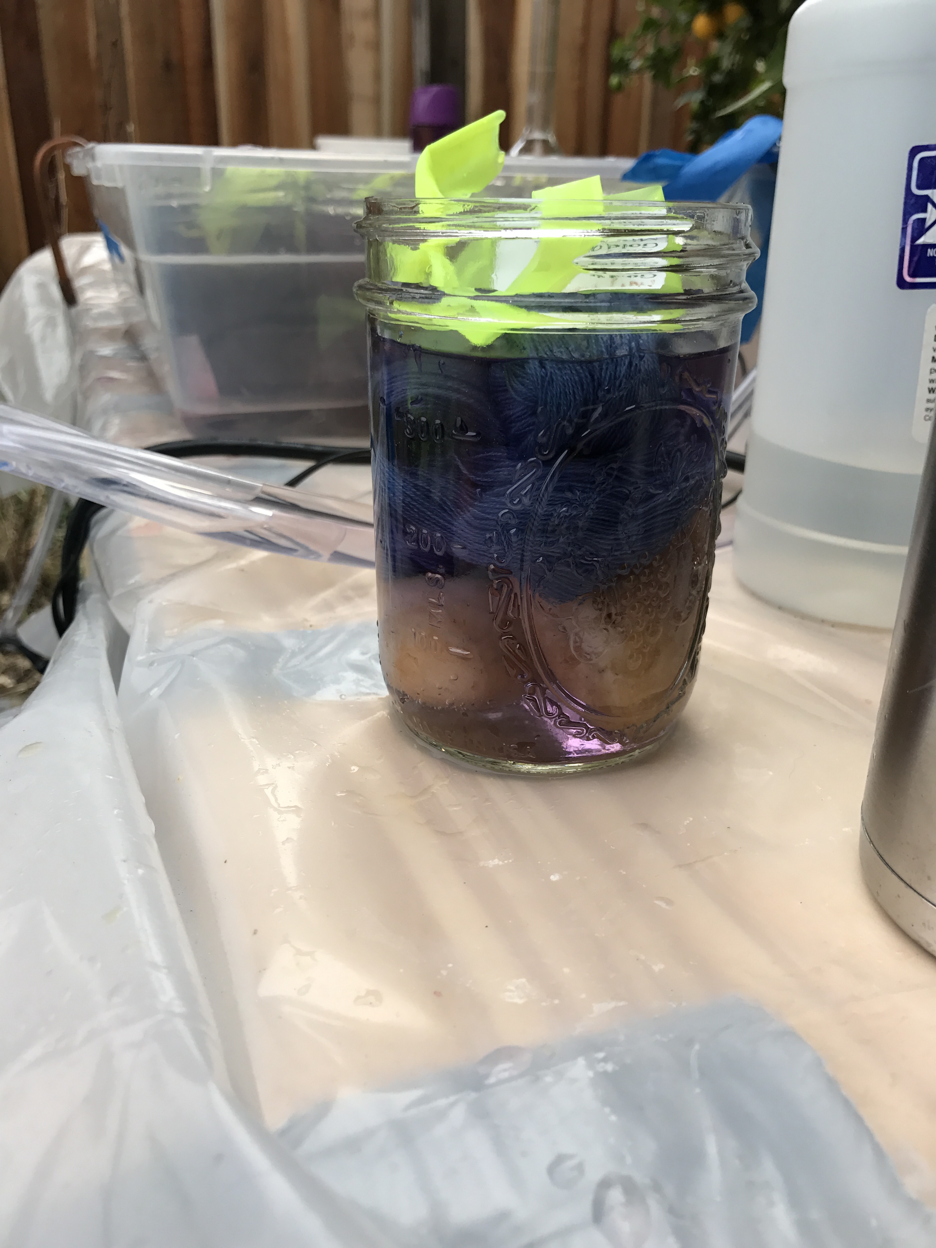
I found initially that the jars, when empty, tended to float. So I stuck rocks into them to weigh them down. (No, those are not potatoes in the bottom!) It worked, but I have some better ideas for next time.

individual dyebath - single jar
individual dyebath – single jar

Here’s what it looks like with 50 individual dyebaths going:

fifty individual dyebaths

Each dyebath has a different concentration of Gold, Mixing Red, and Navy Blue.

Because of the difficulty of measuring small amounts of dye and other dyebath additives, I made up stock solutions of dye, salt, and soda ash, and measured out the amounts with syringes (tested for accuracy). Here is Kaye (my dyeing buddy) adding soda ash solution to one of the dyebaths. She’s holding the skein up above the dyebath as she adds the soda ash solution with the syringe.

individual dyebath - adding soda ash with a syringe
individual dyebath – adding soda ash with a syringe

As you can see, this method is much fussier and more error-prone than the sequential-dyebath method. However, it will enable me to reproduce the results with a single dyebath. And, if I decide to sell color plates of my samples, they will be much more useful to buyers if they don’t have to do three dyebaths to achieve the same results. So I am continuing to experiment and refine the process, to see if I can make individual dyebaths work. So far I’ve botched three sets of skeins, but I’m learning something with every dyebath, and I’m confident I can figure it out, though it may take me a few more weeks. When you’re doing something new, you’ll inevitably run into snags – this is just giving me more snags than most.

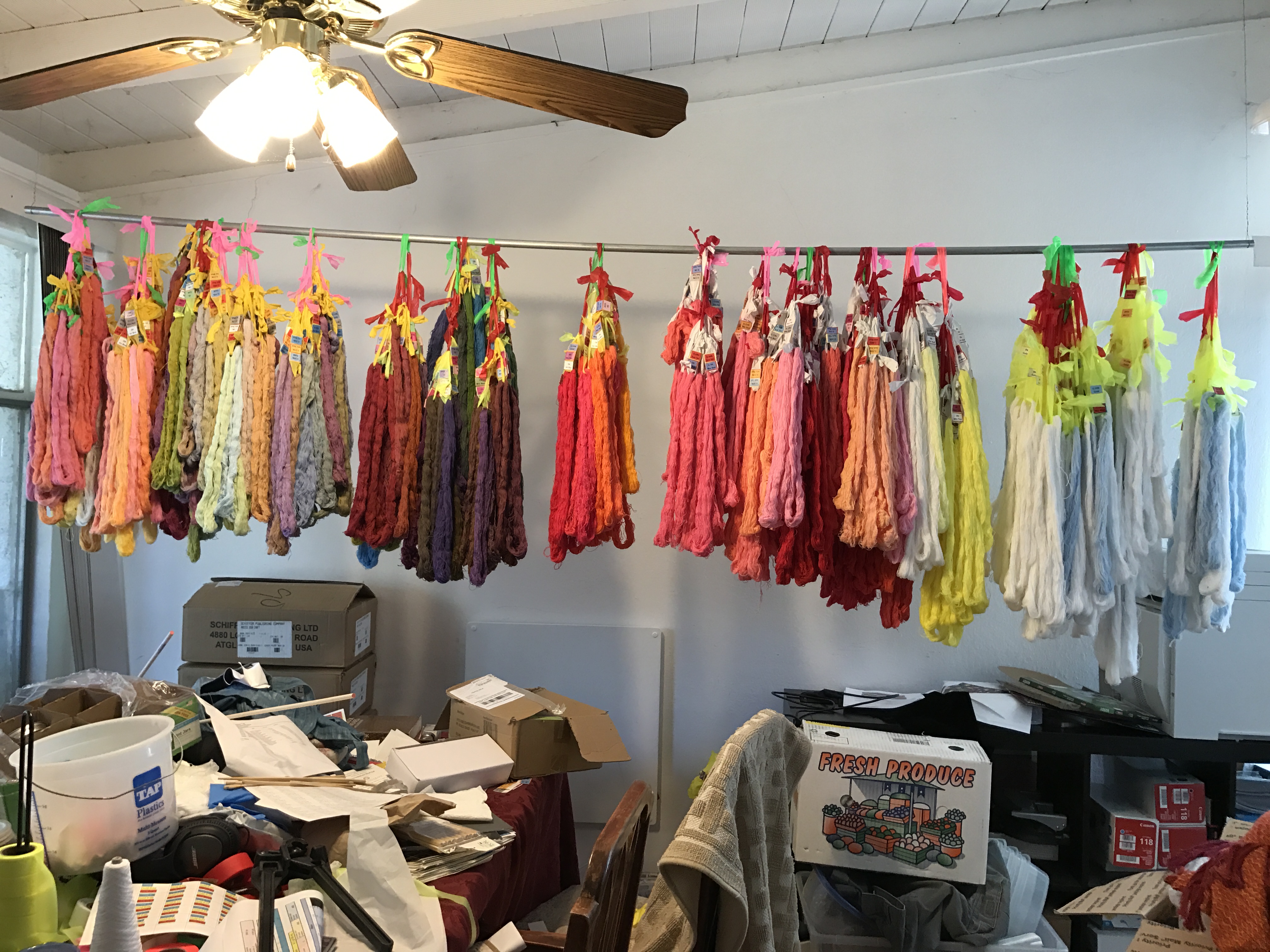
Meanwhile, B. has very kindly put together a skein-drying and storage rack in the dining room, turning an untidy pile of skeins into a beautiful curtain of color.

sample drying rack and storage

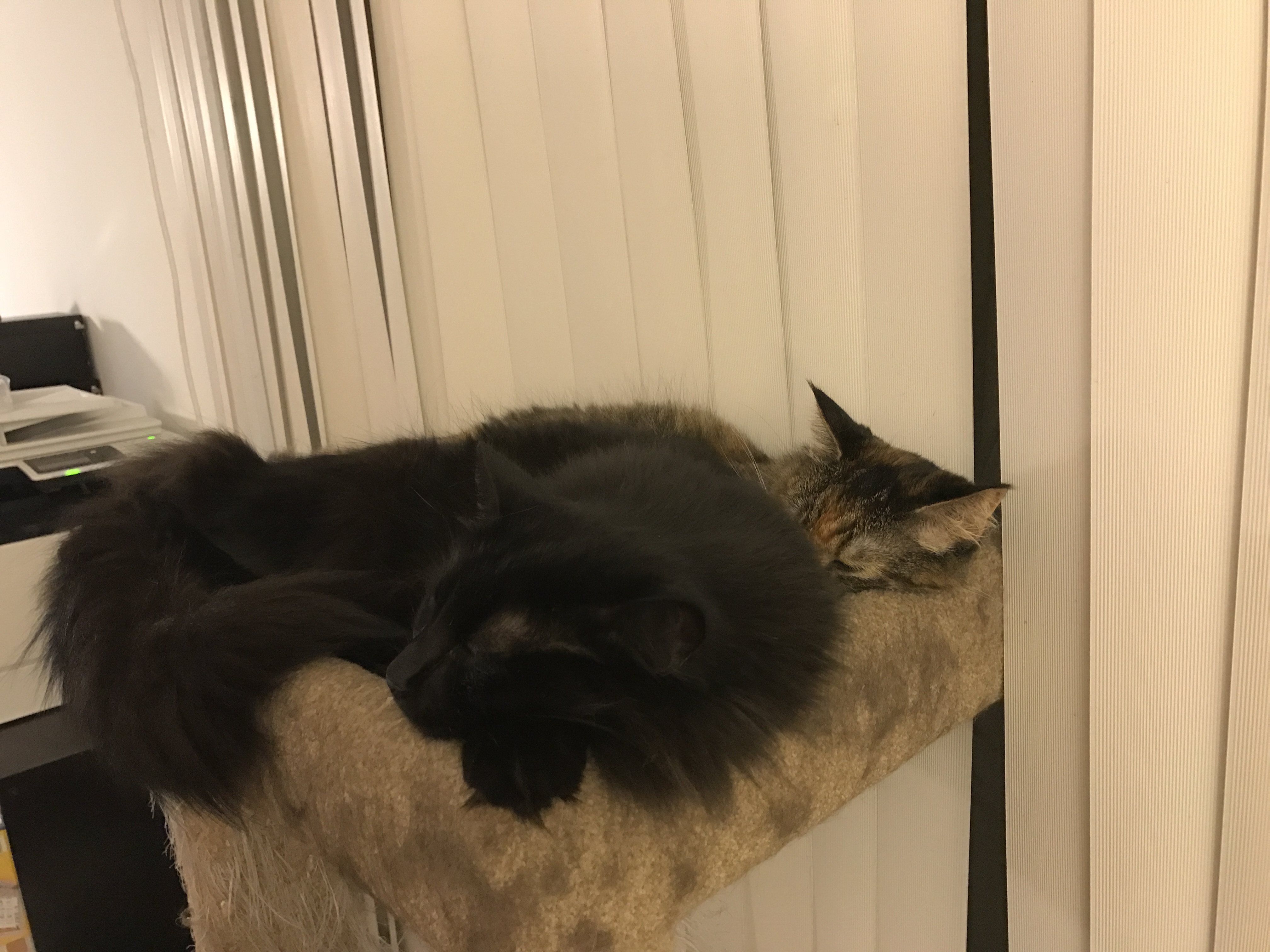
Thankfully, this is what the cats think of it:

Fritz and Tigress expressing their enthusiasm

And that’s it for now! I’m hoping to have pretty pictures of a successful batch soon. Stay tuned!

Filed Under: All blog posts, dyeing, textiles Tagged With: dye samples, procion mx dye samples

March 10, 2017 by Tien Chiu 3 Comments

Procion MX dye samples on cotton: Gold – Mixing Red – Intense Blue

I’ve now completed my second set of Procion MX dye samples on cotton yarn – the Gold, Mixing Red, and Intense Blue samples.

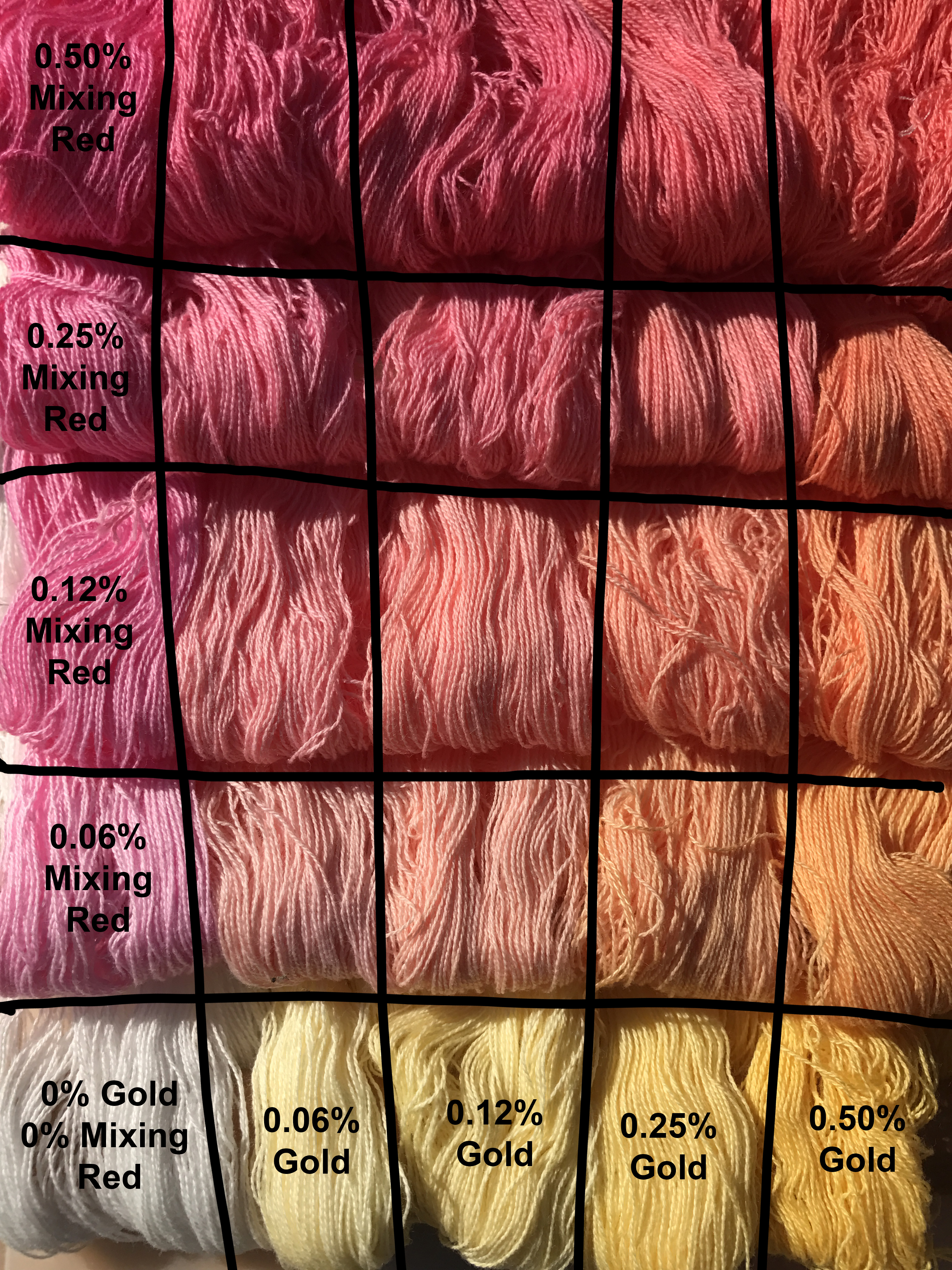
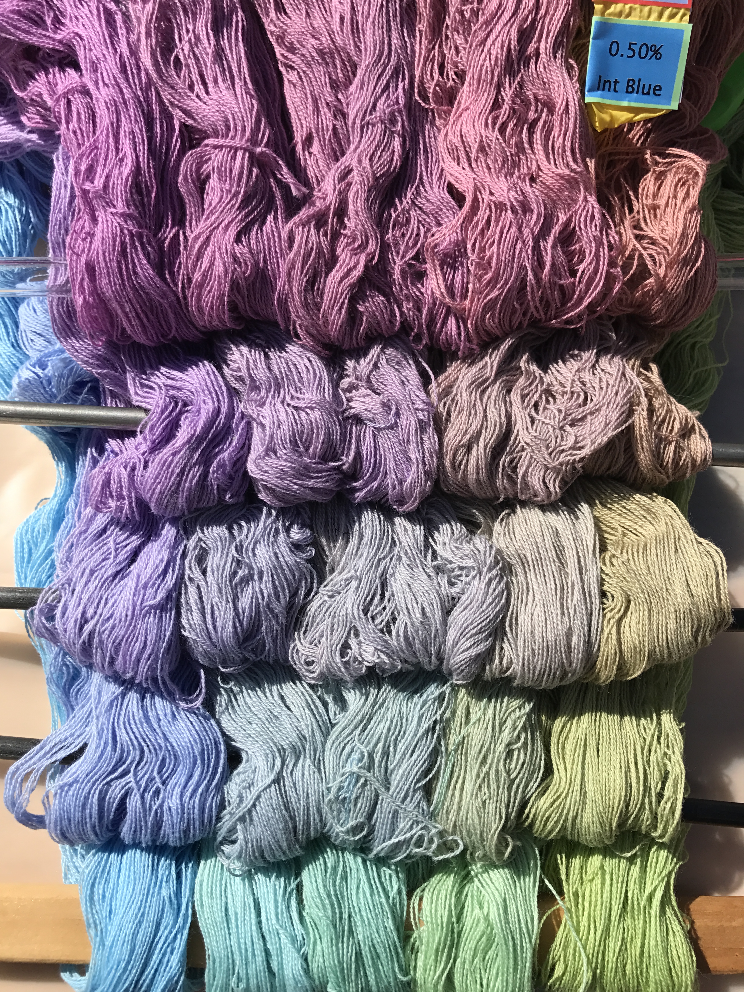
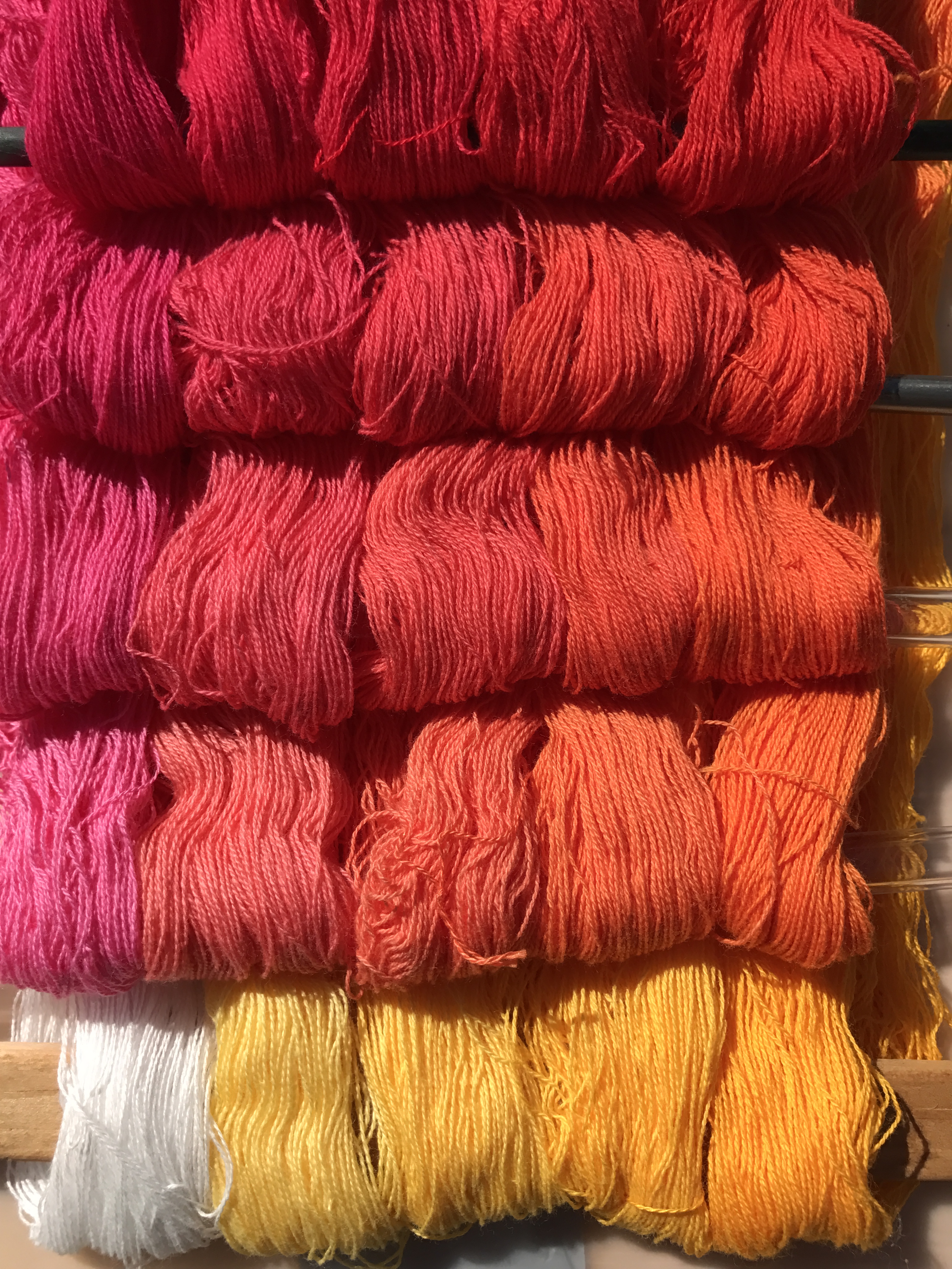
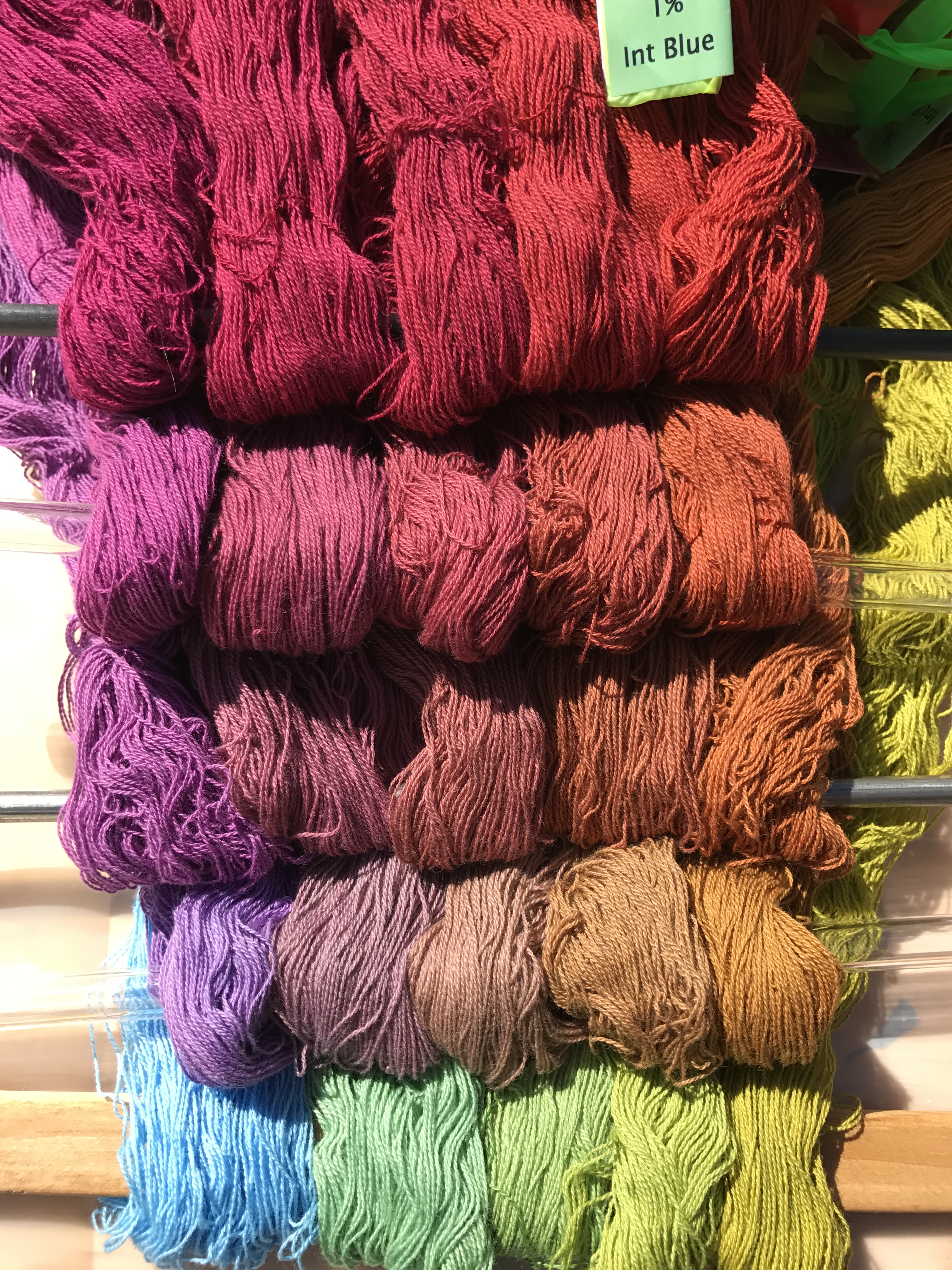
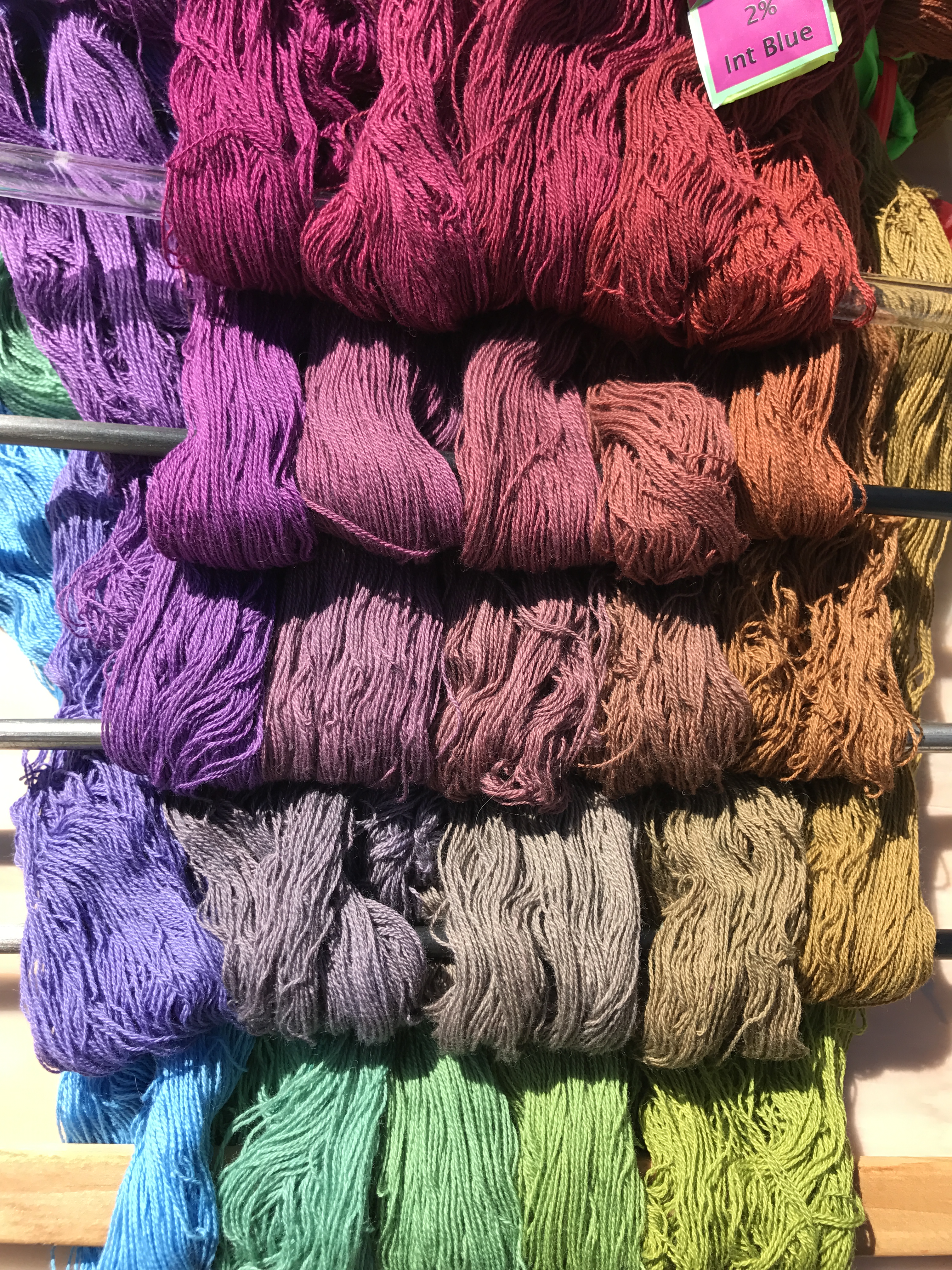
Here are photos of all 250 skeins. Each photo shows all the skeins dyed in one concentration of Intense Blue, which is listed in the caption. The concentration of Gold increases as you travel left to right along the rows; the concentration of Mixing Red increases as you travel up along the columns.

Here’s an annotated photo that shows how it works. This “level” of the cube has 0% Intense Blue, so it’s solely Gold and Mixing Red.

annotated photo of Procion MX dye samples on cotton
annotated photo of Gold, Mixing Red, and Intense Blue Procion MX dye samples on cotton

Each column has one concentration of Gold, each row has one concentration of Mixing Red.

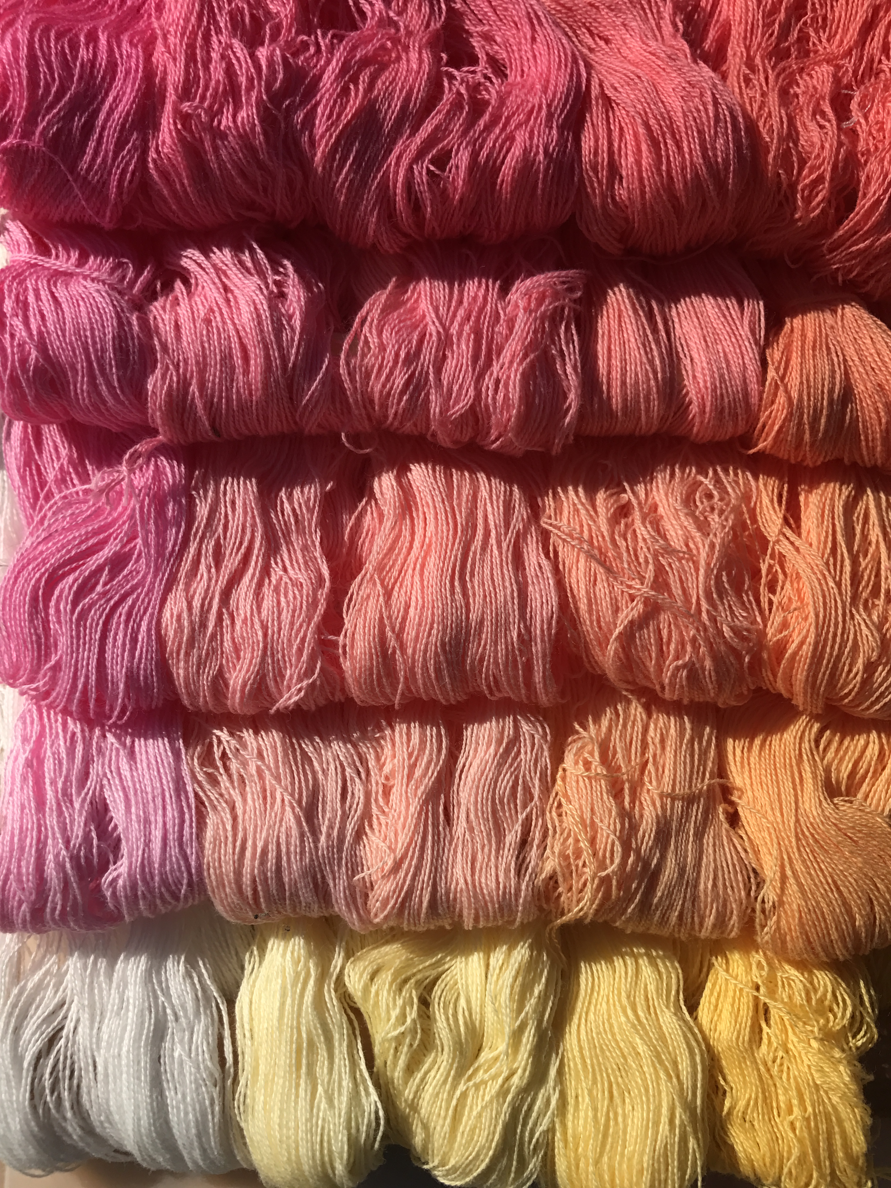
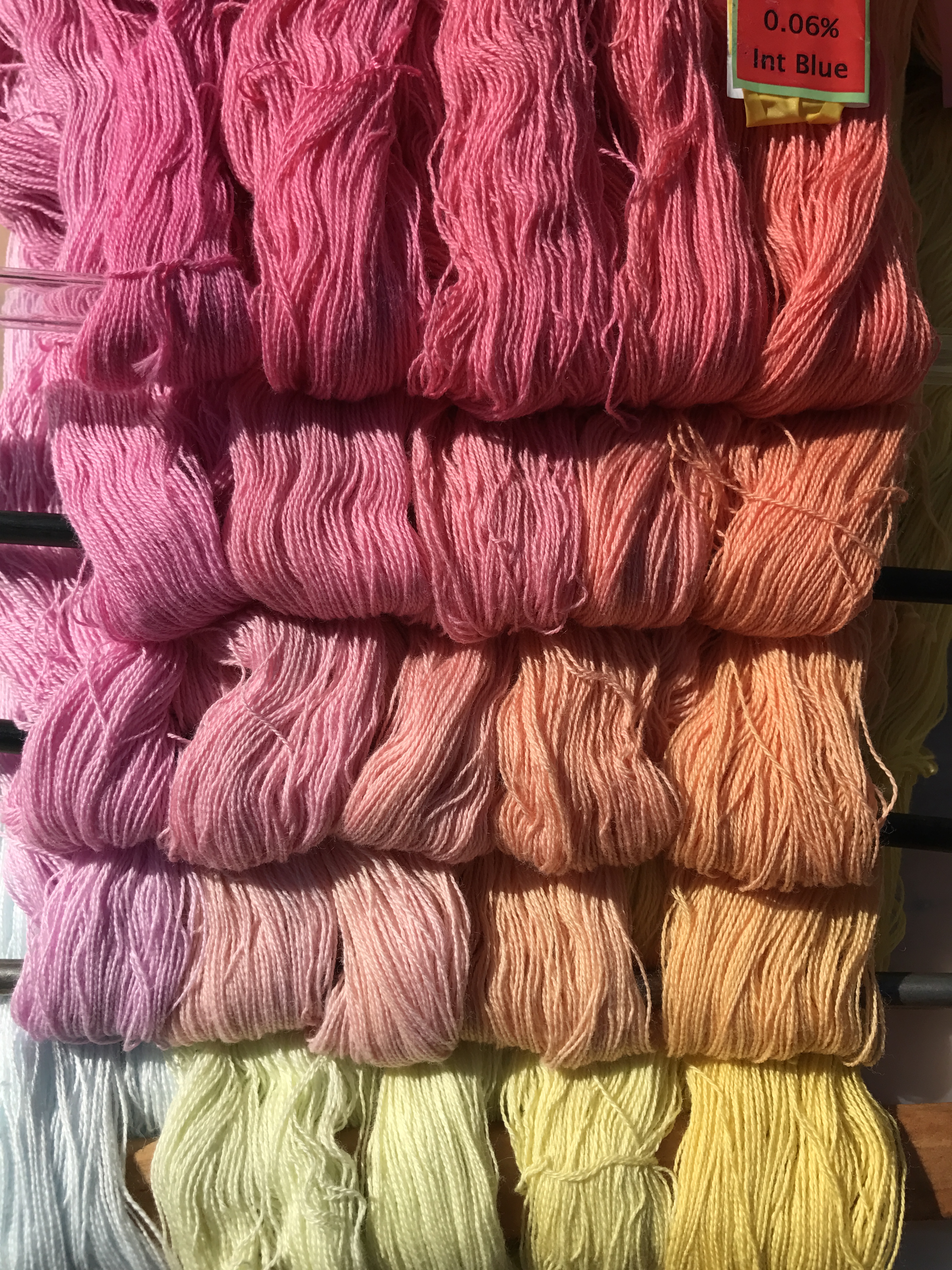
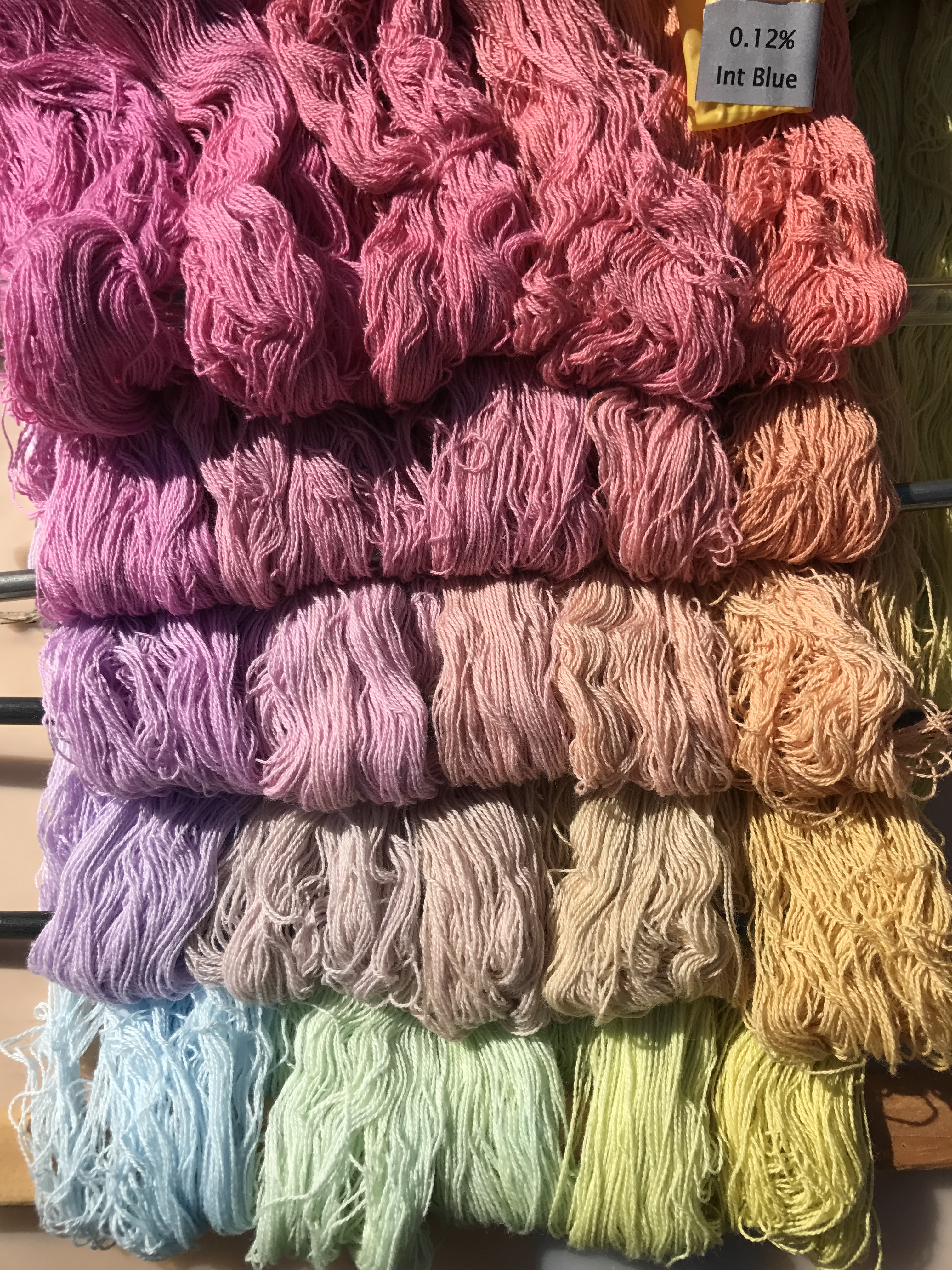
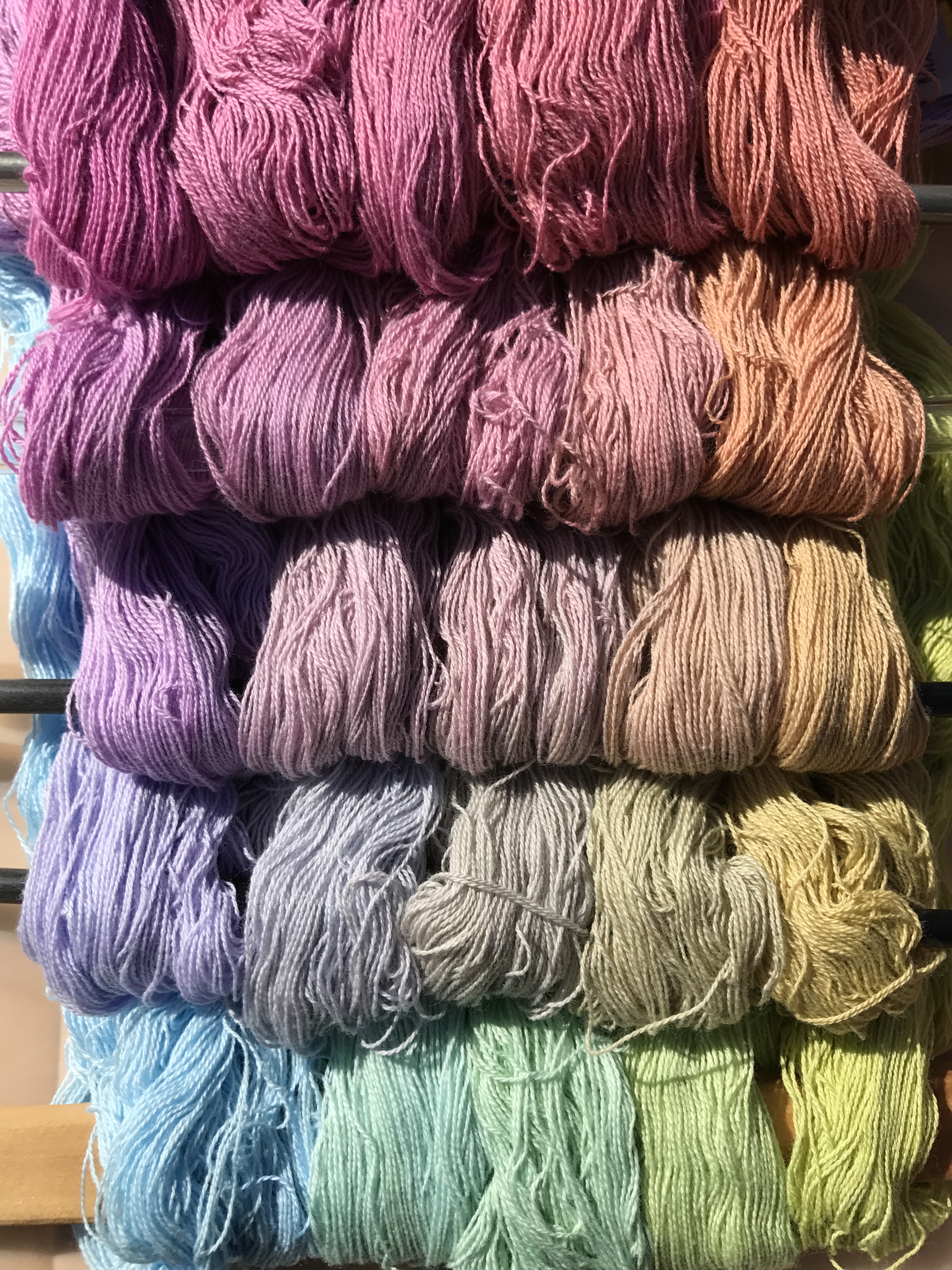
Here are the photos of the “light” cube (lower concentrations of dye). The concentrations are 0, 0.06, 0.12, 0.25, and 0.50% in both Mixing Red and Gold. The concentration of Intense Blue is the same for each photo, and is listed in the caption.

Procion MX dye samples on cotton - Gold-Mixing Red-Intense Blue- 0% intense blue
Procion MX dye samples on cotton – Gold-Mixing Red-Intense Blue- 0% intense blue
Procion MX dye samples on cotton - Gold-Mixing Red-Intense Blue- 0.06% intense blue
Procion MX dye samples on cotton – Gold-Mixing Red-Intense Blue- 0.06% intense blue
Procion MX dye samples on cotton - Gold-Mixing Red-Intense Blue- 0.12% intense blue
Procion MX dye samples on cotton – Gold-Mixing Red-Intense Blue- 0.12% intense blue
Procion MX dye samples on cotton - Gold-Mixing Red-Intense Blue- 0.25% intense blue
Procion MX dye samples on cotton – Gold-Mixing Red-Intense Blue- 0.25% intense blue
Procion MX dye samples on cotton - Gold-Mixing Red-Intense Blue- 0.50% intense blue
Procion MX dye samples on cotton – Gold-Mixing Red-Intense Blue- 0.50% intense blue

And here are the darker concentrations. The concentrations that were used are: 0. 0.50%, 1%, 2%, 4%.

Procion MX dye samples on cotton - Gold-Mixing Red-Intense Blue- 0% intense blue (darker concentrations)
Procion MX dye samples on cotton – Gold-Mixing Red-Intense Blue- 0% intense blue (darker concentrations)
Procion MX dye samples on cotton - Gold-Mixing Red-Intense Blue- 0.50% intense blue (darker colors)
Procion MX dye samples on cotton – Gold-Mixing Red-Intense Blue- 0.50% intense blue (darker colors)
Procion MX dye samples on cotton - Gold-Mixing Red-Intense Blue- 1% intense blue
Procion MX dye samples on cotton – Gold-Mixing Red-Intense Blue- 1% intense blue
Procion MX dye samples on cotton - Gold-Mixing Red-Intense Blue- 2% intense blue
Procion MX dye samples on cotton – Gold-Mixing Red-Intense Blue- 2% intense blue
Procion MX dye samples on cotton - Gold-Mixing Red-Intense Blue- 4% intense blue
Procion MX dye samples on cotton – Gold-Mixing Red-Intense Blue- 4% intense blue

Some thoughts I had while looking at these photos:

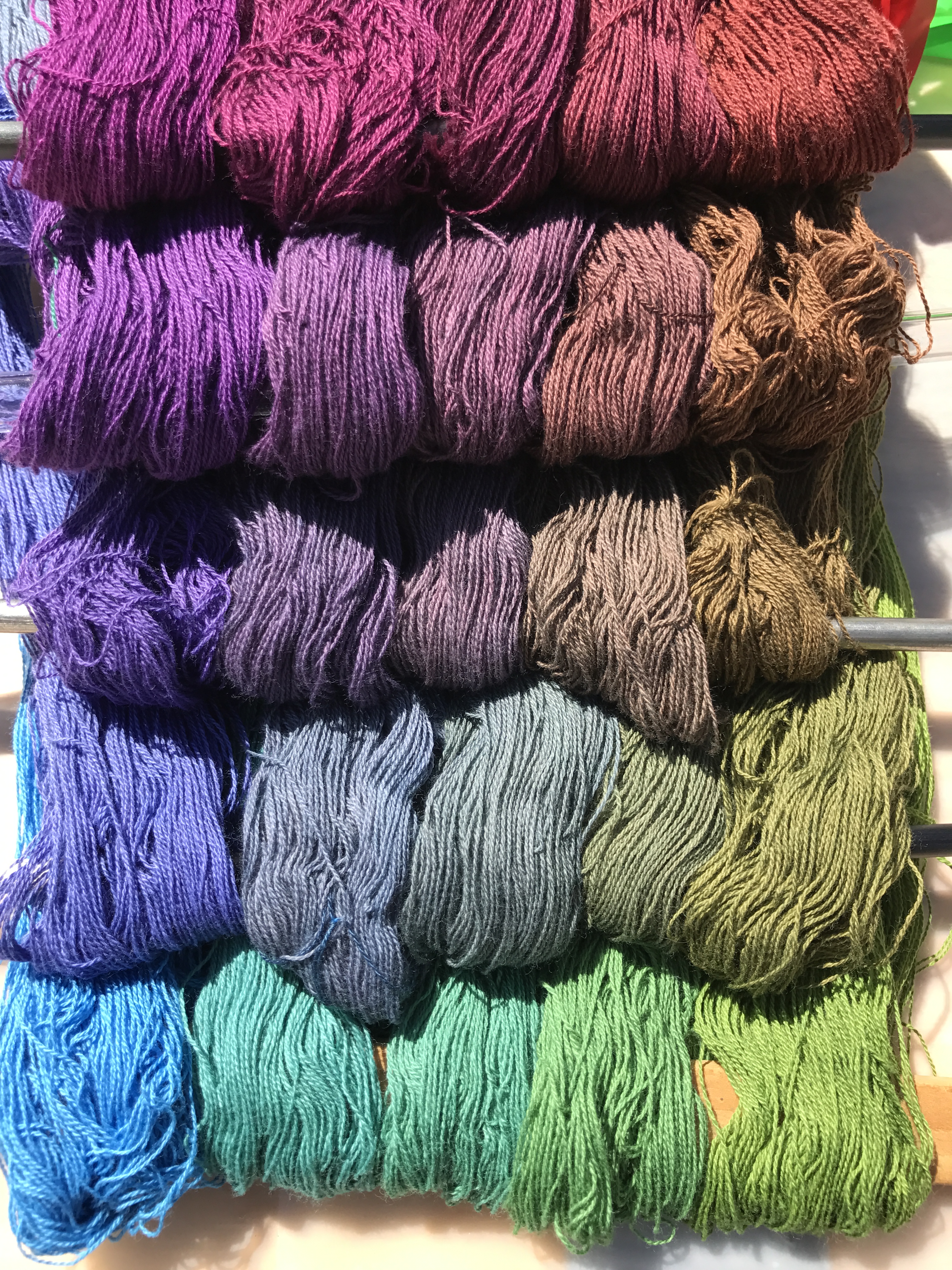
First, true neutral grays are very rare. So far I’ve found maybe two neutral grays in about 500 sample skeins. Everything else leans noticeably one way or another. I had read this, but hadn’t really understood how true it is before.

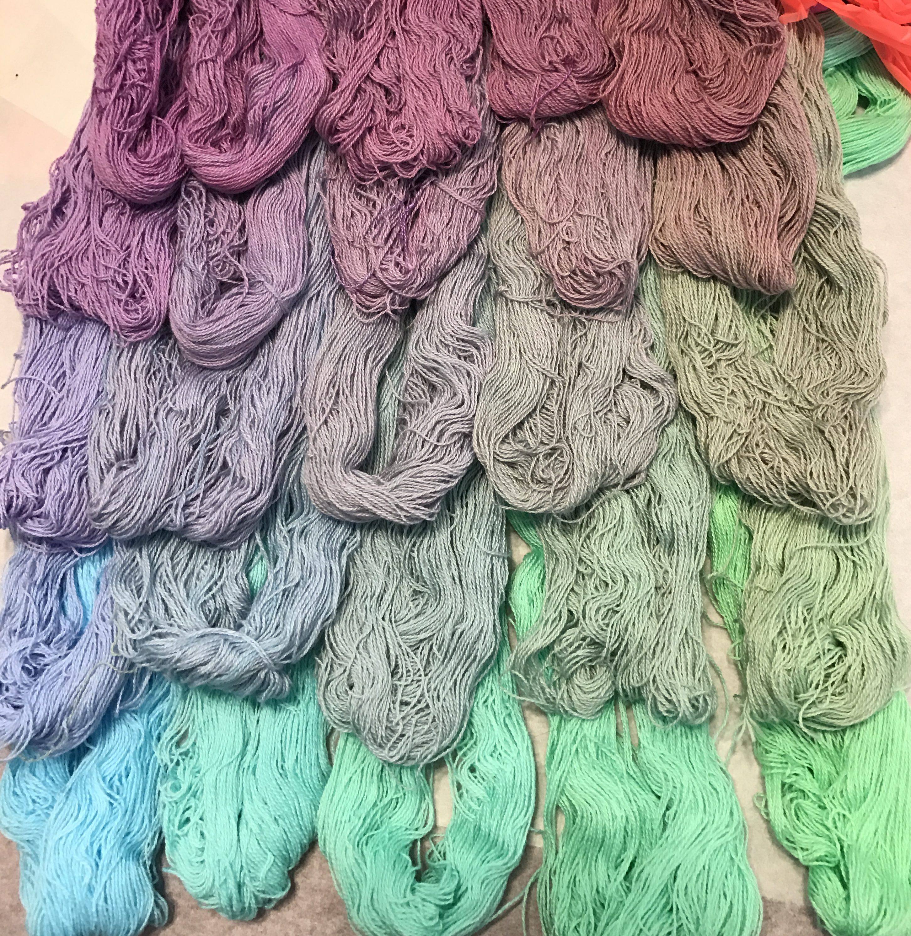
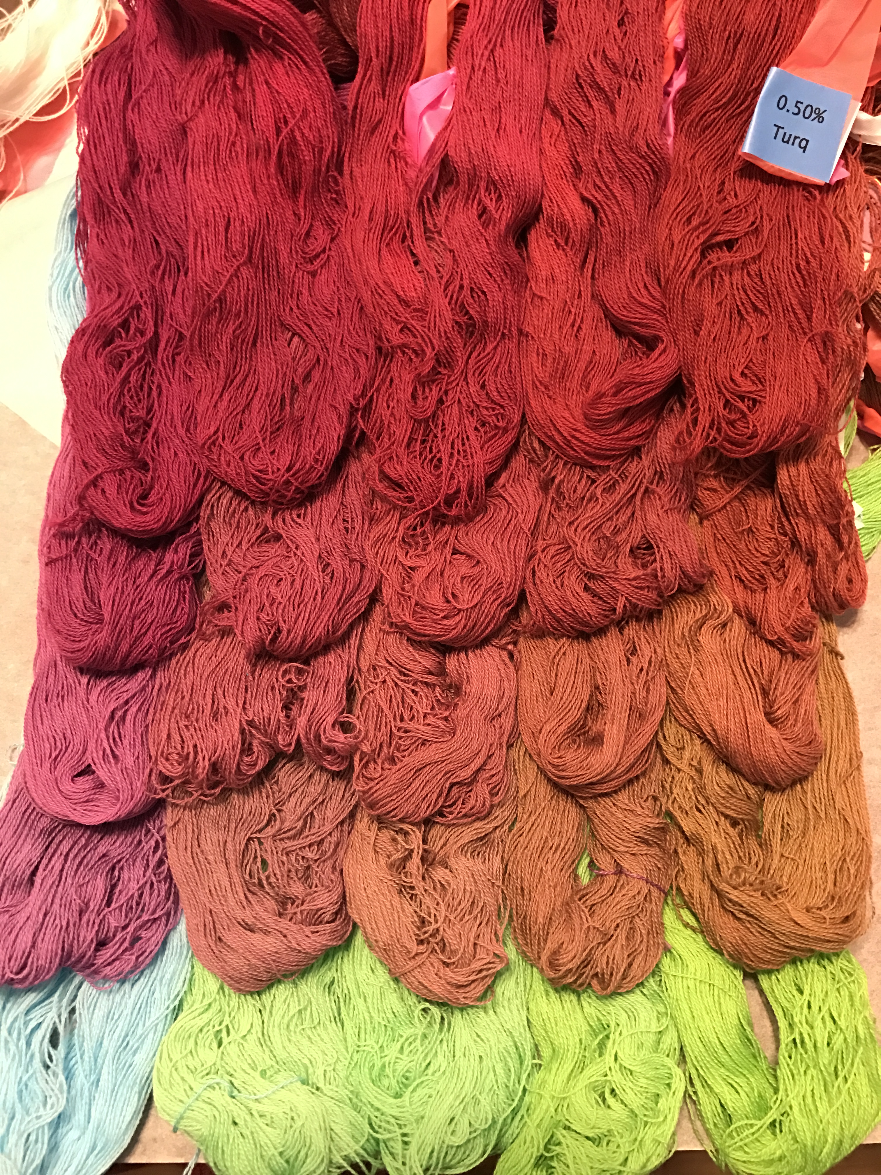
Second, undertones matter. Here is a photo (unfortunately uncalibrated, so the colors may not be 100% true to life) of the Sun Yellow/Fuchsia/Turquoise skeins. Sun Yellow, Fuchsia, and Turquoise are all cool tones, so you’d expect cool shades to result. But look at the dramatic difference between these cooler primaries and the warmer ones:

yellow/fuchsia/turquoise dye "cube" in Procion MX fiber-reactive dyes, 0.5% turquoise
yellow/fuchsia/turquoise dye “cube” in Procion MX fiber-reactive dyes, 0.5% turquoise
Procion MX dye samples on cotton - Gold-Mixing Red-Intense Blue- 0.50% intense blue
Procion MX dye samples on cotton – Gold-Mixing Red-Intense Blue- 0.50% intense blue

At first glance, the color ranges are similar. But there is a big difference in “feel” – the warm primaries on the bottom produce a much warmer “feel” than the cool ones on top. I hadn’t fully appreciated how big a difference primary undertones can make!

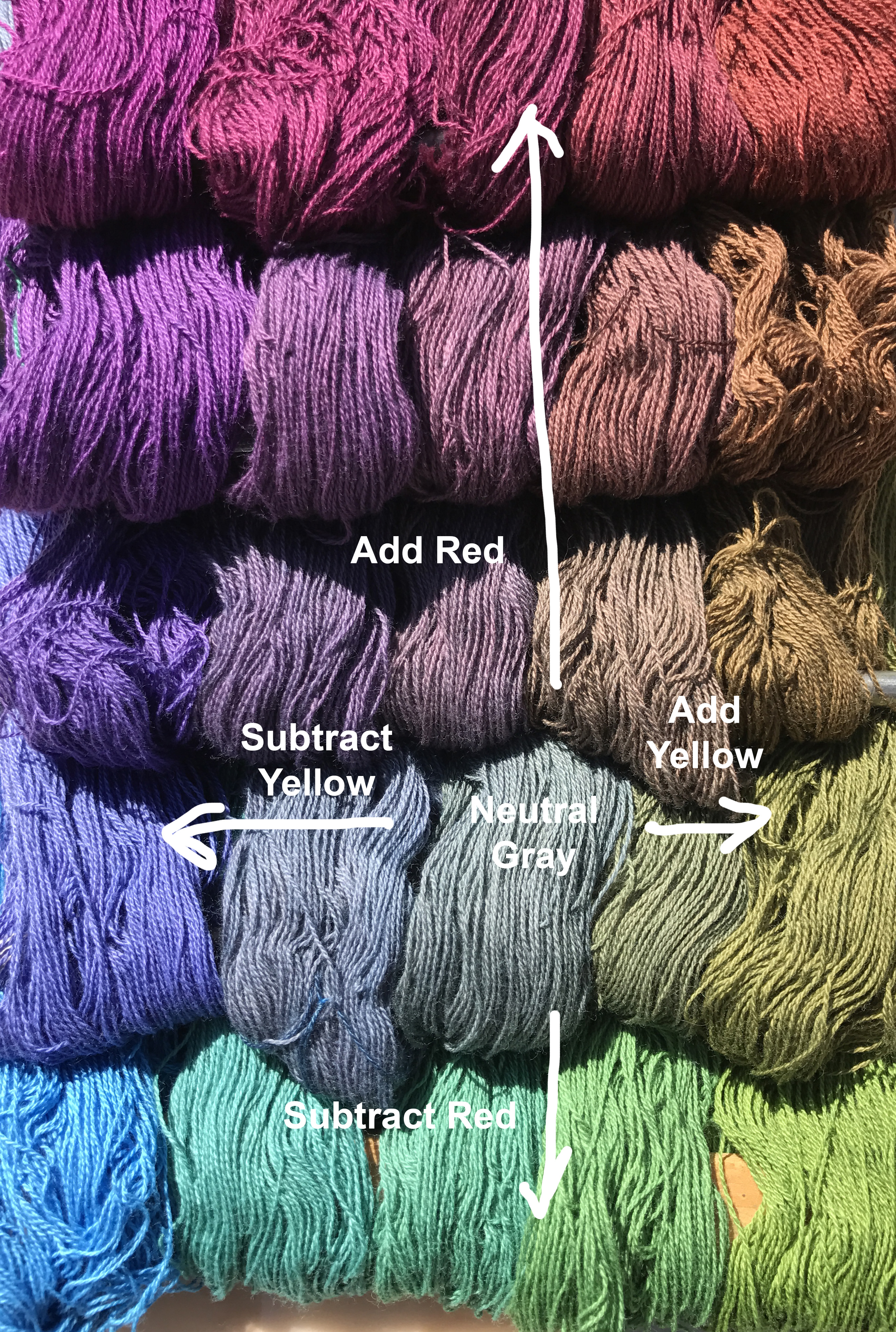
My third realization was about color mixing. Here’s one of my two neutral grays (it may not appear neutral gray on your monitor, but it is in real life). The columns show gradually increasing concentrations of yellow, the rows the concentration of red.

color mixing
color mixing

Of course, any class on color theory will tell you that if you mix yellow and purple you get gray in between, since they are complementary colors. And the same for red and green, moving up and down the columns. But seeing this illustrated in real life is pretty darn cool. It also gives me an appreciation for all the shades of color and how one gets to them by mixing colors. I had never thought of “mauve” as “gray with a little extra red/blue” before, or “olive” as “yellow with a tiny bit of purple”. I could, of course, have thought each of those out based on what I know of color theory, but that’s very different from an intuitive understanding of color. All sorts of happy little connections are being made internally, and I feel I have a much better grasp of color now.

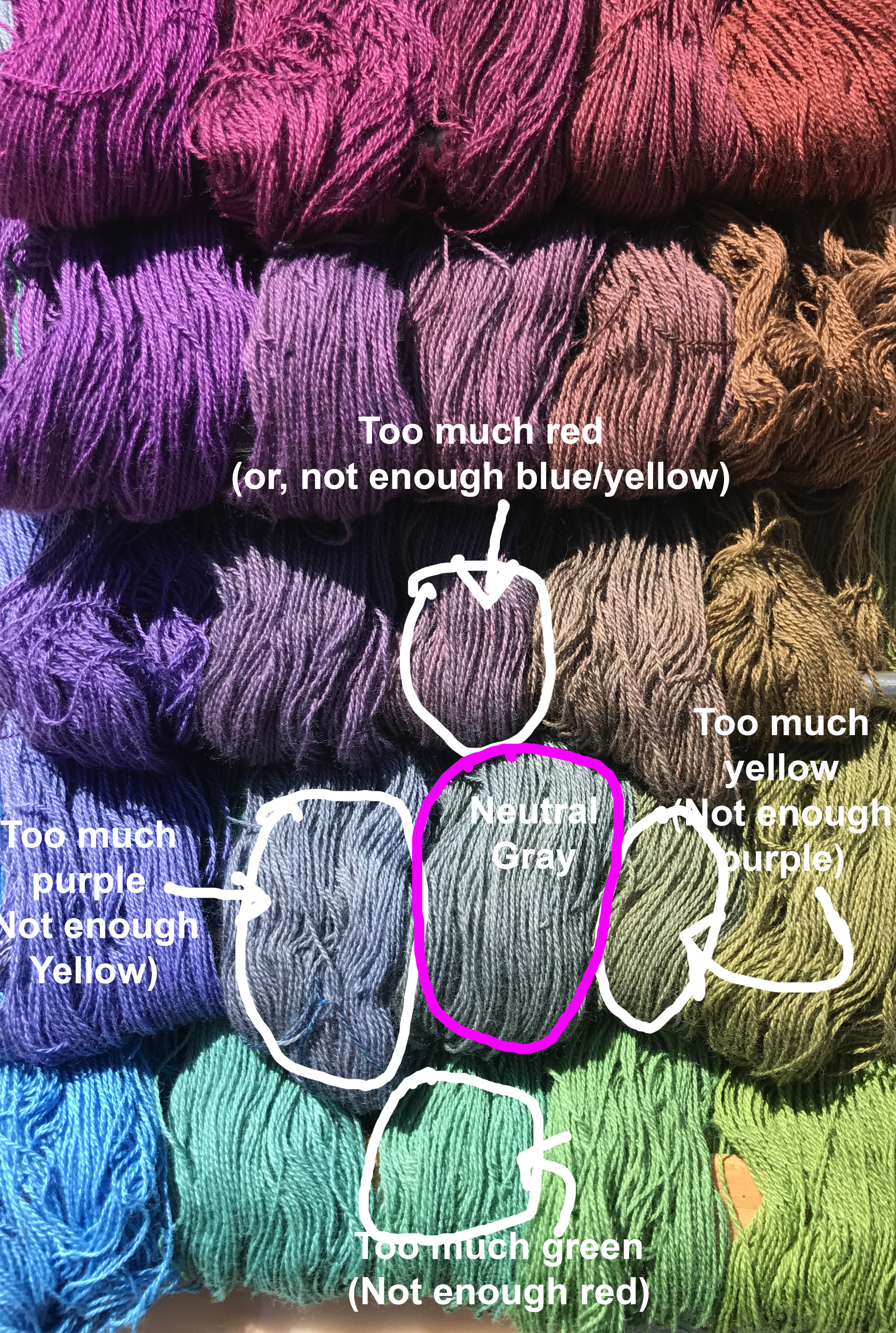
My final realization has to do with complementary colors. Here’s the same photo as above, but annotated differently:

complementary colors

The interesting thing is that I would normally think of the color right above gray as “gray plus a little red”. But it could be seen equally correctly as “gray subtracting a little green”.  Similarly, the color to the left of neutral gray might be considered “gray + purple”, but it could equally be seen as “gray – yellow”. And so on.

I’m not sure exactly why this strikes me as profound. If you think about complementary colors, it’s intellectually obvious. But I had never thought of it this way before. Perhaps it’s because it’s difficult to subtract color in fine art media: If you have some gray paint on your palette and you want to make it redder, you don’t try to subtract green paint, because that’s impossible. You add red. So I had always thought in terms of adding one color or another.

But with dyes, sometimes you don’t want to add more of a particular dye color, because you don’t want to change the concentration of dye. So realizing that you can take out a little blue/yellow dye rather than adding more red is a useful realization, I think. It’s certainly a new way of looking at color, and I’m grateful to have it.

I’m now 2/3 of the way through another dye “cube” – this one is Sun Yellow/Mixing Red/Navy Blue. Hoping to post that in another week or two, along with my observations.

Filed Under: All blog posts, dyeing, textiles Tagged With: color theory, procion mx dye samples

February 27, 2017 by Tien Chiu Leave a Comment

The challenges of color matching

Because I think a set of color-mixing samples in MX dyes on cotton would be of value to the fiber community, I’ve been pondering over how best to make my samples available. The problem is that digital colors are terribly unreliable: both cameras and monitors are very bad at reproducing color accurately, so what you see on your screen may be radically different from what I see in real life.

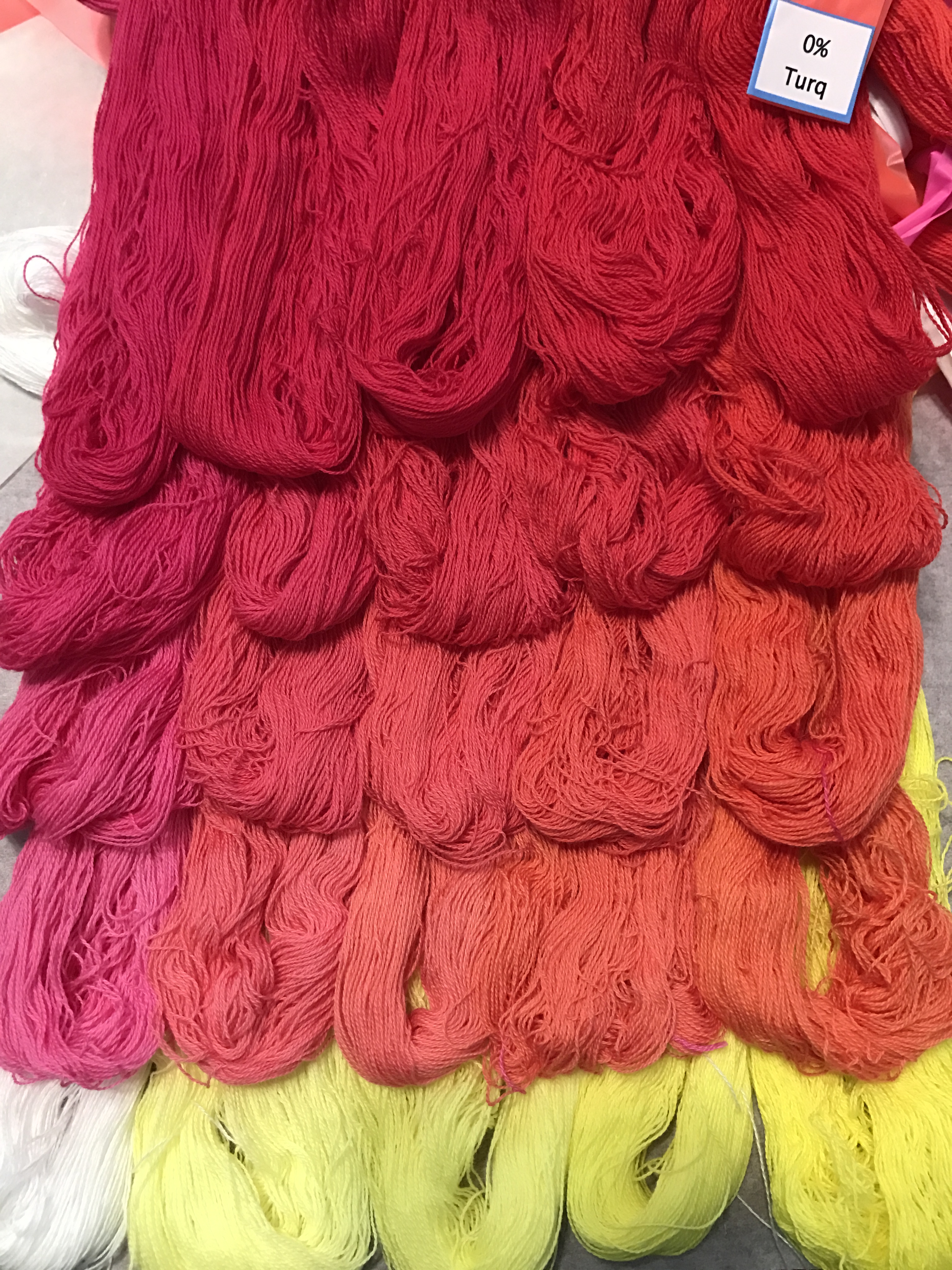
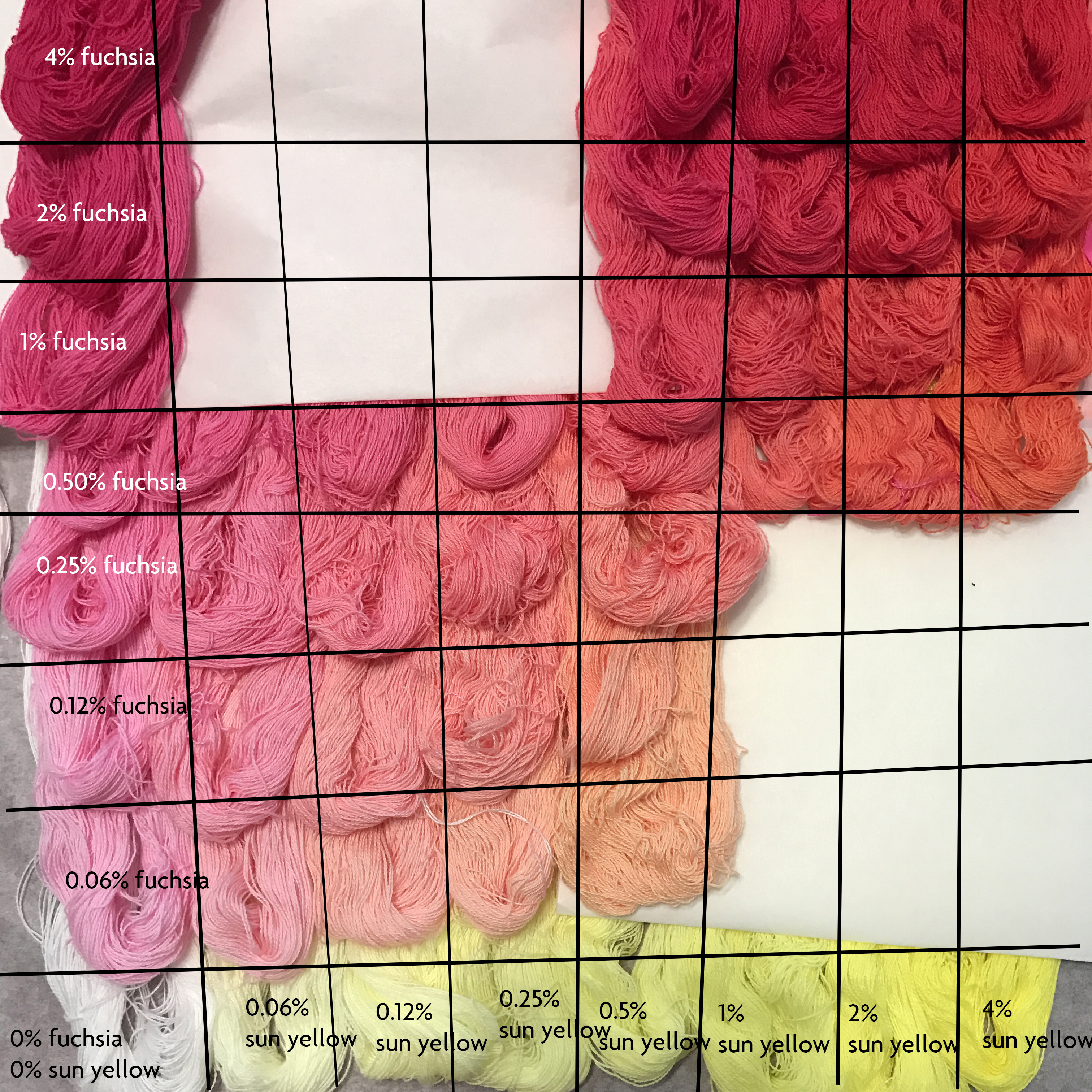
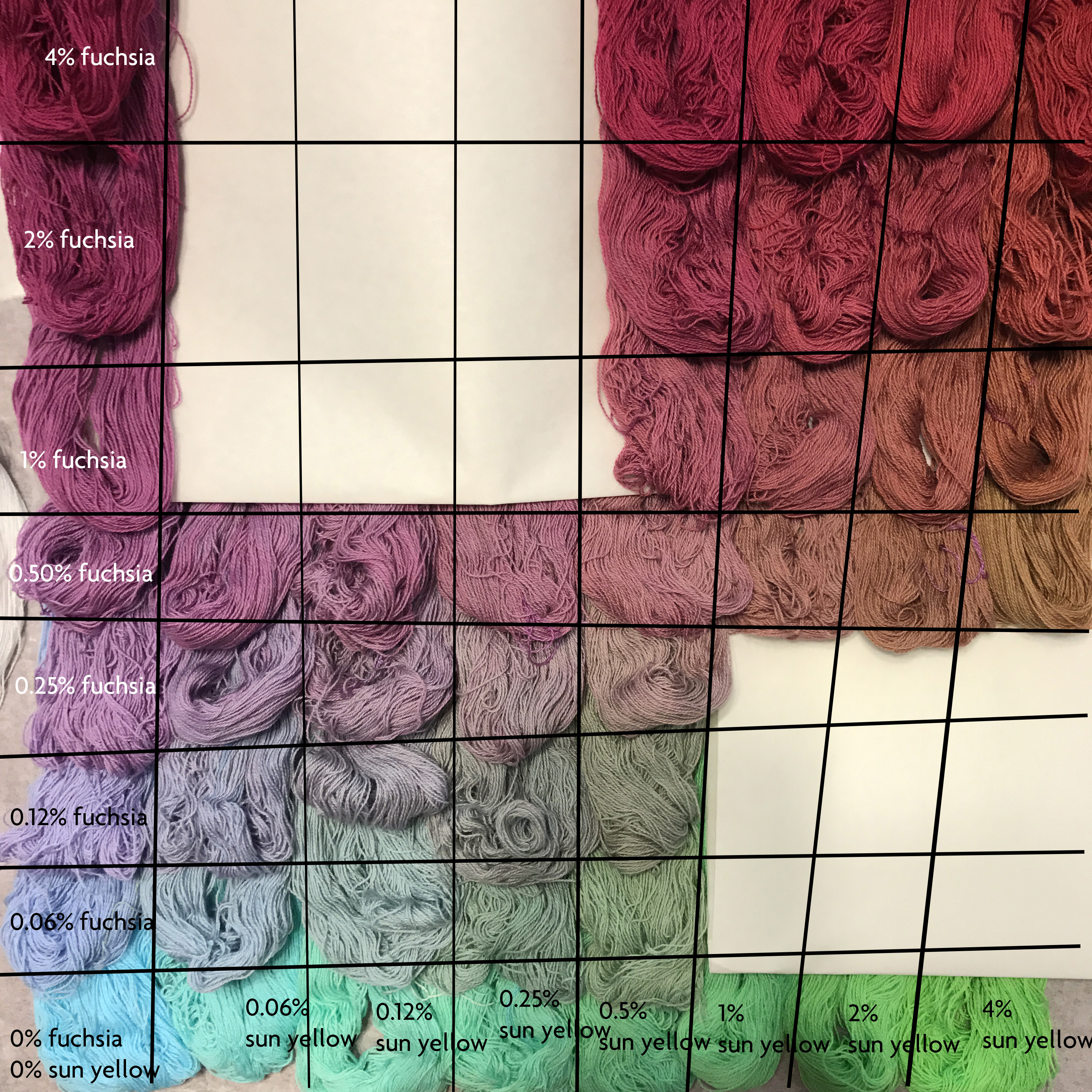
To demonstrate, here are two dye cube layers, shot with my iPhone 7:

yellow/fuchsia/turquoise dye "cube" in Procion MX fiber-reactive dyes, 0.5% turquoise
yellow/fuchsia/turquoise dye “cube” in Procion MX fiber-reactive dyes, 0.5% turquoise
sun yellow, fuchsia, and turquoise - 0.5% turquoise
sun yellow, fuchsia, and turquoise – 0.5% turquoise

While they look very different in the two photos, I can assure you that the skeins in the bottom left corner of each photo are exactly the same color in real life, and closer to the color in the top photo than the bottom one. What is happening is that the iPhone is adjusting colors relative to each other, so the presence of the intense dark reds makes it “decide” that the turquoise is lighter and yellower than it is.

Similarly, one display may show a very different color from another display. I don’t have photos to demonstrate, but if you display the same photo on two smartphones/tablets/monitors, you’ll quickly see the difference.


So then how does one communicate an exact color with precision? Digitally, you can’t. But what I can do is provide a reference to an accurately printed color, that the reader can then look up to see the exact shade in real life. But what color references can I use? The two most common ones I know of are the Pantone color guides and the Munsell color system. The trouble is that both systems are very expensive – $175 for the Pantone formula guide and $1,000+ for the Munsell color books.

So I did some more digging and discovered a marvelous book. Paul Centore has produced a book titled Controlling Colour with the Munsell System that is spectrophotometrically matched to the correct colors, so it is just as accurate as the $1000 book but costs only $75. (It’s available on Amazon.) That is still a bit pricey, but much cheaper than the other options, and very inexpensive indeed for that level of precision.

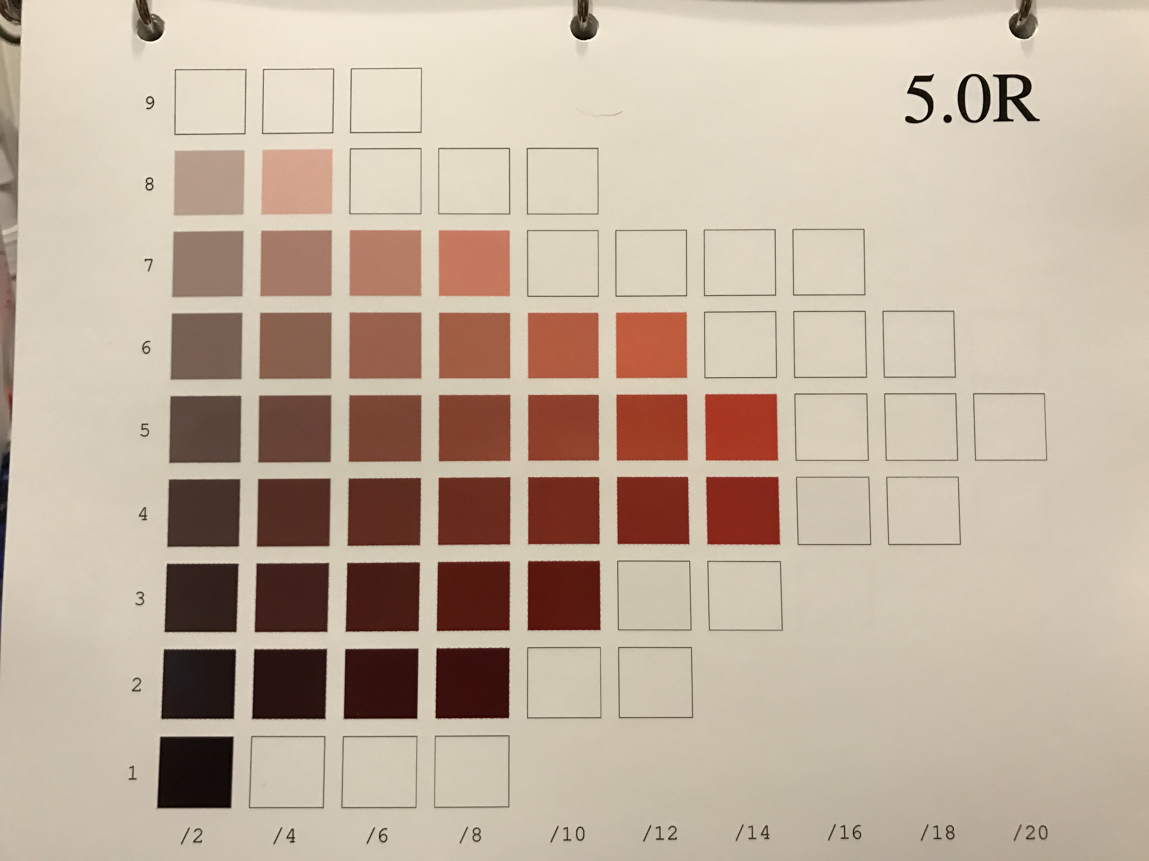
Here is a plate from the book:

one hue of the Munsell color system

(The colors in real life are more saturated than the colors in the photo – what appears brown on my monitor at 5/14 is actually a bright red.)

The Munsell color system breaks down color along three axes: Hue (position on the color wheel), Value (gradation from light to dark), and Chroma (saturation – bright vs. dull). The Munsell colors are typically printed with a different page for each hue, with the value gradations in rows (1-9 from bottom to top) and the saturation in columns (/2 through /20 from left to right). This allows accurate identification of any color.

Of course some colors may fall in between, in which case they are written with in-between numbers; for example, a color that appears to be between 5/12 and 5/14 would be written 5/13. But with 1800 colors there is usually a good color match to be found.

I am inclined towards the Munsell system over the Pantone Formula Guide because the Munsell system is designed to cover the space of possible colors in a systematic fashion, so it is easy to express in-between colors by interpolating between the numbers. The Pantone Formula Guide has a different purpose: to give printers exact guides to follow to reproduce a certain color. It does cover a wide color gamut but there is no provision for in-between colors, at least not that I know of. That makes the Munsell system superior for my purposes.

My plan is to match each sample to a shade in the Munsell system, write that number on the card, and then take photos with the best color accuracy that I can get, so at least the samples start out with relatively matched colors. Thus, people can get a general sense of how the shades shift, with references to the exact color. If I get really obsessive, I may create a chart that maps each shade in the Munsell color book to a shade in my dye samples (if a match exists, of course), so I don’t have to flip through all the samples to find a matching color. 

Why am I doing all this? Because I think it will make it easier for novice dyers to understand and do their own color mixing. Hopefully this will make dyeing your own color palette much more accessible, as it would be possible to get a formula for a color without having to dye 1000 samples yourself.

Of course, all that depends on my having the time and energy to analyze, label, and post photos of all 1500 samples, so this may or may not happen. But that’s what I hope to do.

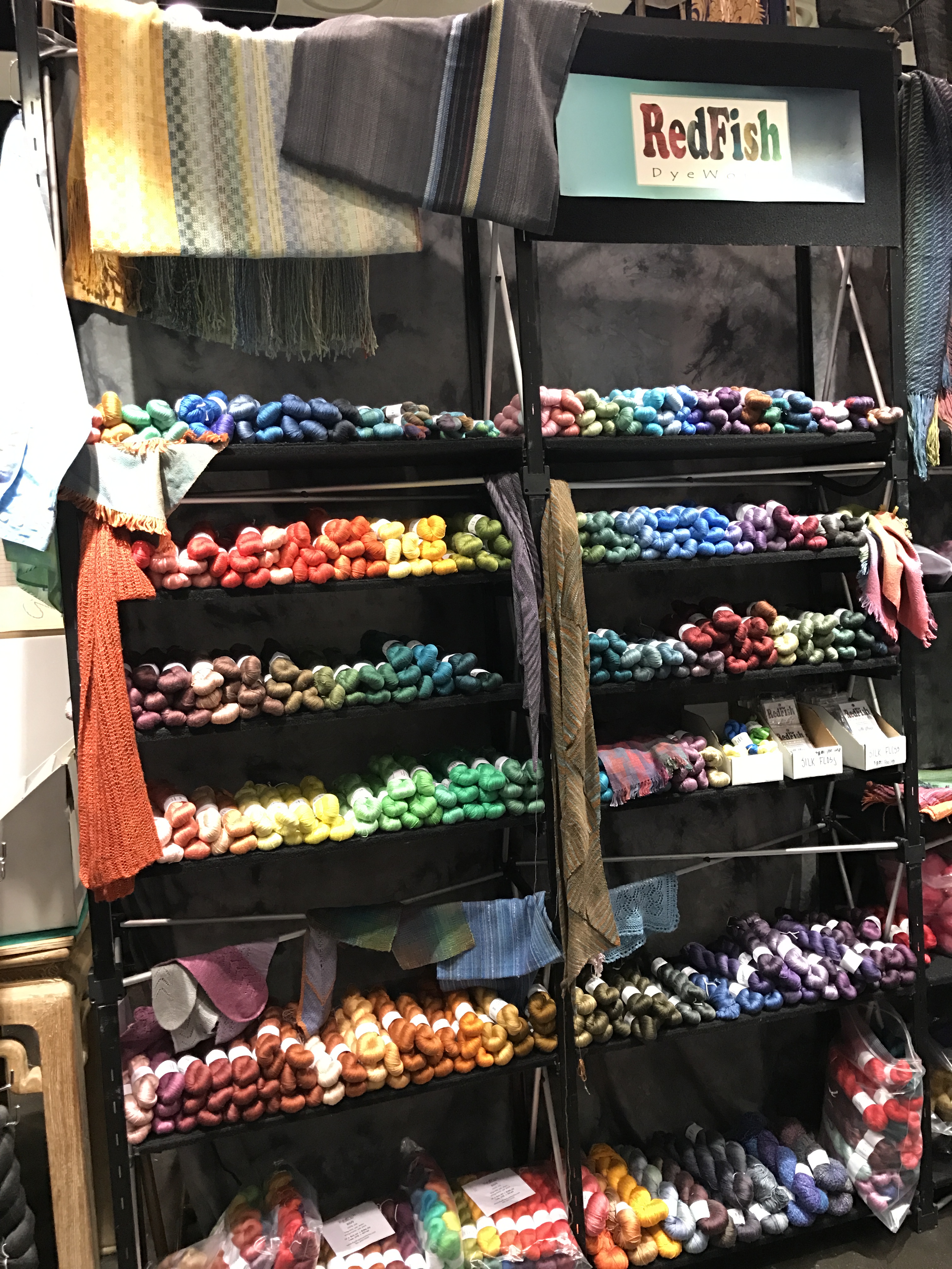
Meanwhile, if you want a wide selection of colors without having to dye your own, may I recommend these folks?

Redfish Dyeworks booth at Stitches West

As you can see, Redfish Dyeworks has an incredible assortment of colors – mostly in silk but also in other protein fibers – available in small skeins. That makes it practical to use lots of colors without breaking your budget. And because the color palette is so large, it’s easy to do color gradations, too. For the interested, they’re at www.redfishdyeworks.com .

Filed Under: All blog posts, dyeing, textiles Tagged With: procion mx dye samples

February 19, 2017 by Tien Chiu 5 Comments

Dye cube #2: Sun yellow, fuchsia, turquoise in dark colors

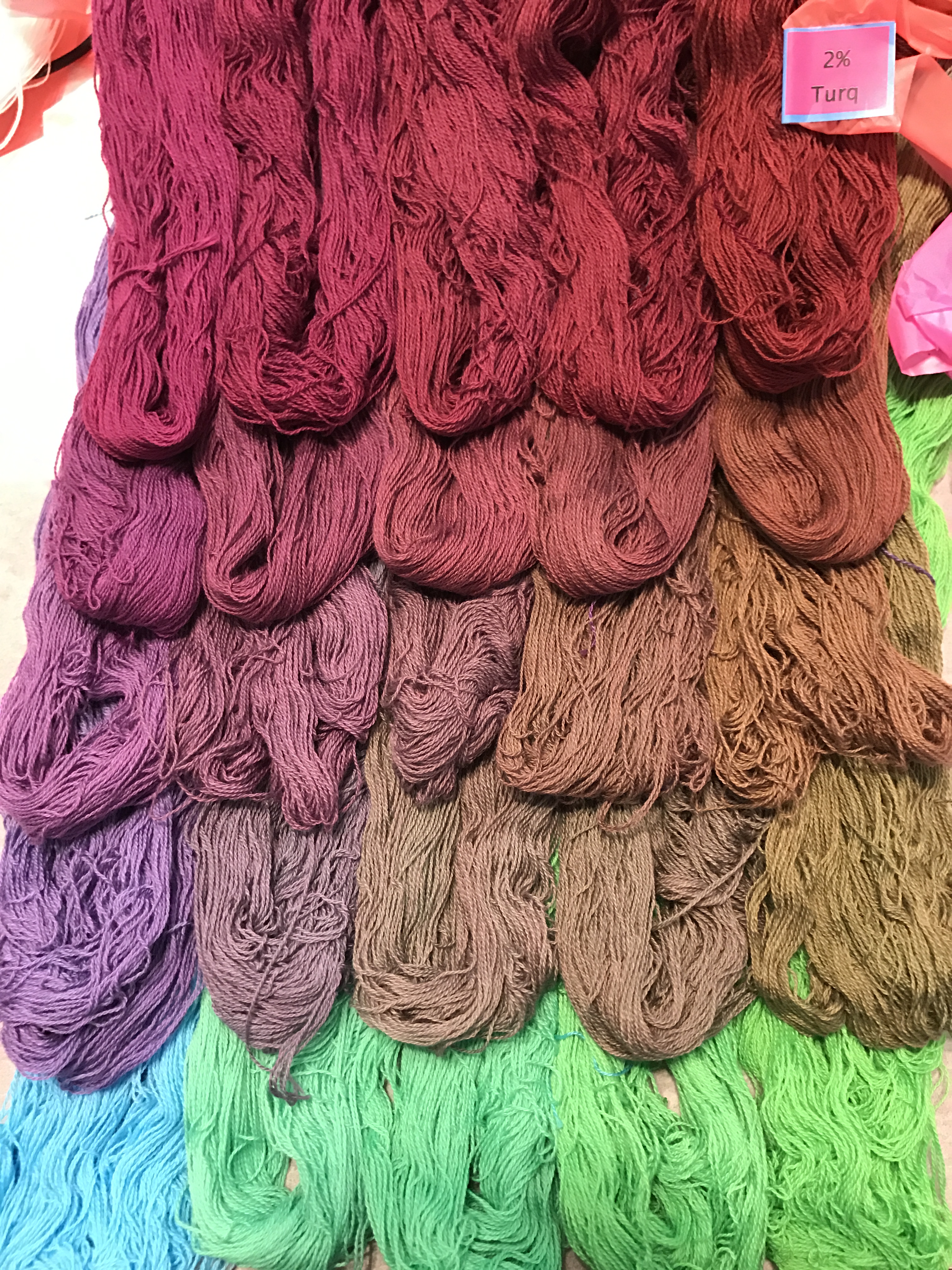
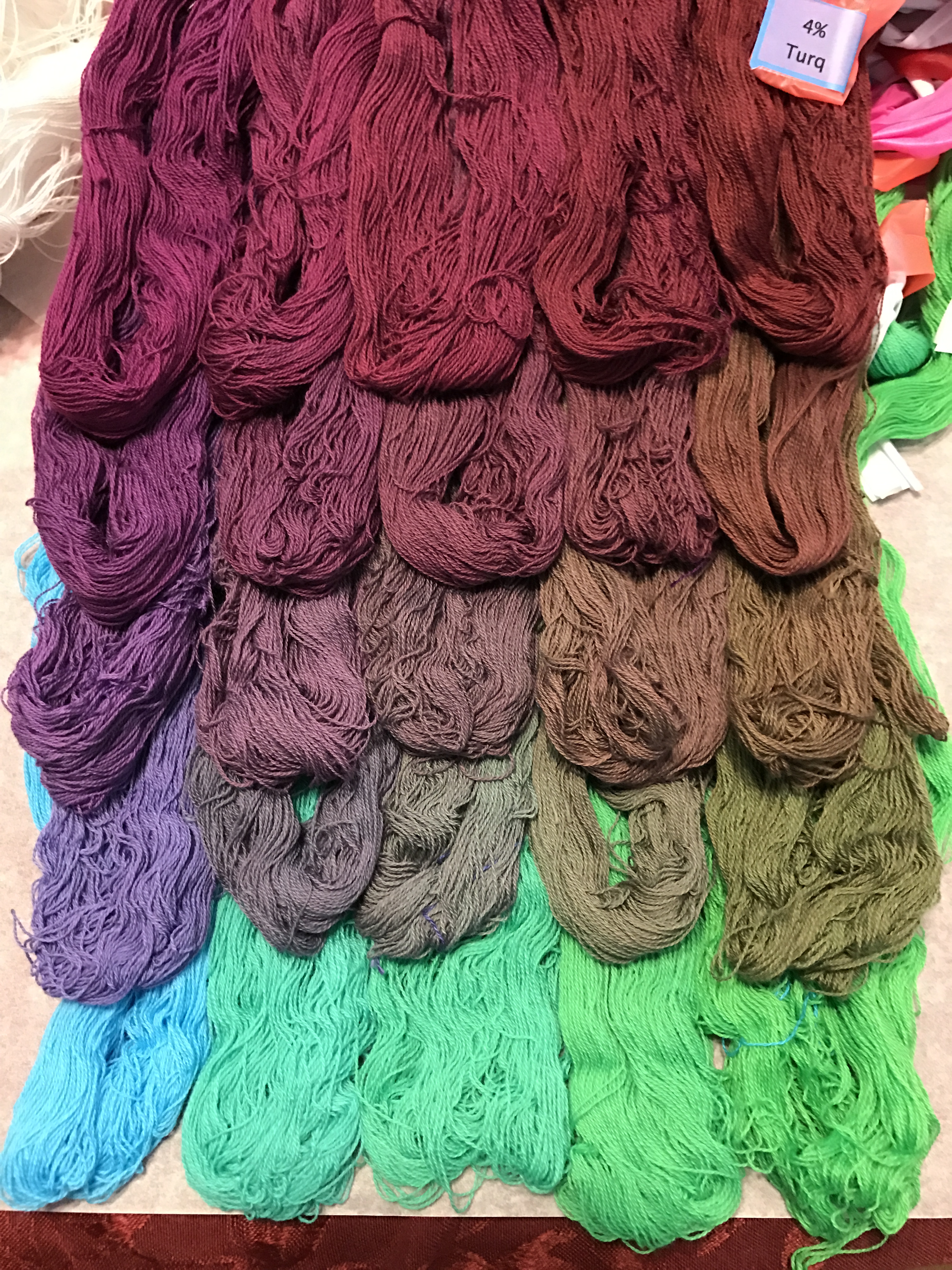
I’ve now completed the second “cube” of Procion MX fiber-reactive dye samples on cotton: dark shades of sun yellow, fuchsia, and turquoise. The dye concentrations I’m using are 0, 0.5, 1, 2, and 4%. The results are of course pretty:

sun yellow, fuchsia, and turquoise - 0.5% turquoise
sun yellow, fuchsia, and turquoise – 0.5% turquoise
sun yellow, fuchsia, and turquoise - 0.5% turquoise
sun yellow, fuchsia, and turquoise – 0.5% turquoise
sun yellow, fuchsia, and turquoise - 1% turquoise
sun yellow, fuchsia, and turquoise – 1% turquoise
sun yellow, fuchsia, and turquoise - 2% turquoise
sun yellow, fuchsia, and turquoise – 2% turquoise
sun yellow, fuchsia, and turquoise - 4% turquoise
sun yellow, fuchsia, and turquoise – 4% turquoise

Why am I doing two independent dye cubes rather than one that covers the entire gamut? Because dye cubes over a certain size are inefficient. They produce a lot of samples too similar to be distinguished. Since each skein costs $0.40, wasted skeins are wasted money.

(Warning: technical discussion ahead.)

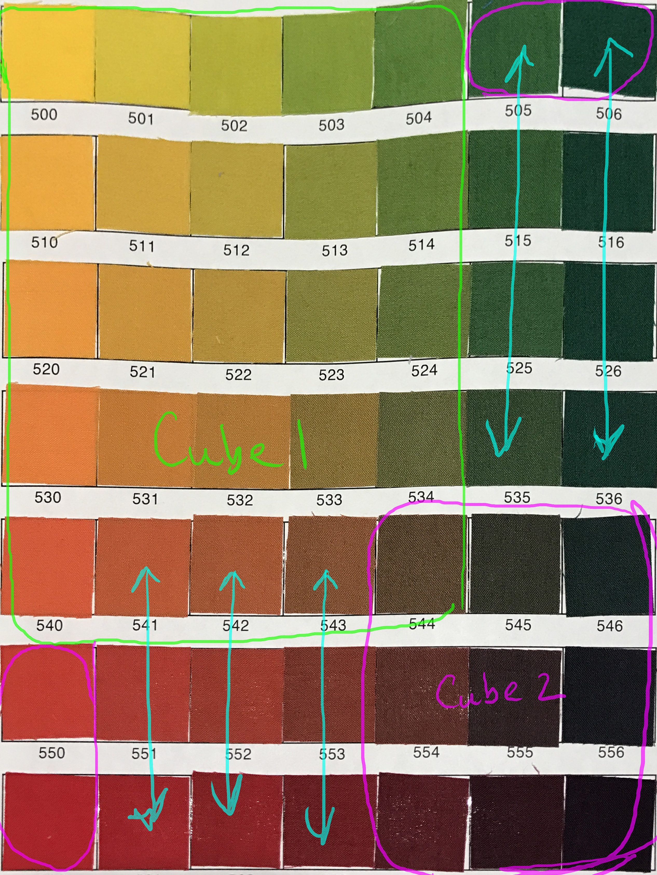
You can see this in the sample book that a friend created in Carol Soderlund’s class (where I got the idea for this particular methodology). Here’s an (annotated) page from my friend’s sample book, showing my overlapping-cube strategy:

annotated sample page


Carol Soderlund uses seven concentrations going up to 3% for her classes. That requires 7^3 or 343 samples. But as you can see, the samples in some sections, as indicated by the turquoise arrows, are very similar. That’s because if you add a very small dye concentration to a very large concentration, you’re likely to see only very small changes. So 0.06% sun yellow + 4% fuchsia is unlikely to look very different from 0.12% sun yellow + 4% fuchsia – the higher concentration of fuchsia overpowers the pale yellows. Based on what I learned looking through my friend’s sample book, once one concentration “outweighs” another by more than 16x, the change in color is pretty close to negligible. So if you look at the sample page, you can see that you can get more-or-less the full set of colors by doing two smaller cubes – the one outlined in green, and the one outlined in magenta. You do have to include the two samples in bottom left and the two samples at top right (the ones circled in magenta) to get a full set of colors, so the second “cube” actually has four concentrations, since you have to include 0 as one of the concentrations to get the primaries.

This doesn’t look like a substantial savings, but it is. At the seven concentrations that Soderlund uses, the double-cube method requires only 5^3 + 4^3 =125+64 = 189 skeins, vs. 343 for the full cube. That almost halves the number of samples, without changing the overall palette much. A much more efficient way of developing a palette. That doesn’t matter much when you’re using small squares of fabric, but with the skeins, which are much more expensive both in $ and time, efficiency becomes important.

So I’m doing a double-cube in eight concentrations: (0, 0.06, 0.12, 0.25, 0.50, 1, 2, 4) with two concentrations overlapping between the cubes:

(0, 0.06, 0.12, 0.25, 0.5)

(0, 0.5, 1, 2, 4)

The choice of concentrations for each cube is based on analysis of my friend’s sample book, looking for the biggest assortment of colors in the smallest number of samples.

So…all that said…here is what the two dye cubes look like when placed together, at the two overlapping concentrations:

double cube, 0% turquoise layer

Here is the annotated version showing the various concentrations:

double cube, 0% turquoise layer, annotated

Here’s what things look like on the layer of the cube with 0.5% turquoise:

double cube, 0.50% turquoise layer, annotated

While some colors are missing from the palette, you can see – looking across the rows from left to right – that there is not much difference between 4% fuchsia/0% sun yellow and 4% fuchsia/0.5% sun yellow. So the samples in between don’t really add much to the palette, and can be safely removed. 

The “missing colors” at bottom right are a little more complex to evaluate, since the difference between the bottom row and the 0.50% row are substantial, but because sun yellow is a really weak mixing color (there’s not a huge difference between 1% and 4%), I’m guessing I didn’t lose a great deal by eliminating those colors as well. If at the end I feel that the palette is incomplete, I can always go back and “fill in” the missing colors. But I’m happy with the results so far.

This double-cube method with eight concentrations requires 250 samples (two 125-sample cubes) for each triplet of primary colors. Since my “budget” is 1600 skeins, that means I’m limited to 6 combinations of primary colors (1500 skeins). So far I’ve completed one, so five more to go! Next up will be a set of warm primaries: golden yellow, “mixing red,” and cerulean blue. I’ll start those as soon as it stops raining, hopefully later this week.

(If you’re just now coming into this series of dye posts, these samples are being made with Procion MX fiber-reactive dyes on 20/2 mercerized cotton yarn. You can read about the methods/protocol used for dyeing the skeins here.)

Filed Under: All blog posts, dyeing, textiles Tagged With: dye samples, procion mx dye samples

  • « Previous Page
  • 1
  • 2

Archives

Tags

aids lifecycle outfits autumn splendor book cashmere coat cats celtic braid coat color study cross dyeing design design class devore doubleweave doubleweave shawls drawing dye samples dye study group gradient colors house infinite warp jacquard loom katazome knitted blanks kodachrome jacket ma's memorial mohair coat network drafted jacket/shawl project network drafting painted warp phoenix rising phoenix rising dress phoenix rising kimono phoenix rising reloaded pre-weavolution project sea turtles taquete tie-dye tied weaves tomatoes velvet weaving drafts web design website redesign wedding wedding dress woven shibori

Categories

  • Africa
  • aids lifecycle
  • All blog posts
  • All travel posts
  • Asia
  • Bangkok
  • Belize
  • Cambodia
  • Central America
  • Chai Ya (Wat Suon Mok)
  • Chiang Mai
  • Chiang Rai (Akha)
  • China
  • chocolate
  • computer stuff
  • creating craft
  • Creative works
  • cycling
  • Delhi
  • Dharamsala
  • drawing
  • dyeing
  • Fiber Arts
  • finished
  • food
  • garden
  • Ghana
  • Guatemala
  • Hanoi
  • Ho Chi Minh City
  • Hoi An
  • India
  • Khao Lak
  • Knitting
  • knitting
  • Ko Chang
  • Laos
  • Luang Namtha
  • Luang Prabang
  • markleeville death ride
  • meditations on craft
  • mental illness
  • musings
  • Phnom Penh
  • powerlifting
  • Rewalsar (Tso Pema)
  • sewing
  • Siem Reap (Angkor Wat)
  • Southeast Asia
  • surface design
  • textiles
  • Thailand
  • travel
  • Vangvieng
  • Vientiane
  • Vietnam
  • Warp & Weave
  • weaving
  • Weaving
  • weavolution
  • writing

© Copyright 2025 Tien Chiu · All Rights Reserved ·


Loading Comments...