Wednesday evening and Thursday morning I decided to finish the dyeing I hadn’t gotten around to. So I mixed up a new batch of dyestock, and dyed five Skystock T-shirts, three button-up rayon shirts, and nine pairs of socks. The results were decidedly mixed, partly because I was experimenting (and you never know how experiments will turn out, do you?) and partly because I botched the wash-out and had some back-staining as a result. (Back-staining is when one item bleeds onto another.)
Fortunately, the only thing that got really ruined was a pair of yellow-and-orange socks that wound up with blue blotches. The others were all salvageable, and some are actually quite nice! However, I’ve definitely decided to be more careful and thorough in washing out the dyes, in the future.
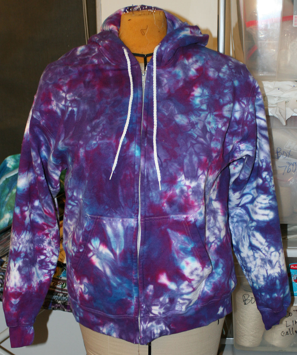
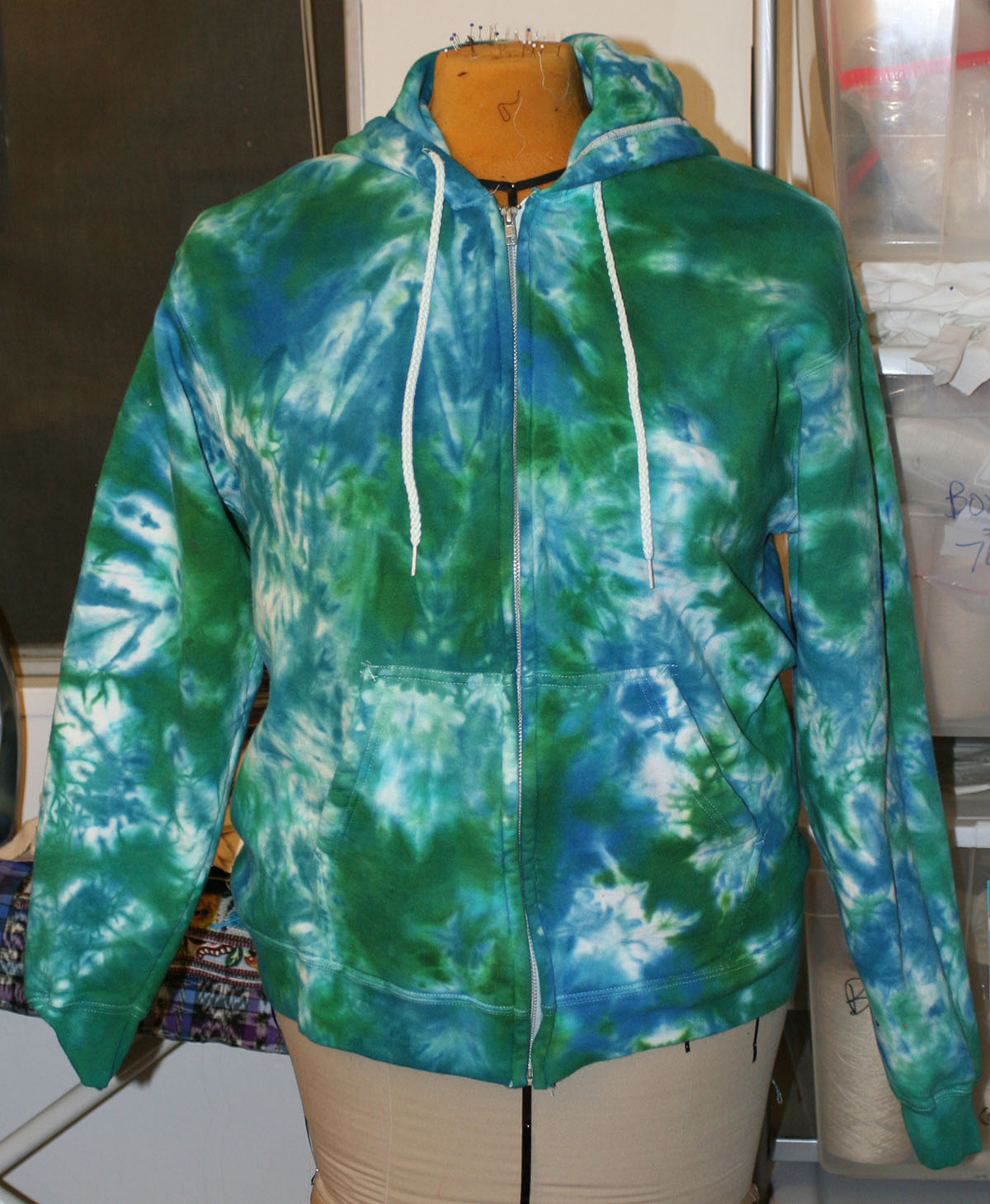
Here are the two colorways of the Skystock shirts:

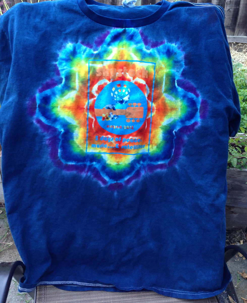
Alas, the logo is not especially prominent on either (though it fares somewhat better on the red/black version), but the pattern is pretty nice anyway. I could overdye the logo to make the lettering more readable, but that would at least partially ruin the star. No, better to leave them as is; they’re still beautiful.
Also, I think I have the star pattern more or less down, which is nice. I will still do some more practice shirts, but I’m pleased with my techniques.
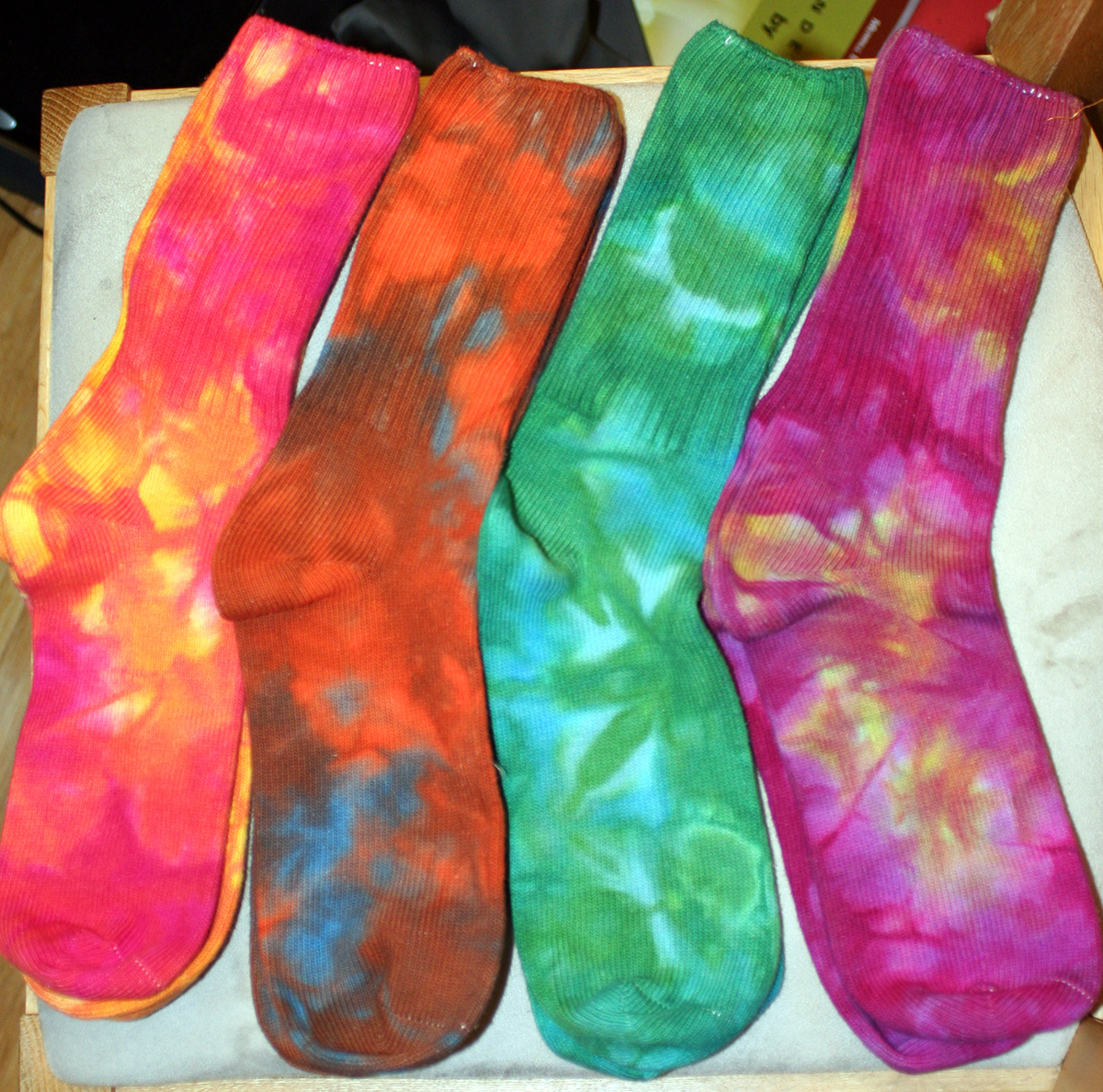
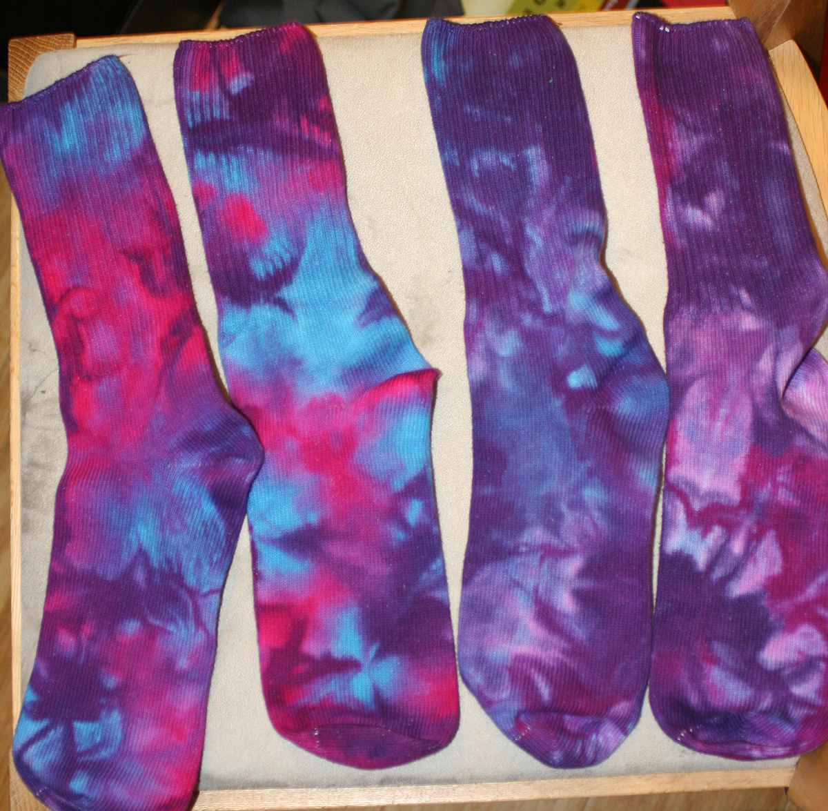
And here are seven pairs of socks (the eighth photo came out blurry):
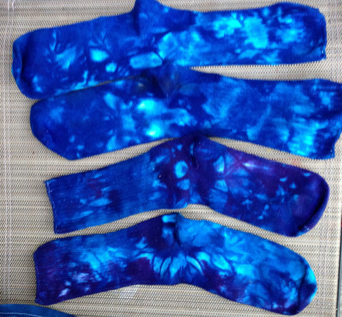
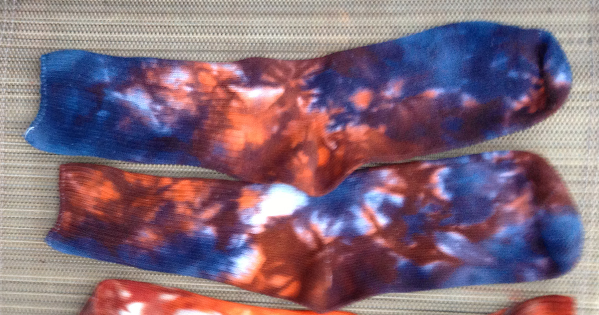
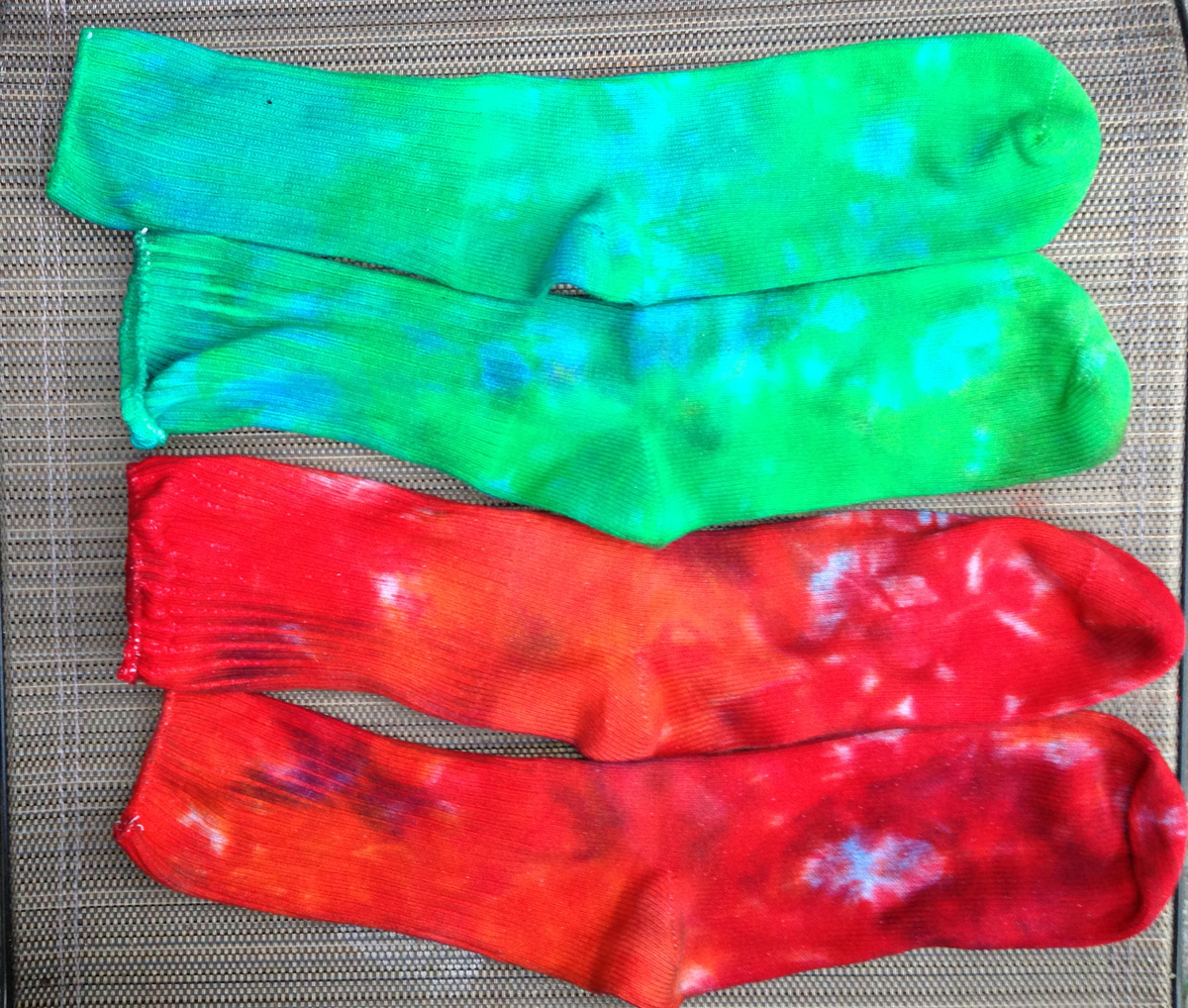
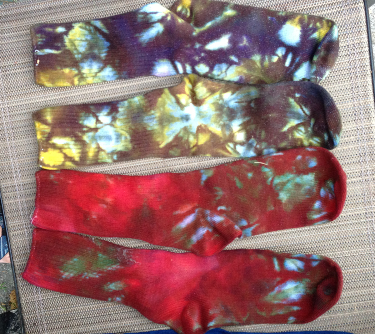
Of these, I like the ones mixed with complementary colors (blue/orange, yellow/purple, red/green) the best. The color ranges are more complex, and the effect is moodier, which (in this case) I like. My second favorite are the blue-on-blue or blue-on-purple socks. But I think all eight pairs came out very nicely.
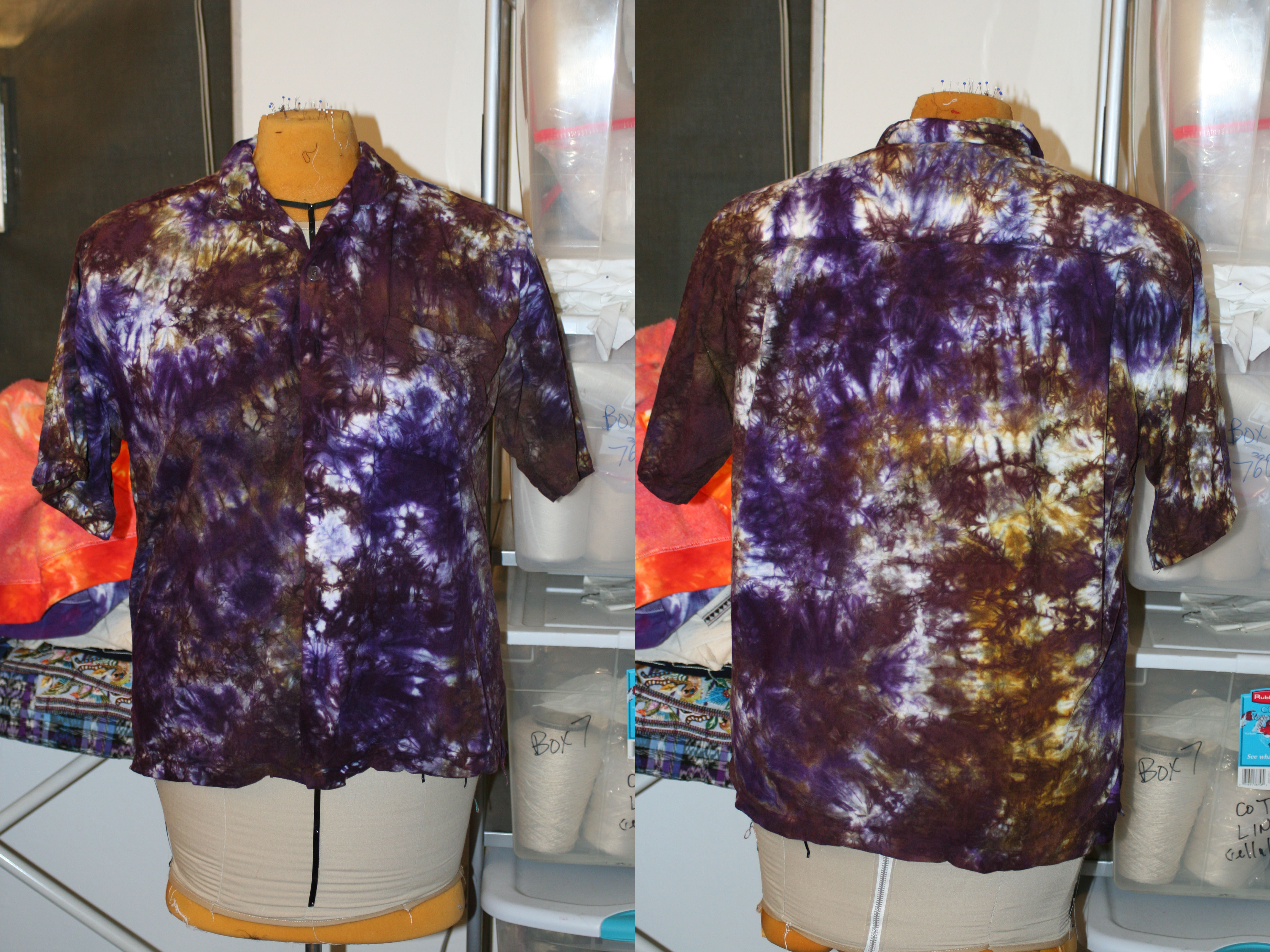
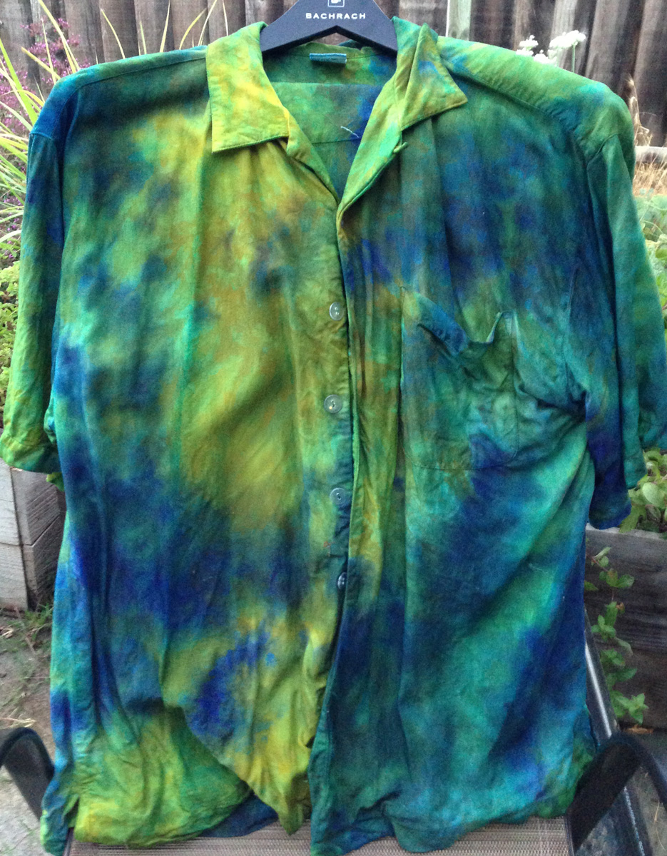
The six shirts (I had previously dyed three, in addition to the three I did in this spurt) were not nearly as successful, and most of them have been remanded to the pile for overdyeing or other rework. Here is the best one:
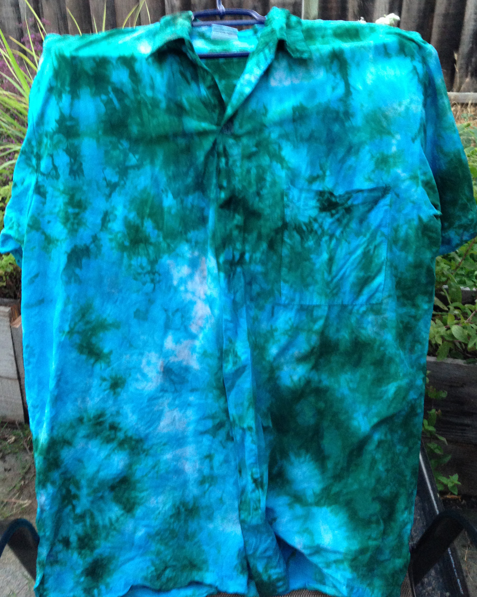
I had meant this shirt to be brighter than it was (incandescent turquoise and emerald green was what I was after), but I’m pleased with it nonetheless. The patterning is crisp and well-defined, and it’s bright enough to be interesting.
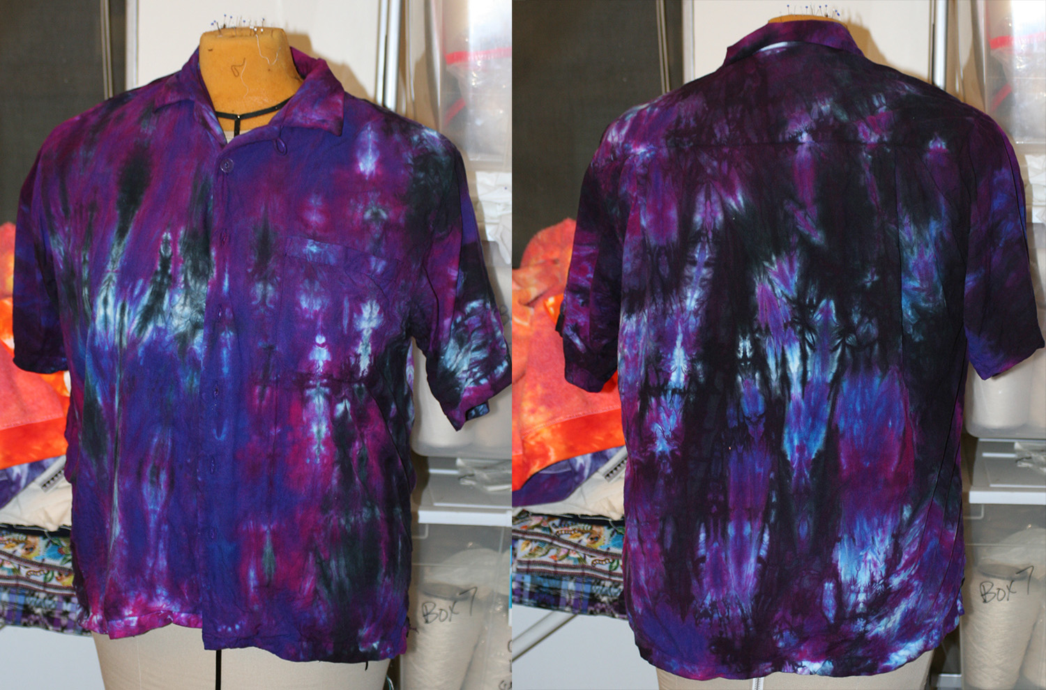
Here’s my second favorite, which is actually darker than it looks in the photo:

 I’m still not deeply fond of this one, but I like the complex patterning and the muted colors. It reminds me of some types of agate.
The others I am not so happy with:

The emerald-and-green shirt above is blurry and boring, and the colors feel washed out. I will either do some surface design on it, or overdye it – probably in a royal blue crinkle pattern (solid color).
The shirt above just doesn’t thrill me. The colors came out in huge, blurry blotches, and don’t look good together. I’m not sure this one is salvageable, but I may try overdyeing or stamping/screen printing anyway. There’s nothing to lose!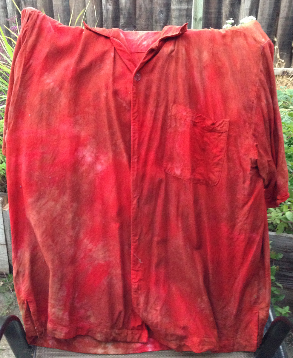
 The two shirts above were an attempt at mixing scarlet and olive green, which sounded like a good idea at the time. The first one wound up blending a bit too much, so feels rather boring. It’s a good candidate for surface design, though. I just have to figure out what to put on it!
The second shirt has nice coloring, but the red is too bright relative to the (remnants) of olive green; the shirt is predominantly red and brown, and the red dominates more than I had intended. Back into the bath for overdyeing. Color will likely be green, just a little bit of it and not very intense, just enough to tone down the reds.
So, mixed results, but even mixed results can be enlightening. And I have a marvelous set of tie-dyed T-shirts and eight wonderful pairs of socks, and plenty of fodder for surface design experiments. While it could have been better, I’m still quite pleased with the results.
Off to work on that warp for Handwoven! The sooner started, the sooner done.