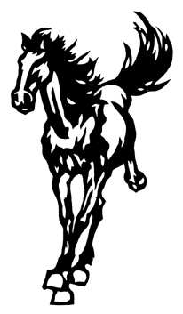
After a very long hiatus, I am finally back to weaving! I’ve decided to start with some basic designs, to help me learn the software and understand jacquard design. So I started with this horse design, a piece of clipart from Dover’s Chinese Cut-Paper Designs:
 Because the warp is fairly wide, I decided to repeat the horse three times across the width of the warp, weaving three different variations. So I set up my jacquard image file, like so:
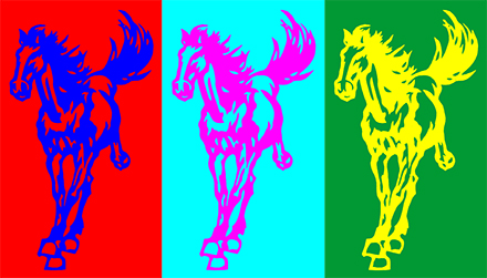
My jacquard design software (Arahweave) translates color into weave structure – all pixels of a given color are replaced with the weave structure assigned to that color. (Think of it as “paint by numbers,” except with weave structures.) So choosing different colors for each of the horses allowed me to make each horse, and each background, a different weave structure.
I decided to use matelassé as the structure because it sounded interesting to me: two layers of cloth stitched together in a design, with a stuffer weft between the layers to allow the design to pop out. I liked the three-dimensionality, and the different structures on top and bottom of the cloth (with different warp densities between top and bottom) would allow me to explore hitherto unused features in the weaving software.
I searched, and found two articles on the Web about designing matelassé. One was Arahweave’s tutorial on creating a matelassé shell, and the other was Stacey Harvey-Brown’s blog post on the topic. I decided to make all three horse foregrounds the same – double weave with a stuffer weft between the layers to puff out the design – but made each background different. In one background, I wove the background as a single layer with the stuffer weft on the back, using a twill design. In one background, I “quilted” the background by using diamond-shaped stitchers. And in one background, I set the stitchers much closer together in diagonal lines.
Here’s the result:
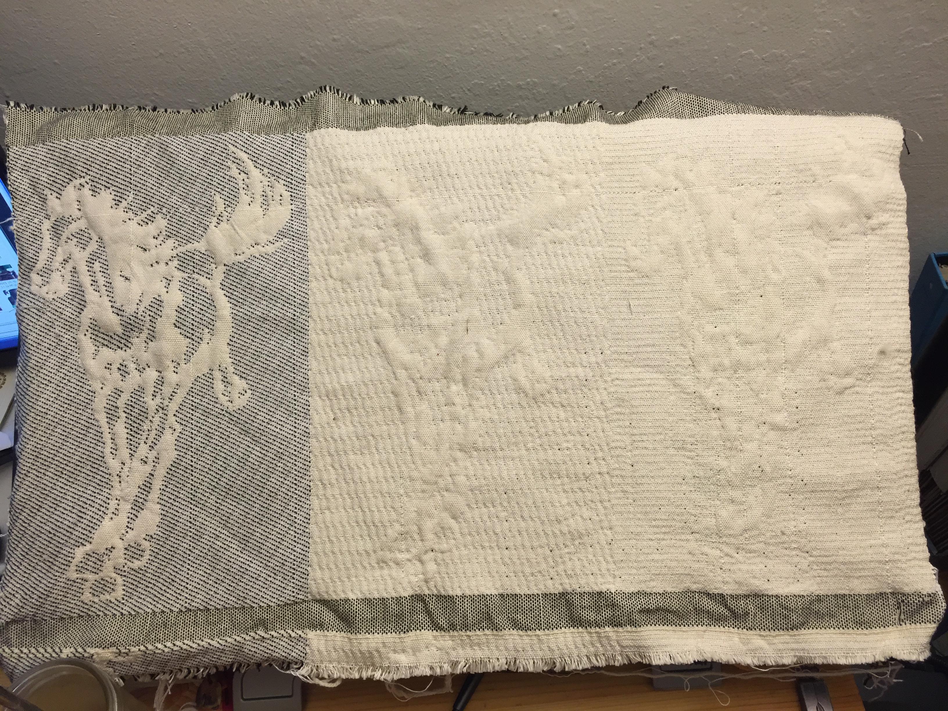
The left-hand horse, with the single-layer twill background, stands out the most, but of course it has color to help. But I also think the puffiness is most distinct compared to the other two. The center horse is just barely legible and the right-hand horse is largely invisible.
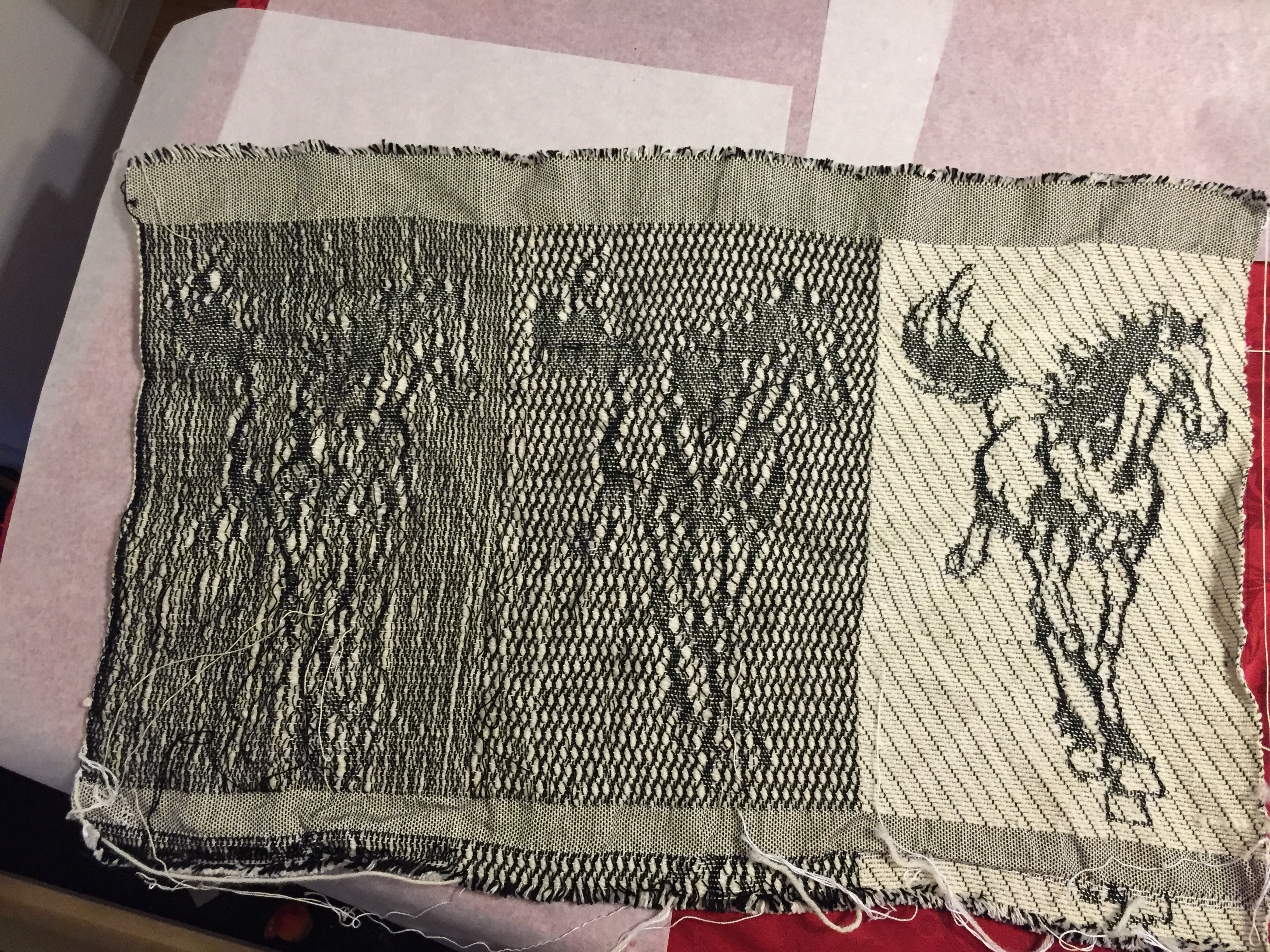
I’m a bit disappointed – I was hoping for more puffiness, and more clearly defined horses – but I have a couple ideas for how to fix it. First, I need to tighten up the back side of the cloth, which I wove at half the density of the front side and which is therefore Way Too Loose:
Second, I think I want to use a thicker stuffer weft. I used a superwash wool, sport weight, that I happened to have on hand, but I think today I’ll go to the yarn store and buy a thicker and loftier yarn.
Third, I’m going to add a thin border – a pixel or two, no more – of single cloth around the horses. The unfortunate part of doing this is that it will add a black border around the horses, as my bottom warp is black, which messes up the quality of the experiment. But I think it will make the horse design show more clearly.
I’m going to try to get this done today. I had originally intended to go to a guild meeting and a party today instead, but I slept twelve hours last night and am still exhausted, usually a sign that my body is fighting off some kind of infectious disease. So rather than infect others, I’ll stay home and weave!
