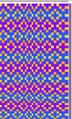
Today I started playing with gradient colors in Photoshop, simulating various combinations of gradually changing weft colors. I took a screenshot of a four-color doubleweave pattern that I liked:
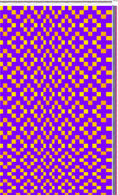
This one actually has some color changes in the weave structure – the orange and gold parts shade from a 3/1 twill to a 1/3 twill over the course of the larger diamonds, making them orange dominant in some places and gold dominant in others.
Anyway, I then separated the Photoshop file into four layers using the magic wand tool and “New Layer by Cut” – one layer for each color. I then selected one weft layer, and used “New Layer” with the “Use Previous Layer as Clipping Mask” check box checked. This enabled me to play with gradient fills without overwriting my original layer.
Then I started playing with gradient colors. First I thought I’d see what happened with a simple color change from fuchsia to turquoise and back again, in the background weft. (Please do click through to see the larger photos; the small ones don’t let you make out the detail.)
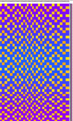
This was pleasing, so I thought I’d try a double gradient and see what happened:
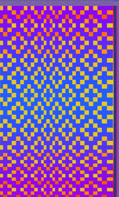
Here the weft that weaves with the yellow warp is shading gradually from red to yellow and back over the course of the shawl, and the weft that weaves with the blue warp is shading gradually from turquoise to fuchsia and back.
I liked this one a lot, but continued experimenting. This time I tried reversing the gradient in the foreground, taking the weft from yellow to red and back. Aackpfft!
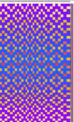
Way, way too “busy”.
This was not useless, however, because it showed one interesting thing: contrasting values and complementary colors have a lot more “energy” and “busy-ness” to them than colors of similar value and not-quite-so complementary colors.
Then, just for kicks, I thought I’d see what happened if you used gradient color with a faster repeat. This time I created the gradients in sections (with a new layer for each gradient), so I could control each gradient separately. One gradient for each big diamond, each going from fuchsia to turquoise and back again. Yikes!
Whew!! WAY too busy. Cross that one off the list.
And so it goes. Right now I’m not trying to create a masterpiece, just fiddling with the knobs and dials and trying to understand how color plays with pattern. There is such a vast realm of possibility with four-color doubleweave and gradients – I’ve barely scratched the surface! But this is really, really exciting. And it’s keeping me from pacing around the house.
Plans for this weekend: clean house! Since I don’t have any current projects (and don’t want to start a new one right before the wedding), I’m going to burn off some of that excess energy by doing a very badly-needed cleanup session on the house. Put away all the dyestuff, clean the kitchen, etc. – straightening up the house in anticipation of Mike’s uncle’s visit with us on Tuesday/Wednesday. I also plan to pack and ship the mannequins for the Convergence display of my wedding-dress this weekend. Getting this dress to and from Convergence is NOT going to be cheap – the insurance costs on shipping a $27,000 object are unholy – but worth it, because I know a lot of people would like to see it there, including me. 🙂

This is a good use of PhotoShop. Gradients are possible but more time-consuming in weaving software.
You wrote, “Here the weft that weaves with the yellow warp is shading gradually from red to yellow and back over the course of the shawl, and the weft that weaves with the blue warp is shading gradually from turquoise to fuchsia and back”. Tien, this is double weave. You have a weft that weaves with the yellow warp and a different weft that weaves with the blue warp. It is double weave. A X(crossing) C, B X D. It is not four-color double weave, which has each weft crossing each of the two warps.
Your block double weave drafts are excellent for learning about double weave.
Best wishes for the upcoming wedding and all associated events! Bonnie