Tien Chiu

  • Home
  • About
    • Honors, Awards, and Publications
  • Online Teaching
  • Gallery
  • Essays
  • Book
  • Blog
  • Dye samples
You are here: Home / All blog posts / Take two
Previous post: Done!
Next post: Finished!

July 17, 2010 by Tien Chiu

Take two

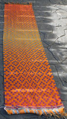
Eight or nine hours of obsessive weaving has produced this second “take”.  The photos, alas, do not do justice to the depth and saturation of the colors – they’re deep jewel shades that practically glow.  But here they are:
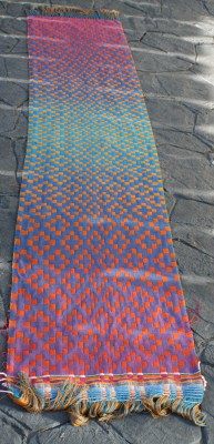
Second handwoven doubleweave shawl, blue/purple side, full view
Second handwoven doubleweave shawl, orange side, full view

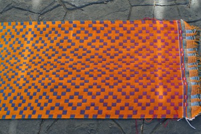
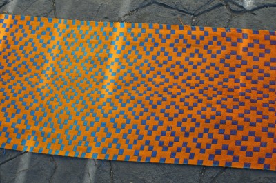
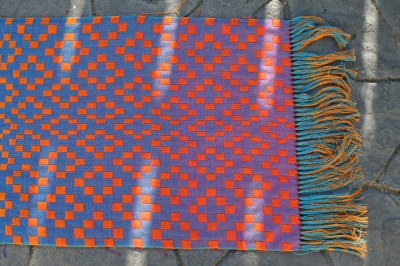
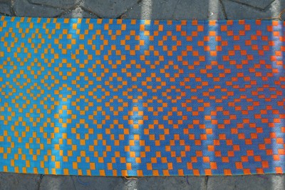
And here are the closeups:

Second handwoven doubleweave shawl, orange side, end view
Second handwoven doubleweave shawl, orange side, center view
Second handwoven doubleweave shawl, blue/purple side, end view
Second handwoven doubleweave shawl, blue/purple side, center view

I like this a LOT better.

For this variation, I eliminated both the striped background and the progression from 1/3 to 3/1 twills in the pattern squares.  Instead, the pattern squares are entirely 1/3 twills, 25% warp and 75% weft showing.  This was to maximize the visibility of the color-gradient wefts in the foreground.

I also decided to tone down the color changes in the background, so as not to compete with the foreground for attention.  So on the blue/purple side, I made the background a 2/2 twill (50% warp and 50% weft showing).  This allowed the blue warp to tone down the color changes a bit, while still leaving them quite visible. Because blue and fuchsia/purple are about equal strength, I “mixed” the colors in equal proportions.

On the gold/orange side, however, I made it a 3/1 twill (75% warp, 25% weft showing) so the gold warp would dominate.  Since yellow is such a weak color relative to red, I figured adding even a small amount of red would still shift the color.  And that is exactly what happened.  I think next time, though, I may try it with 2/2 twill (a 50-50 ratio) – I’d like to see even more reds in the background on the orange/yellow side.

Off to bed!  My flight to Albuquerque leaves at 2pm tomorrow and I haven’t even started packing yet.  Lots to do tomorrow!

Share this post!

  • Tweet
  • More
  • Email
  • Share on Tumblr
  • Print

Filed Under: All blog posts, textiles, weaving Tagged With: doubleweave, doubleweave shawls, gradient colors

Previous post: Done!
Next post: Finished!

Subscribe to Blog via Email

Information resources

  • Dye samples
    • Procion MX fiber-reactive dye samples on cotton
    • How to "read" the dye sample sets
    • Dye sample strategy - the "Cube" method
  • How-Tos
    • Dyeing and surface design
    • Weaving
    • Designing handwoven cloth
    • Sewing

Blog posts

  • All blog posts
    • food
      • chocolate
    • musings
    • textiles
      • dyeing
      • knitting
      • sewing
      • surface design
      • weaving
    • writing

Archives

Photos from my travels

  • Dye samples
    • Procion MX fiber-reactive dye samples on cotton
    • How to "read" the dye sample sets
    • Dye sample strategy - the "Cube" method
  • Travels
    • Thailand
    • Cambodia
    • Vietnam
    • Laos
    • India
    • Ghana
    • China

Travel Blog

Entertaining miscellanies

© Copyright 2016 Tien Chiu · All Rights Reserved ·


Loading Comments...