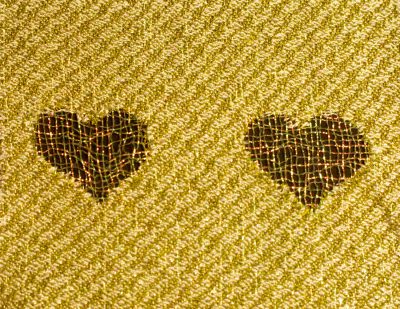
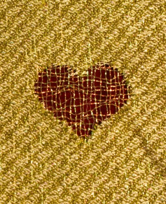
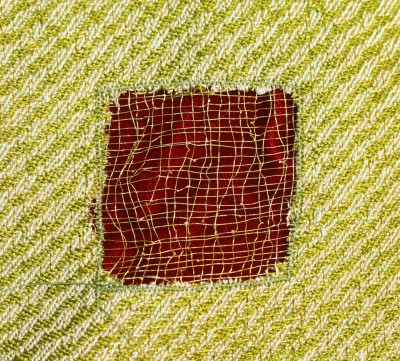
Rather literally:

These are my samples for the Fine Threads Study Group. After I finished weaving the fabric, I silkscreened devore paste onto it in the shape of a heart, using a freezer-paper stencil to create the silkscreen. (Which took two tries, since I had never done that before.) Then I ironed it until the tencel turned dark and crumbly, washed it out, and presto! a beautiful plain weave grid of metallic nylon, in the shape of a heart.
I am very pleased with the results, especially since it took several days of acute frustration to get it right. And, I’ve decided that devore is suitable for use without the machine-stitched outlines (which I thought looked tacky), though I will have to explore this a little more to make sure that larger sections of devore do not sag when hung.
Also, thinking it over, I think the metallic gold thread might be a better choice than the metallic nylon. The reason is this:


The metallic nylon is a little too assertive/too thick; it’s hard to see the fabric underneath (especially in person – the camera doesn’t catch all the glitter). The gold becomes a spidery web, revealing the underneath fabric clearly. Since I want people to be looking at the underneath fabric in the devore areas, the gold is a more appropriate choice.
Since I’ve flipflopped on this before, though, I’m going to give it another day or two (and some more extensive experiments) to be sure. I wish I had more fabric that I could cross-dye for backgrounds; I might have to dye some commercial fabric to give me the right colors to put underneath.
Next up is to weave some more samples, both to test out colors (I have 8 shades left to test) and to see what happens when I burn out larger areas. I will probably weave some sections in gold embroidery thread and some in metallic nylon, so I can compare effects when I do larger sections of burnout.
Once I decide on colors and metallic thread, next up is also some more dye experiments, getting the transition colors from green to brown, so I can make the overall fabric shade correctly. I will have to think carefully about my color choices, and what visual effect I’m after – if I include a section of gold, for example, it will draw the eye instantly, if the other colors are green and brown. So I need to think about what direction(s) to take the color transitions in the background fabric, as well as what metallic threads to use for devore.

I like the metallic gold thread. You can always use a stablizer behind the burn out if you need to. Do try some larger burns as that will give a better idea if you need stablizer or not. Also do you intend to use velvet behind? If so be sure the nap is not too deep so the threads can not sink into the background.
I am eager to see the actual samples.