Well, the velvet attempt was a bit of a disaster. I’m still determined to weave velvet, but I’ve realized that debugging the process and solving all the problems is likely to take months. More on that in a future blog post. (I haven’t given up, just contemplating my next move.)
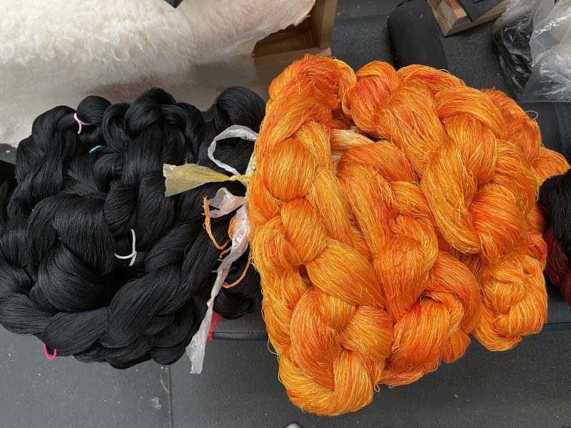
Since I would really like to have a finished project – any project! – someday, I’ve decided to warp up the left side of Grace. I was initially thinking about a black and white warp, which is what most people put onto a jacquard loom because of its versatility. However, black and white is booooooring. (I also almost never use white in my designs.) So I decided to create another “fire” warp instead.
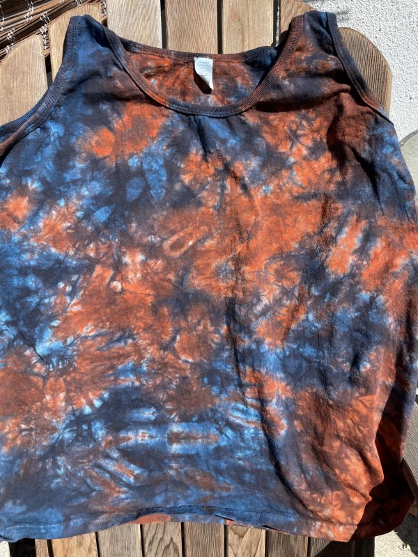
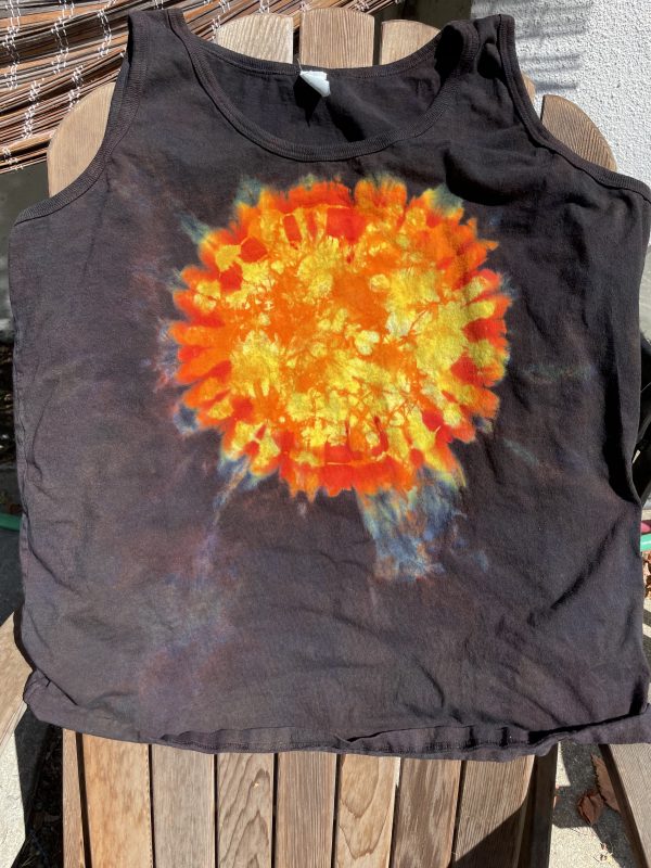
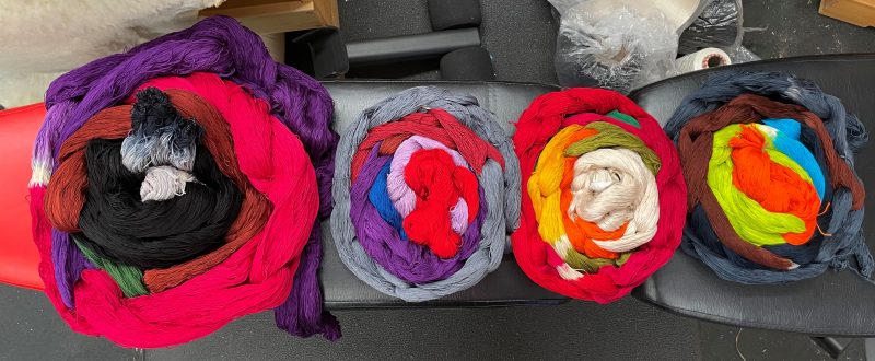
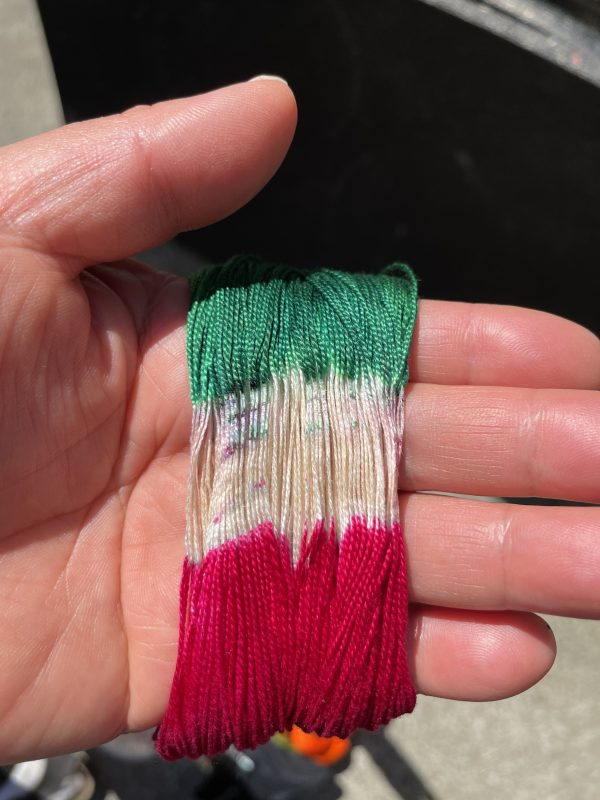
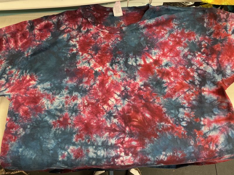
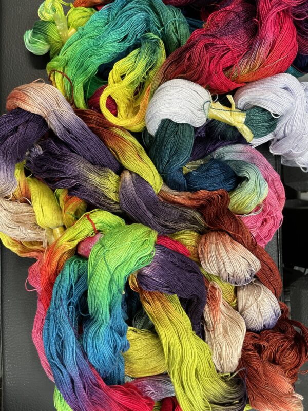
Here’s the one I cut off Maryam when I sold her:
It’s a mix of different fibers and yarn sizes. Here’s how that warp looked, before dyeing:
I think that warp was a mix of mercerized cotton, silk, and unmercerized cotton. The fibers took the dye differently, producing the gorgeous variegation shown above.
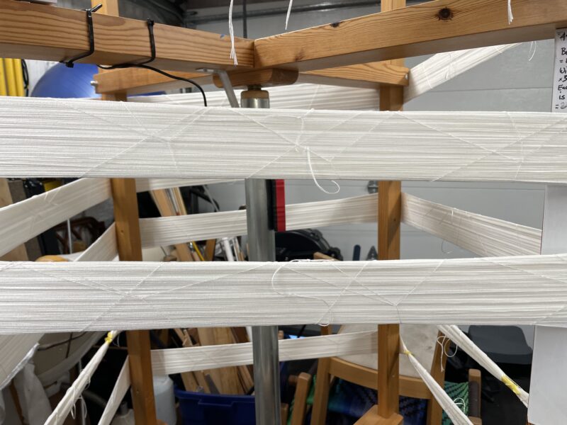
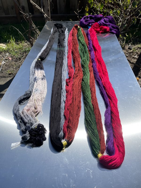
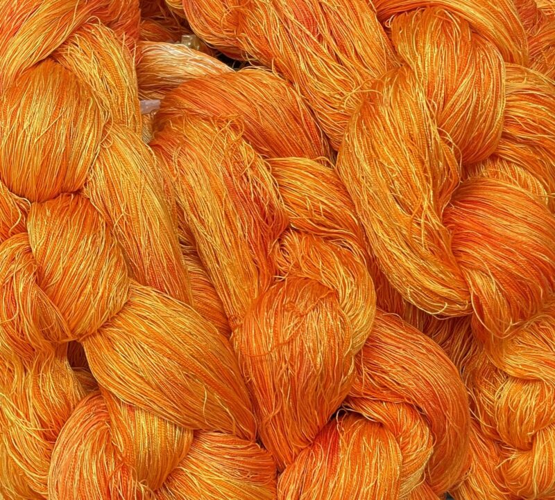
This new warp is a different mix. It’s one strand of 10/2 tencel, one strand of mercerized 10/2 cotton, one strand of a 4/28 nm cabled silk, and one strand of 20/2 silk. They should absorb dyes differently, and also reflect light differently – some are very lustrous, others are not. It should be interesting!
Here’s the warp halfway through winding:
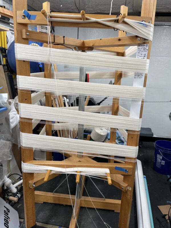
I wound the entire 29″ warp in a single bout. I know you’re not supposed to do this, but with painted warps, winding multiple bouts usually results in abrupt color shifts in the middle of the warp. There are ways to make that less noticeable, but for me, it’s easier just to wind a super-wide warp, dye it, and then separate it out into smaller sections when warping.
(I can get away with winding a very wide warp because I’ve got a large warping mill. I think this approach would not work nearly as well on a warping board.)
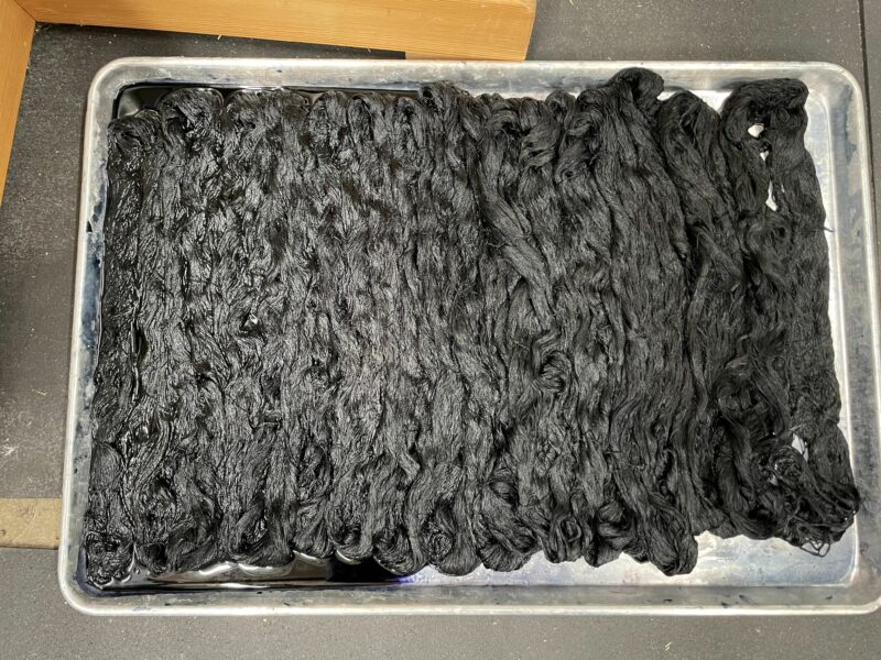
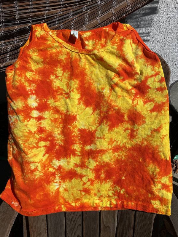
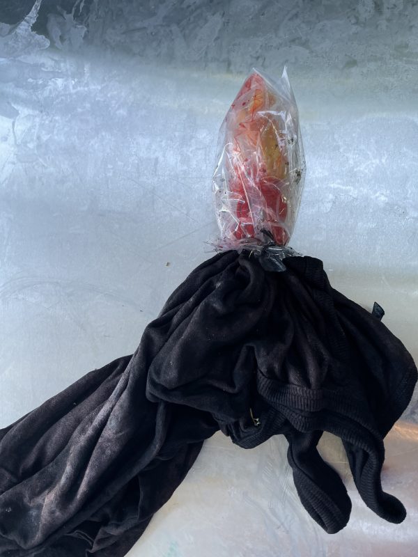
Now to the rain part. It’s been pouring about half the time, which is fantastic because this is California and we (always) desperately need rain. But my dye studio is on the patio, and, well, it’s raining for the next four days. (Hurray! Boo! Hurray!)
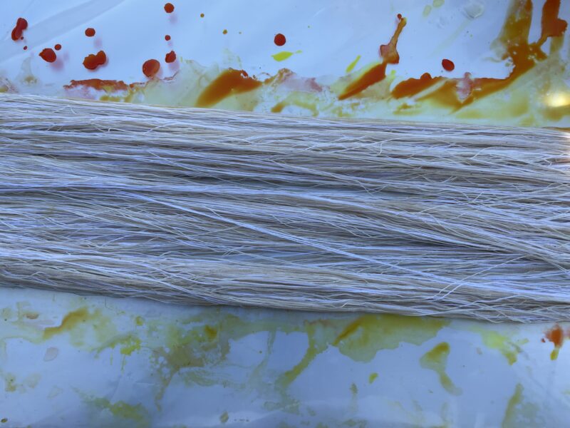
Fortunately, we have a table that sits under an underhang, and stays dry. So I sneaked out during a lull in the rain and did a little dyeing:
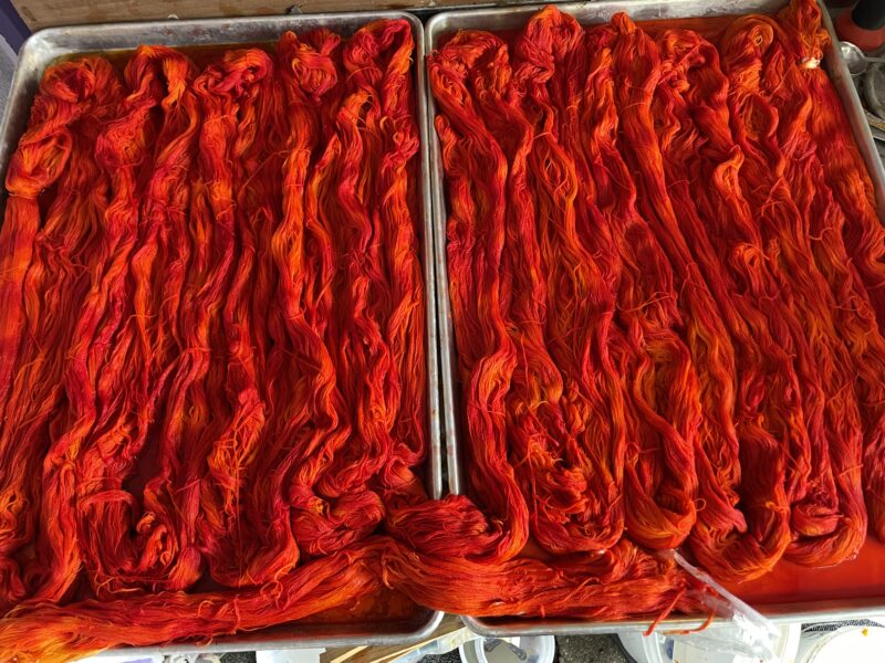
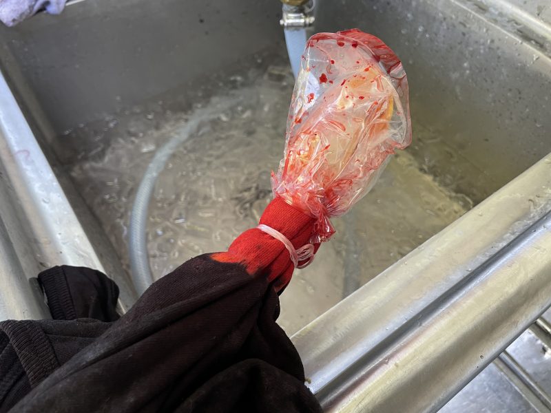
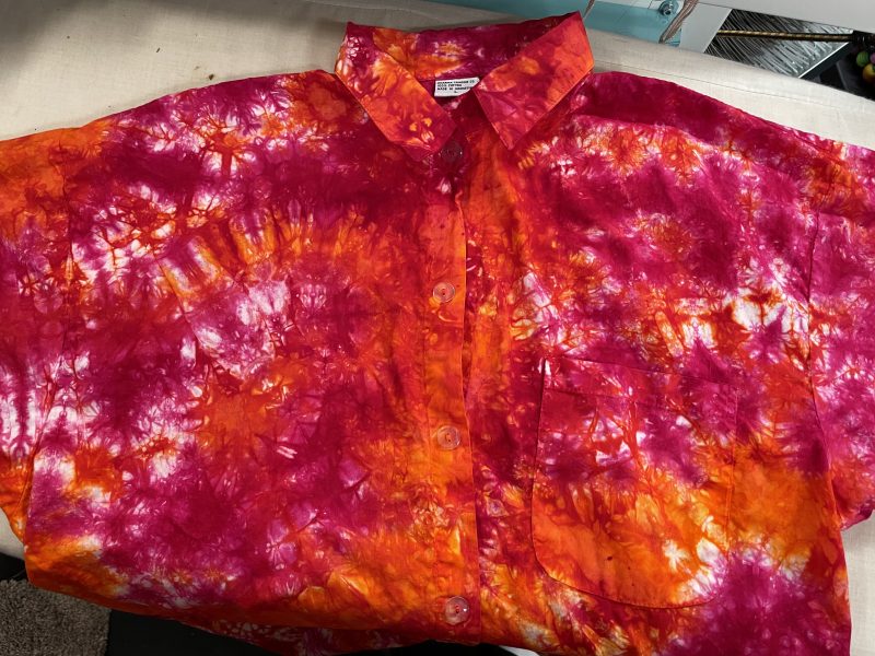
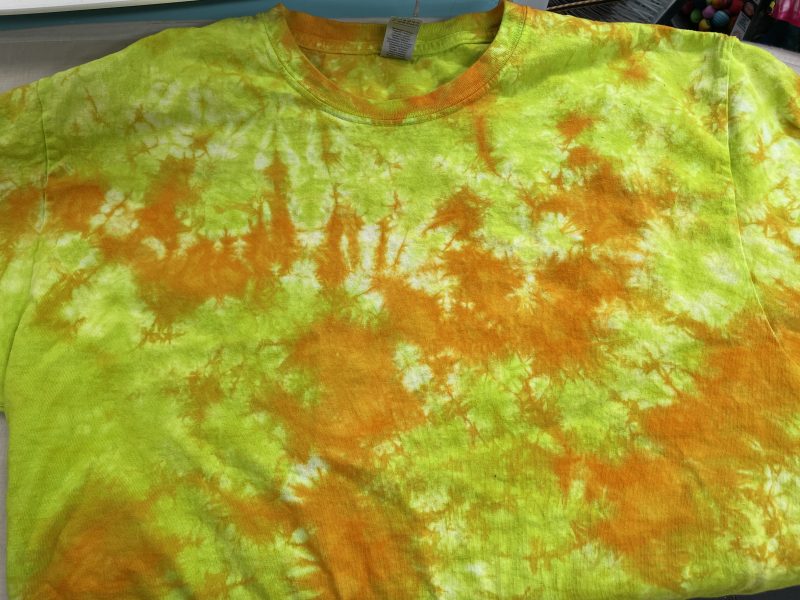
It looks like a solid color in the photo, but once it’s rinsed and dried, it should be all shades of fire. (Crossing fingers that this actually happens – dyeing always entails some randomness.)
I used 1.75 gallons (really!) of golden yellow to start, pouring it over the warp and squishing to soak the entire warp in yellow. (I really didn’t want white spots.) Then I drizzled 2 quarts of orange and red-orange over it, flipped it over, and squirted more orange/red on the yellow spots. My goal was a mostly orange warp with some areas of red-orange and a few areas of gold.
Tomorrow morning, I’ll start rinsing out the warp. I think it will work great for my AI-generated tiger, so I’m going to spend the next week or two working a bit more on the design. In particular, I want to think about how I want to render the circuitry – whether to weave it in metallic yarns, embroider it, couch real circuit boards down, or (this sounds exciting) use the retro-reflective yarns I bought ages ago to create brilliantly reflective areas.
(Retro-reflective yarn, in case you’re wondering, is a plastic yarn that’s been coated with the same glass beads that are used for high-visibility/reflective clothing. It looks flat gray until you shine a light directly at it, at which point it turns brilliantly white with reflected light.)
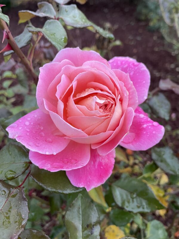
In case you’d forgotten, here’s the tiger I plan to weave:

The left part of the tiger will use the Fire warp, and the right side will use mostly the black warp, I think.
Can’t wait to see how this all turns out!
![By Keven Law (originally posted to Flickr as On the lookout...) [CC BY-SA 2.0 (https://creativecommons.org/licenses/by-sa/2.0)], via Wikimedia Commons](https://tienchiu.com/wp-content/uploads/2018/07/least_weasel-800x684.jpg)