I got the sleeves onto Autumn Splendor this morning – the first time I have EVER been satisfied with a set-in sleeve! Hooray for couture techniques – they work!
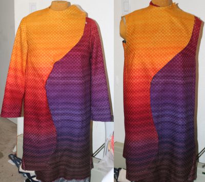
I also experimented with changing the line of the garment as Niki suggested. Here’s a photo (right is original, left is experimentally altered line):

This still didn’t feel right to me, so I experimented for most of this afternoon. I tried beads, but didn’t like it – this is a quiet, understated piece and beads felt too glitzy. I tried simulating a keyhole neckline in the shape of a maple leaf, but that looked stiff and contrived.
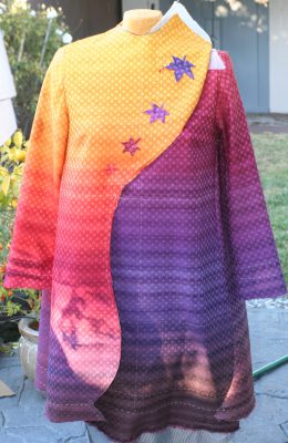
Finally I stumbled upon this:

I like this a lot – the leaves break up the vast expanse of yellow, add visual interest to the top, and emphasize the swoopy motion of the top front curve. They also repeat the color progression in the dark panels, only in reverse (to add a little variety). The only problem, of course, is that now the coat looks unbalanced. It needs something in the top right corner (the gold shoulder) to balance the weight of the leaves, I think. Maybe. Perhaps.
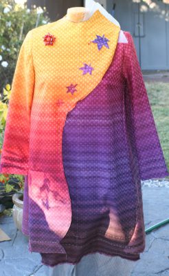
I stuck on a brooch that a friend had made for me:

I don’t like this – it does balance things better, but it looks totally out of place and distracts from the swoopy curve. I think I may just say “to heck with it” and just do the leaves, unbalanced as they are.
But I plan to mull it over for a few more days…maybe baste on the applique leaves and sort of “live with” the various design ideas for awhile, while working on other things. I’ve worked on it too much the last few days – I need fresh eyes!

I really love the leaves! For me, they sort of pull the whole thing together.
I’m nobody in particular really, but as far as the altered line in the top picture… I prefer the original one. Something about the way it falls just looks more trim and slender.
As far as the front decoration, I think I agree that the beads wouldn’t work, but I really liked the design of the lines going down the front. That balanced really well. What if, instead of beads, you did thick plain lines of embroidery in complementing colors down those lines? Either color-shifting with the weave, or the same dark color as one of the lower parts so it would start as eye-popping and then just fade away as it drifts down?
I am also nobody but I agree with Edana. I got quite excited with the addition of the lines you illustrated in your last post. For the first time I felt the flow of the leaves you have been trying to accomplish. I didn’t understand why until that post why I was not getting that feeling from it, but I think it is because of the horizontal striping of the color progression. I like Edana’s suggestion, but what I thought of was twisted ‘ropes’ — think a twisted fringe, in the yarn dyed with a progression of the colors in the coat — attached to the front like the lines in your illustration.
It’s so fun to see it finally coming together.