I revised the phoenixes this morning, lengthening the tail and making it more fluttery, more like a real phoenix. I also changed from full Summer & Winter treadling units to half-units, which I think will yield a better aspect ratio. And then I schlepped it into Photoshop and ran a few more simulations. Here they are, starting with my favorite:
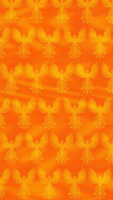
This one has a mottled warp and solid orange weft. It has plenty of movement (reminiscent of an inferno) but the phoenixes are still distinct. I wouldn’t necessarily be able to get that kind of movement in a painted warp (I’d really have to paint it on the loom) but I could get patches of color.
Here are a few others:
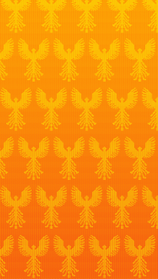
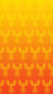
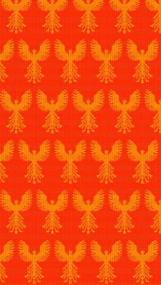
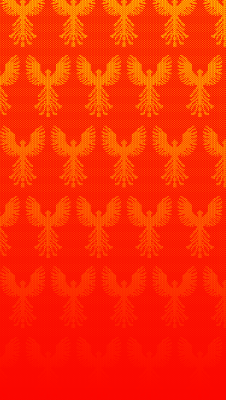
Of particular interest to me are the two gradients, one in pattern warp and one in both tabby warp and weft. They accomplish the same thing (a vanishing flight of phoenixes) but have vastly different “feels”. I will definitely have to weave up both versions to see what I think in the “real thing”.

Depending on what you are going to do with it the one with the phoenixes rising out of the solid red is fantastic! The symbolism of it says so much.
Depending on what you are going to do with it the one with the phoenixes rising out of the solid red is fantastic! The symbolism of it says so much.
The gradient warp with solid weft really appeals to me, but I love them all. This could be because I have an unreasonable love of the color orange, too.
I can’t wait to follow your progress on this!
The gradient warp with solid weft really appeals to me, but I love them all. This could be because I have an unreasonable love of the color orange, too.
I can’t wait to follow your progress on this!