The last few days I’ve mostly been writing – a small publisher has expressed possible interest in the book, which means I’ve been hastily fleshing out my table of contents and outlining the rest of the book so I have something to show them. Remarkably, it looks like I have only about thirty posts left to write (the remaining two chapters will be in the book but not the blog), meaning I may be done with the book blog by June! I’ve been working on it so long that the idea of finishing shocks me. Even more shocking is the idea that I may be done with the book someday!
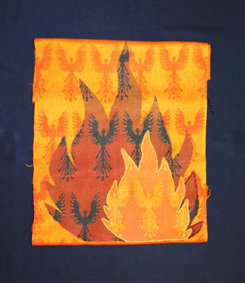
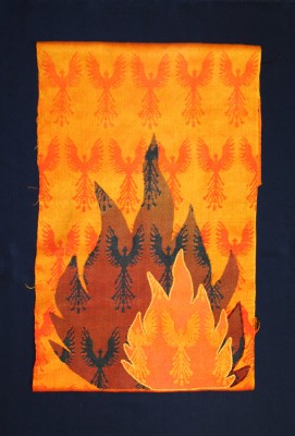
Anyway, despite my focus on writing, I have not been idle on the phoenix front. I’ve applied the edging to the smaller flame – two strands of 5/2 perle cotton couched down with one strand of embroidery floss. I’ve also acquired the backing – half a yard of silk charmeuse in navy blue. Put it all together, and it looks like this:

Or this:

As you can tell, I’m still on the fence. The basic dilemma I’m facing is that the shorter version feels more visually balanced, but the emphasis is on the flames and you don’t really see the phoenixes in the background. The longer version has “empty space” at the top that feels a little weird to me – when my eye looks at it, it initially says, “Nothing there – why is there so much empty space in this piece?” Then it does a double-take and says, “Holy cow, there are PHOENIXES there!” I don’t like the initial weirdness or the double-take, but I do like the visibility of the background phoenixes.
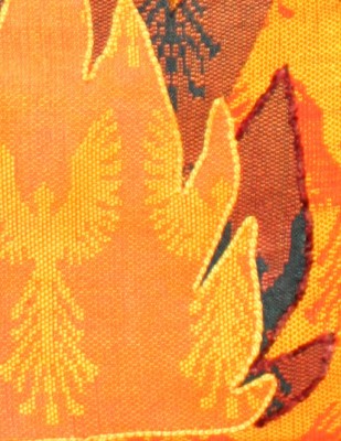
My second dilemma relates to the borders. My initial attempt at dyeing the rayon chenille failed, so I tried couching the smaller flame with two strands of 5/2 perle cotton. But it didn’t quite feel right, so I dyed another batch of rayon chenille and tried stitching the outer edge of the large flame with it. Here’s what the two look like close up (click on either of my previous two photos to see the whole composition):

I’m torn. The chenille provides a much softer, more blended edge than the perle cotton, but I don’t know if it would work with both flames outlined in chenille – would it look too Velvet Elvis-y? At the same time, doing one edge in perle cotton and one in chenille might just look weird. Doing both edges in perle cotton would produce a very crisp, clean-cut look, but I don’t think I want that – feathers and fire are both soft and blurry at the edges, not crisp!
So I am thinking this over for a day or so. Not too long though, because a photographer friend is coming over next Sunday, and I want to have this wall hanging finished before then, so we can practice on it!
Meanwhile, my to-do list has gotten out of hand again. In the next three weeks, I need to write another fifteen book blog posts, a book review for Complex Weavers Journal, my article for the Designing Fabrics Study Group article exchange, the lecture I’m giving at the American Textile History Museum in April, and a formal book proposal. Plus I need to finish and photograph the phoenix wall hanging, and mail about a bazillion packages. It’s definitely going to be a challenging time, but I’m pretty confident I can plow on through.

I like the phoenixes without any flames. …. but you’re the artist 😉
If you were able to highlight one of the Phoenixes on the top left of the longer version that would give your eye someplace to go and maybe that would get rid of the wierdness. Maybe one Phoenix flying on to the border or something like that.
Can you slide the flames up so the background is half a repeat shorter, but the top row of phoenixes is mostly complete. I don’t care for the version where the flame touches the top of the frame.
It sticks out to me, the way the phoenixes of the various layers don’t line up. But maybe you meant it to stick out.
I like the longer version–it’s more about the rising phoenixes. In the short version they’re trapped in the flames, and it just looks crowded.
Unfortunately, the flames are already fused to the background – also, it’s not possible to line up the phoenixes as they are slightly different lengths. (The orange phoenixes are in a different weave structure from the black ones – orange = turned Summer and Winter, black = mix of twill and double weave. So the lengths don’t quite match up.)
I like the idea of highlighting one of the phoenixes in the top left – may try that! Thanks Lena for the idea.
[WORDPRESS HASHCASH] The poster sent us ‘0 which is not a hashcash value.
Tien, I, too, like the longer version. And Lena may be on to something!
[WORDPRESS HASHCASH] The poster sent us ‘0 which is not a hashcash value.