I went over to my friend Lisa’s last night to get her view on the piece. Interestingly, she preferred an even longer version of the piece, showing a full row of phoenixes above the flame, like so:
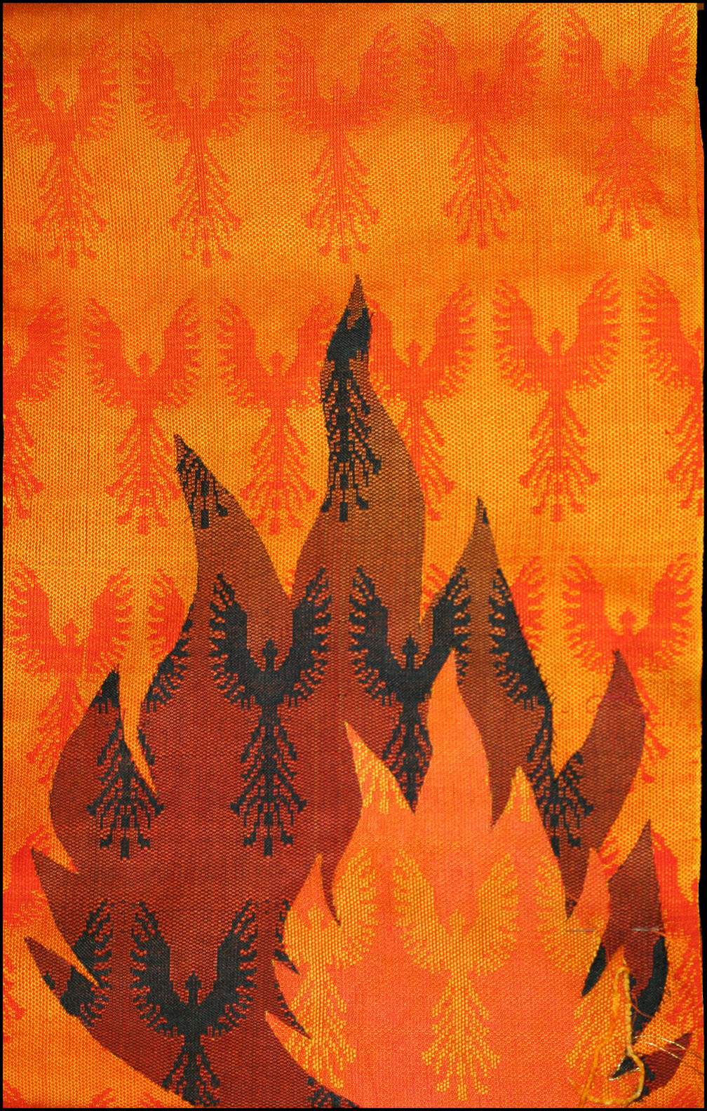
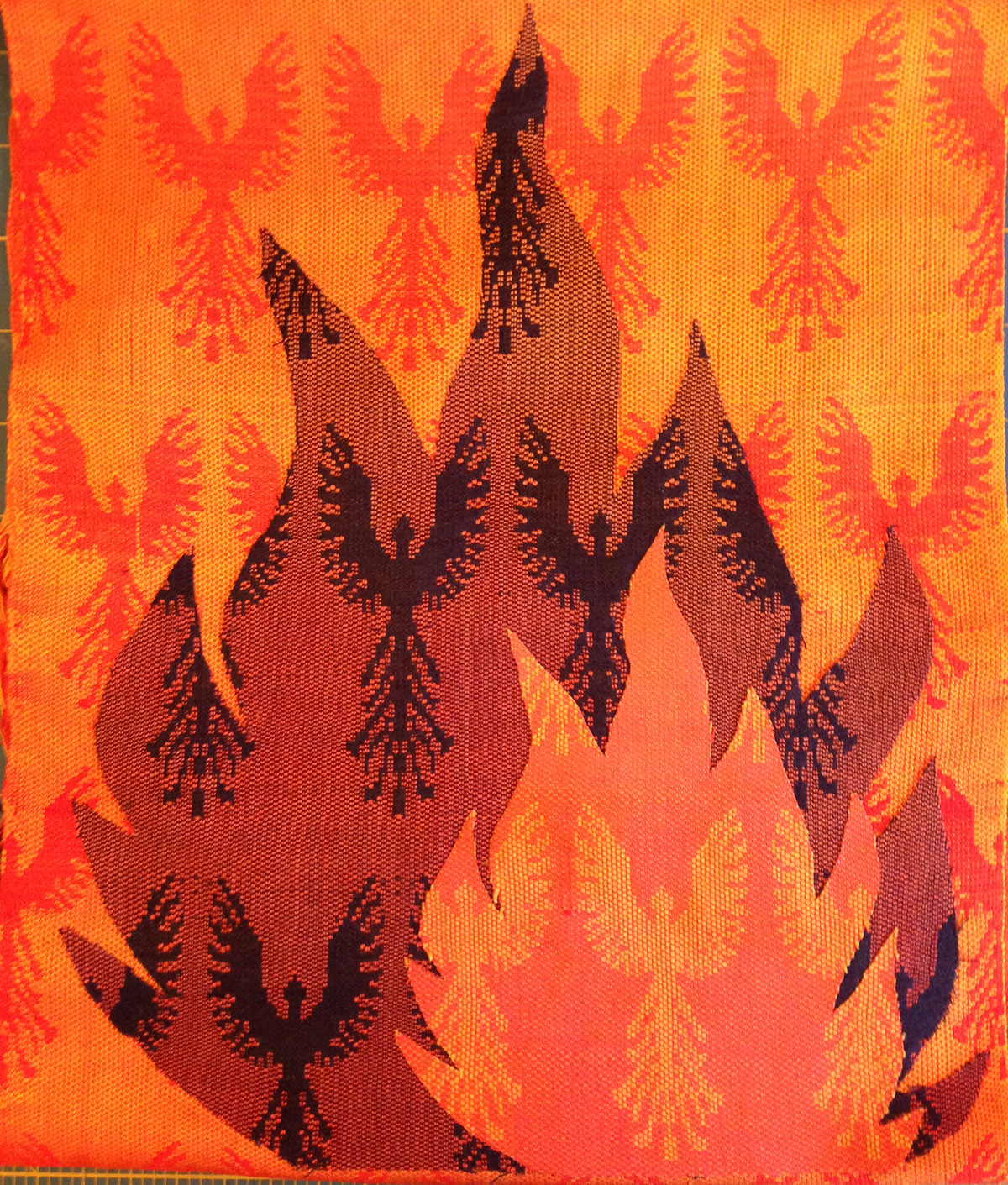
I liked the idea, which was to help the eye move out from the flames to the background, thus bringing out the background phoenixes. However, I felt it unbalanced the piece – all the focal points are near the bottom, and it left the eye wondering what to do up top. With the shorter flame, the focal points are more distributed:
But I set that aside for the moment and tackled the other problem, which was the border. I had not intended to put on a border, but Lisa felt it would be better with one, and after some experimenting, I agreed.
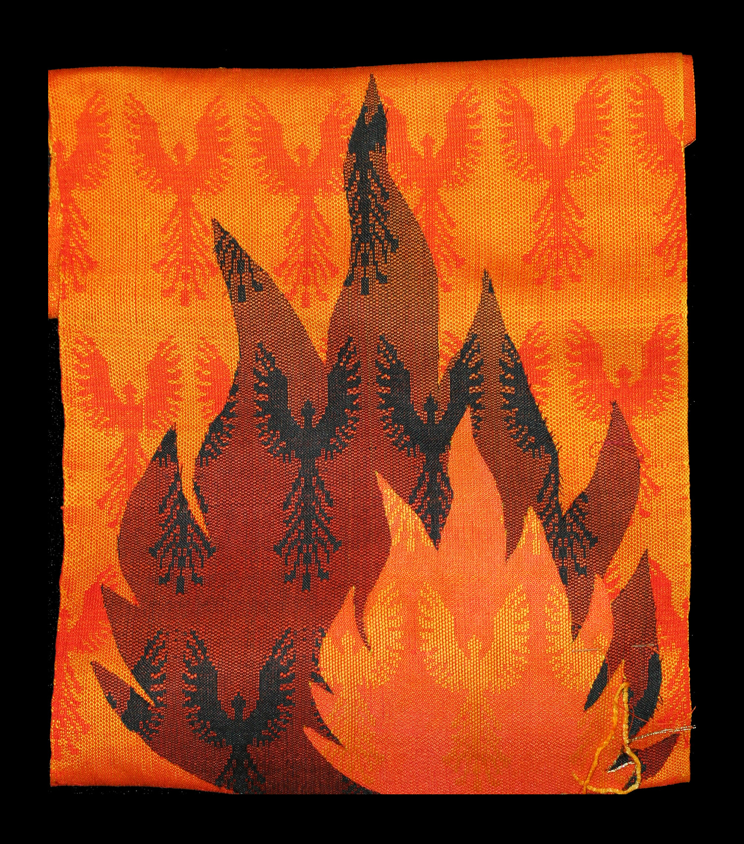
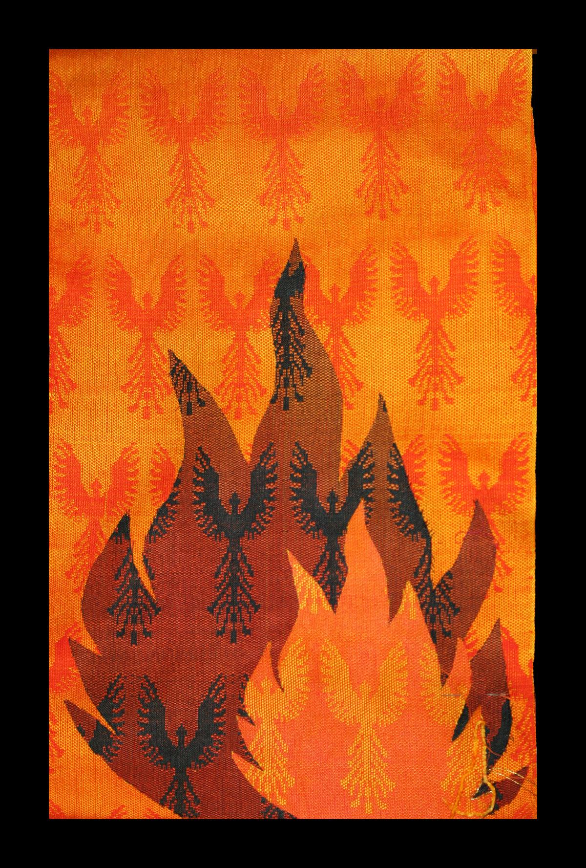
But what color for the border? I tossed it into Photoshop and did some experiments. Black was too stark, for both versions:
Reds warmed the piece up nicely, but didn’t provide enough color contrast – it just felt boring: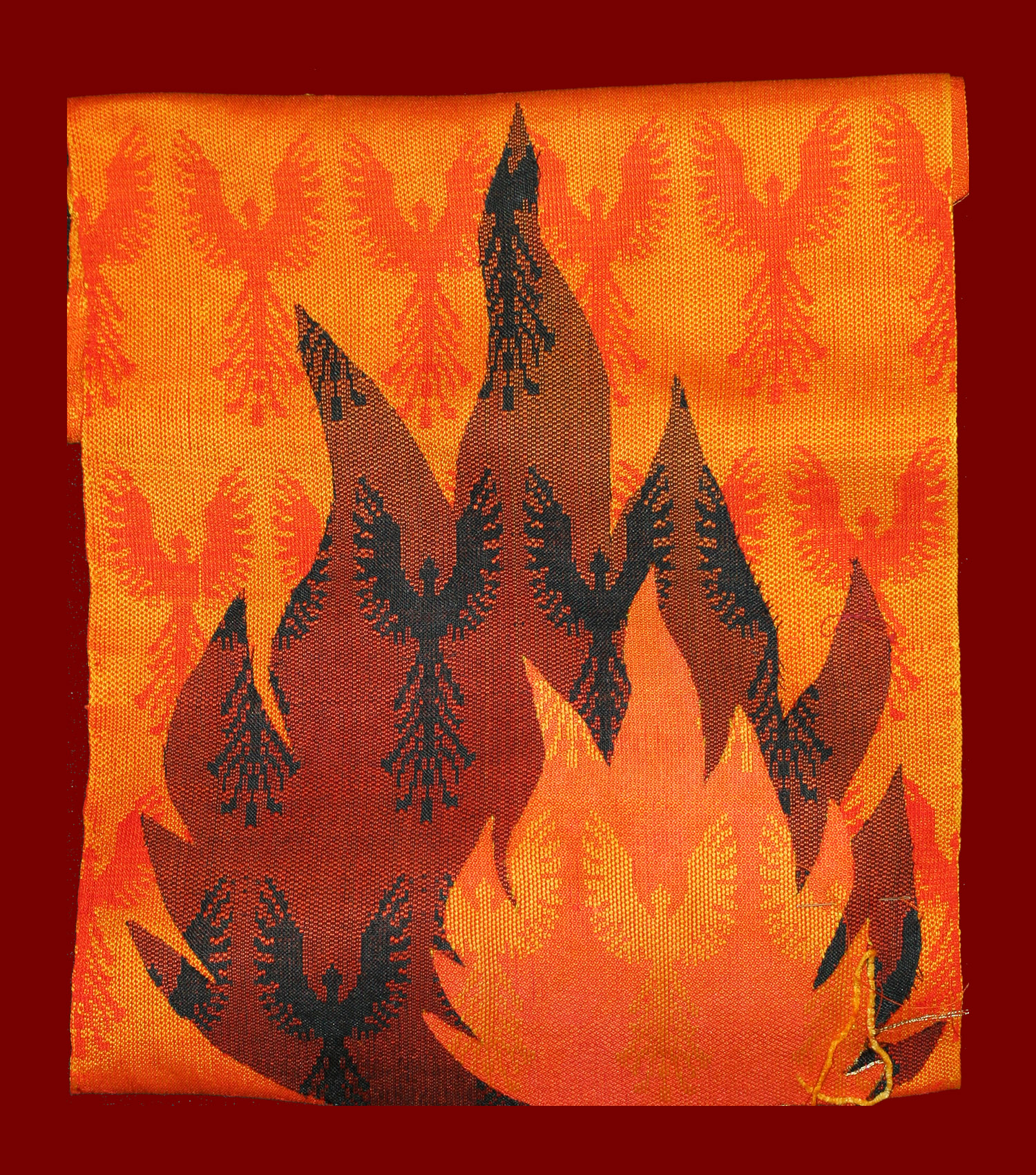
After seeing the effect of the red, I realized that I really wanted to pop out the orange, and the best way to do that would be to pair it with a dull blue. Blue is the complement of orange and will therefore intensify it, and dull colors make bright colors look brighter, so a dull blue would really pop it. Furthermore, a dark color will make light colors look lighter, so a dark navy blue (according to color theory) should really make the orange background “pop”.
And so it did:
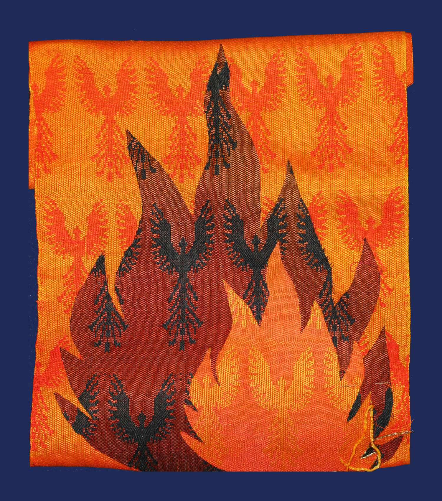
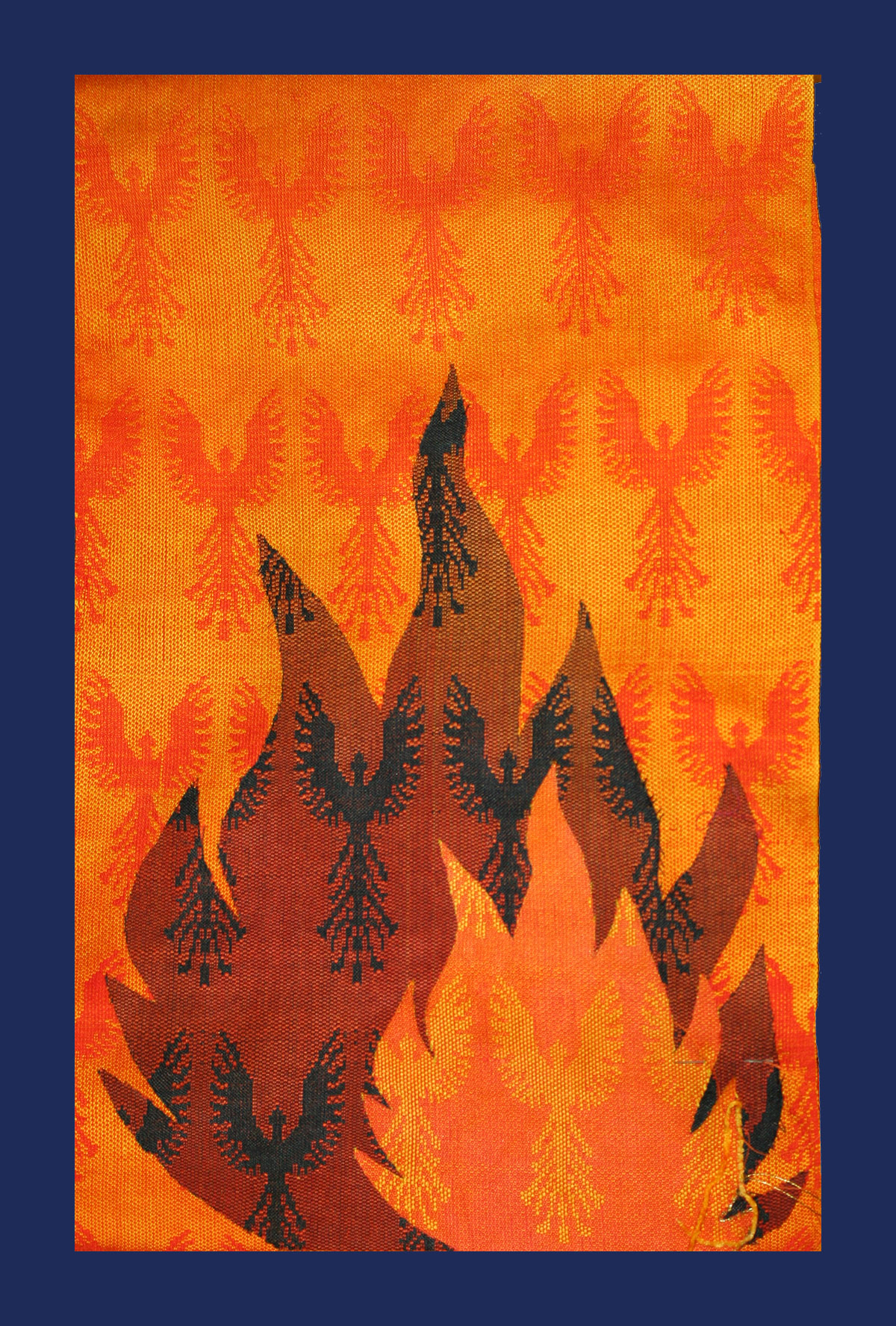
Interestingly enough, with the borders added, I now think the longer version is better than the shorter one. I think it’s because the high contrast between orange and blue at the top of the piece catches the eye, giving it something to look at up top. The shorter version, on the other hand, feels crowded.
I did make one other experiment, with a mottled background, but considered it unsuccessful:
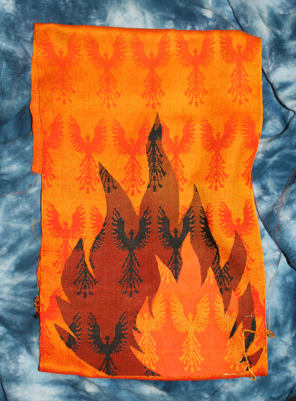
Here the border is visually interesting, which is exactly what I don’t want – it calls attention to itself and distracts from the piece. So I’ll use a solid or only very slightly variegated navy blue for the border. A trip to Thai Silks seems in order!
Finally, I tested out a couple different types of border for the edges of the flames. Lisa and I went through various possibilities for couching thread, and finally decided a fine chenille might do the trick. I did a small experiment and it seemed promising, so I’m going to dye some rayon chenille yarns over the next few days and see if it works.
And a true font of happiness is this:
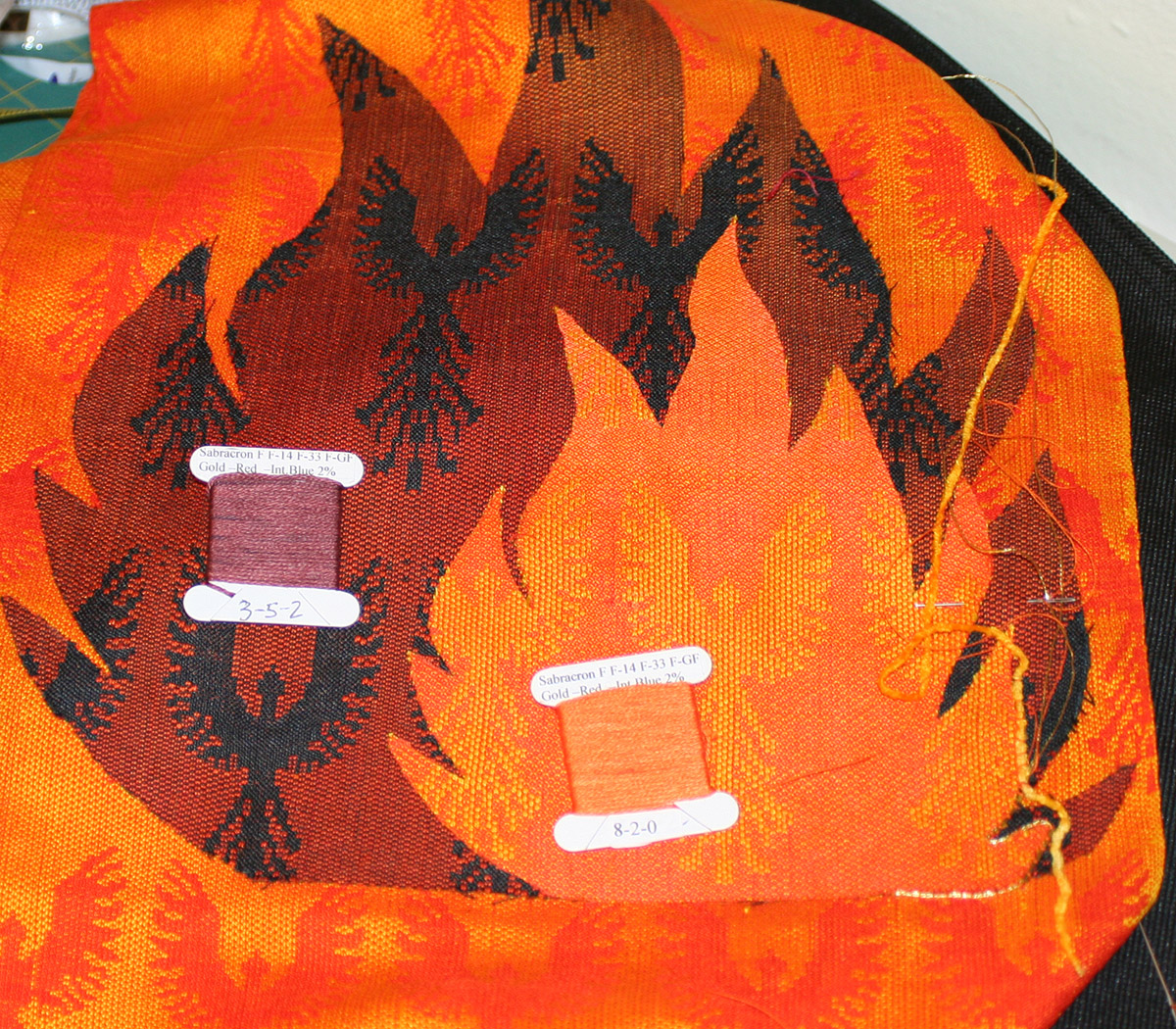
It’s just so wonderful to wonder how to match a color, then walk over to your sample book and pull out two color chips that, magically, match. No laborious experiments needed! This is why I spent a whole summer just making dye samples. Well worth it.
(You can see my experiments with yarns to the bottom left – the gold was a bit too gaudy, but the rayon chenille softened (and hid!) the edge nicely.)
Anyway, I feel like I’ve made tremendous progress on the design. And here I thought I was almost done after doing the cutting and fusing! It just goes to show how a design evolves until the moment the last stitch goes in.
Next steps are to dye the chenille and to get the navy blue fabric for the background. I think I will make it silk broadcloth, or maybe raw silk. I need to see the fabric to know, so it’s time for a trip to Thai Silks!

I love the navy but shorter piece.