Tien Chiu

  • Home
  • About Tien
  • C.V.
  • Online Teaching
  • Works
  • Essays
  • Travels
  • Book
  • Blog
  • Dye samples
You are here: Home / Archives for All blog posts / textiles / surface design

December 24, 2015 by Tien Chiu Leave a Comment

Testing embellishments

I’m traveling at the moment, but have found some time to work on the phoenix. I’ve been testing embellishments – mostly on the head, as that’s the most important part. Here’s what I’ve done so far: most of the crest feathers, the beak, and a little bit of the head.

partially embroidered handwoven phoenix head

If you compare it to the original head, you can see there is quite a difference:

phoenix head - original
phoenix head – original

The embroidery, especially around the eye, adds sharp detail, bringing the phoenix into focus.

I’m embroidering using DMC #5 perle cotton, which is similar to the weft in size and sheen. I tried using silk embroidery floss, but the finer threads looked out of place. I’m also using two metallic yarns: one very fine thread, used four at a time, to connect the beads to the crest feathers, and a much thicker thread (made with real gold!) for the center of the crest feathers. The thicker thread is too delicate to stitch with, so I’ve couched it down instead.

Embroidery is going slowly, partly because the backing fabric I chose is too tightly woven to work well with the thick threads I’m using. Pushing the needle through the fabric takes significant effort, which is bad for my thumbs as well as my temper. I’ve already decided to use a coarser fabric for the real piece. I have some cotton or linen cloth from my mother’s stash that should prove suitable.

As stitching the head has been very slow going, I had hoped to avoid stitching the entire body as well. Alas, my attempts at laziness have come to naught: the embroidered beak and part of the head look so much nicer than the original that I have decided to do solid embroidery on the entire head. And if I do the head, I really need to do the body, or it will look funny. Fortunately there’s enough division between the body and the wings/tail that, as long as I add a little bit of transition embroidery to connect the two, I shouldn’t have to do solid embroidery on anything else. I do intend to do more embroidery on the wings/tail, both to add a bit of metallic sparkle and to add some dimensionality to the feathers/wings, but nowhere near the amount I’ll need to do for the body.

As much as I’d like to finish stitching the body on the test piece, I’ve decided to move on to other parts of the bird. The test piece is exactly that – a sample meant to test out my embroidery ideas. Stitching the entire body would consume a lot of time. Since I have only about five weeks to complete the entire project, including the embroidery samples, I don’t want to spend one more instant on the sample than absolutely necessary. I know now that I want to embroider the entire body, and that’s all I need from this area of the sample. (I do need to figure out the shading on the body, but that is more easily done via digital painting.)

So the next step will be to test out my embellishment ideas for the tail. I want to add a little detail to the front feathers. There are two layers of feathers in the tail – this is obvious in the digital painting, but not in the woven piece. So the tail looks a bit flat right now; I want to make it look three-dimensional. I’m not entirely sure how I’m going to accomplish that yet. Maybe with ribbons, maybe not. Fortunately, I can experiment on the sample.

Meanwhile, the cat-sitter has been sending us a ton of photos of our beloved cats, who look happy and healthy. Here’s Tigress, hanging out in the cat tree.

Tigress, posing for the camera

Filed Under: All blog posts, surface design, textiles, weaving Tagged With: ma's memorial

December 21, 2015 by Tien Chiu 1 Comment

Embellishments

I’m heading off to the airport in a few hours, visiting family for two weeks. The phoenix is accompanying me, so I can work on embellishments while I’m traveling. In fact, it has its own suitcase! as there is a lot to bring: the phoenix, the sample version, the embellishments, the scroll frame on which to stretch the phoenix, a table stand for the scroll frame – the list goes on. But I am short on time, as the piece needs to be completed (or complete enough to photograph) by February 1, so I have only six weeks to finish it. And I am traveling for three of those weeks! So the phoenix is coming with me.

What embellishments, and where? Well, here they are in a big untidy heap:
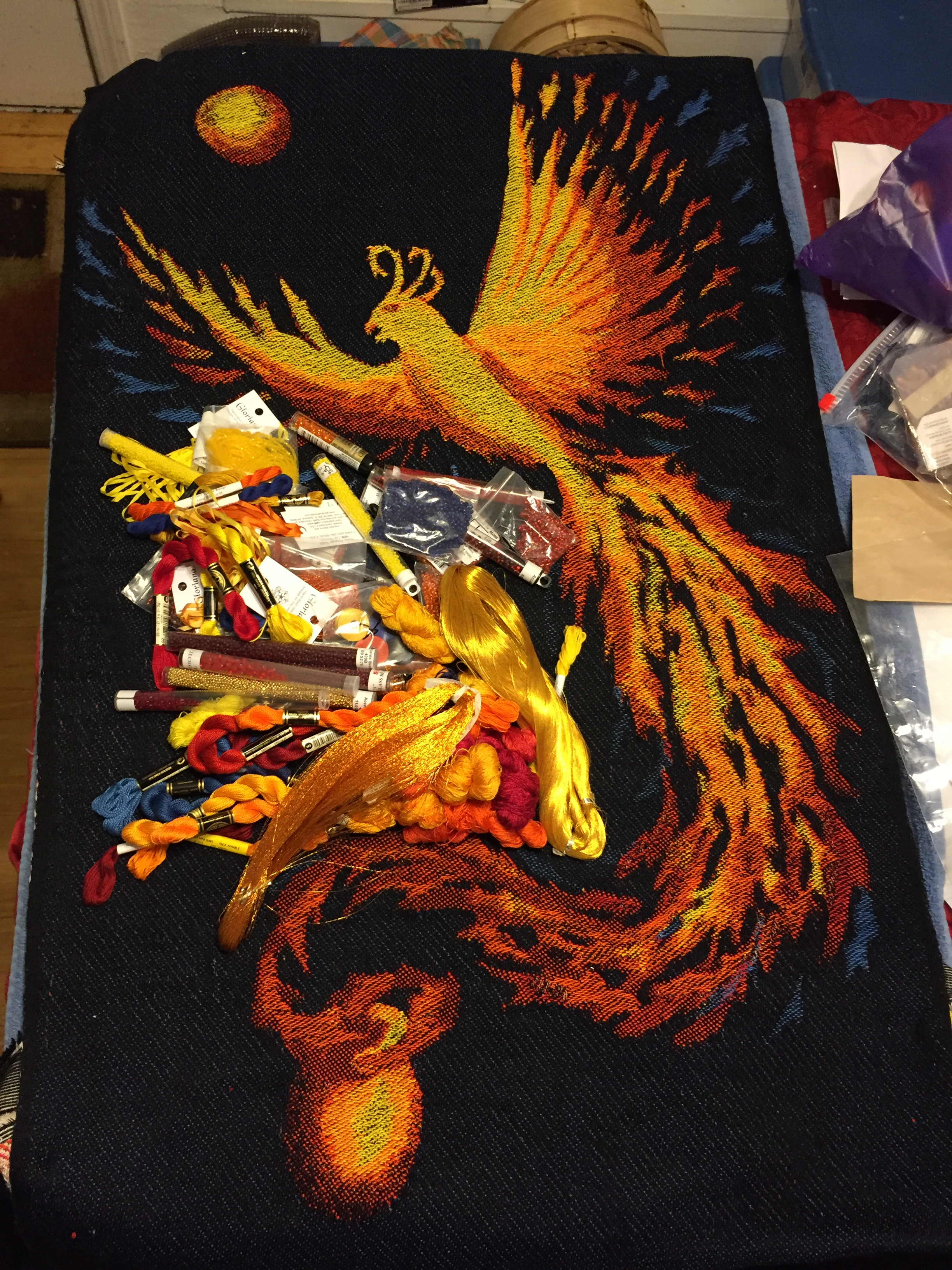
phoenix with all the trimmings

Metallic threads (some made with real gold!), silk ribbon, perle cotton, silk embroidery floss, skeins of 30/2 silk (hand-dyed by me), and a ton of size 6 seed beads, mostly from my mother’s stash. (She was very interested in lapidary, beading, and jewelry-making generally.)

Here’s a more organized view of the embroidery threads, showing the color palette:
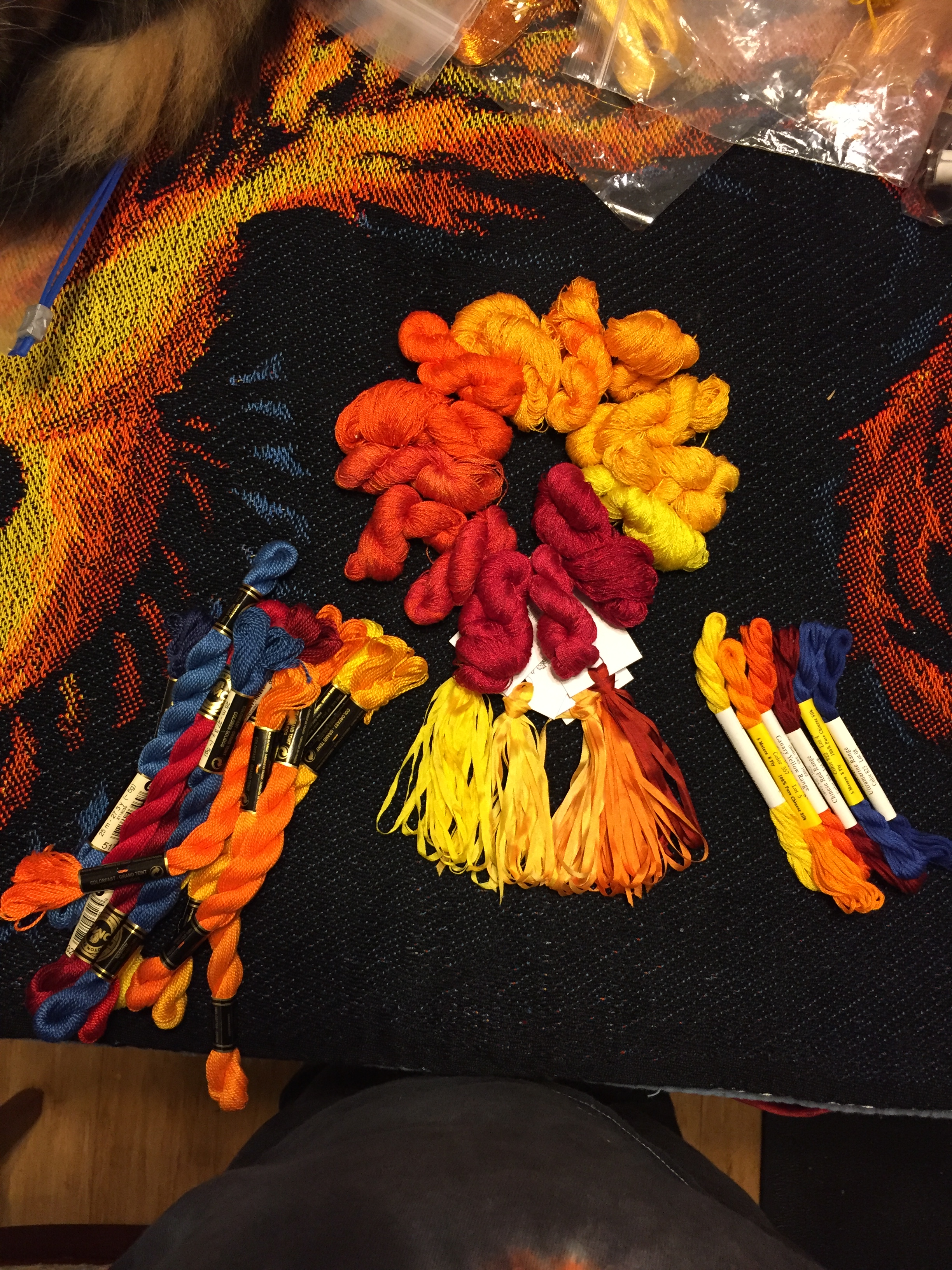
a more organized look at the embroidery threads
a better look at the embroidery threads

And, because everything is better with cats (at least according to the cats!), here are the usual photobombers:

photobombing cats
once more, with cats!

Now, what am I planning to do with all those embellishments?

First, I plan to embroider the entire body and head, to add details and also to give the body more opacity, which will emphasize its role as the focal point for the piece. You can see in this photo that the body appears somewhat translucent, especially in the spots where only the yellow weft is on top. Where there is only one weft on top, the coverage isn’t as good, so the black warp shows through more.  The black also turns the yellow a bit greenish (black + yellow = olive), which I don’t like. (I deliberately used a golden yellow in hopes of staving off the green cast, but apparently I didn’t go far enough.)
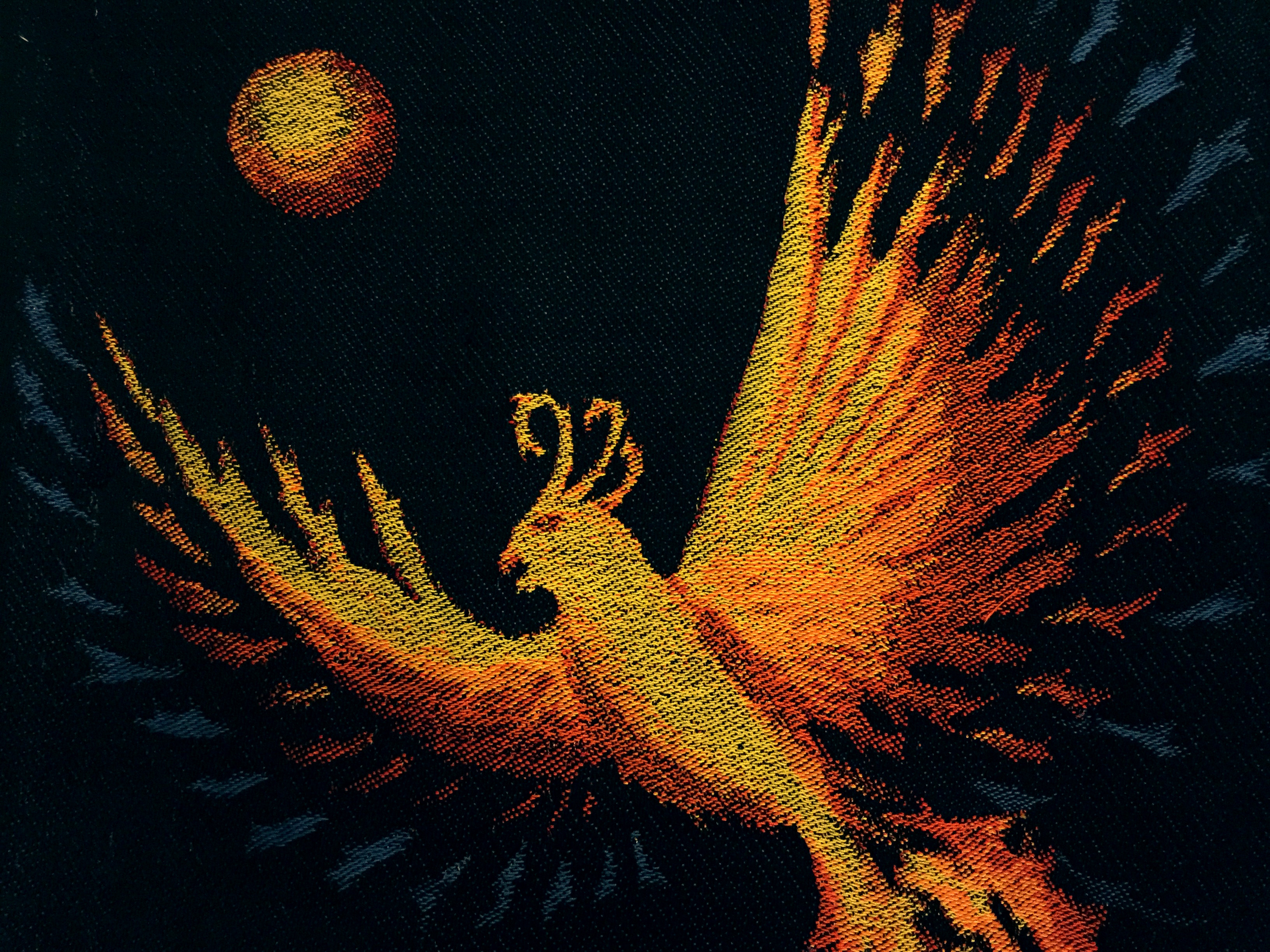
top of phoenix
top of phoenix

Anyway, since the head and body are the focal point for the piece, they need to be more opaque and more detailed. So I’ll likely use a shaded satin stitch for the body (so I can have more subtle shading), with bits of metallic thread to add highlights. On the head, I’ll use a shaded satin stitch as well, but add more metallic thread and also outline the eyes and beak with different colors. The crest feathers will get metallic threads and some bright yellow/orange beads.

I also plan to extend some satin stitches out to the wings, to avoid a big jump in texture/appearance from the body to the wings. The wings will also get some metallic threads and possibly a little bit of embroidery to emphasize the upper edges of the feathers. I will likely add some beads – yellow/red/orange in the outer feathers, and blue/black in the blue areas. In the left-hand black area between wings and feathers, I’ll add some blue/black beads (they are sapphire around a black core), expanding out from the blue feathers in the wing. That will add a bit of subtle motion to the space, so it isn’t quite so empty, without drawing attention from the phoenix.

Here’s the entire phoenix again, so you can see what I’m talking about. The blue/black beads will go in the space on lower left, between the blue feathers and the tail.

finished handwoven phoenix design

In the tail, I plan to outline a few of the feathers and embroider a few feathers to give the tail more dimensionality. There are two layers of feathers in the tail, which is clear in the digital painting but not in the woven cloth. I’m not quite sure how to outline the top feathers without losing the feeling of transparency at the feather edges – that will take some experimenting. I also plan to add a little glitter via the metallic threads, tapering off as I reach the end of the tail.

I’m planning to outline the moon and the urn to make them more solid, and also to embroider my mother’s birth and death dates on the urn, to make it more clearly a cremation urn.

And that’s it for now. I’m starting with a test piece, both to test out my embellishment plans and to practice my embroidery skills before starting on the final piece. Doing the test piece and the real piece in six weeks will be a real stretch, especially while traveling, but I think I can get it done.

Filed Under: All blog posts, surface design, textiles, weaving Tagged With: ma's memorial

April 8, 2015 by Tien Chiu Leave a Comment

Jacquard study

I’ve spent a good chunk of the last few days studying jacquard weaving. No pretty pictures yet, of course – the loom won’t arrive for another four months! But it is becoming obvious to me that it will take serious study – a month or two at least – before I’m prepared to do any serious jacquard design. I would like to work with a wide range of structures, and to do that I need to understand each structure and how to construct it, either in Photoshop or jacquard weaving software. I’d also like to evaluate jacquard weaving software – probably Arahweave – to see if the features justify purchasing it over Photoshop. That means installing it and playing with it to understand how it “thinks”. All that will take time, so it’s a good thing I have several months to work on it!

I’ve started my education by rereading The Woven Pixel by Alice Schlein and Bhakti Ziek. This has lots of great information about using Photoshop for jacquard design. I’m also reading through Digital Jacquard Design by Julie Holyoke, which is very good but quite dense. I’m trying to get through both books this week, if possible. Next week I go back to work, and between that and writing my book, I will have much less brainpower at my disposal. I doubt I can achieve a full understanding of both books in the next five days, but I can at least make a decent start.

I also had a wonderful visit with Susie Taylor, a very talented weaver who lives nearby. Aside from being an wonderful handweaver (her woven origami pieces are amazing), she’s also an industrial jacquard designer, and has generously offered to help me figure out jacquard design. I visited her studio yesterday and she showed me a big pile of jacquard samples she had designed for industry. It was eye-opening. Most of the handwoven jacquard pieces I’ve seen have been quite simple, structurally – shaded satins, double twills, lampas. Susie’s work included matelasse (with a stuffing weft held between two layers), tissue weaving (an extra weft inserted in certain areas of the fabric, but not used through the entire piece), and seemingly complex color patterns that use just two wefts at a time, as in Fair Isle knitting.

And those techniques were just the tip of the iceberg! It was fascinating to see the variety of structures and techniques used in her designs. It gave me a lot to chew on – there is far more freedom in jacquard design than I had thought. It reminded me of the Shakespeare quote, “There are more things in Heaven and Earth, Horatio, that are dreamt of in your philosophy.” Certainly there is more than I had dreamed. I’m really excited, and looking forward to learning more.

Speaking of the book, I am almost done! I’m currently writing exercises for the last few chapters – only three or four more exercises to go. Then some clean-up work, and I’ll be ready to send it out to artists so they can review their quotes and send me any photos they are willing to provide. I’m hoping to finish this by the end of the week, and start sending out the book next week. That is two weeks ahead of schedule. Which is wonderful – but I’m trying not to get complacent. There is still a lot to do between now and August 1 (the publisher’s deadline for the manuscript), and I’m sure to hit some roadblocks in between. So I am doing my best to get ahead of schedule and stay that way.

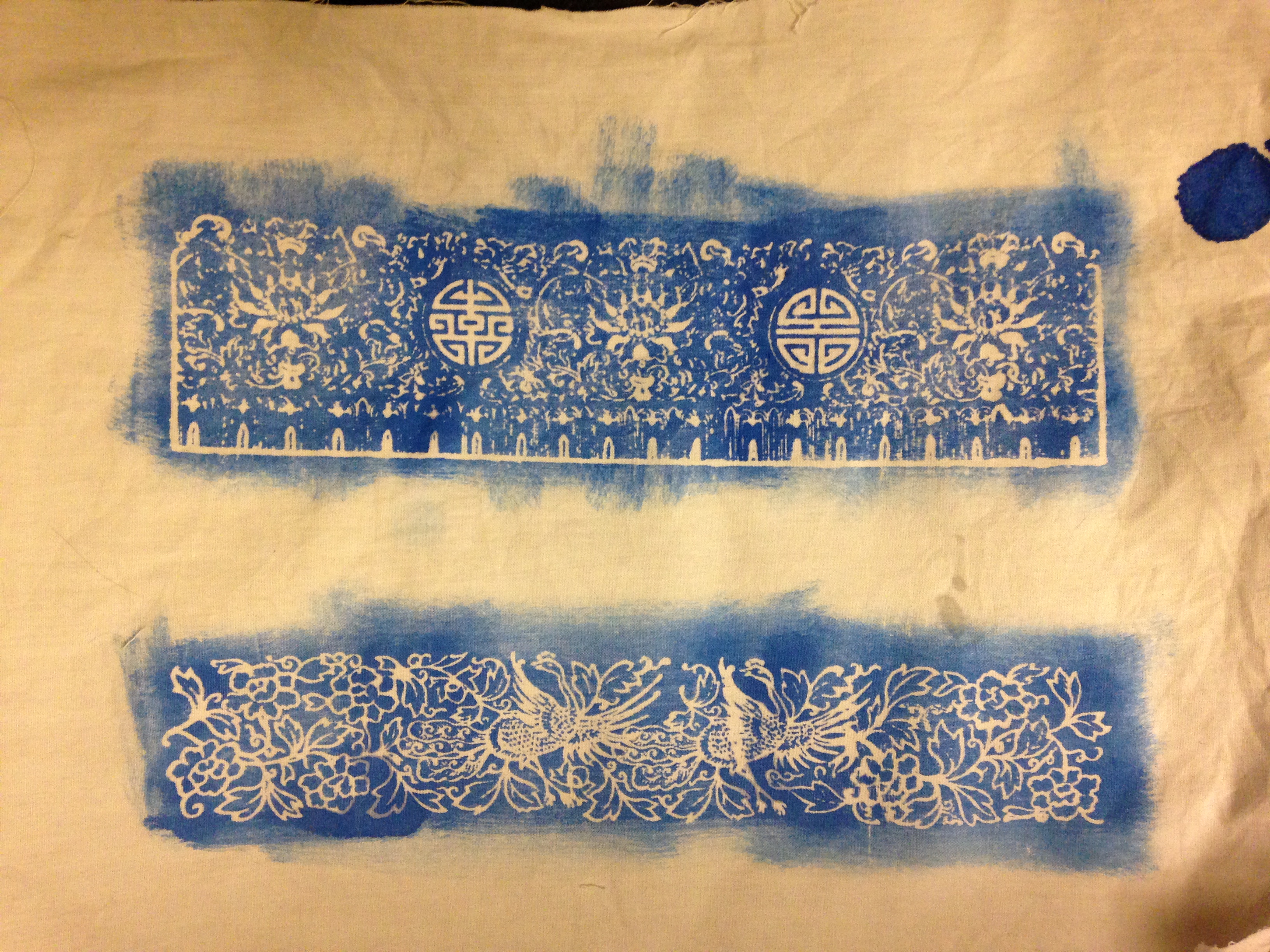
Katazome-wise, I am pleased to say that I managed to get some good screen prints with katazome paste. Here are two of my samples:

Celtic knotwork in screen printed katazome paste
screen printed katazome paste - attempt at fine details
screen printed katazome paste – attempt at fine details

In the second photo, I was  testing to see how fine a line I could produce. It looks like 0.5 or 0.7 mm is the finest line I can achieve. In the top design, only part of the elaborate, delicate scrollwork appears. In the bottom design, which is a bit bolder, the pattern comes out perfectly.

(For the technically curious, to get this to work, I switched to a bell nose squeegee – the kind Speedball puts out – and held the squeegee at a 45 degree angle for the first 2 passes, then at 20 degrees for the final pass. This deposited a heavier layer of katazome paste than previously, thick enough to stand up to a stenciling brush.)

Finally, here is a lovely photo of Tigress napping. She looks so adorable and innocent in the photo, you’d never suspect her of having shredded an entire roll of toilet paper a few days before.

Tigress napping
Tigress napping


Filed Under: All blog posts, surface design, textiles, weaving Tagged With: katazome

April 3, 2015 by Tien Chiu 4 Comments

Screen printed katazome paste

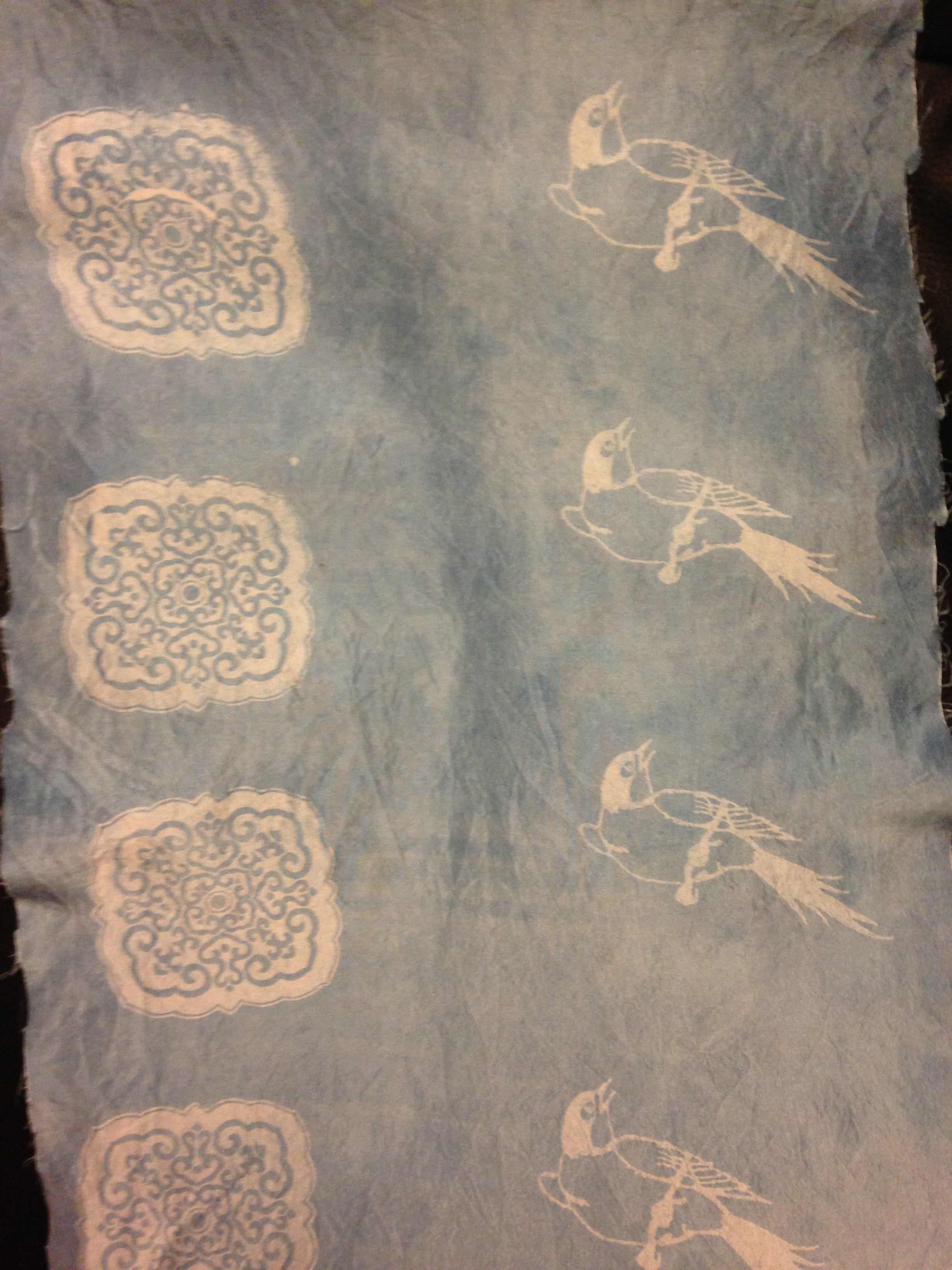
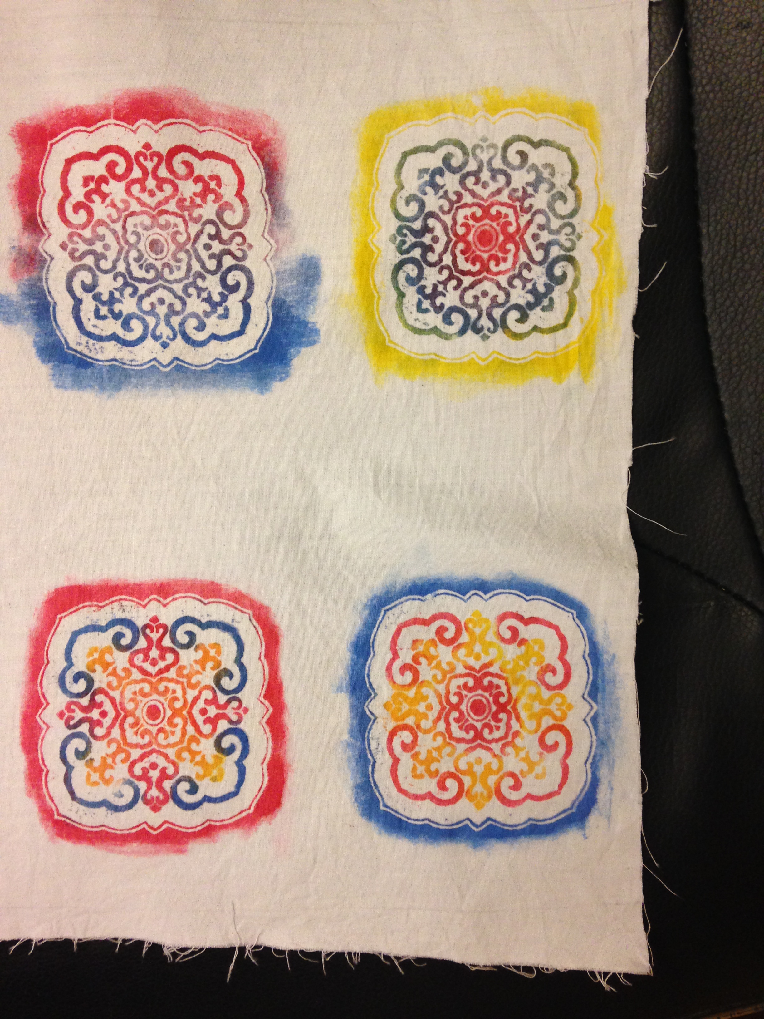
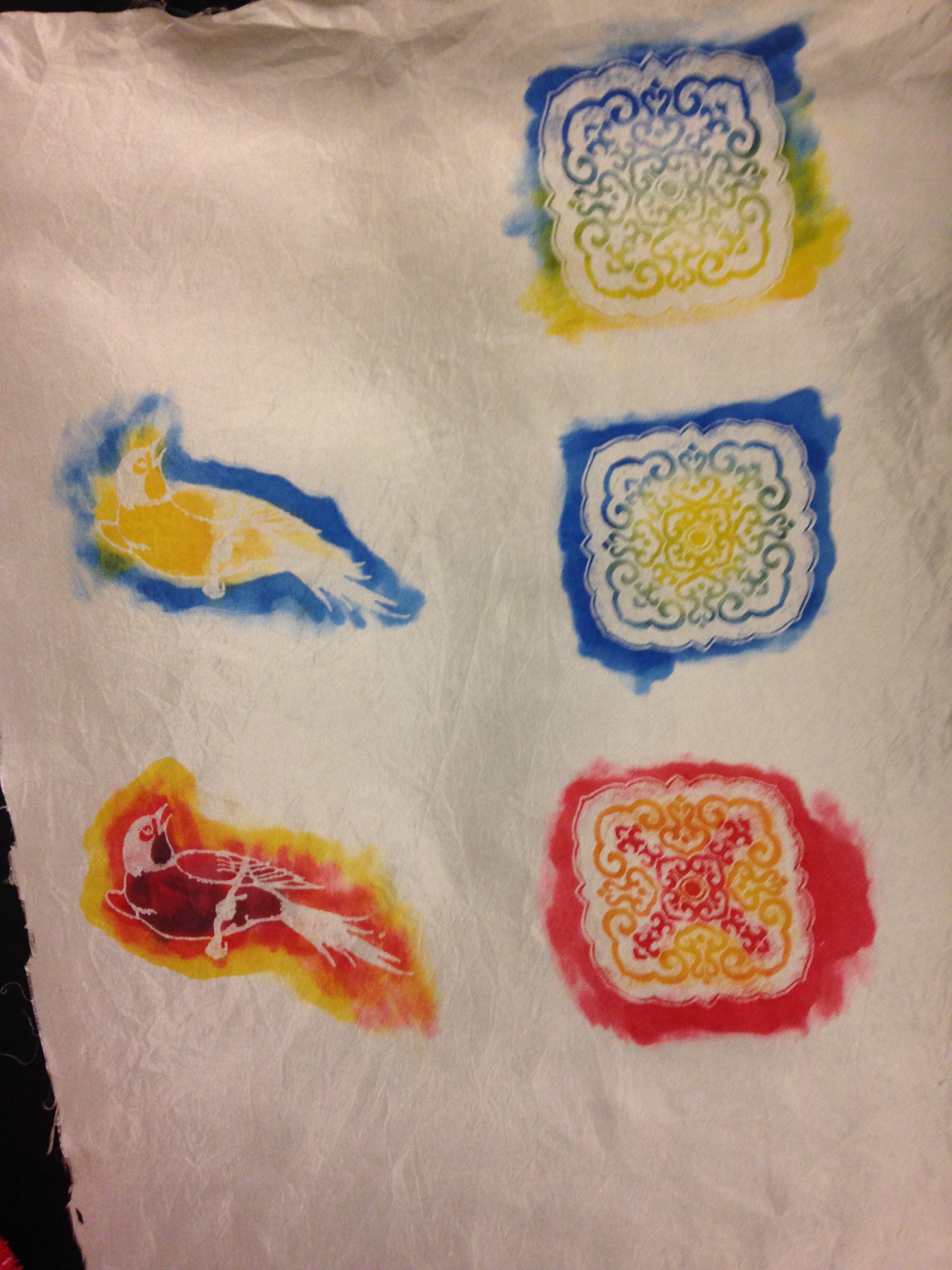
I hadn’t planned to do more katazome, but some little section of my brain whispered, “Didn’t John Marshall say you could screen print with katazome paste?” And I still had a cup or two of the katazome paste left, enough to do some experiments. So I did. Here are the results:

screen printed katazome paste - indigo dyed
screen printed katazome paste – indigo dyed
screen printed katazome paste - using credit card as squeegee
screen printed katazome paste – using credit card as squeegee
screen printed katazome paste - using screen printing squeegee
screen printed katazome paste – using screen printing squeegee

If you click on the photos for the larger versions, you’ll see that the katazome paste did fairly well, but there are blotches of paint in some of the resisted areas, especially in the versions where I applied paint with a stencil brush rather than dipping the piece into an indigo vat. I attributed that to insufficient coverage, either because the squeegee didn’t deposit enough paste through the screen or because the paste was too thick. This afternoon I tried again with thinner paste and a ball-nosed (rounded edge) squeegee, which is supposed to deposit a thicker layer of paint when screen printing. The results look promising so far, but the paste is still drying; I’ll know more later this afternoon, after I get a chance to play some more.

I’m super excited about the prospect of screen printing katazome paste, if I can get it to work reliably. Since I have a thermofax machine, I can create a screen in less than a minute, given a black and white starting image. This is much faster than spending hours carving and painting a stencil! And screen printing allows more design options than stenciling. So if I can get this to work reliably, I’ll be in dyer’s heaven.

Meanwhile, I have completed the second qiviut scarf and am rolling straight into the second sea-turtle scarf. 360 picks down, 3960 to go. I’m hoping to finish it next week, but since I am also studying two books on jacquard weaving and working on the book, not to mention pleasant katazome distractions, that may or may not happen.

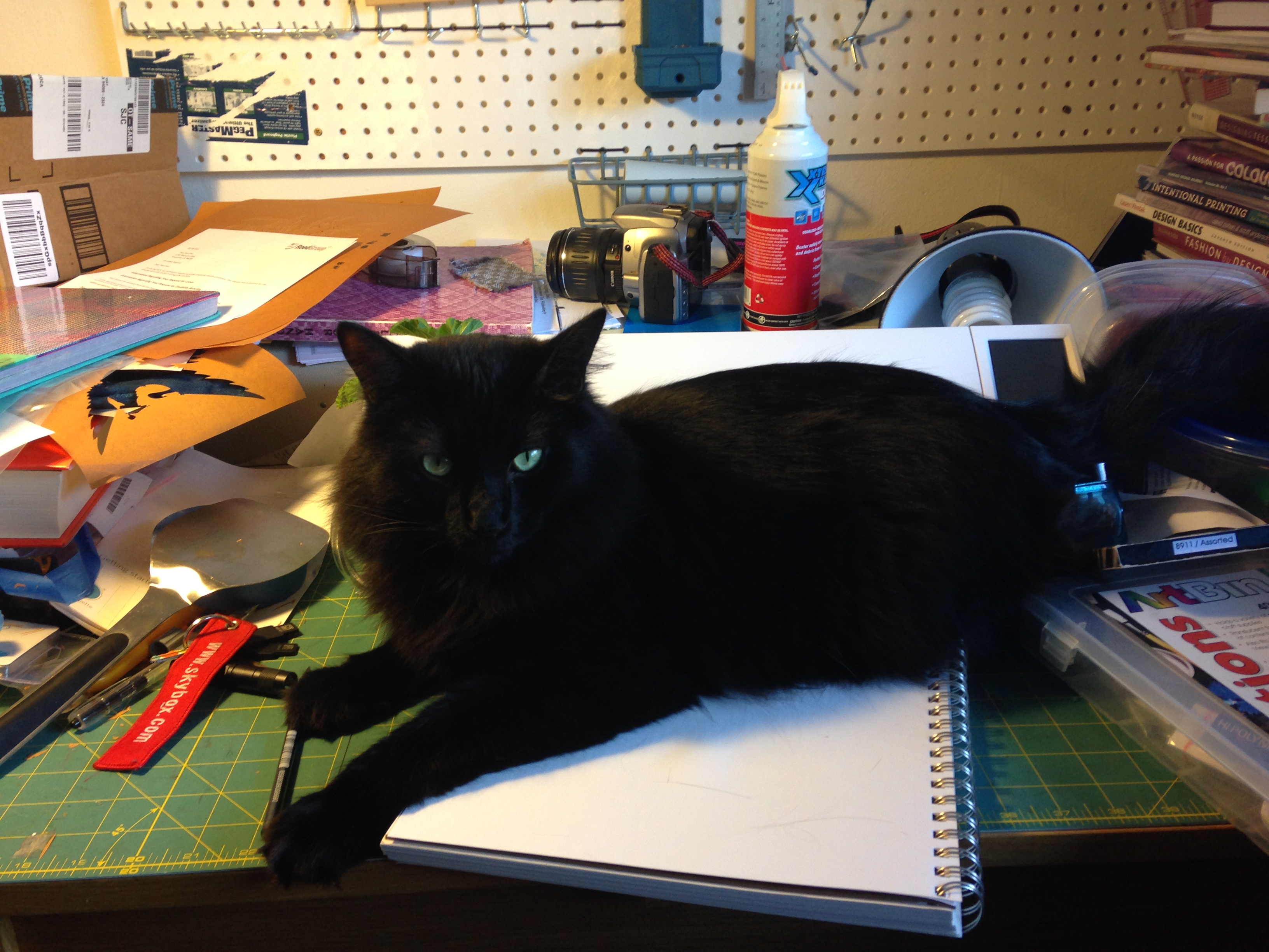
And drawing? It has fallen by the wayside – well, with some assistance, that is. I had forgotten how things work in this house. As soon as I cleared enough space and started to draw, the inevitable happened:

Fritz helping me draw

I really would like to learn to draw, though, and I still have nine days left, so perhaps I’ll just trundle on outside and do my lessons there.


Filed Under: All blog posts, dyeing, surface design, textiles Tagged With: katazome

March 30, 2015 by Tien Chiu 3 Comments

Katazome play day

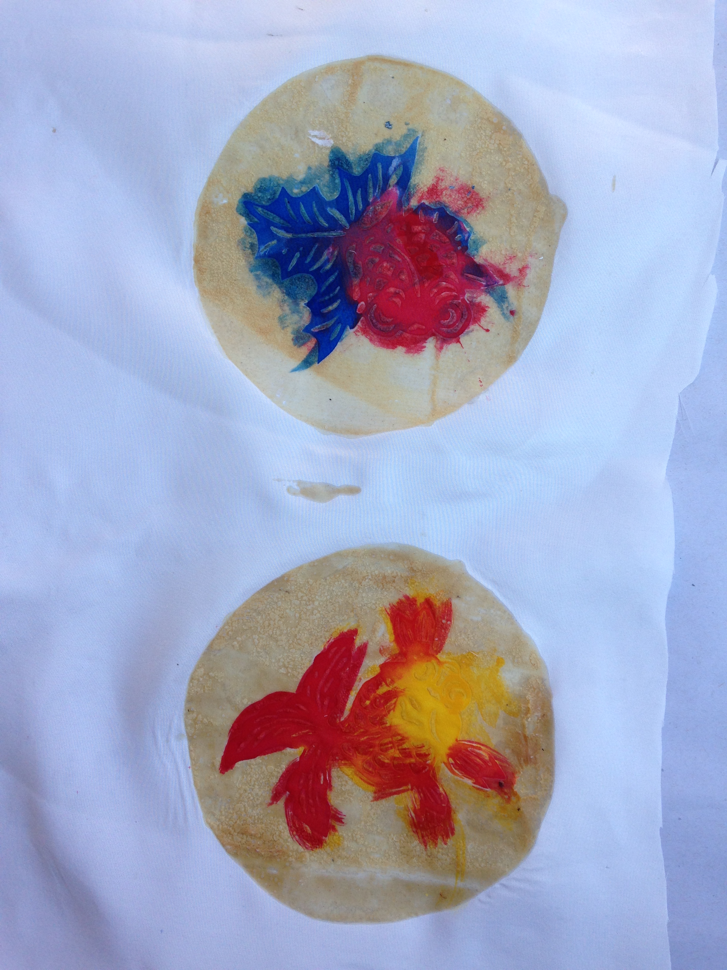
I’ve spent the last two and a half days working with katazome, the Japanese art of stenciled paste-resist dyeing. Friday I cooked up the paste, a mix of glutinous rice flour and powdered rice bran. Saturday, my friend Alfred and I pasted up some pieces – Alfred dipped his in an indigo vat, and I hand-painted some of mine. Here are “before” and “after” shots of my work:

hand-painted katazome horse, before rinsing out the paste
hand-painted katazome horse, after rinsing
hand-painted katazome dragon, before rinsing out the paste
hand-painted katazome dragon, after rinsing out the paste
katazome goldfish - before rinsing out the paste
katazome goldfish – before rinsing out the paste


handpainted katazome goldfish - finished
handpainted katazome goldfish – finished

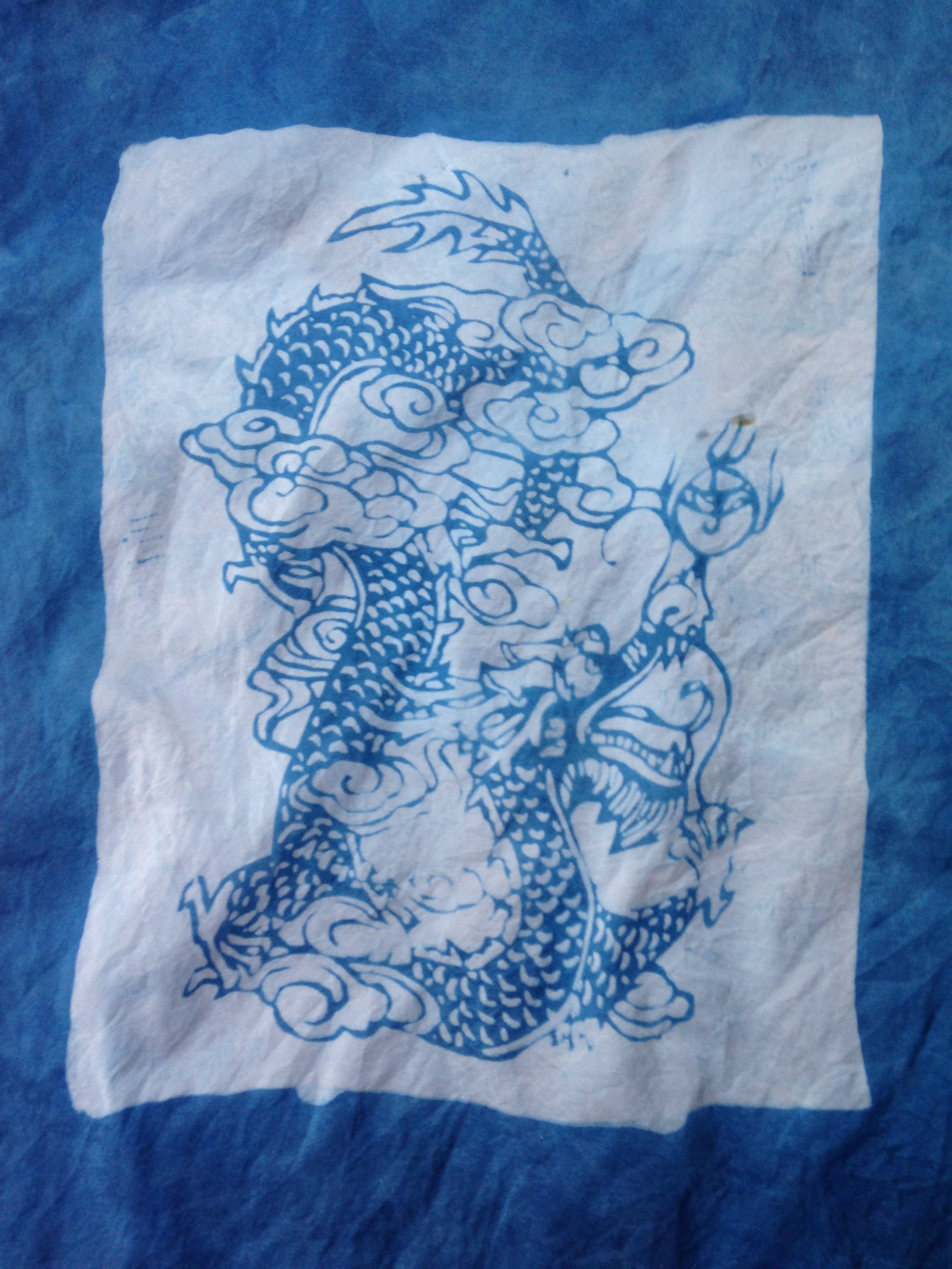
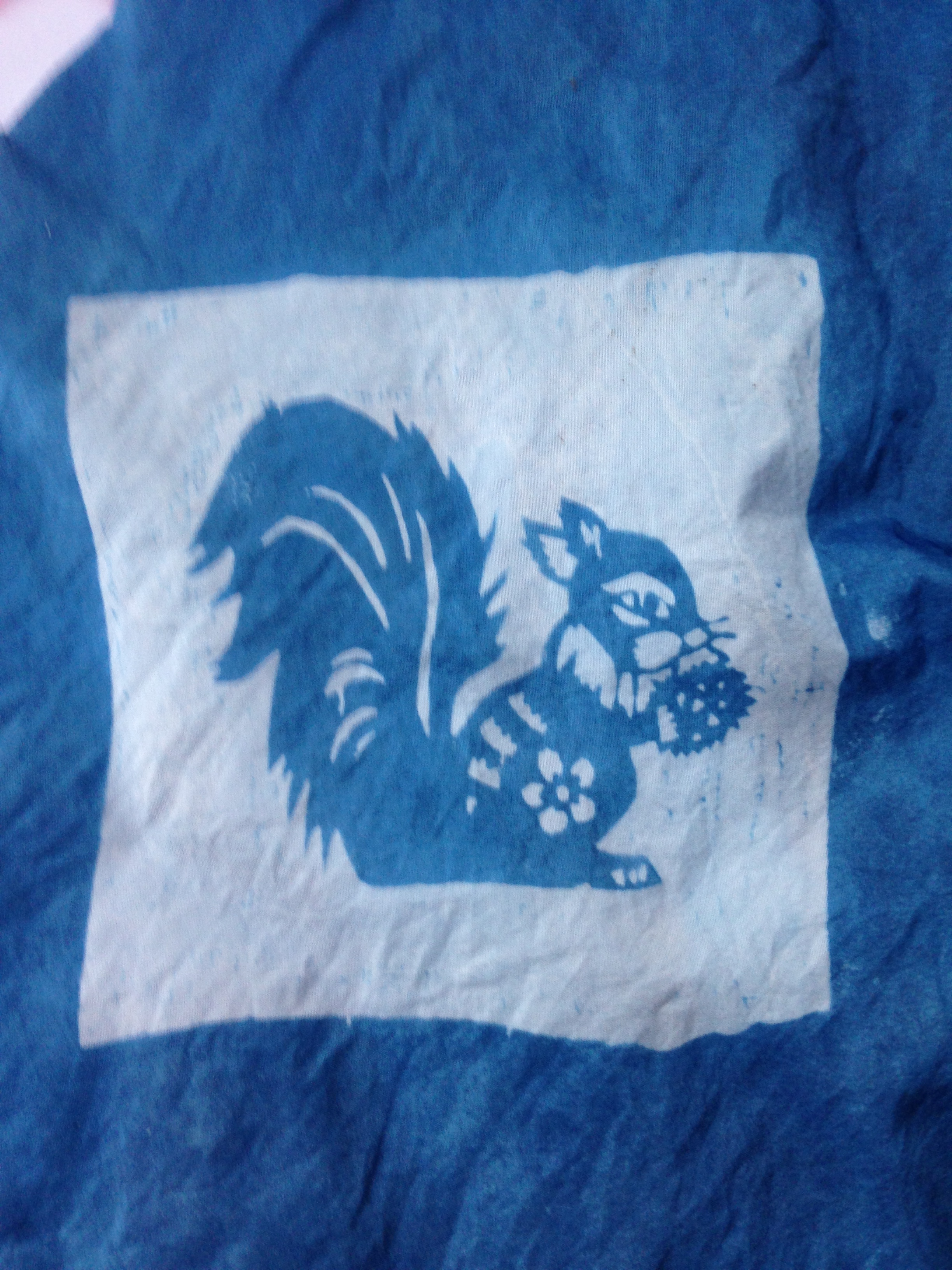
And here are some of the indigo-dyed versions:

katazome dragon, dipped in indigo
katazome squirrel, dipped in indigo
katazome seashells, dipped in indigo

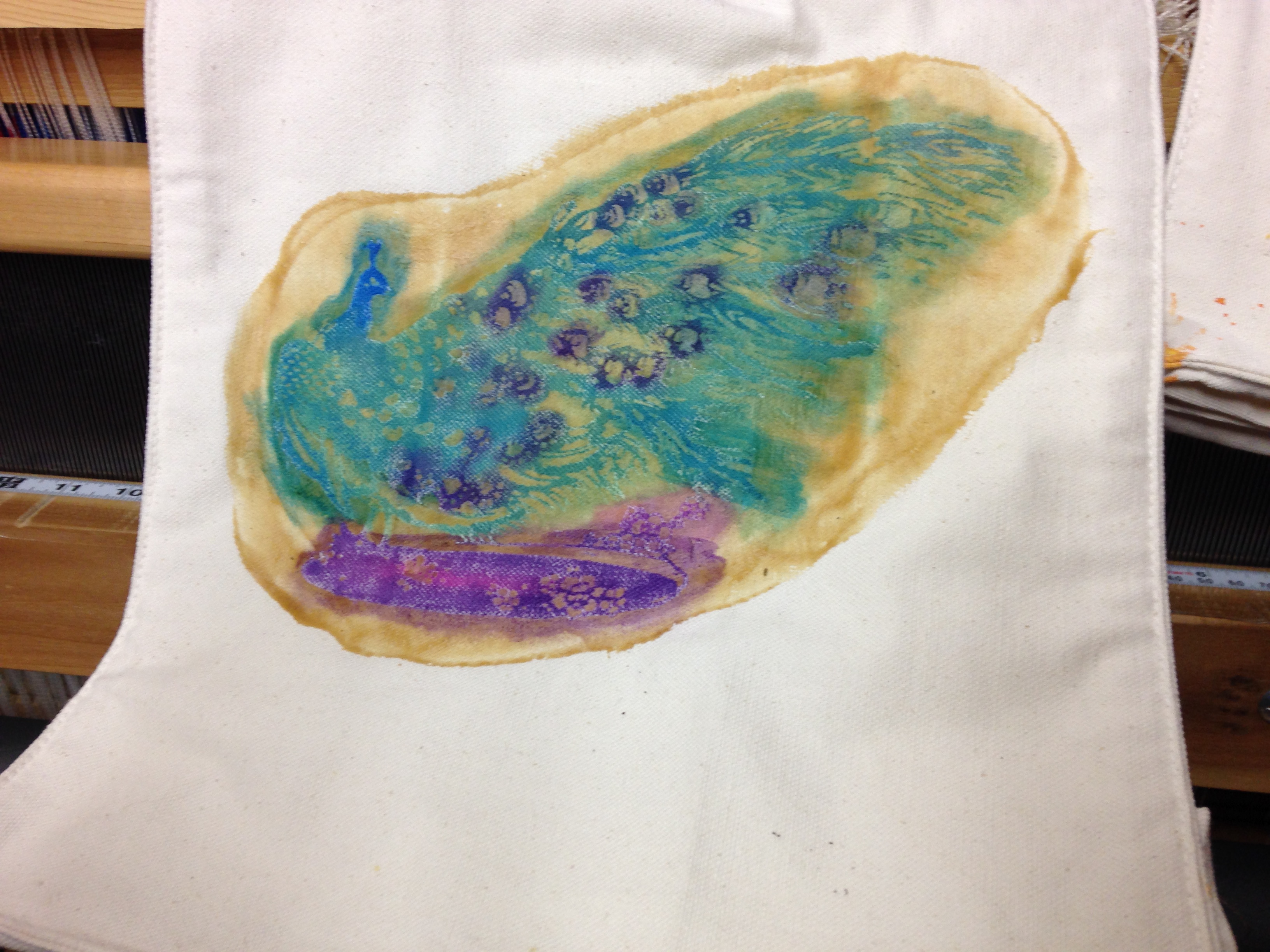
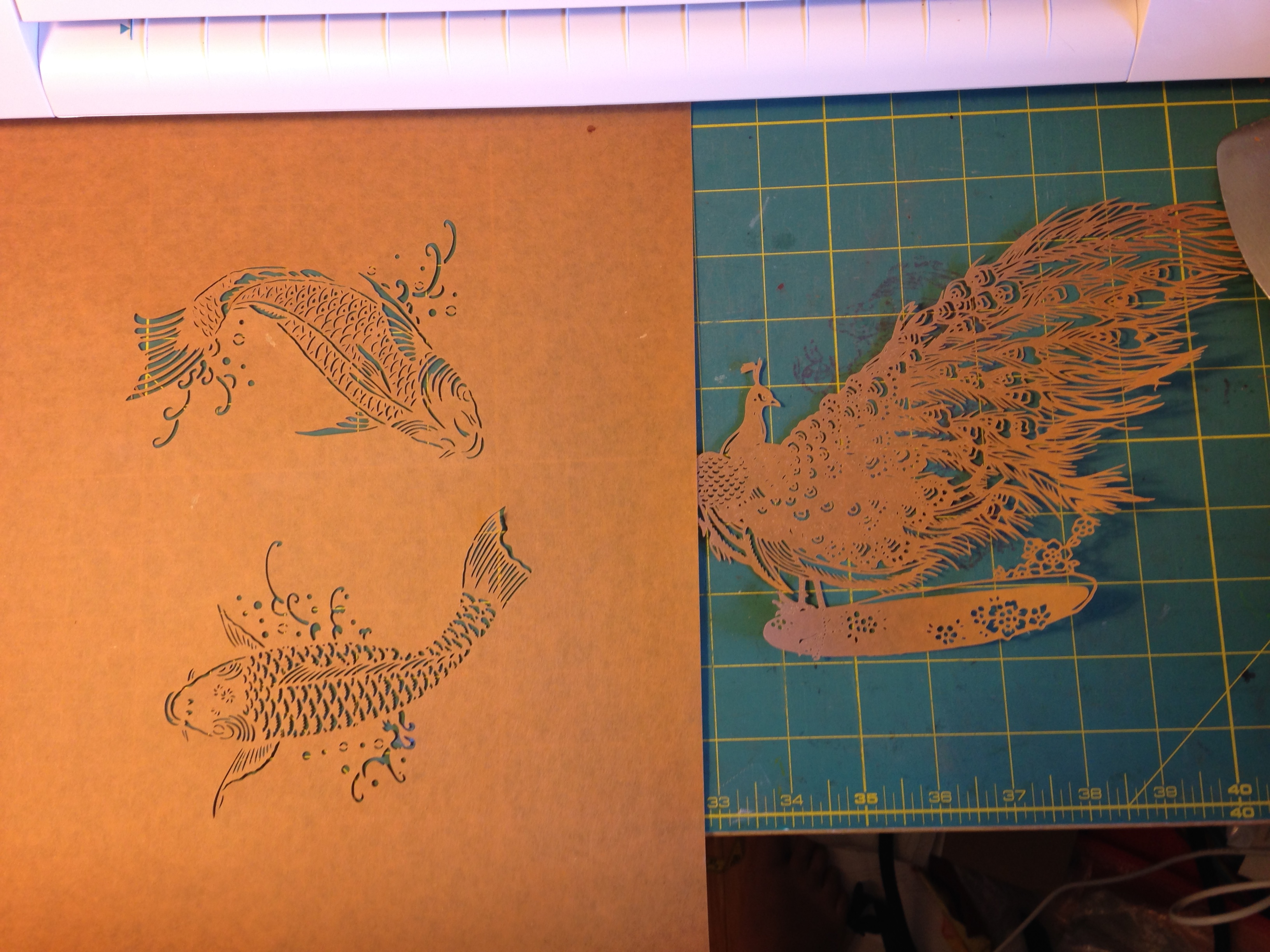
Saturday, Alfred and I also completed quite a few new stencils – applying paint and netting to one side, removing the excess paint, and drying them flat. I used those stencils yesterday, producing a ton of half-finished pieces. Here are two of them:

katazome peacock
katazome peacock
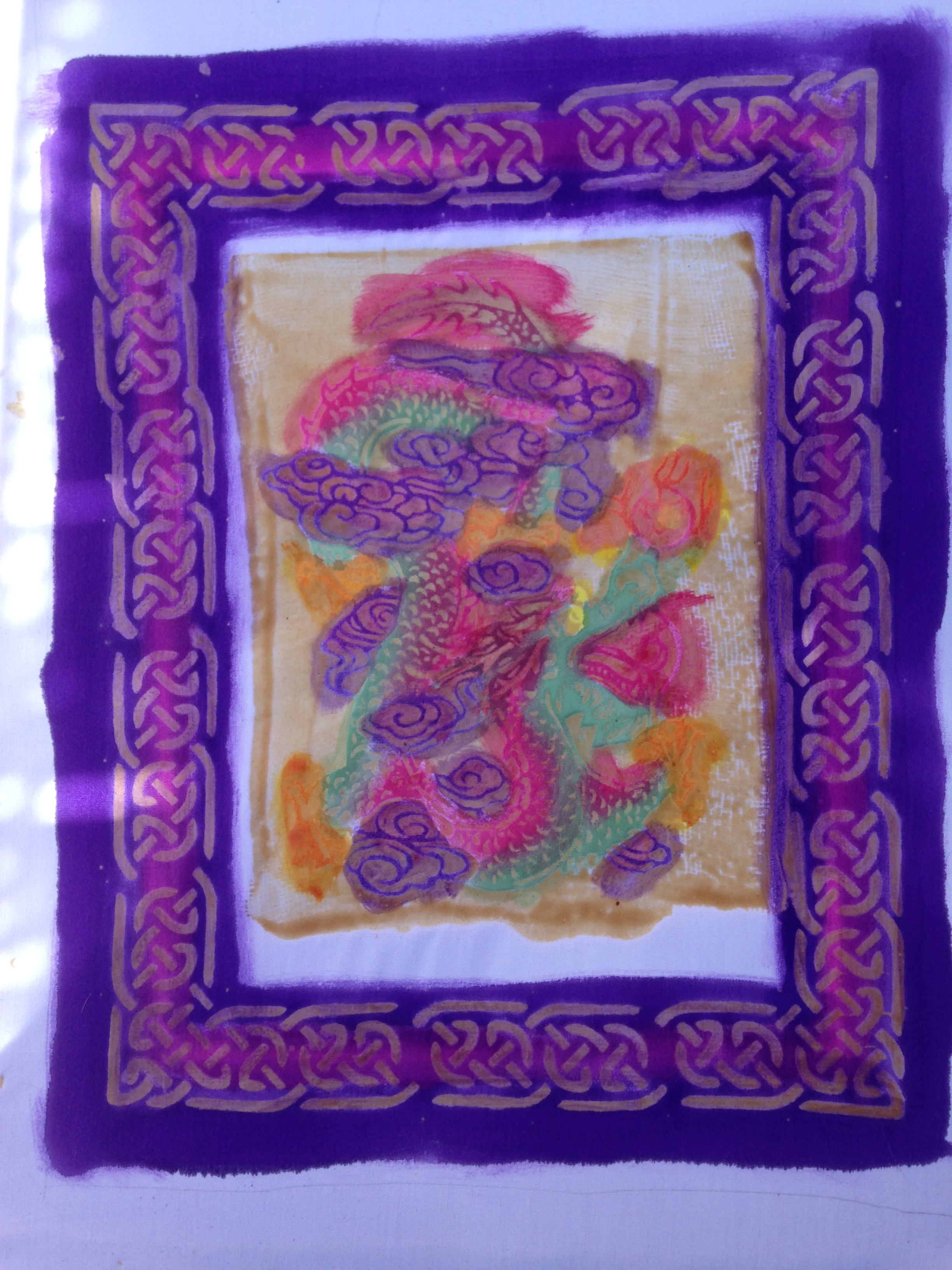
katazome dragon with Celtic knot border

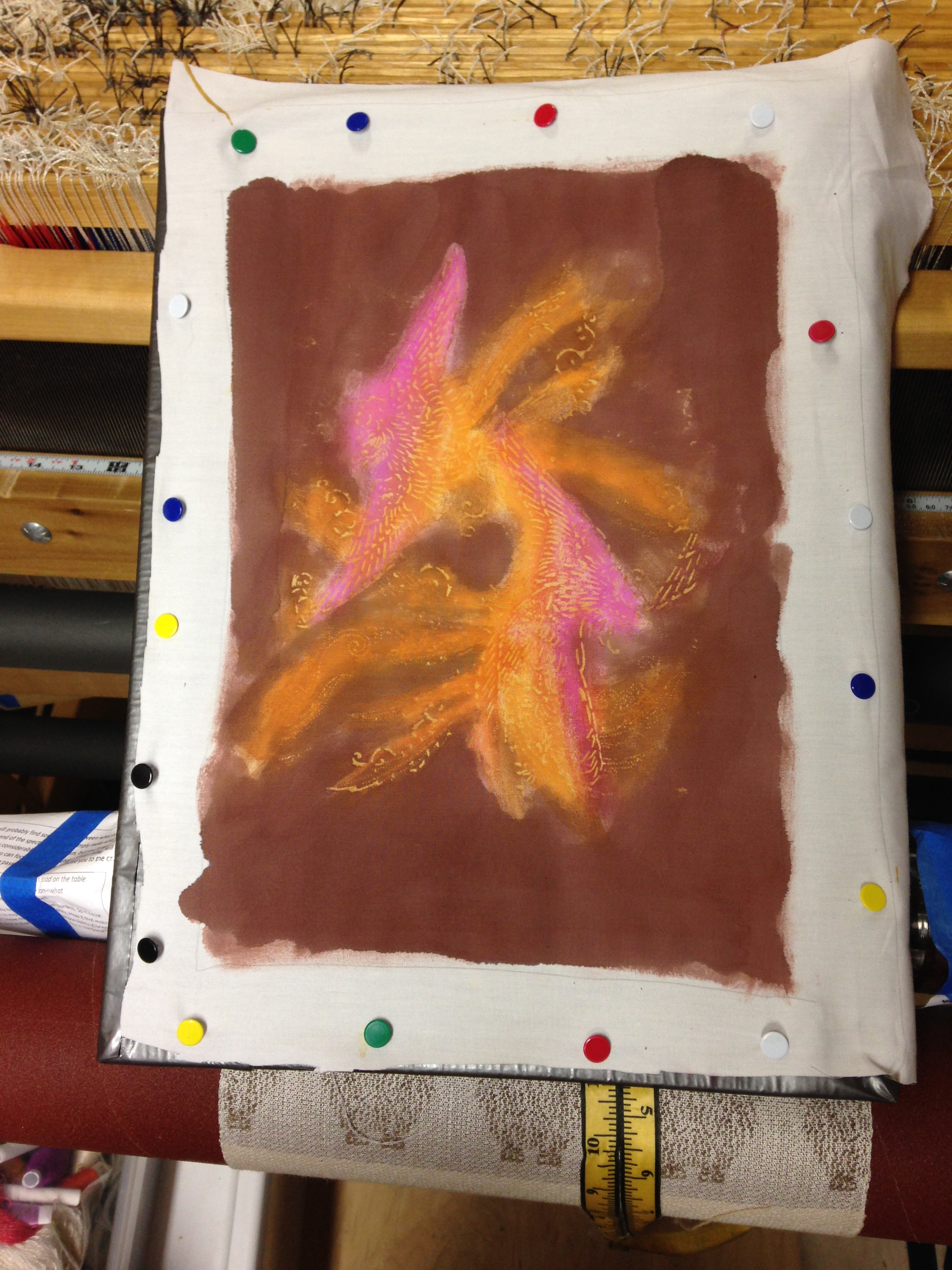
These will come out better than the first batch, I think, as I did them more “properly” than the first batch. Instead of painting onto untreated cloth pinned to a plastic background, I pre-sized the cloth with soy milk (which helps prevent bleeding) and stretched them out by pinning them to screen printing frames. Here’s a pic of the whole shebang:

katazome phoenixes, stretched out on screen printing frame

The Japanese way to do it is to use harite (clamps) on either end of the fabric, then put shinshi (bent pieces of bamboo with a pin on either end) into the selvages. The whole collection is then suspended from two pillars, holding the fabric nice and taut, perfect for painting. However, while I had shinshi, I didn’t have harite, or pillars to suspend the whole affair from – and in any case, for pieces so small it would have been serious overkill. So I used what I had lying around.

I can’t wait to see how the new batch came out. None of the pieces are perfect – there are drips of paste and places where a repeating stencil didn’t come out right – but since they are mostly just samples, that doesn’t matter much. I learned a lot while doing them, which is the important part!

Today I might paste up a few more pieces of cloth, but will probably dip them in an indigo vat rather than do elaborate painting. I have only two more weeks of recovery before I have to go back to work, and as katazome isn’t one of my main interests, I don’t want to “waste” too much of my precious time on it. But it sure has been fun to play with, and I love the results!

And the cats? Fritz was delighted to see my friend Alfred on Saturday, as Alfred has big feet – big enough to stick your entire head into, if you’re a shoe-fetishist cat. Here is a video of an ecstatic Fritz, caught in flagrante delicto with one of Alfred’s shoes.

Filed Under: All blog posts, surface design, textiles Tagged With: katazome

  • « Previous Page
  • 1
  • 2
  • 3
  • 4
  • …
  • 14
  • Next Page »

Archives

Tags

aids lifecycle outfits autumn splendor book cashmere coat cats celtic braid coat color study cross dyeing design design class devore doubleweave doubleweave shawls drawing dye samples dye study group gradient colors house infinite warp jacquard loom katazome knitted blanks kodachrome jacket ma's memorial mohair coat network drafted jacket/shawl project network drafting painted warp phoenix rising phoenix rising dress phoenix rising kimono phoenix rising reloaded pre-weavolution project sea turtles taquete tie-dye tied weaves tomatoes velvet weaving drafts web design website redesign wedding wedding dress woven shibori

Categories

  • Africa
  • aids lifecycle
  • All blog posts
  • All travel posts
  • Asia
  • Bangkok
  • Belize
  • Cambodia
  • Central America
  • Chai Ya (Wat Suon Mok)
  • Chiang Mai
  • Chiang Rai (Akha)
  • China
  • chocolate
  • computer stuff
  • creating craft
  • Creative works
  • cycling
  • Delhi
  • Dharamsala
  • drawing
  • dyeing
  • Fiber Arts
  • finished
  • food
  • garden
  • Ghana
  • Guatemala
  • Hanoi
  • Ho Chi Minh City
  • Hoi An
  • India
  • Khao Lak
  • Knitting
  • knitting
  • Ko Chang
  • Laos
  • Luang Namtha
  • Luang Prabang
  • markleeville death ride
  • meditations on craft
  • mental illness
  • musings
  • Phnom Penh
  • powerlifting
  • Rewalsar (Tso Pema)
  • sewing
  • Siem Reap (Angkor Wat)
  • Southeast Asia
  • surface design
  • textiles
  • Thailand
  • travel
  • Vangvieng
  • Vientiane
  • Vietnam
  • Warp & Weave
  • weaving
  • Weaving
  • weavolution
  • writing

© Copyright 2025 Tien Chiu · All Rights Reserved ·

Loading Comments...