Tien Chiu

  • Home
  • About
    • Honors, Awards, and Publications
  • Online Teaching
  • Gallery
  • Essays
  • Book
  • Blog
  • Dye samples
You are here: Home / Archives for All blog posts / textiles / surface design

September 16, 2022 by Tien Chiu

Playing in the dye pots

Yeah, I know. I start by saying “Less fiber content” and next thing you know, I’m posting about dyeing? But hey – that’s what I was up to last weekend. That’s my story, and I’m sticking to it.

My wardrobe, as you may or may not know, consists almost exclusively of tie-dyed clothing. This isn’t because I’m a ‘60s child (I wasn’t born in the ‘60s), nor because I’m a Grateful Dead fan. It’s mostly a practical choice: when you are a five-foot-tall woman with exceptionally wide shoulders, you can pretty much guarantee that nothing off the rack is going to fit.

(How exceptionally wide? The average shoulder width for an American woman is 14.4 inches, and for a man it’s 16.1 inches. Mine are 17.5 inches shoulderbone to shoulderbone – plus all that muscle from powerlifting. I’m basically a freakishly short female linebacker.)

To accommodate my odd dimensions, I buy white T-shirts and white men’s shirts from Dharma Trading Company and dye them so they don’t all look identical. This strategy has worked beautifully for me for many years. 🙂

But then I got a fabulous tattoo covering most of my right arm.

My original theory was that I’d get the tattoo and then wear T-shirts when I wanted to cover it up, and tank tops when I wanted to show it off. As soon as I got the tattoo, though, I realized, “Why the *#& would I ever want to hide this??? I’m going to wear tank tops all year round!!”

Of course the only problem with this theory was that I didn’t actually have any tank tops. Dharma Trading to the rescue! I dyed eight tank tops the weekend after I got the tattoo. Whew! Disaster averted.

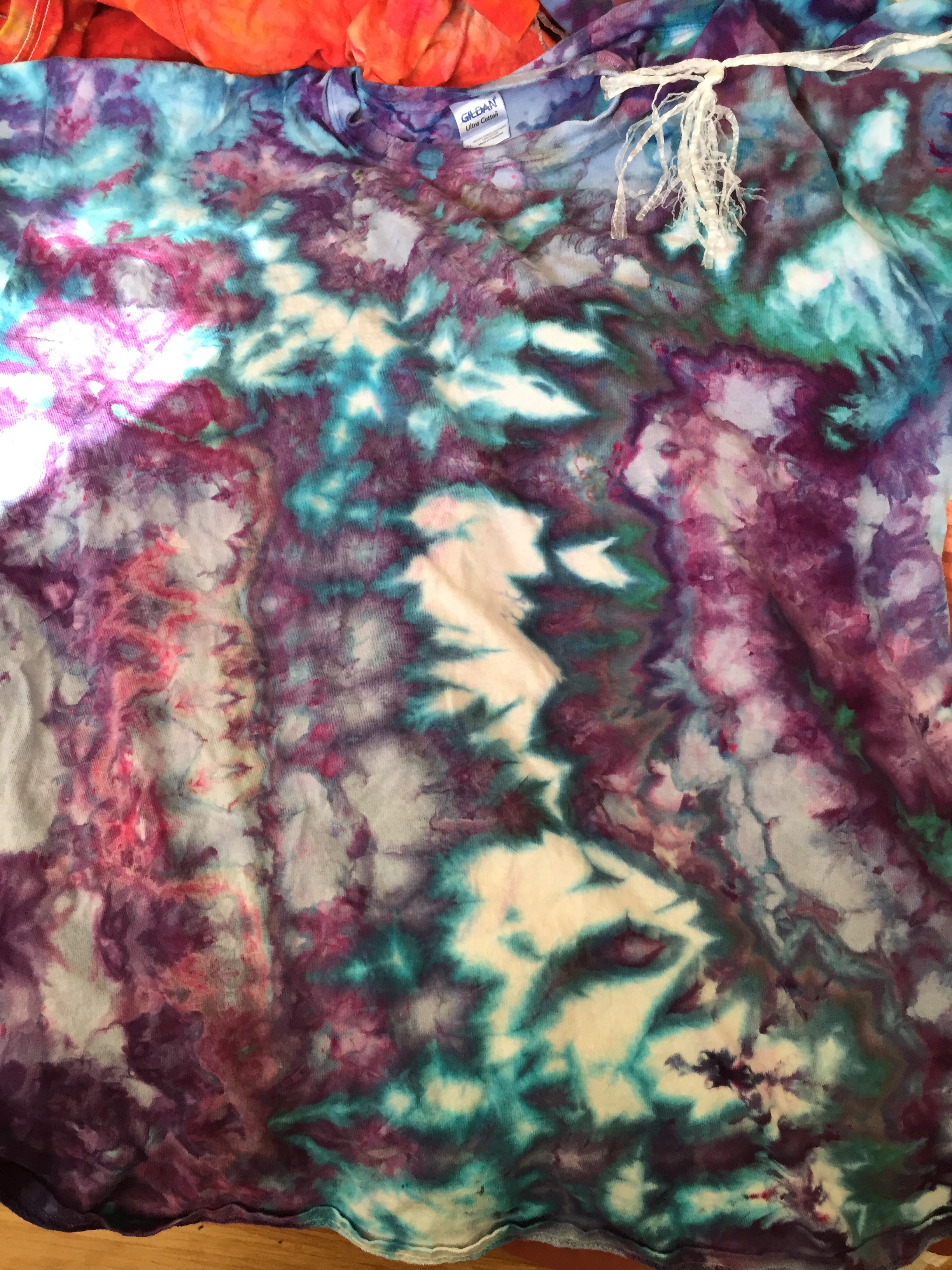
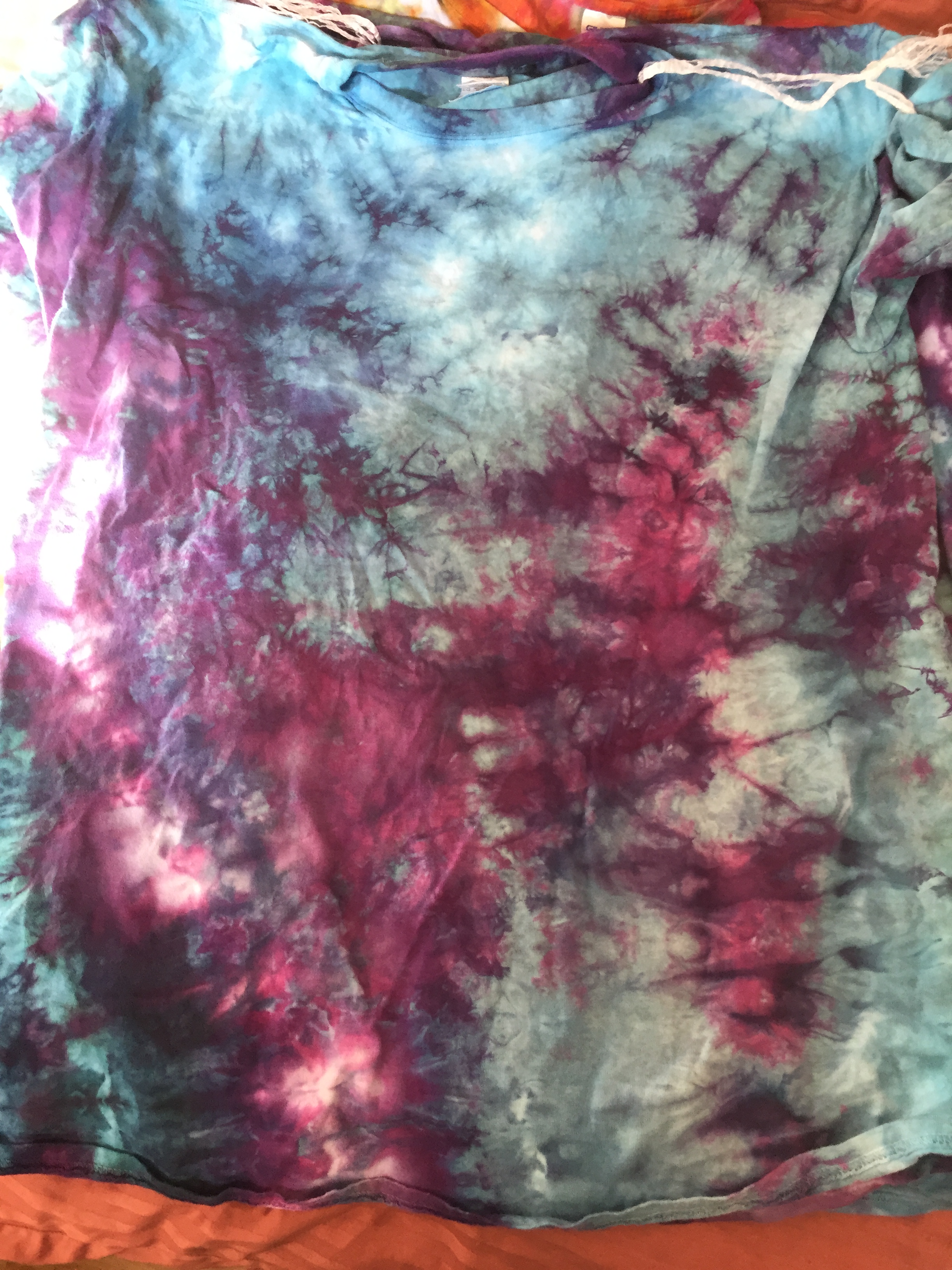
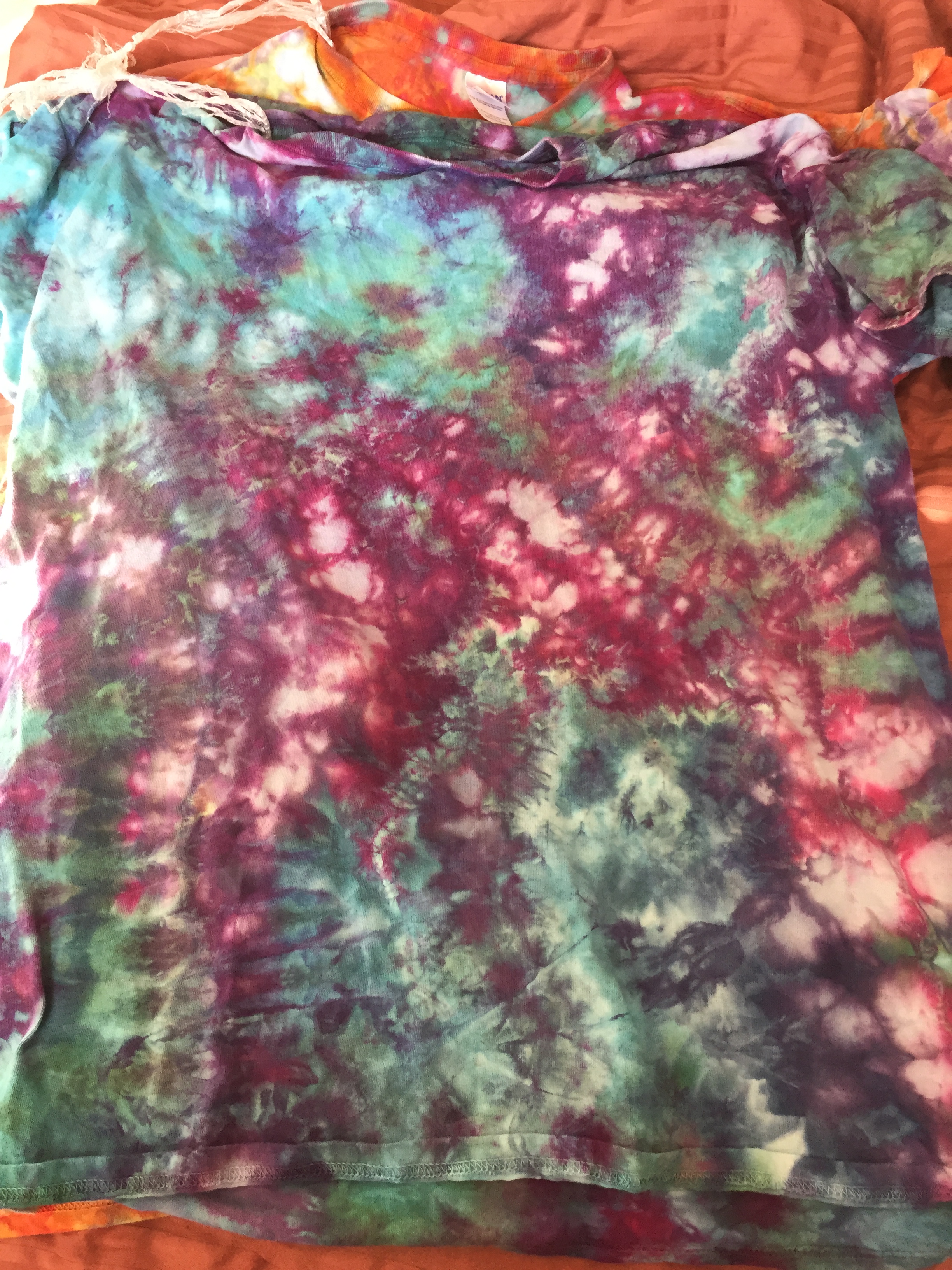
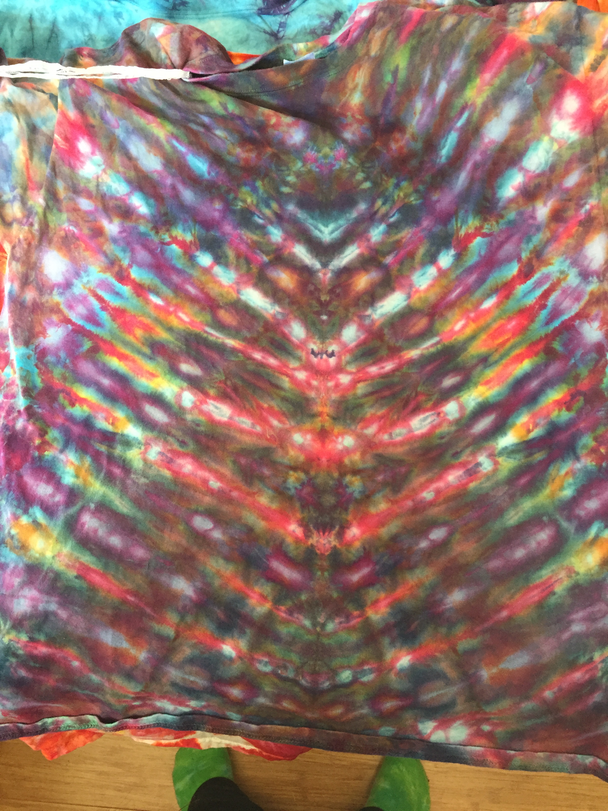
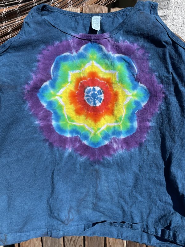
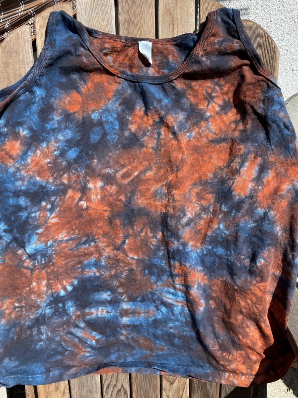
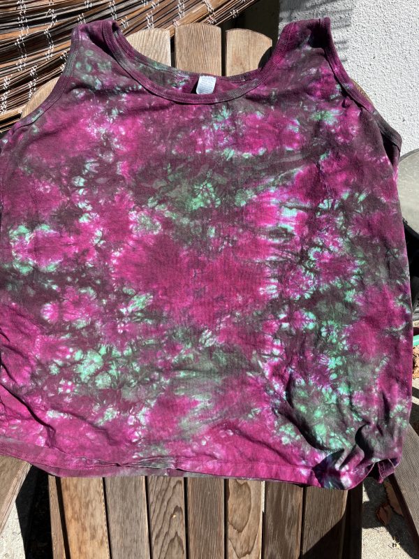
But a girl likes to have some variety. So last weekend I dyed eight more, plus a T-shirt for Jamie, who (much to my relief) has FINALLY relented and allowed me to dye something for her.

Here’s what came out of the dyepots (pardon the less-than-perfect photos; I was in a rush):

Black bordered mandala tank top
Rainbow mandala tank top
Blue and rusty orange scrunch pattern tank top
Magenta-purple and green scrunch pattern tank top
Square pattern, yellow-red-orange turquoise and purple tie dye tank top
flame pattern tank top

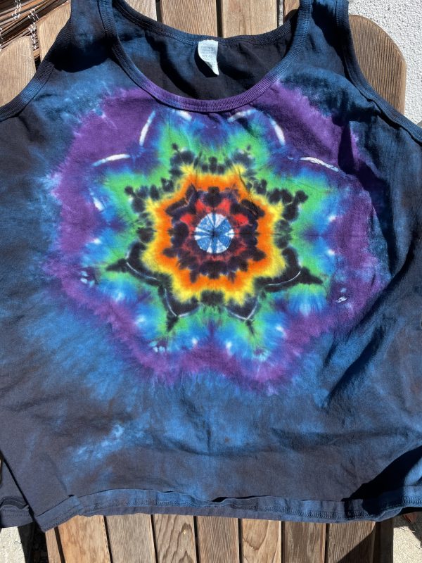
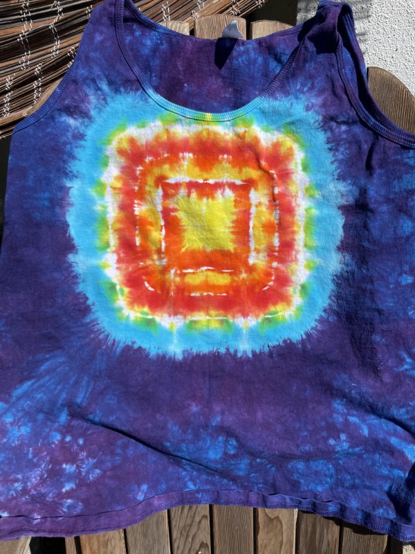
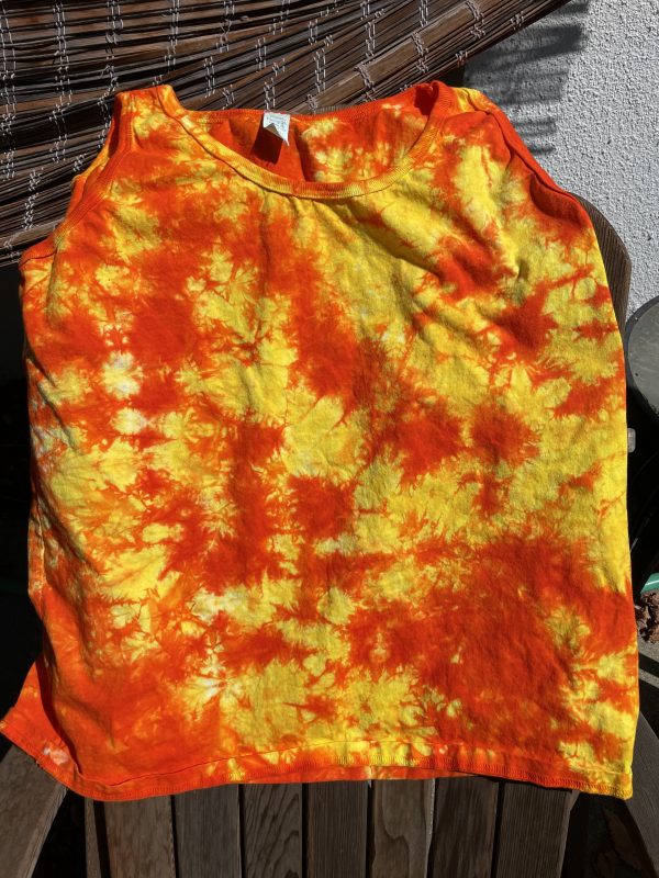
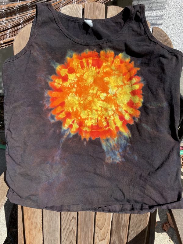
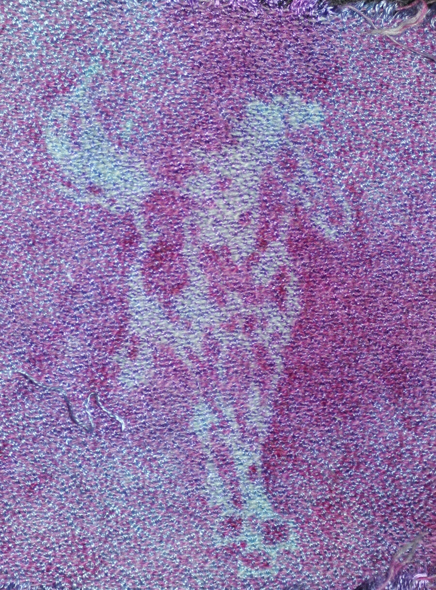
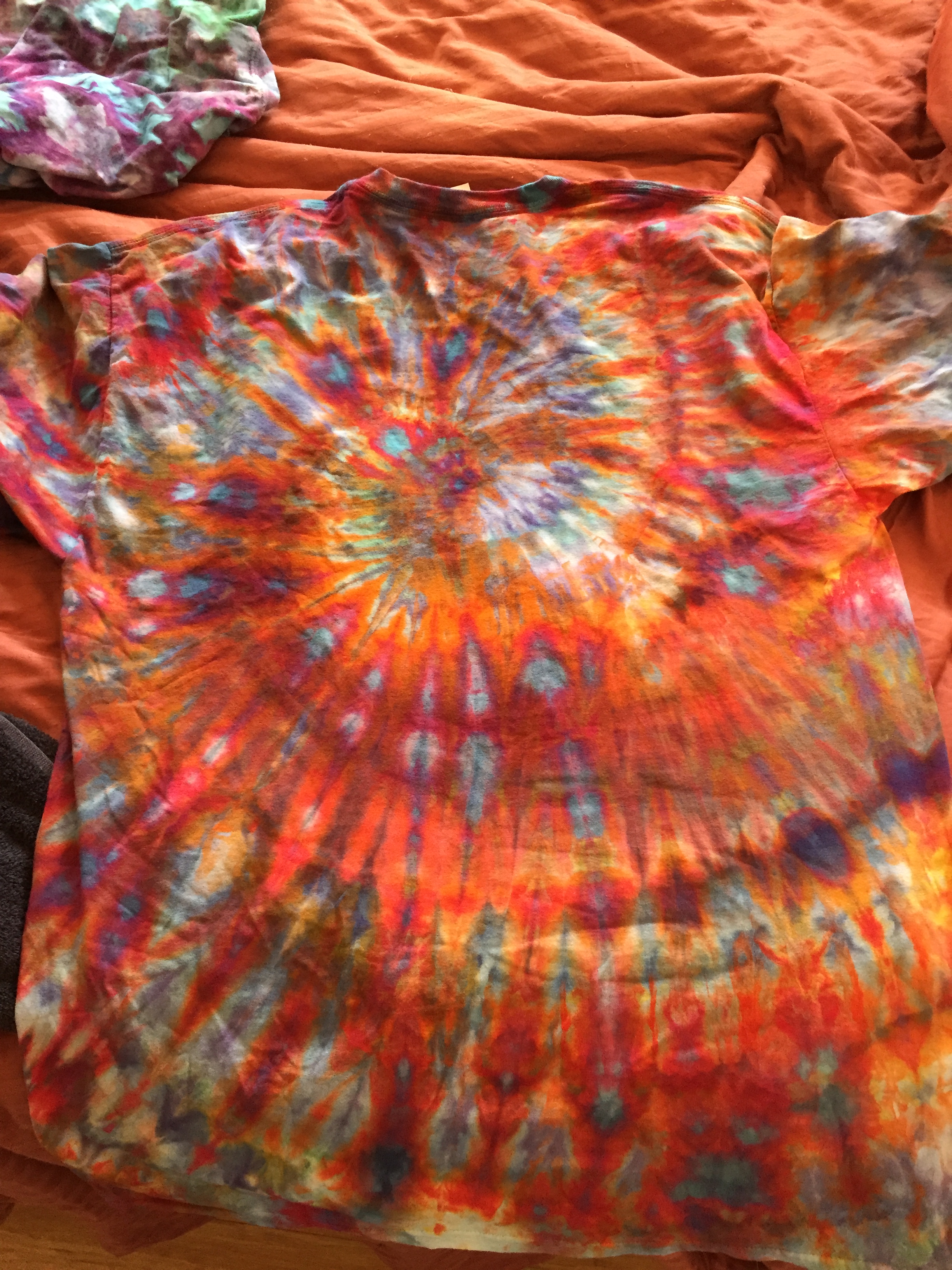
The last tank top is actually double dyed. That is to say, it’s actually been dyed twice. The first time it was dyed like the second to last one (the orange and yellow flame pattern). Unfortunately, it got a stain on it, so of course the only thing to do was overdye the stain. So I tied it up in a circle pattern, put red around the edges, and dyed the outside black.

Preventing the dye from getting where you don’t want it is a bit of a tricky process – dye has a way of splashing and seeping in very inconvenient ways, especially when it’s something like black on yellow where mistakes would be VERY obvious. (The dye gods are capricious!)

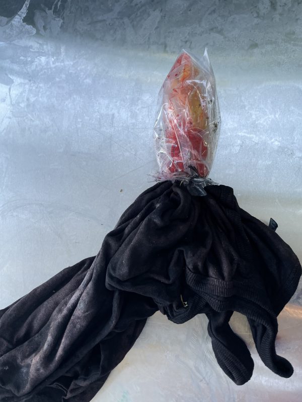
To protect against this, I used a method called “capping” which is just a fancy way of saying “stick the part you don’t want contaminated into a plastic bag and then tie the bag on tightly before applying more dye. I actually capped it twice, once to keep the flame-patterned dye from getting contaminated with red and once to keep the red area from getting contaminated with black.

Here’s what it looked like when fully capped and dyed:

Red starburst tie dye in progress photo, with the red and yellow areas capped off in a plastic bag

And here’s what it looked like when it was partially uncapped:

Red starburst tie dye, partially uncapped, with the red portion showing

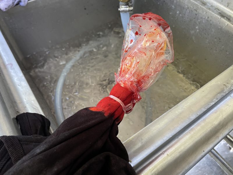
Here the first plastic bag has been removed to reveal the red portions but the orange-and-yellow is still protected.

You might be wondering about the sink full of water with ICE floating in it that appears in the background of the photo. The ice is the secret to keeping your tie-dyes bright when you’re rinsing out the dye.

There’s a potentially dangerous moment when you dunk your beautiful multicolor tie-dye into the water. With fiber-reactive dyes, there’s always a lot more dye than the fabric can actually react with, and the moment you plunge the fabric into the water, a ton of loose dye comes off into the water…and can potentially stain your beautiful shirt.

However, if the water is freezing cold, the dye can’t react. That’s because the dye reaction requires alkalinity, moisture, dye, and some heat to take place. The fabric has soda ash (alkalinity) and dye in it, so if you put it in warm water, all four dye reaction components are present. If you put it in ice water, though, there’s not enough heat for the dye to react, and the loose dye can’t stain the fabric.

At the same time, the first rinse bath rinses out the soda ash that gives the dye the alkalinity it needs to react. So after the ice water rinse, all the other rinses are safe to do in room temperature or warm water for as long as you like. In fact, it’s recommended to soak overnight in cold water to make the rinse-out process as easy as possible. The rinse water will turn super-dark with loose dye – but it all comes out. No dye reacts with the fabric. All because of that first ice-water rinse!

Better living through chemistry!

I have another dye day scheduled next weekend – some friends from waaaaaay back in high school are coming over and we’re going to do more tie-dyes together. Since it’s starting to get cooler, I may do some sweatshirts, and maybe some T-shirts and tank tops for Jamie.

Filed Under: All blog posts, textiles, dyeing, surface design Tagged With: tie-dye

May 22, 2018 by Tien Chiu

Breakthrough

The last two years have been a bit of a puzzle for me. I’ve done virtually no weaving – which is pretty darn odd, considering I quit my job so I could focus on developing my career as a textile artist. At first I thought it was because I was busy doing other things – mostly, working on my business and fulfilling my duties as Board President at the San Jose Museum of Quilts and Textiles. Both of those took (and are still taking) a ton of time and emotional energy. But two years? I was starting to wonder if I’d made a mistake buying a jacquard loom, because I seemed to have very little interest in weaving. But I couldn’t seem to come up with anything that triggered my enthusiasm.

Then two things happened. The first was getting a close look at Itchiku Kubota’s kimono, which are both beautiful and masterful. Conceiving and executing these kimono requires not only vision, but impressive technical skills and deep understanding of the design possibilities of each technique. Years of technical mastery are needed to make them.

This is very different from how most textile artists currently work. Current textile art emphasizes message; it’s about what you’re saying with your art, not about the skill and precision with which the art is made. In fact, too-good construction can even make your work suspect, because good craftsmanship is associated with craft, not art. (Insert the usual arguments about craft vs. art here.)

As a result, most of the textile art I’ve seen recently, while powerful, has been pretty simple, technically speaking. Most of it could be composed by someone with just a few years of experience, and made within a matter of weeks or months. And there is absolutely nothing wrong with that style; it’s a perfectly valid approach to art, and it results in some remarkable pieces. It works for a lot of artists.

But it doesn’t work for me. My natural preference is for work that is intricate; that combines multiple media; that requires technical mastery; and that takes many months or years to complete. But I’ve seen relatively little modern work that fits that description. (Except for the American Tapestry Alliance shows, which I love!)

So when I asked a lot of established artists how to study and develop a career as a textile artist, much of their advice on who and what to study came from a body and philosophy of art totally different from what I loved. And I didn’t see my style of work reflected in any of the textile art I’d seen. Technical virtuosity seemed stuck in a past that emphasized skill over creativity; modern art emphasized creativity and downplayed skill. Who was doing the kind of complex, technical art that I wanted to do? Where was my tribe?

Alice Walker, in her essay “Saving the Life that is Your Own: The Importance of Models in the Artist’s Life,” says:

In that story I gathered up the historical and psychological threads of the life my ancestors lived, and in the writing of it I felt joy and strength and my own continuity. I had that wonderful feeling writers get sometimes, not very often, of being with a great many people, ancient spirits, all very happy to see me consulting and acknowledging them, and eager to let me know, through the joy of their presence, that, indeed, I am not alone.

Kubota made my kind of art. Seeing his kimono sent a shock of recognition through me. This is the kind of work I want to do…that intricacy, that breadth of vision, that fusion of multiple disciplines. Yes, yes, a thousand times yes! And – having finally found my tribe – I suddenly felt less alone, and a lot more hopeful.

Another thing that has really encouraged me was a discussion I had recently with a museum curator. We were talking about another jacquard artist’s work, and the person I was talking to said, “You know, I think she did herself a disservice when she decided to limit herself to what could be done on a jacquard loom, as opposed to using whatever technique would help her say what she wanted to say.”

I stopped for a moment, thunderstruck. Oh! Duh!

Because, of course, I had fallen into the same trap. It’s a natural mistake: when you buy a very expensive hammer, it’s hard not to feel that you need to pound a LOT of nails to justify your purchase. So, having bought a jacquard loom, I had naturally been envisioning myself as a jacquard weaver – weaving exquisite pieces that exploited the powerful capabilities of the loom. And focusing on weaving to the exclusion of other disciplines.

But I’ve never been terribly excited about handwoven cloth. (Yes, I know that’s a strange confession for a well-known weaver.) To me, cloth is mainly interesting as a raw material for other processes – dyeing and sewing, maybe origami. And flat cloth? It leaves me, well, flat. Since I had been envisioning jacquard-woven flat wall hangings, is it any surprise that I lost my enthusiasm for starting new work?

The last revelation I’ve had has to do with the question of art vs. artistic career. My style of art is quite different from most of what is currently being exhibited and sold. And because I want to put hundreds or thousands of hours into each piece, building a body of work will be really slow. As a result, taking my approach may seriously impact my career as an artist. I have been noodling unhappily over this for the last two years. Kubota’s kimono have knocked me clean off the fence I was sitting on, because if I can make work like those kimono – or even get close – I do not give a flying fuck about whether I ever have an artistic career.

Which, I think, finally qualifies me to call myself an artist. 🙂

There’s a wonderful passage in Richard Bach’s Illusions that describes how I feel. The protagonist (Richard) has been barnstorming around the Midwest, offering people short airplane rides for a small fee. In the process, he meets the Messiah, whose name is Donald Shimoda. Richard decides he wants to be a Messiah too, so he studies with Donald. In this section, Richard has just given his “Sermon on the Mount” teaching to Donald for the umpteenth time:

I looked at him. “Too wordy?”

“As always. Richard, you are going to lose ninety percent of your audience unless you learn to keep it short!”

“Well, what’s wrong with losing ninety percent of my audience?” I shot back at him. “What’s wrong with losing ALL my audience? I know what I know and I talk what I talk! And if that’s wrong then that’s just too bad. The airplane rides are three dollars, cash!”

“You know what?” Shimoda stood up, brushing the hay off his blue jeans.

“What?” I said petulantly.

“You just graduated. How does it feel to be a Master?”

“Frustrating as hell.”

He looked at me with an infinitesimal smile. “You get used to it,” he said.

Having thought through all that, I have some very exciting ideas for combining jacquard designs with dyeing. In particular, I want to cross-dye jacquard-woven cloth woven from cotton and polyester threads. Cotton and polyester are ideal for this purpose because dyes for cotton (fiber-reactive dyes) do not dye polyester, and dyes for polyester (disperse dyes) do not dye cotton. So you can weave a pattern in white on white, print on the fabric using fiber-reactive dyes, and then dye it in a different design using disperse dyes. The finished piece will show the cotton in the fiber-reactive pattern and the polyester in the disperse-dye pattern.

This is a bit hard to envision, so here is a sample I made a few years ago while playing with this idea. The warp is Tencel (or maybe cotton), the weft is alpaca, and it’s dyed with both acid and fiber-reactive dyes. The pale blue fiber-reactive dye is applied first (it dyes both cotton and protein fiber), then the thickened red-purple acid dye is stenciled on. The acid dye dyes the alpaca but not the silk, giving an interesting pebbled texture. (You can read more about the process in this blog post.)

This is pretty interesting in itself, but throw in a jacquard loom and some really interesting stuff becomes possible. For example: suppose you weave an image of a tree, where the tree is woven in polyester and the background in cotton or mostly-cotton. You can weave the trunk of the tree in a “bark” pattern that is mostly polyester with some textured cotton ridges going through it, and then paint different colors/designs on the polyester and the cotton parts of the bark. You could weave birds in cotton half-hidden against a canopy of polyester leaves. Then you could stencil a pattern of light and dark green on the polyester leaves without touching the birds, and come back and paint the cotton birds later.

Or you could go abstract and do shibori or tied-resist dyeing (twice!). Or you could try to do woven shibori! Depending on thickness, polyester thread may be strong enough to use as tie threads…and polyester has memory, so there is also the option of permanently-set crimp cloth. The possibilities are truly endless, and well worth exploring. This could be a LOT of fun!

Filed Under: All blog posts, musings, textiles, dyeing, surface design, weaving Tagged With: cross dyeing

May 4, 2018 by Tien Chiu

Pilgrimage

Most artists find their way into art gradually. Their interest develops over several years, often early in their lives.

I didn’t arrive at art quite so gradually. In fact, I regarded fiber arts as a not-terribly-important hobby until December 1995. Then a friend handed me a copy of Smithsonian Magazine, saying, “I saw this article and thought you’d find it interesting.” I opened it, and was floored by a photo of the most amazing art I’d ever seen. It was a kimono, Burning Sun, by Japanese artist Itchiku Kubota.

At that moment, I knew that what I wanted to do with my life, more than anything else, was to make something as beautiful, powerful, and technically masterful as that kimono. It had never occurred to me that fiber art could be art before – I’d been spinning yarn for sweaters and designing interesting quilt tops, which people thought were artistic. But in my mind, they weren’t art. Kubota’s kimono could stand against the most masterful painters and sculptors. They opened my mind to a whole new world of what could be done with textiles.

Alas, Kubota’s work normally resides in Japan, at the Itchiku Kubota Museum. A trip to Japan was on my bucket list, but it didn’t appear likely to happen anytime soon.

So when I found out the kimono were on exhibit at the Textile Museum of Canada, well…

Tien with Itchiku Kubota's Burning Sun, at the Textile Museum of Canada
Tien with Itchiku Kubota’s Burning Sun, at the Textile Museum of Canada

…that’s me, standing next to the artwork that inspired my calling.

It was amazing to see Burning Sun in person. Many artworks don’t live up to their photos when viewed in real life. But Burning Sun’s photos didn’t do it justice – not even close! – because an image of the full piece can’t capture the intricate detail.

For example, here’s an closeup near the bottom of the left sleeve:

Closeup of the left sleeve of Itchiku Kubota's Burning Sun
Closeup of the left sleeve of Itchiku Kubota’s Burning Sun

At this distance, you can see some details – stitched-resist (shibori) dyeing, delicate brush painting, and embroidery.

Getting closer, though, you can make out more:

Even closer view of the left sleeve of Itchiku Kubota's Burning Sun
Even closer view of the left sleeve of Itchiku Kubota’s Burning Sun

Now you can see that there are two kinds of embroidery thread – rough silver thread at the middle right, and a smooth, glossy thread at top right. You also get a glimpse of the wonderful textures created by the shibori stitching.

And if you stick your nose right up against the fabric (don’t worry, I didn’t touch it!):

Super close view of the left sleeve of Itchiku Kubota's Burning Sun
Super close view of the left sleeve of Itchiku Kubota’s Burning Sun

Now you can see that the base cloth isn’t plain weave – it’s woven in horizontal ridges punctuated by irregularly placed floats, creating a textured fabric with floating flecks of light.

I spent two days in the exhibit, from opening until closing (though I did take a break for lunch on both days). I took 1,297 photos of the 40 kimono – though I wish I’d taken a few more, since I’ve found some gaps already. The first day I ran madly about documenting/photographing EVERYTHING, because I wanted detailed shots I could study later. Near the end of the second day, I had a few hours left, so I spent some time just looking at, and absorbing, the artistry in the kimono.

I would really have liked a third day (or another three weeks, months, years…), but two was enough to get most of what I needed. Kubota’s work is inspirational to me in so many ways – the sweeping vision, the incredible technical mastery (across multiple disciplines!), the integration of conceptually different design elements (physical texture, flat areas of ink drawing, shibori dyeing), and the ability to design at multiple scales, from the sweeping vista to tiny stitches. It is ambitious, masterful, and complex. I have never seen anything like it.

Here are some hopefully illustrative photos.

This first photo is of five kimono from the “Symphony of Light” – envisioned as a set of 80+ kimono depicting the seasons of Mt. Fuji and then expanding into the universe. (Kubota only finished about half of the Symphony before he died.) 

6 kimono from Itchiku Kubota's "Symphony of Light"
6 kimono from Itchiku Kubota’s “Symphony of Light”

As you can see, when lined up next to each other, the kimono form a single sweeping image.

In fact, this set of six kimono is actually part of a much larger set, that all merge into a single image. Here is a panorama with 13 kimono (you’ll have to click in to see the larger version; it’s hard to make out details if you don’t). You can see how the seasons merge into one another, late summer to fall to early winter.

13 kimono in Itchiku Kubota's "Symphony of Light"
13 kimono in Itchiku Kubota’s “Symphony of Light”

I believe that all the kimono of the Symphony of Light can be lined up in this way. What a breathtaking vision!

But wait! That’s not all! Each kimono also stands alone. Let’s look at just one kimono – Hin (Nostalgia). It’s the fifth one from the right:

Itchiku Kubota's kimono "Hin (Nostalgia)"
Itchiku Kubota’s kimono “Hin (Nostalgia)”

While it was designed as part of a larger set, it also forms a complete composition when viewed by itself.

But look a little closer. See that boring-looking dark brown section in the bottom right corner of the left sleeve, just above the “cloud” at the bottom? This is what it looks like from a foot away:

closeup, left sleeve, Itchiku Kubota's "Hin (Nostalgia)"
closeup, left sleeve, Itchiku Kubota’s “Hin (Nostalgia)”

Wow! That boring brown spot is really interesting! The variety of textures is amazing – the smoothness of the “fog” drifting through the bottom, and the longer, sharper creases traveling in different directions on the right side, to give motion to the misty tendrils. The trees are composed of delicate ink painting in the center of each brown area, outlining the trunk, and horizontal ridges suggesting branches. (And if you look to the left, in the medium brown area, you’ll see some very light brush painting suggesting more trees hidden in mist.)

Further up the sleeve, there’s another great set of textures:

top left sleeve of Itchiku Kubota's "Hin (Nostalgia)"
top left sleeve of Itchiku Kubota’s “Hin (Nostalgia)”

I love this particular section because it’s almost all texture – but texture used in a deliberate and astoundingly precise manner to create movement, depth, and patterning. There are four textures just in this small section! And the textures are coordinated with subtle dyework to create the impression of layers of mist shifting over the mountain.

What blows my mind isn’t just the technical excellence of the work but the multidimensional expertise needed to envision it. Each of the design components Kubota is using – texture, color, line – is created using a different kind of surface design technique. Each of those methods “thinks” differently. It’s hard enough to design using even one of those three methods, which is why most textile artists work inside a single branch of surface design. But here Kubota is integrating three very different methods in a single piece, combining them into something far more powerful.

Here’s a shot from near the bottom of the kimono that shows a similar combination of techniques:

bottom of Itchiku Kubota's "Hin (Nostalgia)"
bottom of Itchiku Kubota’s “Hin (Nostalgia)”

Here the shibori ridges create earth and tree branches. To get crisp definition in the tree trunks – not achievable with shibori – Kubota uses ink pen. And, because neither of those techniques produces luster or luminescence, Kubota’s decided to embroider the tops of the trees with scattered stitches in smooth, lustrous gold thread. This gives the effect of sunlight glinting off the treetops.

Kubota’s work has had a profound impact on me because he worked the way I want to work, and his work shatters a lot of the constraints that were suggested to me as a budding artist. For example, I was advised to pick three or four techniques to work with, in a single medium. The idea is to achieve greater mastery by exploring one area deeply rather than trying to integrate a lot of unrelated methods. Kubota works with just a few techniques, but drawn from vastly different areas of surface design. It’s inspiring to me to see that this can work – because my natural inclination is to work across multiple disciplines. Trying to focus in a single area felt terribly limiting.

I’m still processing all my thoughts and feelings about the exhibit. Seeing Kubota’s work has helped me recognize some of the limitations I’d imposed on myself, and reassured me that there is enormous potential in my multidisciplinary approach. The design philosophy embodied in his kimono is making me think deeply about what it means to me to be an artist, what I want to strive for in my work, and what I want to learn. And, of course, I’m also learning a ton about design by examining the work of a master.

Kubota’s work is also making me feel enthusiastic about weaving again, which is great after a nearly two-year hiatus. I was seriously wondering whether I had made a mistake buying a jacquard loom, because I felt like I might be done with weaving. But seeing his work has made me think of some really cool stuff I could weave (and dye) – and I can’t wait to get started on it!

Over the next couple weeks, I’m planning to write a series of blog posts about some of the thoughts the kimono have inspired – both philosophy and design. Stay tuned!

Filed Under: All blog posts, musings, textiles, dyeing, surface design Tagged With: itchiku kubota

February 19, 2016 by Tien Chiu

Ice dyeing

I’ve spent the last several days experimenting with ice dyeing. I had planned to set up the loom for triple weave, using two layers of ice-dyed cotton warp and one layer of white wool warp. But since I hadn’t ice-dyed before, I decided to experiment with it before dyeing a long warp.

To ice dye something, simply soak it in soda ash solution, pile ice on top, and dribble fiber-reactive dye, either powdered or liquid, on top. (If you are using powdered fiber-reactive dye, you MUST use a dust mask or the dust will get into your lungs. I use a respirator.) Then you wait for the ice to melt. If you want darker colors/less white, flip whatever you’re dyeing over and ice dye again on the other side. Wait a day or so for the dye to set, and you’re done. (Here are more detailed instructions.)

I decided to experiment on T-shirts, because T-shirts are the cheapest fabric I know of, and because I needed to expand my tie-dye wardrobe anyway (doesn’t everyone?). So I paid $33 for a dozen T-shirts at Dharma Trading Company, and off I went.

Here’s a photo of the T-shirts in process. I cut up cardboard boxes, wrapped the cardboard around the T-shirts, and piled ice on top. Then I dribbled on dye – red/orange/yellow and blue/green/purple, as I wanted to test both color combinations.

ice dyeing in progress

And here are some of the shirts I got (primarily the blue/purple/green ones as the red ones mostly weren’t that interesting).

ice dyed shirt ice dyed shirt ice dyed shirt

These were all scrunched up loosely with dye dribbled randomly on top, then flipped over and treated the same way.

I decided to try some actual tie-dye patterns. Here’s a V-shaped fold with red/orange/yellow on one side and blue/purple/green on the other:

ice dyed shirtAnd (you may remember this from last post) here is a spiral, red on one side and blue on the other:

ice dyed T-shirt
ice dyed T-shirt

Of course, after I finished all my ice dyeing experiments, a weaving buddy blew my triple-weave plans out of the water by pointing out that I could do the piece much more simply if I painted the warp on the loom, rather than trying to dye two painted warps, then exchange layers throughout the piece. So instead of putting on a triple weave warp with ice-dyed warps, I’m going to put on a double weave warp, one layer of white wool and one layer of white cotton. That should enable me to weave all the pieces I’ve been contemplating.

I think I may use the rest of the current warp to experiment with painting warps on the loom, rather than weaving the rest of the cat placemats. The cat placemats are cute, but also very laborious, and the central motif is not my own design, which complicates showing it to people. And it would be helpful to test whether the warp painting idea will work before I commit to a long and expensive warp.

Speaking of cats, I decided to take a photo of the stack of tie-dyed shirts. Of course, as soon as I laid out the stack, someone decided to photobomb.

“But having a cat makes every photo better,” explains Tigress. “The Internet says so.”

a photobombing cat
Tigress “improving” my photo

Filed Under: All blog posts, textiles, dyeing, surface design Tagged With: ice dyeing

December 24, 2015 by Tien Chiu

Testing embellishments

I’m traveling at the moment, but have found some time to work on the phoenix. I’ve been testing embellishments – mostly on the head, as that’s the most important part. Here’s what I’ve done so far: most of the crest feathers, the beak, and a little bit of the head.

partially embroidered handwoven phoenix head

If you compare it to the original head, you can see there is quite a difference:

phoenix head - original
phoenix head – original

The embroidery, especially around the eye, adds sharp detail, bringing the phoenix into focus.

I’m embroidering using DMC #5 perle cotton, which is similar to the weft in size and sheen. I tried using silk embroidery floss, but the finer threads looked out of place. I’m also using two metallic yarns: one very fine thread, used four at a time, to connect the beads to the crest feathers, and a much thicker thread (made with real gold!) for the center of the crest feathers. The thicker thread is too delicate to stitch with, so I’ve couched it down instead.

Embroidery is going slowly, partly because the backing fabric I chose is too tightly woven to work well with the thick threads I’m using. Pushing the needle through the fabric takes significant effort, which is bad for my thumbs as well as my temper. I’ve already decided to use a coarser fabric for the real piece. I have some cotton or linen cloth from my mother’s stash that should prove suitable.

As stitching the head has been very slow going, I had hoped to avoid stitching the entire body as well. Alas, my attempts at laziness have come to naught: the embroidered beak and part of the head look so much nicer than the original that I have decided to do solid embroidery on the entire head. And if I do the head, I really need to do the body, or it will look funny. Fortunately there’s enough division between the body and the wings/tail that, as long as I add a little bit of transition embroidery to connect the two, I shouldn’t have to do solid embroidery on anything else. I do intend to do more embroidery on the wings/tail, both to add a bit of metallic sparkle and to add some dimensionality to the feathers/wings, but nowhere near the amount I’ll need to do for the body.

As much as I’d like to finish stitching the body on the test piece, I’ve decided to move on to other parts of the bird. The test piece is exactly that – a sample meant to test out my embroidery ideas. Stitching the entire body would consume a lot of time. Since I have only about five weeks to complete the entire project, including the embroidery samples, I don’t want to spend one more instant on the sample than absolutely necessary. I know now that I want to embroider the entire body, and that’s all I need from this area of the sample. (I do need to figure out the shading on the body, but that is more easily done via digital painting.)

So the next step will be to test out my embellishment ideas for the tail. I want to add a little detail to the front feathers. There are two layers of feathers in the tail – this is obvious in the digital painting, but not in the woven piece. So the tail looks a bit flat right now; I want to make it look three-dimensional. I’m not entirely sure how I’m going to accomplish that yet. Maybe with ribbons, maybe not. Fortunately, I can experiment on the sample.

Meanwhile, the cat-sitter has been sending us a ton of photos of our beloved cats, who look happy and healthy. Here’s Tigress, hanging out in the cat tree.

Tigress, posing for the camera

Filed Under: All blog posts, textiles, surface design, weaving Tagged With: ma's memorial

Next Page »

Subscribe to Blog via Email

Information resources

  • Dye samples
    • Procion MX fiber-reactive dye samples on cotton
    • How to "read" the dye sample sets
    • Dye sample strategy - the "Cube" method
  • How-Tos
    • Dyeing and surface design
    • Weaving
    • Designing handwoven cloth
    • Sewing

Blog posts

  • All blog posts
    • food
      • chocolate
    • musings
    • textiles
      • dyeing
      • knitting
      • sewing
      • surface design
      • weaving
    • writing

Archives

Photos from my travels

  • Dye samples
    • Procion MX fiber-reactive dye samples on cotton
    • How to "read" the dye sample sets
    • Dye sample strategy - the "Cube" method
  • Travels
    • Thailand
    • Cambodia
    • Vietnam
    • Laos
    • India
    • Ghana
    • China

Travel Blog

Entertaining miscellanies

© Copyright 2016 Tien Chiu · All Rights Reserved ·


Loading Comments...