Tien Chiu

  • Home
  • About Tien
  • C.V.
  • Online Teaching
  • Works
  • Essays
  • Travels
  • Book
  • Blog
  • Dye samples
You are here: Home / Archives for design

July 18, 2012 by Tien Chiu Leave a Comment

Design poker

I was feeling rather stuck in my attempts at fashion sketches, so in an effort to avoid Blank Page Syndrome, I decided to play design poker.  This is basically a modified version of the guild challenge game where everyone draws several cards with colors, fiber types, visual theme, etc. and then creates something based on the cards they drew.  I don’t think it’s a great way to design, but the imposed constraints and the pre-seeding of ideas are good for overcoming the terror of a blank page.  And generating ideas is good.

So here are the results of the first three rounds of Design Poker.  In each round, I drew four photos from a collection of couture photos, and drew a croquis for Phoenix Rising based on ideas or construction elements from all four photos.  Some of them didn’t actually involve all the photos, but that’s OK: the objective is to generate good ideas, and if I was happy with the result (I was!), then all is well and good.

I apologize for the poor quality of the original fashion photos.  I had printed them out in black and white, to avoid distracting myself with color, but the printouts didn’t photograph well.  Still, it gives you a bit of an idea, and if you click through to the full-size version you can probably make out most of it.

Here they are:

Photos for Round 1 of design poker
Design one sketch
Design one sketch

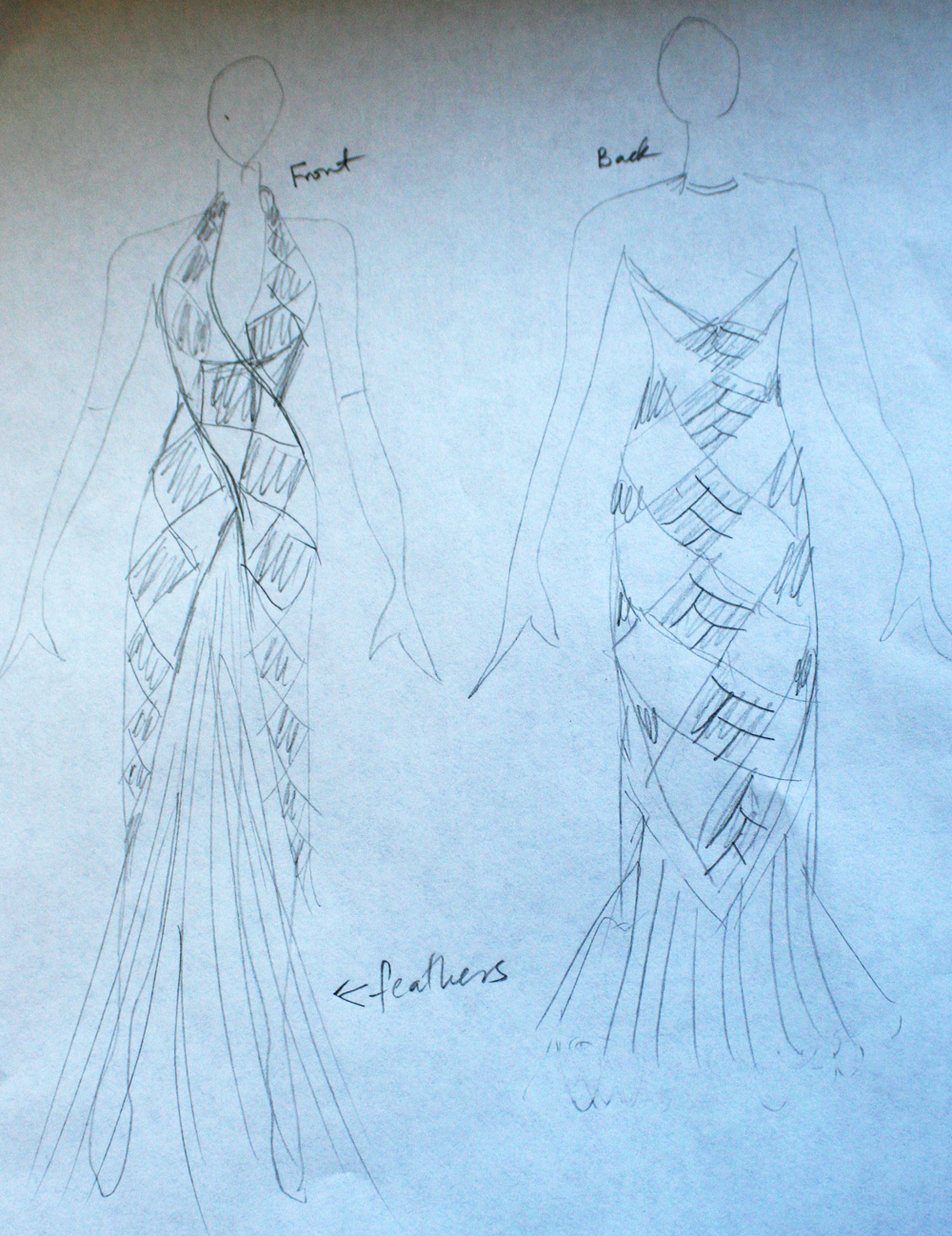
Here we have the spiraling diamonds in the top right photo, the “x” construction of the bottom right photo, and the feather skirt of the bottom left photo.  I couldn’t figure out how to incorporate the top left photo, and was happy with this sketch, so I left it at that.

And the second round:
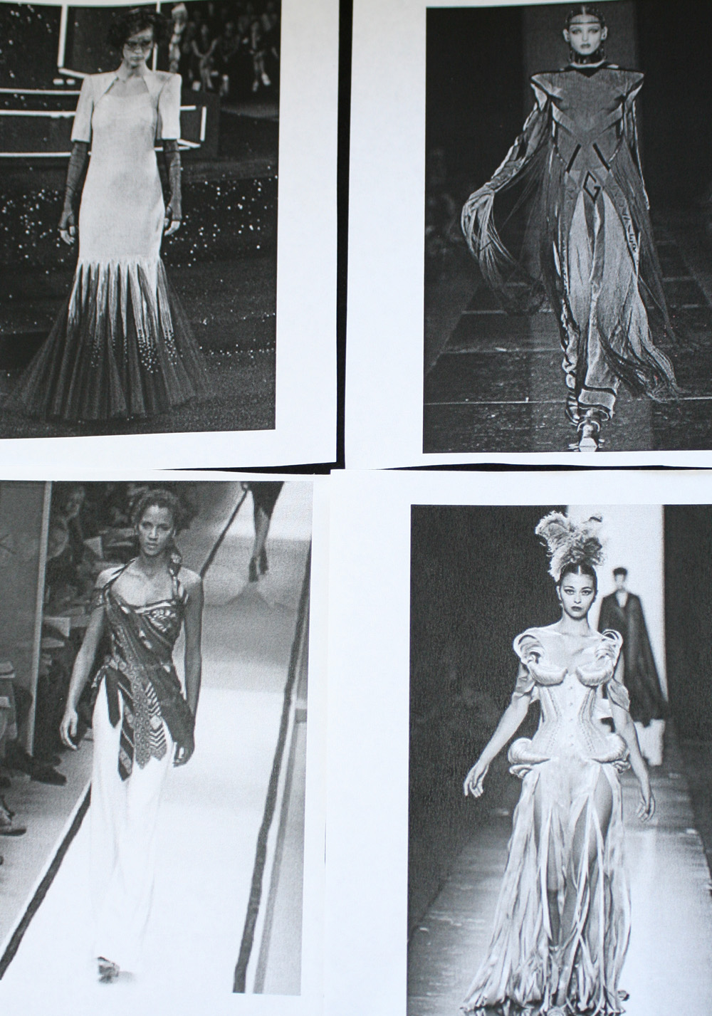
Photos for design 2
Photos for design 2
Design 2
Design 2

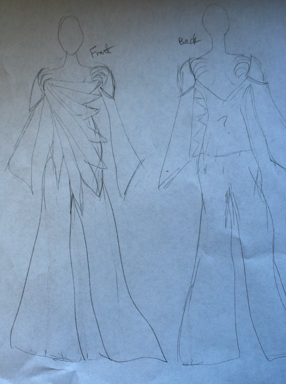
I really like this design.  It incorporates the flowing feel of the top right photo with the shoulder curlicues of the bottom right photo, and the awesomely cool “feathers” going across the body derive directly from the diagonal lines in bottom left.  The top left photo I couldn’t incorporate, so I left it out.

And here is round three:
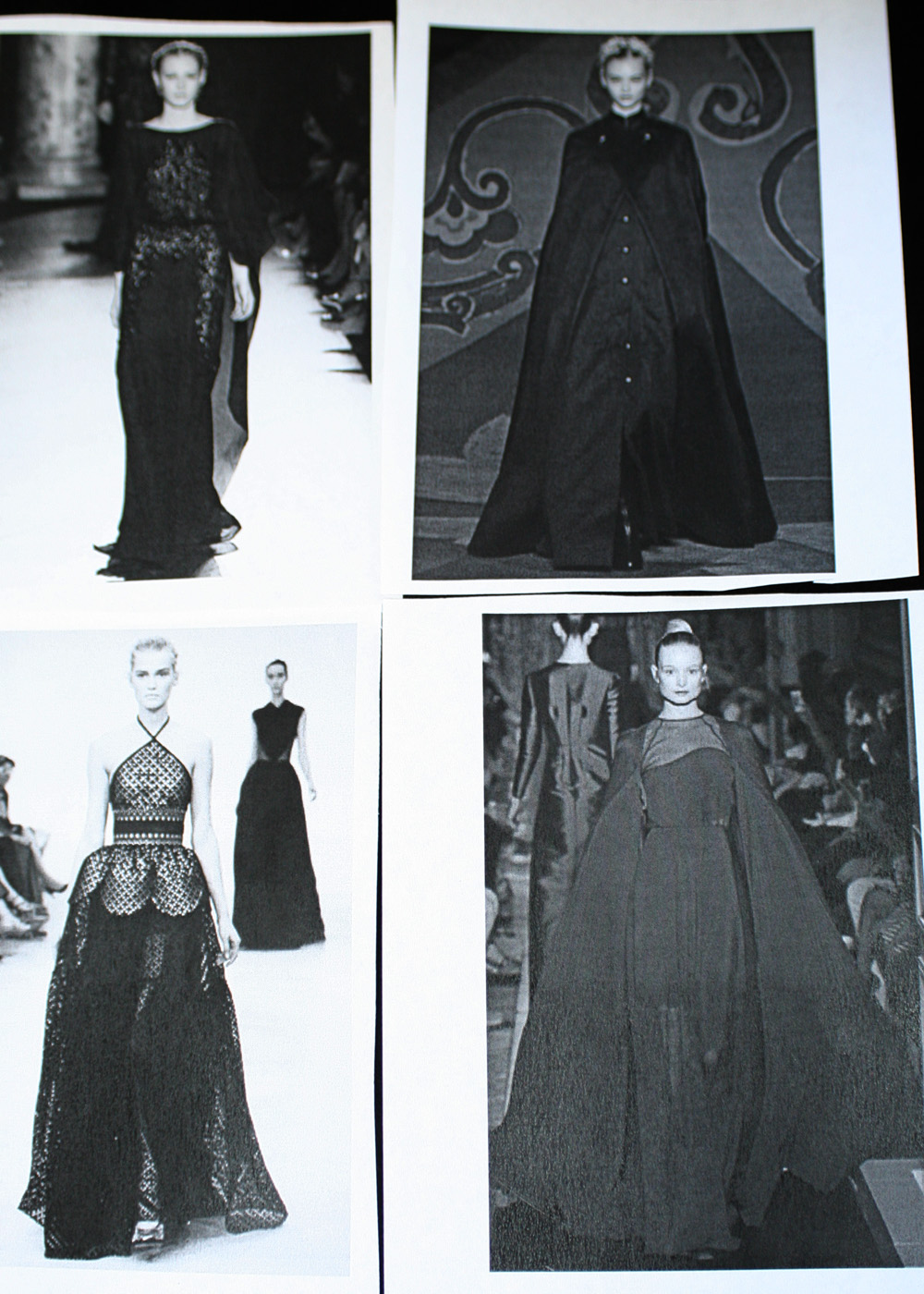
Design 3 photos
Design 3 photos
Design #3
Design #3

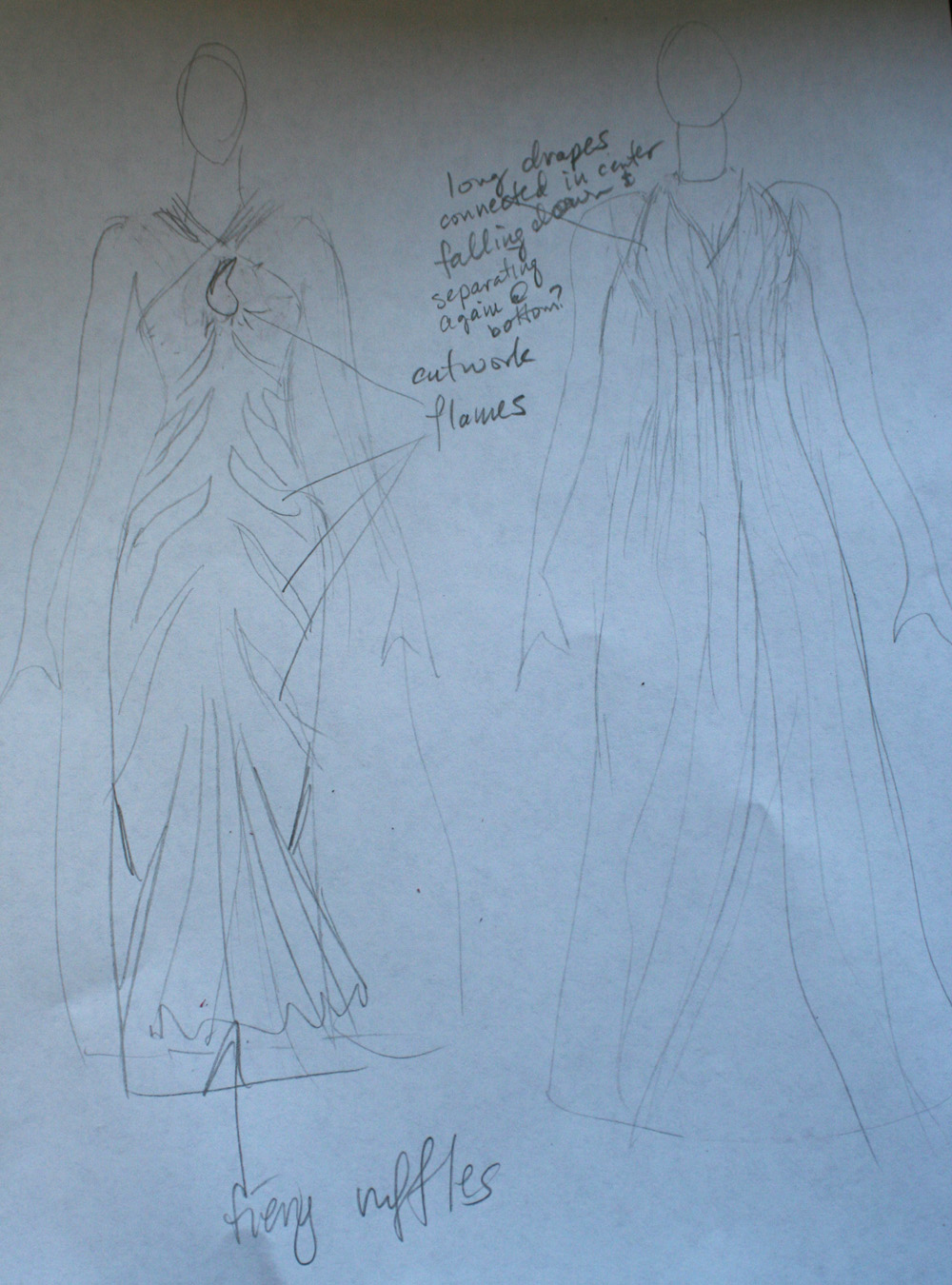
This incorporates the cutwork from the top left photo, the idea of a billowing cloak/cape from the two right-hand photos, and the neckline of the bottom left photos.  The drapes from the back (which I’m not sure if I would combine into a single cape or leave them separate) come up and over the shoulders to meet the front (which is actually held up with a halter top).  The dress itself is a mermaid-ish design, with flame cutwork (maybe with orange-red flames on a black-and-red background) and fiery orange ruffles at the bottom.

Anyway, none of these are genius designs, but they’re intriguing ideas, and remarkably good for something based on four photos drawn at semi-random.  I think I’m going to play design poker every morning for a couple of days, and see what happens.  I may even graduate to colored-pencil sketches!
Filed Under: All blog posts, sewing, textiles Tagged With: design

July 4, 2012 by Tien Chiu Leave a Comment

Design wall

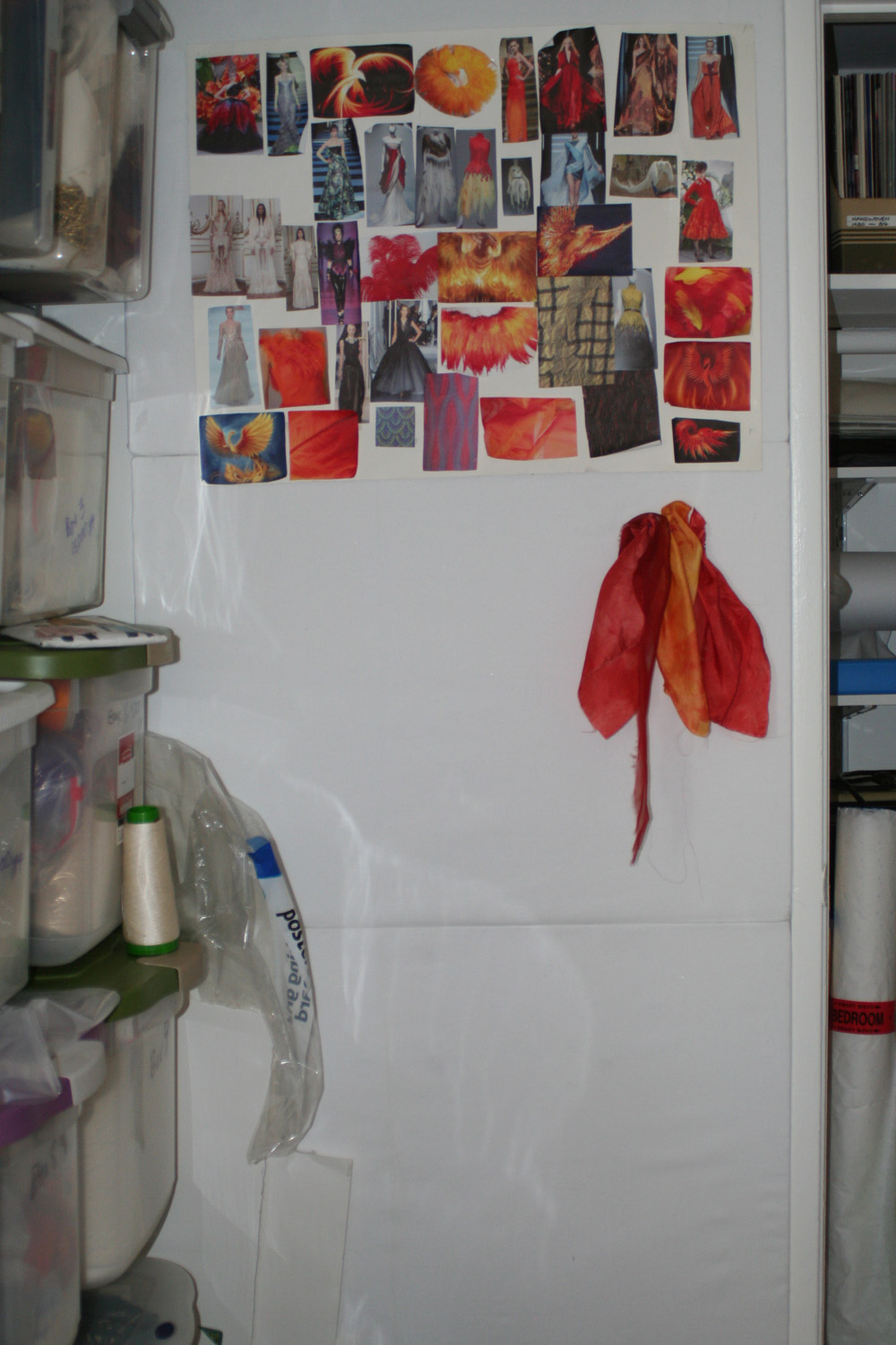
I have just put up the design wall in my studio!  Here it is:

design wall
design wall

It’s nothing fancy – three panels of builder’s insulation (half-inch polystyrene), covered with flannel and mounted using Velcro – but it will do.  The basic idea is to have a neutral-colored wall you can pin things to – or, if you cover it with flannel, just smooth the fabric against it so it sticks to the fuzz.  (Works best with quilting cottons – doesn’t work with silk as it doesn’t stick).  Quilters use design walls all the time; it’s not quite as good for sewing, but I can use it to store samples and work out design questions without tying up the dress form.

Currently on the design wall is the mood board for Phoenix Rising, plus some scraps of dyed china silk and organza from my earlier experiments.  I might also use it for book stuff, if I need to resort to physical scraps of paper.

Filed Under: All blog posts, textiles, weaving Tagged With: design

March 27, 2012 by Tien Chiu 4 Comments

More mockups

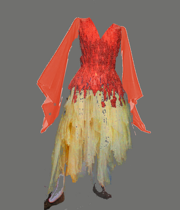
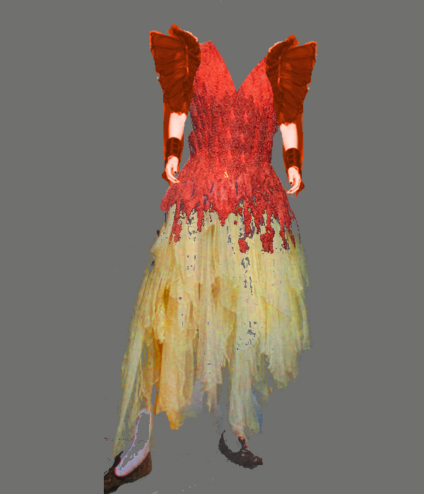
I went back to my mood board and picked out a couple of photos that appealed to me.  I still liked my original mockup with the textured bodice and the “ragged” skirt, but I wanted to try out a few ideas for the shoulders, neckline, and sleeves.  Here is my current favorite (which still needs a lot of work):

new mockup, with bell sleeves and V-neck

I am not crazy about the bell sleeves, but they are better than the other things I’ve been considering.  I like the sleeves because they suggest wings, but they also draw the eye downwards, whereas (in my opinion) the rest of the outfit is traveling up.  The eye lands on the bright yellow/orange skirt, then travels up to the red bodice, giving a feel of fire traveling upwards.  Then it hits the sleeves and the direction changes suddenly.  Very distracting.  Of course, it may play out better on an actual person, because when looking at a person, the eye is drawn immediately to the face, in which case it would be traveling down, not up.  But still, I’m not wild about it, though it’s the best of the mockups I’ve made.

Here are some of the other things I tried, and the reasons I don’t think they work:

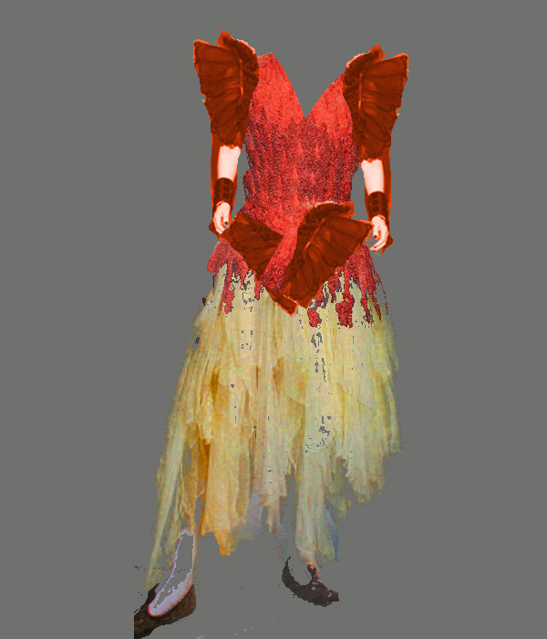
mockup with shoulder wings

This doesn’t work because the wings look stiff and pointy, while the rest of the garment flows smoothly and softly.  Also, the wings establish a horizontal line up top that is totally at odds with the straight up/down flow of the rest of the garment.  It also suggests a triangle, which is what I tried next, with disastrous results:

combined mockup with shoulder wings and pointed bodice

Here the hard, feathered feel is totally at odds with the soft drape of the skirt – it feels rather like a muscular, butch heroine on top, and a sappy romance heroine on bottom.  Yuck!

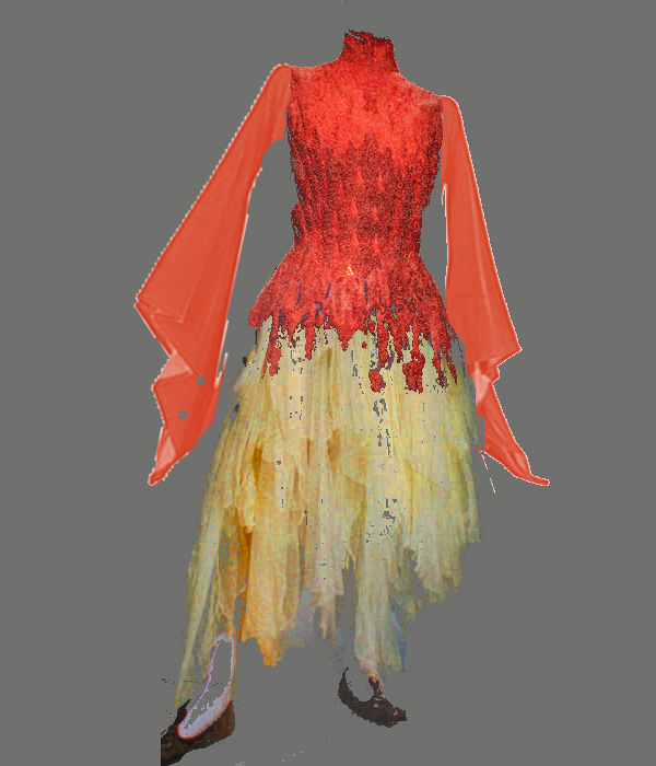
Then I tried adding long, flowing sleeves, which is how I arrived at the bell sleeves:

combined mockup, bell sleeves, high neck

The bell sleeves aren’t so bad, but the high neck was a real problem; now it “feels” to me like the wearer is choking.

So I put a V-neck on it, which I liked better and which is my current working mockup (it’s the one at the top of this post).  I’m still not satisfied – wondering the bell sleeves would be better if made a little more textured in flavor (there’s a smoothness to the sleeves that is not echoed anywhere else in the piece)  and maybe made a little shorter, about waist-length, so it doesn’t compete with the rest of the garment.

Finally, here is the one other effect that I really like, but can’t figure out how to integrate: the loose, flowing overskirt that billows out as the wearer walks.  I think it’s totally incompatible with the draped folds, though it might make an interesting cape or something.  (I keep thinking of the X-men superheroine Phoenix, though I don’t believe she wears a cape.)

Anyway, I haven’t arrived at a design I really like yet, so time to mull over things (and contemplate my mood board) some more.  It’s still in gestation, and I expect to go through a lot of design changes before I’m done.

Filed Under: All blog posts, sewing, textiles Tagged With: design, phoenix rising

November 25, 2011 by Tien Chiu Leave a Comment

Quilter’s design class!

One blog I read regularly is Elizabeth Barton’s Art and Quilts, Cogitations Thereon, which often contains interesting notes on design in textile art.   Much to my excitement, Elizabeth announced this morning that registration was open for two classes she is teaching, one of which is an introduction to design!  So I immediately signed up.  I’m not a quilter, but the class is more about design and quilting, so I think I can get a lot out of it.  She has some other classes as well, but I’m satisfied with the introductory one for now.

One question I have been contemplating for awhile is the role of imagery in my work.  I tend to think symbolically rather than visually, which is to say that my work tends to be less about visual design and more about the combined symbolism of the components.  For example, Autumn Splendor is composed of maple-leaf imagery on top of color shifts in autumn colors, with curved lines symbolizing the drift of autumn leaves.  This is explicit messaging, “readable” as you would read a book.  Other fiber artists don’t feel compelled to do this: they are happy to work with color and design, abstractly.

While there is nothing wrong with symbolic work, and I expect it to continue as my mainstay, I feel that I over-focus on symbolism, producing a weakness in design.  So a class in something more abstract and design-focused should help me with my weak points.  I am still trying to come up with another plan for continuing study.

One possibility I am seriously considering is Open College of the Arts in the UK.  It’s an entirely distance-learning B.A. program in the arts, and they have a textiles program!  Judy in Australia is taking the first course and blogging about her experience at her blog, Fibres of Being.  I’ve been very intrigued by what she’s done so far – once Autumn Splendor is complete, I may seriously consider signing up for the first class.  My only concern is that it’s not cheap – about $1000 – and there are so many weaving seminars and conferences going on this year that it may be difficult to squeeze in, cost-wise.  The full degree is also a substantial investment of time and energy – but there’s no reason I need to complete the entire program, since I already have a degree.

So many choices for distance education!  The Internet makes all the difference.

Filed Under: All blog posts, textiles Tagged With: design

September 24, 2011 by Tien Chiu 1 Comment

New design

I went up to see Sharon today, samples and coat muslin in tow.  I brought along the coat muslin because, even though the pattern pieces were too wide for my fabric, I loved that doggone collar and wasn’t quite ready to let it go.

And I didn’t have to!

Here is a sketch of our planned design:

Autumn Splendor, design sketch - asymmetric front and back

The right side will have a mix of bright autumn colors – gold, orange, red, burgundy, purple.  The left side will be a mix of darker colors – burgundy, purple, and brown mostly.

The collar, which I had originally intended to be a deep green (silk or velvet), came out looking garish in the sketches, probably because the green doesn’t relate to any of the other colors – oranges, reds, and warm purples/browns.  It would work better if there were more blues or blue-purples.  So instead, we substituted a purple collar, which provides both color and value contrast with the top of the front – adding considerable interest and drawing the eye upwards, towards the wearer’s face.  (In the sketch it looks rather garish, but see the photo below.)

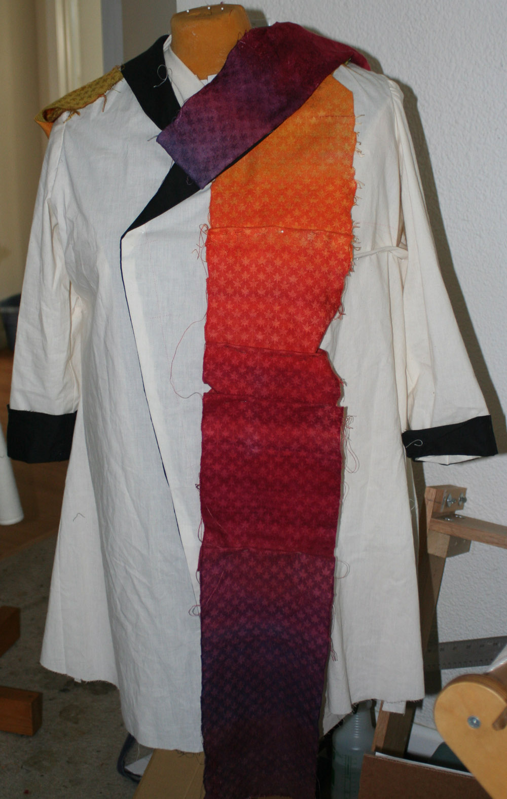
Here is a drape of the sample over the coat, showing the color sequence and the contrast collar:

autumn splendor, rough mockup

Both the purple and the yellow lean towards red, making the contrast much less garish than, say, acid yellow against violet – enough to be interesting, but not overpowering.  The purple collar fabric is actually the reverse of the sample fabric, with dark wool leaves and lighter silk background.  I like this effect and may use it, but I’ll have to monkey with the design first, as there are unsightly floats on the reverse face.

Here are two of the designs we tossed around en route to the one we liked:

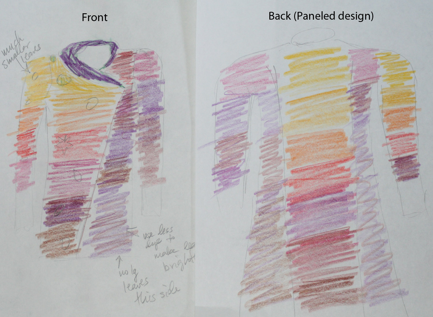
unused design - center back panel

We tried this design in hopes of avoiding an unsightly center-back seam.  Because the panels are individually hand dyed before weaving, there’s no hope of getting the color changes to match perfectly.  A center back seam would make  this super obvious, and of course there’s no way to cut the entire back out of a single piece if you can only weave 22″ wide fabric!  The idea was to contrast the bright panel against the darker colors, so the non-matching colors would be clearly intentional.

The reason we rejected this design is because the color imbalance is distracting.  The sleeve matches the adjacent panel on the left side, but not on the right side, and I didn’t like the alternation between light  to dark to light.  And, the colors at the shoulder seams would not match.

And here is another one with slightly different construction:

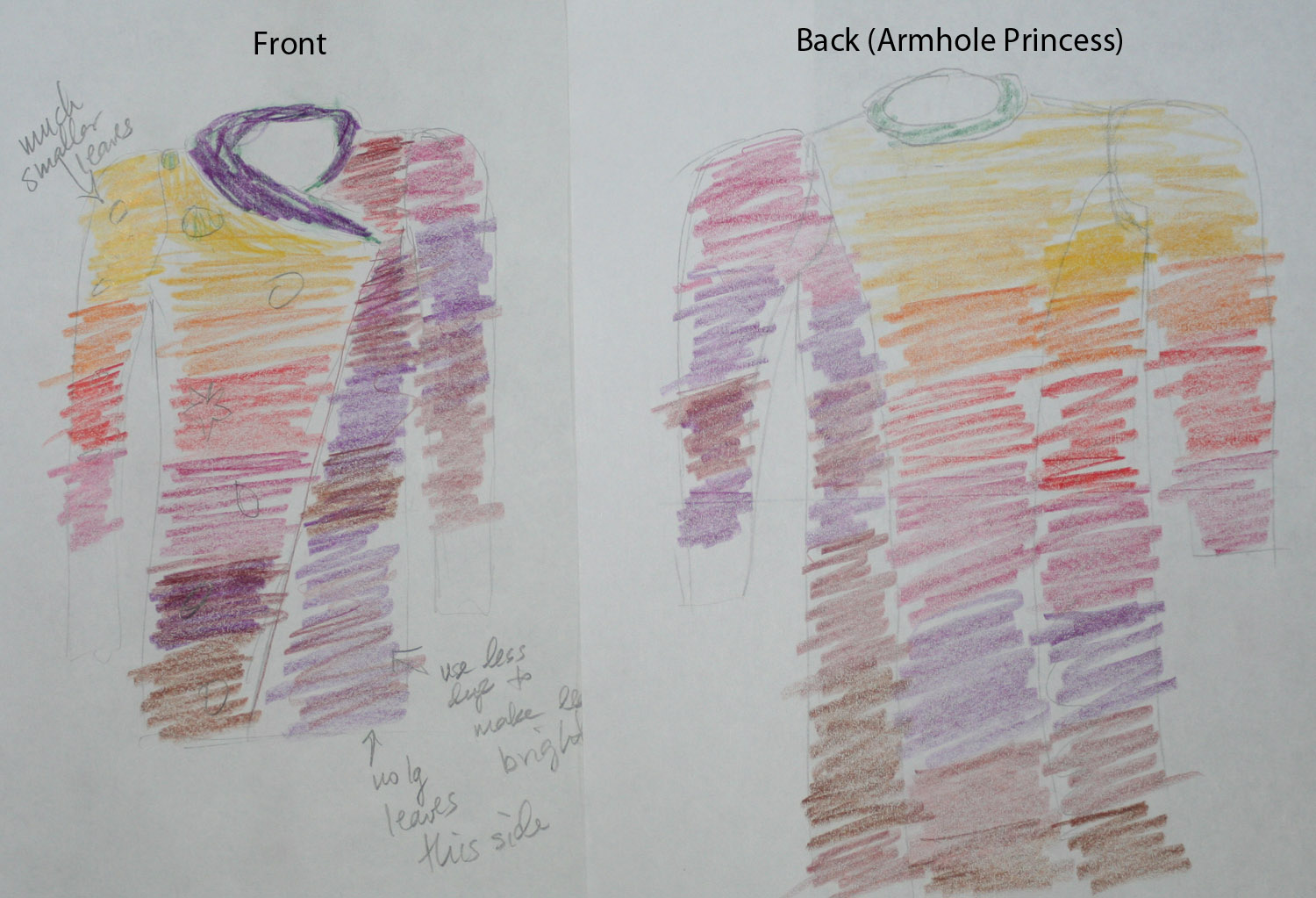
unused design - armhole princess in back

This one wasn’t quite as distracting as the paneled design, but I felt it was badly unbalanced – light colors and warm colors tend to dominate, so the large amounts of gold, orange, and red in the top right section unbalance the design.  I wanted something with more of the darker colors, that wouldn’t look quite so garish.  (Also, the shoulder seams would still clash, with gold meeting purple on the left shoulder.)

And here, just as a reminder, is the one that was Just Right:

Autumn Splendor, design sketch - asymmetric front and back

This is much better, for many reasons:

  • the asymmetrical theme/energy of the front is echoed in the back
  • the greater “strength” of the bright colors is balanced against a larger quantity of dark color
  • adjacent panels in the body are different colors, so seams don’t need to match
  • shoulder seams are compatible colors
  • diagonal line in back adds movement and interest, important since this piece is about autumn, the season of change, leaves drifting down on the air currents.

The little circles on the sketches represent falling leaves.  I was planning to silkscreen leaves directly onto the fabric using my new-to-me thermal screen printer, but am now thinking that I will silkscreen patterns onto a different fabric and applique the leaves to the main body of the coat.  This has the dual benefit of allowing me to see/arrange the materials on the finished coat, and reducing the chance of costly screwups. I’m not an experienced screen printer and have zero experience with thermal screens, so am terrified of screwing up while printing onto my laboriously prepared blank.

One final (and encouraging!) note: this may take far less time than anticipated to weave up.  I had been expecting to weave twelve 54″ panels for a princess line design, but with only six panels in the design, and a shortened length of about 48″ (40″ plus extra for hems, etc.), it should go much quicker.

Off to knit the first blank!

Filed Under: All blog posts, dyeing, sewing, textiles, weaving Tagged With: autumn splendor, design, knitted blanks

  • « Previous Page
  • 1
  • …
  • 3
  • 4
  • 5

Archives

Tags

aids lifecycle outfits autumn splendor book cashmere coat cats celtic braid coat color study cross dyeing design design class devore doubleweave doubleweave shawls drawing dye samples dye study group gradient colors house infinite warp jacquard loom katazome knitted blanks kodachrome jacket ma's memorial mohair coat network drafted jacket/shawl project network drafting painted warp phoenix rising phoenix rising dress phoenix rising kimono phoenix rising reloaded pre-weavolution project sea turtles taquete tie-dye tied weaves tomatoes velvet weaving drafts web design website redesign wedding wedding dress woven shibori

Categories

  • Africa
  • aids lifecycle
  • All blog posts
  • All travel posts
  • Asia
  • Bangkok
  • Belize
  • Cambodia
  • Central America
  • Chai Ya (Wat Suon Mok)
  • Chiang Mai
  • Chiang Rai (Akha)
  • China
  • chocolate
  • computer stuff
  • creating craft
  • Creative works
  • cycling
  • Delhi
  • Dharamsala
  • drawing
  • dyeing
  • Fiber Arts
  • finished
  • food
  • garden
  • Ghana
  • Guatemala
  • Hanoi
  • Ho Chi Minh City
  • Hoi An
  • India
  • Khao Lak
  • knitting
  • Knitting
  • Ko Chang
  • Laos
  • Luang Namtha
  • Luang Prabang
  • markleeville death ride
  • meditations on craft
  • mental illness
  • musings
  • Phnom Penh
  • powerlifting
  • Rewalsar (Tso Pema)
  • sewing
  • Siem Reap (Angkor Wat)
  • Southeast Asia
  • surface design
  • textiles
  • Thailand
  • travel
  • Vangvieng
  • Vientiane
  • Vietnam
  • Warp & Weave
  • weaving
  • Weaving
  • weavolution
  • writing

© Copyright 2025 Tien Chiu · All Rights Reserved ·

Loading Comments...